
Art in Board Games
Interviews with the creatives behind board game art, graphic design and product design.
Featured


Art in Board Games
Interviews with the creatives behind board game art, graphic design and product design.
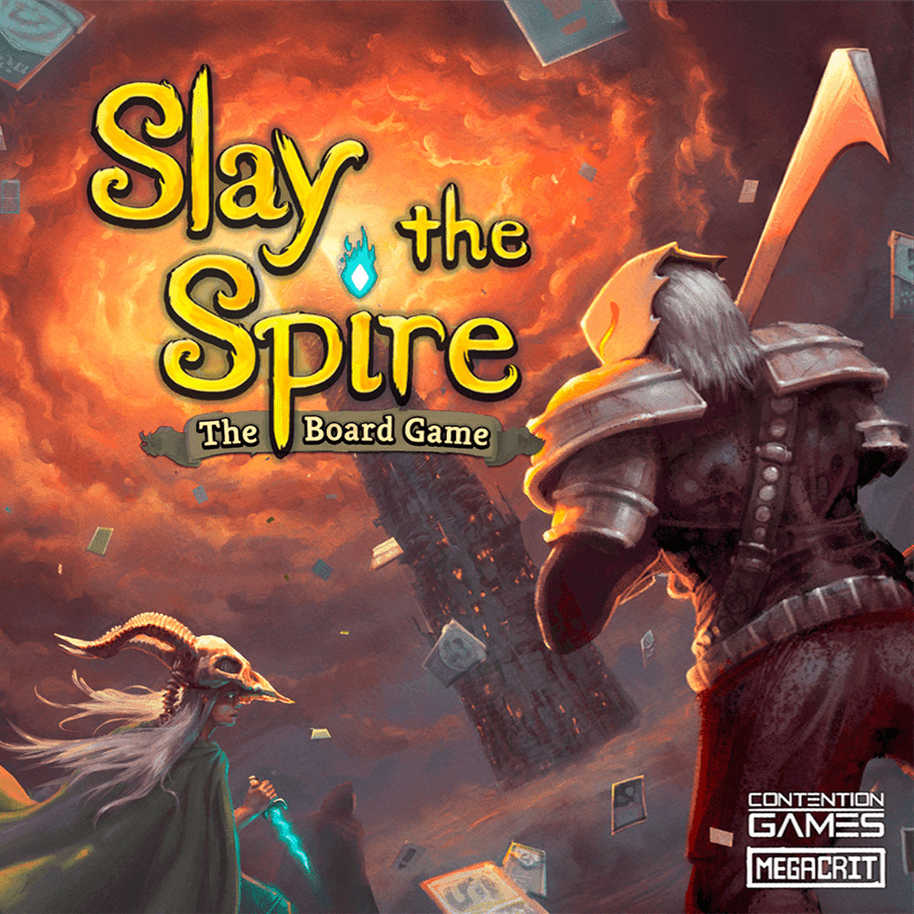
Slay the Spire is a phenomenal hit. The video game has sold an estimated 3 million copies and has been adapted into a board game, which is already rated in the top 50 best board games ever on Board Game Geek.
“Rereading that chapter in Fellowship of the Ring, the most terrifying part of those visions in the Mirror was Frodo seeing the Eye, and I knew I wanted to bring that image into the moment.”
“There are many tragic moments in the story, I tried to reflect them with colors, shapes, and other resources. The board game follows Onoda's life chronologically, and I tried to reflect that in the cards; you can see how he ages.. “
“My background in graphic design helps me curb my desire to use all the colours, because in the end working with a limited palette is always going to be more impactful.”
“Some connect with an illustration because it captures a personal experience, others are drawn to a particular animal, and some simply love the way the sky makes them feel…”
“If we think about the science fiction of the 1960s, we can say that its main characteristic, in terms of design and thinking about the mechanics of space travel, is optimistic naivety….”
“There are some really, really weird things in the ocean. One of the most difficult parts of filling my fictional sea with life was coming up with fake fish that were more terrifying or bizarre than the real fish..”
“I got my first couple of board game clients after I did a self-directed fan redesign project where I made new art and graphic design for a game I really love..”
“Fame and Fable draws inspiration from folktales, mythology, classic and modern fantasy, and popular culture. It’s a love letter to all of those influences, but it also keeps things light and approachable…”
“The idea was to immerse the players in an ocean of folded paper. To achieve this goal, we established a few guidelines: simple compositions with few secondary elements, a sheet of paper as a background, and lights and shadows to bring depth to the pictures.”