Ryan Laukat: Art in Board Games #45
Welcome to Issue 45 in my series sharing the stories behind board game art.
There are a few artists whose work inspired me to start this website. Ryan is one of them. His work features in a number of board games in my collection, and whenever I play them, I feel immediately drawn into worlds that feel magical and inviting. Enjoy our chat!
Check out the interview archive for more great insights into board game art.
Hi Ryan, thanks for joining me! For our readers who aren't aware of your work could you tell us a bit about yourself and what you do?
Hello! I'm a board game designer and illustrator. I've been lucky enough to work in this industry for around ten years. I started as an illustrator and then founded Red Raven Games so that I could publish my own designs. Some of my games include Above and Below, Near and Far, and Eight-Minute Empire. I live with my wife, Malorie, in Salt Lake City, Utah, right up against some beautiful, snowy mountains, and within two miles of where I grew up! We have a daughter and two sons.
Red Raven Games has become synonymous in the industry for combining great art with captivating worlds and stories. When you're creating a game what is your general thought process? Where do you start?
My obsession with creating games started when I began inventing tabletop role-playing games as a teenager. I loved to create worlds to explore and creatures to inhabit them. So naturally, that influences how I approach most of my board game designs today. When creating a game, my motivation is usually to build a world and use the game mechanisms to allow players to explore it and experience it. I think about who the players will get to be in the game, and where they will go, and start there. I think it helps create a more immersive experience.
Last year you successfully kickstarted Empires of the Void 2 the follow up the 2012 original. What can you remember about that time (2012) and what made you want to return to this project?
I'd wanted to revisit the game for many years. I actually made many redesigns of the original game but never published any of them. I wanted another shot at the setting because I felt my skills as an illustrator and game designer had improved. Of course, Empires of the Void was my first published game. I'm proud of what I accomplished, but there certainly were things that I didn't do quite right. The rule book in that first game was not sufficiently clear and left too many things unexplained. The trading did not pan out as well as I had hoped. Some players left the game with a frustrated feeling because of a multiplayer direct conflict problem where two players can gang up against a third, leaving no way to catch up. I wanted to solve these and many other problems, and so I attempted it in Empires of the Void II.
In terms of the illustration, when you worked on Empires of the Void 2, how did you aim to develop the originals aesthetics into this sequel? What have you learned about graphic design and art since the original and how did that impact your choices?
My goal this time around was to create something a little more on the realistic side when compared with, say, Near and Far, and indeed, the original Empires of the Void. I wanted to make a beautiful space map like the original had, and of course many of the of the original aliens and planets, but with an updated vision that I felt would be more immersive. I looked at a lot of hard sci-fi art, especially the covers of books from the 60s and 70s. This meant painting with more subdued tones than usual and experimenting with new brushes.
You are arguably best known for your work on Above and Below and it's sequel, Near and Far. So starting with the original, how did you create this world and was there any inspiration you drew from in developing it?
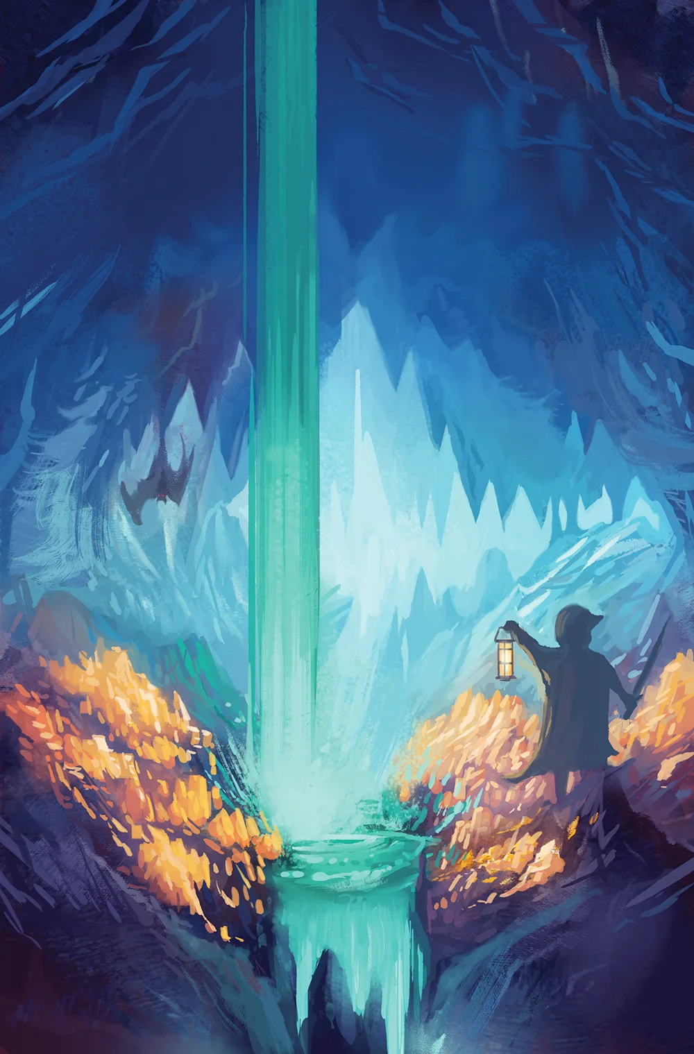
When creating Above and Below, I actually sketched the cover before I even designed the game. That sketch worked as a compass for me, and I designed the rest of the look and the game mechanics around it. I was trying to pin down the feelings and memories that I had playing Super Nintendo games as a child, and that helped me build the friendly, colorful setting. At the time I was also very interested in making my games look as natural as possible, letting the art easily incorporate symbols or information, rather than have obvious graphic design boxes to keep art and information separate.
So thinking about that first sketch of the box cover, how did you get from that initial idea to the game we see today?
I took that sketch and taped it to my computer monitor, hoping to get the same sort of feeling that was in the sketch. Sometimes it's hard to replicate the feeling that is present in a thumbnail or sketch, and it can be pretty frustrating. Thankfully, this time, I threw down the colors quickly and it was like a seed sprouting into a huge, blossoming tree. The Above and Below cover took around four hours, and it didn't change too much after that. Sometimes I repaint the covers for my games multiple times (like with Near and Far), but this time, it felt right pretty much from the get-go.
I used a lot of blue and green, especially on the box, as a message to players that the game is pleasant and inviting. Just as important is the chalky brushwork and painterly style, which is meant to remind the viewer of a children's book. It says, "There's a story in this game."
I paint using a Wacom tablet, but I've learned to watch the monitor so I don't have to use the tablet's screen (it's much faster and more efficient for me if I don't have my hand in the way of the painting). My method has changed over time, but it's been pretty consistent for the past five years, besides updated brushes and the way I choose colors. I paint exclusively with Photoshop, and I'm pretty particular about having the right brushes, shortcut keys, and layout.
When you came to work on Near and Far, how did you aim to base it in the same world (as Above and Below) yet still take the player new places?
I made sure to keep the painterly style and chalky brushwork, but the yellow and orange tones are more associated with risk, exploration, and adventure. Western movies and art were a big influence on the look of the game. At the same time, people need to know that this is in the same universe, so animal races play a big part in the setting! I also decided to include some inked drawings instead of detailed renders on some components, such as the World Cards and the Treasure Cards. I feel like this matches the "wild frontier" feel I was going for.
You talked about nostalgia towards childhood games, so how important has it been when illustrating your games to create worlds that are inviting for all ages?
There's an inner child in me that guides almost everything I work on. The sense of wonder I had when experiencing new worlds when I was young is one of my biggest reasons for creating games and settings. And with my kids, it's like I get to experience that sense of wonder all over again as they dive into books and games. A common inner thought I have is: Would 10-year-old me get excited about this?
As someone who has experience working in all areas of a games production what advice do you have for designers, publishers and illustrators to help them successfully collaborate?
Good illustrators are in this business not only because of their skill with a brush and their time spent honing their craft, but also because of their imagination and ideas. A good publisher and designer will give some creative liberty to the illustrator and not be too picky about how every little thing should look. Of course, for me as an illustrator, I want tons of creative freedom and it's hard for me to get interested in a project if I don't have it. Any good collaboration is going to require some give and take on everybody's part though. One thing I'm still learning is that I need to listen to all suggestions and know how to look through another person's eyes to see the project in a different light. What I might prefer personally might not be the best thing for the game.
Upcoming release from Red Raven Games, Megaland, is the first to have your partner Malorie as co-designer with yourself. Can you tell us a bit more about how this came about and what effect that had on the creation of the game?
It was a lot of fun designing a game together, but truth be told, Malorie has always been very involved in my game design projects, so it was only a slight change in dynamic. It didn't start out as a co-design. I was trying to design a light, push-your-luck game, but nothing was really working out. Malorie helped me solve mechanical problems with new ideas. We both have strong opinions about what works and what we like, so there were moments when we had some strong disagreements about this design. But I think that kind of thing is the forge fire that gets the design where it needs to be. I'm sure we'll do another co-design in the future.
What are you currently reading, listening to or looking at to fuel your work?
I've been reading Homer's Odyssey and The Count of Monte Cristo by Alexandre Dumas. Reading the Odyssey has been especially eye-opening and enlightening. It has an amazingly timeless quality. I've also been playing Pillars of Eternity, an excellent successor to the Infinity Engine games I enjoyed so much as a teenager.
Finally, if we’d like to see more of you and your work, where can we find you?
You can follow me on Twitter @ryanlaukat. We also post lots of photos of our games on Instagram @redravengames.
(All images provided by and copyright of Ryan Laukat and Red Raven Games)


