

Parks (2nd Edition) Board Game Art - Reimagining the Hit National Parks Game - Interview with Josh Emrich (Issue #72)
“Some connect with an illustration because it captures a personal experience, others are drawn to a particular animal, and some simply love the way the sky makes them feel…”
In this board game art interview, I’m speaking to Josh Emrich, an American artist whose work on the Parks (2nd Edition) artwork gives the hit U.S. National Parks game a new look.
I first interviewed Josh back in 2018 about his work on Campy Creatures and Caper with Keymaster. Updating a well-loved game like Parks is no easy task, but I think the team has done a stellar job. I’ll leave it to Josh to tell you more about the Parks (2nd Edition) art.
Enjoying the site? Support it by sharing the articles you liked.
For more great insights into board game art, check out the interview archive.
Hi Josh, welcome back to the site! For anyone new to your work, could you tell us a bit about yourself?
I can’t believe it’s been seven years since we last spoke! Back then, I had just completed my first board game, Campy Creatures, and my design studio, Emrich Office, was primarily focused on branding for the craft beer industry.
Since then, I’ve added a few more game titles to my portfolio, but the biggest shift has been in our clientele. While we’ve retained a single craft brewing client — Bottle Logic Brewing — we’ve transitioned to building brand style guides and developing creative work for the entertainment industry.


We’ve been fortunate to collaborate with dream clients like Disney, Nickelodeon, Netflix, and TNT/TBS. Much of this growth stemmed from the storytelling ability and diverse skill set we honed through our work in both craft brewing and board games.
But to answer your question, I’m primarily a graphic designer and illustrator, though I tend to avoid strict labels because I love working across different creative disciplines. Ultimately, I love creating experiences that bring people together in the real world. I especially enjoy creating things that help people connect with themselves and with others, which is probably why board games have been such a natural fit for me.
Parks 2E - Photography by Kovray
You’re the artistic lead for Parks (Second Edition). What were your first thoughts when considering this project?
When the license for the 59 Parks artwork in the original Parks game ended, Keymaster approached me to help reimagine Parks for a new generation of players.
At first, I was hesitant — it was a massive undertaking with big shoes to fill. But as we discussed the game’s future and the creative possibilities, I became excited about the opportunity to explore the natural world in a new way. Much of my work is rooted in pop culture, so shifting my focus to the breathtaking landscapes of the National Parks was a refreshing and inspiring challenge.
Parks (Second Edition) looks stunning. How did your existing relationship with Keymaster Games help with the work?
Thank you! That really means a lot, especially coming from someone who appreciates the aesthetic details of board games.
My relationship with Keymaster Games, the publisher of Parks, goes back nearly nine years—which is a long time in the creative industry. Over that time, we’ve built a lot of trust in each other. We previously collaborated on Campy Creatures and Caper: Europe, along with other behind-the-scenes projects.
Caper Europe - Photo by Ross Connell
I’m a huge fan of the original 59 Parks artists and the artwork licensed for the first edition of Parks. Keymaster’s internal design team also played a crucial role, adapting the 59 Parks artwork and crafting the game’s overall visual language — some of which built on our work for Campy Creatures and Caper, especially in the wood grain textures and typography.
There was no way I could match their combined talents, nor would I try. Thankfully, I had an incredible team that included the original Parks developers — creative director Mattox Shuler, game designer Henry Audubon, and game producer Jen Graham-Macht — along with my co-illustrator Lisk Feng and graphic designer Seth Nickerson.
What areas for improvement did you identify when evaluating the first edition?
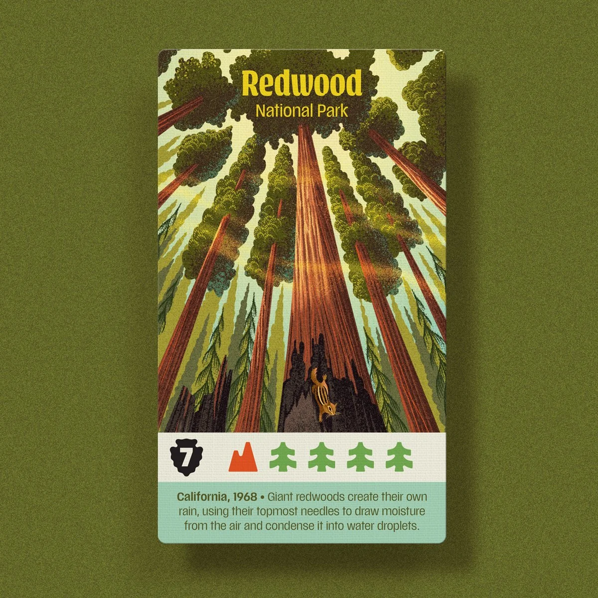
As much as we loved the first game, Keymaster and I wanted to offer something distinct while still honoring the beauty of the national parks and enhancing gameplay. We focused on three key opportunities. Optimizing the artwork & readability, creating a unified artistic vision, and evolving the game’s identity. Since we were starting from scratch, we could design the artwork specifically for the game and include all 63 National Parks.
Parks 2E - Photography by Kovray
Is there an advantage to using art created specifically for board games?
The original 59 Parks artwork began as 18” x 24” posters, meaning fine details and contrast were often lost when scaled down to playing cards. For the new edition, I tailored the illustrations to maintain just the right level of detail, contrast, and readability for the card format.
We also considered various lighting conditions—whether a well-lit kitchen table or a lantern-lit campsite—and improved readability by incorporating larger, crisper fonts, more distinctive icons, and brighter, high-contrast colors.


Parks 2E - Photography by Kovray
The first edition of Parks featured artwork with a wide variety of styles. Did anything in particular inspire your new approach?
For Parks (Second Edition), it was just Lisk Feng and I handling the illustrations, allowing us to create a more cohesive visual experience. I drew inspiration from three artists known for their ability to capture landscapes with striking simplicity and depth:
Eyvind Earle (an artist famous for his work on Disney’s Sleeping Beauty)—his serigraph prints capture light and shadow cascading over hills, iconic trees, and a sophisticated sense of space and color.
Gordon Mortensen—a reduction woodcut print artist whose work conveys undulating wildflowers, shifting weather, and layered depth that immerses viewers in the landscape.
Ray Morimura—a Japanese woodcut artist known for his unique perspectives and rhythmic compositions, such as lily pads dotting a pond or birds in flight.


How did reimagining the art present an opportunity to evolve Parks’ identity for the second edition?
Every game’s theme offers a distinct point of view that shapes the player’s experience and adds meaning to the mechanics — this, in turn, defines the game’s “brand.” The original Parks evoked a cozy, nostalgic feel inspired by WPA-era National Park posters, dark wood grains, and muted colors.
For the second edition, we wanted to emphasize a more modern sense of adventure, wonder, and awe in nature. To achieve this, we drew inspiration from the bold, energetic aesthetic of the 1980s and ’90s outdoor brands, which are seeing a resurgence today. This design direction is reflected in elements like the hiker, resource, and wildlife tokens, the new player mats featuring canteens and backpacks, the gear cards with modern outdoor equipment, and the topographic textures and fonts throughout the game.
Ultimately, this approach created a more cohesive and distinctive design, giving Parks a fresh aesthetic that not only enhances this edition but also sets the stage for future games in the Parks lineup.
Parks 2E - Photography by Kovray
The new edition of Parks features 63 iconic locations. What is your process when handling such a substantial list?
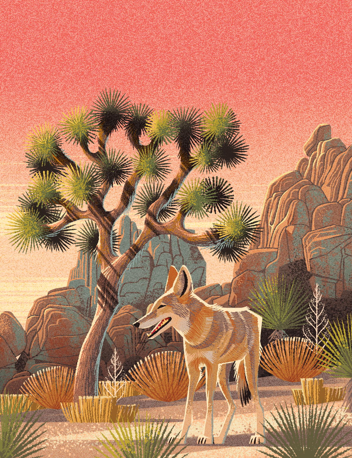
Like the nerds we are, my wife and creative partner, Katie, and I researched every park and compiled our findings into a massive spreadsheet. We cataloged iconic features, flora, fauna, unique seasons, and notable weather events, as well as notable activities. From there, we grouped the parks into six major categories: Deserts, Mountain West, Alaskan/Northern, Coastal, Geological Wonders, and Forests.
This approach allowed me to tackle the illustrations in manageable batches, grouping parks with similar ecosystems or features. As I worked through each batch, it became easier to ensure distinctiveness by varying the time of day, season, landscape focus, or highlighting different wildlife and human activities. The larger guiding questions I asked myself were:
What is the most iconic feature of this park, and is it the most striking example of its kind in the National Parks?
If not, what’s the next best thing, or can I depict it in a unique way?
How can I capture a sense of awe and wonder — something visitors might experience under the right conditions?


Many of the U.S. National Parks share similar geographic features. Was there consideration taken to ensure they all felt unique?
Sometimes, I feel compelled to feature an obvious landmark — like Delicate Arch in Arches or Old Faithful with bison in Yellowstone — because they’re the best-known representations of those parks, and people expect to see them. Other times, a park may be famous for a particular feature, but a more dramatic example of that feature exists elsewhere.
A good example is Wind Cave: it has the longest cave system in the U.S., and American bison roam its hills. However, Mammoth Cave and Carlsbad Caverns are visually more striking, and the largest and oldest bison herd is found in Yellowstone. Instead, I chose to depict Wind Cave’s rolling hills at sunset with an American elk, an animal I hadn’t yet featured in another park illustration.


How important was accuracy when depicting the National Parks?
Unlike many board game themes, Parks is set in real places — we can’t invent mountain ranges or alter the shape of a waterfall; everything must be grounded in reality. Ideally, we’d visit every park for firsthand reference, but that would be a costly and time-consuming endeavor (though we’d love to do it!).
Instead, we relied on reference photos — many of which are taken from the same vantage points. Often, that’s simply the only place photographers can stand without risking a fall, damaging native plants, or encountering an unfriendly bear.


The US National Parks hold a special place in the hearts of many, but do you have any personal favorites?
One of the things I’ve really enjoyed about this game is hearing which National Park illustrations resonate with people. Some connect with an illustration because it captures a personal experience, others are drawn to a particular animal, and some simply love the way the sky makes them feel.
For me, Rocky Mountain National Park holds a special place in my heart because of my Uncle Dave. He was one of my biggest supporters in becoming a professional artist—attending my art shows and buying my paintings even when they didn’t exactly go with his decor. When I moved from Indiana to Colorado after college to pursue better career opportunities, he encouraged me every step of the way.
Josh & Dave - Rocky Mountains National Park - 2005
Josh’s Uncle Dave in the Rocky Mountain National Park 2005
Eventually, when Katie and I decided to get married in Colorado, Uncle Dave came out for the wedding, fell in love with the state, and bought a house in Estes Park—right on the doorstep of RMNP. Having family nearby was incredible, and we often met up for hikes. Uncle Dave was deeply involved in RMNP, volunteering as a “Road Hog” and Hikemaster guide for the YMCA.
When my sister and her husband visited, he’d take us on epic hikes — whether summiting Longs Peak (the tallest in RMNP at 14,256 ft.) or traversing Flattop Mountain along the Continental Divide, descending by glissading down Andrews Glacier. One of my favorite experiences was snowshoeing through the park in the winter when the crowds were gone, and we could walk across frozen lakes to take in spectacular views.
Sadly, Uncle Dave passed away unexpectedly a few years ago, and working on Parks became a way to honor him. I know he would have loved it. That’s why, on the RMNP card, you’ll find a special tribute — Uncle Dave leading the way as we snowshoe across Lake Helene, beneath Flattop Mountain, Ptarmigan Point, and Notchtop.
Thank you for sharing this story with us Josh.
Josh and Dave, Snowshoeing through the Rocky Mountain National Park Artwork - Parks Second Edition
Final Card Art for the Rocky Mountain National Park card - Parks Second Edition
Last time we spoke, you were reading the Wildwood book series to your kids. What are you reading, listening to, or looking at to fuel your work at the moment?
Yes! I’m really looking forward to Laika’s stop-motion adaptation of Wildwood—hopefully later this year! Lately, I’ve been thinking a lot about how the virtual world—smartphones, social media, pornography, dating apps, video games, online betting, and AI—is shaping our mental health and ability to connect meaningfully in the real world.
As a father of teenagers now, this is especially top of mind. Jonathan Haidt’s The Anxious Generation: How the Great Rewiring of Childhood Is Causing an Epidemic of Mental Illness has profoundly reshaped how I think about my own relationship with technology. It’s a must-read for any parent looking to set healthy boundaries for their kids.
At the same time, my work relies on a deep understanding of people. Art is my primary language, but to create meaningfully, I need to see and know others on a deeper level. That’s why I’ve been reading How to Know a Person: The Art of Seeing Others Deeply and Being Deeply Seen by David Brooks.
He argues that “the act of seeing another person is profoundly creative”—a sentiment that resonates with me. How do we look someone in the eye and recognize something larger in them, and in turn, in ourselves? That’s the kind of connection I strive for in both my life and my work.
To better appreciate how cohesive the new art feels, I turned the cards into this GIF - Ross Connell
Finally, where can we see more of your work?
Keymaster and I have more games slated for release in 2026. I’m working on some fun projects for Disney Parks, but I can’t share details at this point. We continually create new label art for Bottle Logic Brewing, and each release is part of a larger story, almost like a serialized graphic novel. The best way to follow these projects is on my Instagram @emrichoffice.
Thanks to Josh Emrich for providing the images for this article and Kovray for the wonderful photography.
If you are curious to play Parks (2nd Edition) it is now available to buy, or play online at Board Game Arena.

PARKS Board Game Art - Communicating Through Color and Illustrating the National Parks - Interview with 59 Parks Project(Issue #50)
A commercial artist isn't in the field just to execute someone else's vision. We like to approach the series as a collaboration and most feedback starts or ends with "what do you think?". That's because we value each artist's insights and ideas. Artists also work incredibly hard on their craft…
Welcome to Issue 50 in my series sharing the stories behind board game art.
Today, I’m talking to JP Boneyard, one of the founders of the Fifty-Nine Parks print series. Parks is a board game that combines the gorgeous art of this series with game mechanics from Keymaster Games. It’s a wonderful celebration of the US national parks, well worth seeing. Check it out below!
Check out the interview archive for more great insights into board game art.
Hi JP, thanks for joining me! For our readers who aren't aware of your work could you tell us a bit about yourself and what you do?
Thank you for making the time! I provide creative direction for The Fifty-Nine Parks Print Series. The series is a celebration of National Parks, design, and printmaking. Our origins are tied to DIY music, screen printed posters, and a love of the parks. During high school friends and I set up all ages art and music events in our small town. 100 of those shows took place in a backyard shed and we hosted bands from all over the world. As a necessity to promote those events friends and I developed a love for design and printmaking. Little did we know we'd later have a career in both!
In the early 2000's we spent a lot of time touring the country in bands and on road trips. This is where we developed an awareness of and appreciation for the parks. Being from a small isolated town in Massachusetts we couldn't believe some the awe inspiring natural wonders out there! 18 years and 350+ events later we've combined all of our favorite things into our full time focus. We still tour often but now it's with a traveling collection of gig posters and parks prints!
You helped found the Fifty-Nine Parks Print Series. Can you explain the series and what some of the biggest challenges were in creating it?
The parks series began shortly after I moved to Austin, TX for a design job in 2015. One of the biggest challenges is finding the combination of the right artist with the right park. It's really important to find a scene that really represents the park, too. We're incredibly mindful about each artists strengths and interests. That often informs which park folks work on. Another challenge has to do with time. Since each posters costs about $3,500 to produce we have to be intentional and strategic about which park we release and when. Especially since we can only afford to release two posters a month. We know some parks only have a few thousand visitors each year. Since we've committed to making a poster of every park we know we won't recoup that initial investment for a year or two — and that's okay. But since each new release essentially kickstarts the next we have to be savvy about our release schedule. The first two years were pretty lean for us. Fortunately it feels like we're starting to gain some momentum now that we have almost every park represented.
In terms of cohesion we rely on the beautiful typeface Riley Cran designed and a simple but effective poster template. The rest is curation, some art direction, and careful color choices.
You're working with Keymaster Games on the card game PARKS. How did this collaboration happen, and what made you want to get involved?
We've loved Keymasters work for a few years now and we often travel with a copy of Campy Creatures on road trips — it's one of our favorite games we own! We were in touch with Keymaster after meeting Josh Emrich who did most of (or all of?!) the design work for Campy. The quality of the products, the game mechanics, and the appreciation for solid design really makes them stand out. I have a philosophy that basically says "swing at everything" and don't fear rejection. It was a long shot but we talked with Mattox at Keymaster and it turned out they were aware of the series! Shortly after a few enthusiastic conversations we began collaborating on PARKS! We're stoked to work together!
What kind of research goes into finding those scenes? Do you have guiding principles, or is it more instinctive than that?
We research every scene with each artist. Sometimes this is easier if we've been to the park ourselves. Some parks — like the ones in Alaska — are tougher to get to so we often reach out to friends or other artists who may have been. We also do as much visual and historical research as possible via the internet. We prefer basing each composition on our personal photos and experiences whenever possible though. When picking a scene we like to play to an artists strengths and choose something iconic enough to represent the park. We also like to include a loose narrative in each poster — that's often why you'll see hikers or wildlife in each poster.


How do you use colour to communicate more about the parks themselves?
We use color to represent each park in the best light. In most cases we're being pretty faithful to the natural colors found within the parks. Some artists take a more stylistic approach to their work so we may have a color palette that is stylized but somewhat representative. We also have constraints with the number of colors we can use since each poster is a 6-8 color screen print. That in itself is a fun challenge. Showing the parks in the best light possible often means leaning towards vibrant scenes that evoke a sense of wonder and awe. This is largely conveyed through the rendering of each park and the scene we choose — the color palettes help drive this home though.


How do you go about translating the larger prints of the Fifty-Nine Parks project into the much more scaled-down version we see here in the game?
Most of the illustrations were designed to look great large and still read well somewhat small. That's because we're considering what the images look like as a print and what they look like (smaller) online. The only snag we really hit was with longer park names. In some instances we had to make some tweaks to park name or the background of an image. Otherwise the illustrations felt like they worked pretty well within the context of the board game!


How has your perception of the board game industry changed while working on this game?
We had no idea how much play testing went into board games. It's brilliant! Usability testing exists in so many other fields, why not here!? I'm not sure why this was a surprise to us but it really speaks to the dedication of both game publishers and players!
With this project you’ve collaborated with a lot of different creatives, so what advice would you give to anyone wanting to work with artists?
I'd say the biggest consideration is respect. A commercial artist isn't in the field just to execute someone else's vision. We like to approach the series as a collaboration and most feedback starts or ends with "what do you think?". That's because we value each artist's insights and ideas. Artists also work incredibly hard on their craft. Respect in communicating what may not be working and acknowledgement of what is, is crucial. Almost every email exchange ends with "thank you". That's because I really do appreciate that someone made the time to work with us — and in many cases — made something pretty remarkable in the process.


Additionally, what advice would you give to anyone who wanted to work as an artist?
Stick with it. Practice. No matter what. And don't take design feedback or rejection personally — it's all in the interest of refining your craft. If you really do goof up on something, own it, learn from it, and move forward. At the same time be mindful of who you listen to. Message boards and comment sections are filled with critics who haven't put in the work themselves. Art is subjective and your worth as an artist — or as a human — isn't derived from other peoples approval. It's derived from loving what you do and doing your best at this moment in time. If your best doesn't feel like enough continue to work and refine your craft — you'll get there eventually!
What are you currently reading, listening to or looking at to fuel your work?
Art directing the series means I'm working closely with dozens of artists at once. For books anything by basketball coach John Wooden, NBA legend Bill Russell, mythologist Joseph Campbell, or anything on stoicism. This is often where I go for insight into working with others or finding more inspiration to enjoy this whole experience — meaning my work but also being alive! Music is all over the place but Minutemen, Kendrick Lamar, Sam Cooke, Aaliyah always do the trick. Instagram is a great resource for inspiring images of parks and finding new artists to work with.
Finally, if we’d like to see more of your work, where can we find you online?
You can find us on Instagram at @fiftynineparks and online at 59parks.net. 5% of each poster sale is donated to the National Park Service and we screen print every poster here in the USA! Thank you for making time to talk with us!

PARKS: The Board Game, a game about exploring and discovering the US National Parks is on Kickstarter until 20th Feb!
(All images courtesy and copyright of Keymaster Games and the Fifty Nine Parks project).
If this is your first time visiting the site then why not stick around a while! I’d really recommend checking out the communities Top 10 Best Art of 2018 to see some absolutely gorgeous games and then head to my interview archive, as there are a wealth of wonderful stories in there.