

Interstellar Adventures Board Game Art - Narrative Design and the Optimism of 1960s Science Fiction - Interview with Adrián Iglesias (Issue #71)
“If we think about the science fiction of the 1960s, we can say that its main characteristic, in terms of design and thinking about the mechanics of space travel, is optimistic naivety….”
In this board game art interview, I’m speaking to Adrián Iglesias, an Argentinian artist whose work on the Interstellar Adventures artwork combines a comic illustration style with escape room style game mechanics.
Being an escape room-style game, there’s a lot of secret stuff I can’t share, but I hope what I can share sparks your imagination. Enjoy!
Enjoying the site? Support it by sharing the articles you liked.
For more great insights into board game art, check out the interview archive.
Thanks for joining us, Adrián! Could you tell us a bit about yourself?
Hello Ross, thank you for welcoming me and giving me a place in this space. A little about me, I was born in Argentina, in the south of the country, where I graduated in fine arts at the National University of La Plata.
My love for drawing and comics has been a constant in my life since childhood. Even before I learned to write, I was creating simple comic strips based on the animated shows I enjoyed, like Mazinger Z, He-Man, and Space Ghost. These were my initial forays into graphic storytelling.

After completing my education, I took on a few conventional jobs until I decided to pursue my true passion. I left everything behind and, along with some friends, started a comic publishing company. Thankfully, that leap of faith paid off: I landed my first steady role as a comic artist for a series about hackers and spent four years teaching comics at a private multimedia art school. For over fifteen years now, I have been working as a freelance illustrator and comic artist.

You’ve illustrated Interstellar Adventures, a new escape room-style sci-fi board game on Kickstarter. Can you tell us a little about it?
When Harriet contacted me, she mentioned three words that instantly piqued my interest: retro science fiction. As a fan of science fiction, especially the nostalgic variety I enjoyed as a child, I felt a spark of excitement. I realized there was an entire universe of board games related to this theme that I had yet to discover.
With a whole sci-fi world to create, where did you start?
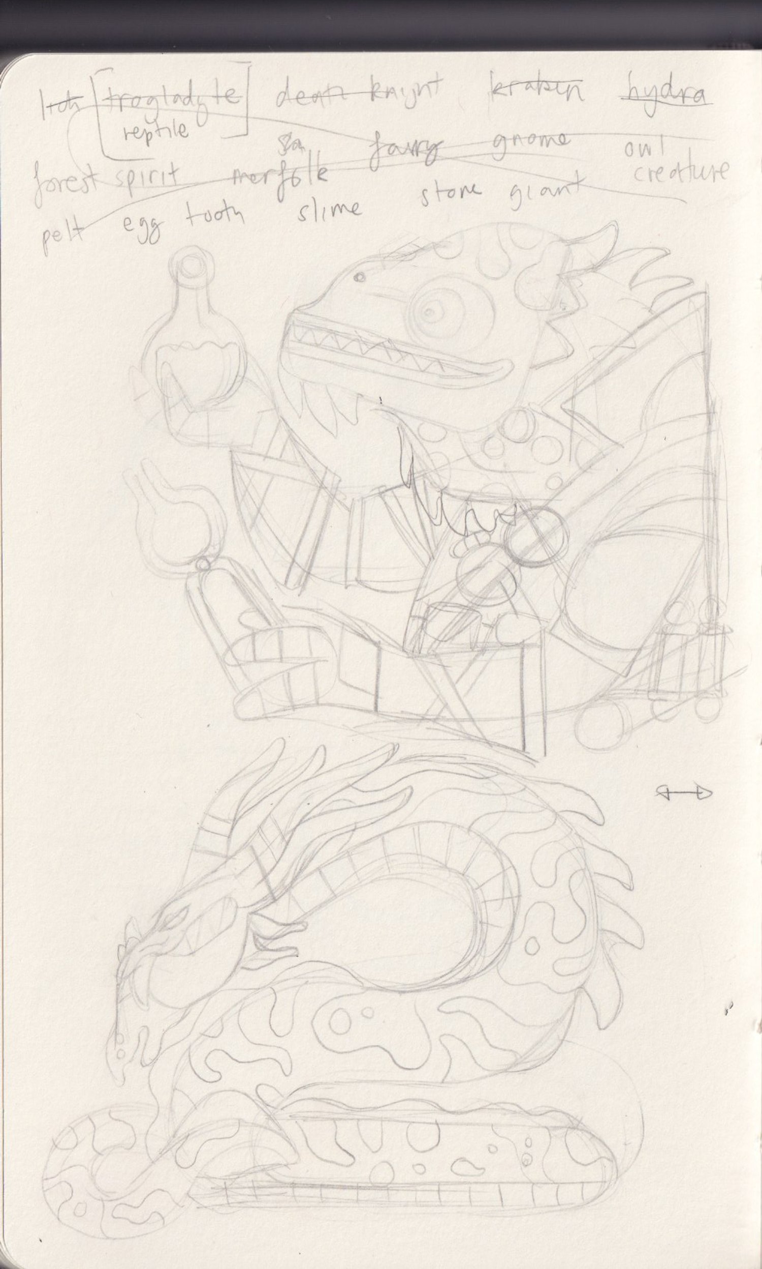
We started working on the design of the characters and the illustrated cards. But little by little the project unfolded before my eyes as something new. It has a richness in the gameplay that I hadn't seen before. Screens to launch missiles, cards that change by overlaying other cards, secret messages, and puzzles that form new paths for the characters. Every detail is thought out. It is a lot of fun to illustrate, and I can't wait to make it a reality and play it.


How did you look to illustrate a world that feels specific to another era?
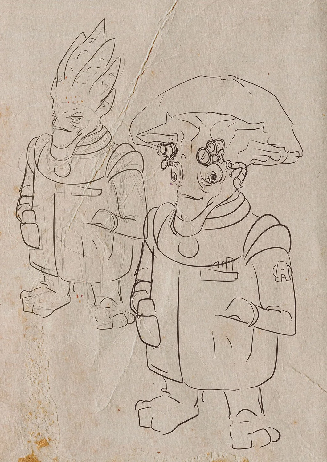
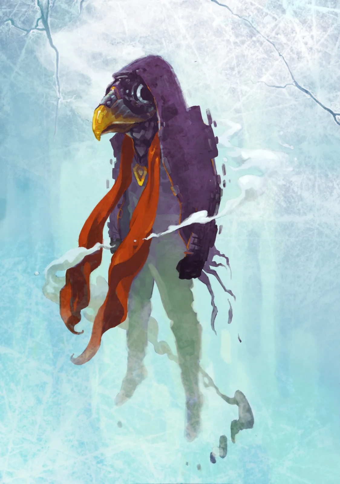
If we think about the science fiction of the 1960s, we can say that its main characteristic, in terms of design and thinking about the mechanics of space travel, is optimistic naivety. These were stories that took place in space before mankind had ever set foot in space, so there were thousands of fundamental details that were unknown and that later complicated the idea of space exploration. Yes, it was known that it was necessary to wear a space suit. Just contrast the designs of Terrore nello Spazio with Alien.
Keeping this concept in focus, I created the suits and items featured in the game. To complete the project's visual identity, I drew inspiration from 1960s comics. This is reflected in a restricted color scheme, the incorporation of halftones, and a texture reminiscent of offset printing and paper.
This combination of naive design and limiting the vast arsenal of digital tools, I think, is what gives a retro look to the project.

As a comic artist, what do you think is the key to illustrating memorable characters?
That's the key question, isn't it? In my view, one of the most crucial elements in comics and graphic storytelling is the performance. The drawing style, or how the artist depicts reality, offers an almost limitless variety and is heavily influenced by personal preference. I tend to favor synthesis and exaggeration in my drawings. Additionally, character design plays a significant role; creating characters that are instantly recognizable and have distinctive shapes greatly enhances the initial visual impact. However, all of this loses its effect if the characters fail to convey the emotions that the story aims to express when they interact within the two-dimensional world we've crafted for them.

Real-world escape rooms are very kinetic spaces. How did you look to breathe life into the inanimate objects and environments of Interstellar Adventures?
Everything is in function of telling a story and conveying the tone and message of a scene. Of course, this manipulation of shapes and colors must go unnoticed by the reader, and therein lies the skill of the artist. For example, the palette turns to warm tones (reds) if the scene has action and danger. Conversely, it leans towards cool colors (blues) if we need to convey calm, pause, and tranquillity. Something similar happens with lighting. It is manipulated to guide the viewer's eye over the drawing.
We know that we see the areas of highest contrast first, and that is where we put the most important things. The dimensions of the eyes, mouth, and even hands of the characters change based on the emotional requirements of each scene. When it comes to set design, it becomes a character in its own right.
For Interstellar, I envisioned the crew alongside their designated spaces within the ship simultaneously. This means that each crew member's personality is reflected in the set, and the set influences their character as well. A great example of this is Eugine, the robot engineer. His design is quite basic, evoking the look of early 20th-century submarine suits, which aligns with the aesthetic of the engineering section.


The sci-fi genre has a rich history in creative arts. Did anything inspire your work on Interstellar Adventures?
Undoubtedly, my gateway to science fiction was Star Trek, the original series and as such it left an inescapable mark on my imagination. Although I'm also a big fan of cyberpunk, works like Blade Runner, Akira, Neuromancer, Ghost in the Shell, I discarded that whole branch of the genre as the underlying tone doesn't match the spirit of Interstellar Adventures.
To the Star Trek imaginary was added the low-budget science fiction films I used to watch on Sunday afternoons at my grandparents' house: The Day the Earth Stood Still (1951 film), Terrore nello spazio (1965), Forbidden Planet (1956), Invasion of the Body Snatchers (1956), among many others.


Were there any challenges in illustrating an escape room-style board game?
Absolutely, it’s an exhilarating journey! I’ve never embarked on anything quite like this before. Initially, Harriet and I focused on character design, an area I’m quite familiar with and have tackled many times. Once we nailed that down, we shifted our attention to the cards. Although I had never illustrated anything of this nature, I found it easy to visualize each card as a panel in a comic book, which made the process feel even more thrilling.
Then came the box design, which was truly a highlight. Harriet proposed a brilliant concept: to style the packaging like an old television set. This required me to carefully consider the box layout and how each side would contribute to a cohesive concept.

What captivates me the most are the puzzles within the game—paths that shift in the player's hands, crystals that materialize, monsters lurking in enigmatic caverns, and numbers concealed in unexpected places. The gameplay of Interstellar Adventures is extensive and diverse, and I’m eager to dive in and witness how all the intricate elements we’ve crafted will come together to create this captivating adventure.


What are you reading, listening to, or looking at to fuel your work?
I find it fascinating to learn about the art, books, comics, music, films, and literature people gravitate towards, as it offers a glimpse into what fuels their creative spark. It's truly another window into the artist's world.
Currently, I'm rewatching Star Trek, with episodes from ‘The Next Generation,’ ‘Deep Space 9’, ‘Voyager,’ or ‘Enterprise’ perpetually playing on my second screen while I work in my studio. My go-to entertainment choices outside of work are detective stories, whether in the form of series like Columbo, Sherlock, Murder She Wrote, or Miss Marple or novels featuring Cormoran Strike. A particular favorite is the iteration of Dr Who starring Matt Smith alongside Karen Gillan.
For a comic book artist, reading comics is something that, apart from being very enjoyable, is almost obligatory. You always learn from studying the great artists of the medium. Now, I'm following two collections: Angel Wings and Conan, The Cimmerian. I always manage to have Argentinean comics at hand to keep up to date with new releases like Almer, Jobs, Nathaniel Fox; and anything drawn by Eduardo Risso, Mandrafina, and Alcatena. To finish this review, I could mention the literary sagas I've read lately: Liu Cixin's Remembrance of Earth's Past; The Witcher, Patrick Rothfuss's incomplete trilogy; and the one I'm currently reading, Brandon Sanderson's Born of the Mist.
Finally, where can we see more of your work?
Thanks for the question! Searching for 'santaplix' on any search engine will lead you to my social media profiles, where I share drawings, glimpses into my creative process, and geeky content. However, for a comprehensive and organized collection of my work, please visit my website at www.santaplix.site. This is where I showcase my creations: comics, stories, illustrations, and ongoing projects. While most of my content is in Spanish, there's a dedicated section featuring English translations of my comics.
Find out more about Interstellar Adventures, the escape room board game from Minty Noodles, by visiting its Kickstarter page.
All images provided by Adrián Iglesias and Minty Noodles.

Deep Regrets Board Game Art - A Deep Dive into this Creepy Fishing Game - Interview with Judson Cowan (Issue #70)
“There are some really, really weird things in the ocean. One of the most difficult parts of filling my fictional sea with life was coming up with fake fish that were more terrifying or bizarre than the real fish..”
In this board game art interview, I’m speaking to Judson Cowan, a designer, artist, and publisher whose new game Deep Regrets filled me with both excitement and terror.
It’s not the first time I’ve been drawn in by Judsons art. About five years ago, I backed a game on Kickstarter called Hideous Abominations. In the game, you are presented with a carnival of body parts and, as a mad scientist, are tasked with combining them to create your own monsters. I love a macabre theme, but what drew me in was the playful artwork.
Judson is back with a brand new game, Deep Regrets, that combines fishing with the horrors that could lurk beneath the surface. Discover why this game hooked me below!
Enjoying the site? Support it by sharing any articles you liked.
For more great insights into board game art, check out the interview archive.
Thanks for joining us, Judson! Could you tell us a bit about yourself?
Thanks for having me! I am all over the place. Professionally and mentally. Obviously, I’m a board game designer, but that’s been new to me in the last four years. I’m a musician, an illustrator, a graphic designer, a photographer, a filmmaker, a gamer, a climber, a horror fanatic - I like being able to do and try everything (except sports, I could not give two shits about sports).
Weirdly, I’ve never really liked calling myself any of those things. I’m just a person who does things; I do some things more than others. I feel like avoiding being put into a specific bucket is an important part of my personal brand.

“I once designed a blimp for Conan O’Brien.”
BORING RECAP OF CAREER: I’m originally from the States and studied design and photography at uni in North Carolina. I worked for about a decade in the ad industry as an art director in Atlanta, Georgia. I once designed a blimp for Conan O’Brien. I’ve always had a side hustle of doing music for commercials and games, most notably Ben10 and Rogue Legacy, respectively.
And I’ve made a name for myself in the Soulsborne community doing maps and fan art of the video game Dark Souls. Before I moved into board game design, I spent about a decade in-house at Skyscanner, where I was a creative director and people manager.
Forgive an obvious question, but what comes first, theme or mechanics?
Theme and mechanics are so intrinsically linked I have trouble considering them individually. Take Deep Regrets, for example: the first time I thought about it, I already knew that I wanted a horror fishing game that featured heavy push-your-luck mechanics, dice used for strength, multiple depths and shoals, and a strong focus on exploration and discovery.
I developed the visual style, the theme, and the gameplay all simultaneously. I was even thinking about what the trailer, marketing, and box would all look like and how they would tie together the first day I started working on the game – I’m designing an end-to-end experience, not just a game. So, what comes first? The experience comes first. And theme and mechanics both serve the experience.
There’s a Maya Angelou quote I really like:
“I’ve learned that people will forget what you said, people will forget what you did, but people will never forget how you made them feel.”
That’s how I think designing games should be approached: how do I want to make people feel? And how do I use theming and mechanics to create those emotions?
What is your attraction to SPOOKY STUFF when it comes to theme?
I’m just a SPOOKY GUY, I guess! I’ve always been obsessed with spooky stuff. I grew up making haunted houses for trick-or-treaters in my front yard. I was weaned on Scooby-Doo, Gremlins, Ghostbusters, and Scary Stories to Tell in the Dark. And I’ve honestly just never weaned off. All my favorite things are horror - movies, books, games.
I actually spent a season moonlighting at Netherworld in Atlanta, scaring people professionally. I once scared the rapper Bow Wow! He always brings his crew through the haunt every year.
The first game I designed was about building and running your own haunted attraction called Fright House. It’s a forever project that may never be finished, but I really hope to come back to it at some point; it’s very close to my heart!
You are the designer, graphic designer, and illustrator of your games. What are the advantages of doing it all?
There are a few advantages, but I think the most important one is velocity. Because I don’t have many external dependencies, I can move very quickly. I know what I’m trying to achieve, and I can get there very quickly because I’m not waiting on someone else to pass back design/art/development work.
The other key one is control. Coming back to this idea of crafting experiences, being able to control every aspect of that experience provides a very “auteur” approach. I hope that you can feel a lot more of my personality in my games than you might in games made by larger teams since I’m very carefully controlling every aspect of it.
The downsides are equally important: you don’t have a team to bounce ideas off of, you work in relative isolation, and you’re a huge bottleneck for your projects. I’ve tried to balance these negatives a bit by moving into a shared office space with other board game designers, so I have people working in the same discipline nearby at all times to chat with and get support from!
As a one-person studio, how important is playtesting and feedback?
I learned the importance of user research and feedback in my corporate life, and I brought that mentality with me to board game design. Here, user research is just playtesting, and it’s critical to making good games.
You can always tell when a game didn’t go through the proper amount of testing or was only tested by close friends and family who were too polite to give it the proper dressing-down it required.


I have a dedicated group of playtesters that I trust and work with a lot, but I also try to attend meetups and go to board game cafes and such to play with people I don’t know. Plus, looking for localisation partners gives a lot of very diverse feedback from very different cultures as publishers play your game to see if it's a good fit for their catalogue.
It’s important to get a variety of perspectives and consider how you’ll implement that feedback into your game.
In an early version of the game, madness was a universal scale - it did the same things, but it affected all players unilaterally. This was quite cool because it meant you could put pressure on other players and decrease the value of their fish. The downside was that Regrets didn’t do much. They drove up the global madness when acquired, but the only other effect they had was to force the player with the most to lose their most valuable fish.
In playtesting, the feedback I got was that Regret cards felt meaningless and extraneous. Ultimately, that feedback encouraged me to part with the idea of a global madness track in favor of individual player madness tracks. I lost a bit of “take-that” in favor of greater player agency and greater thematic integration of the Regret concept, and the game is much stronger for it!
In your opinion, what are the crucial elements of good graphic design?
If you’re familiar with Dieter Rams, the German industrial designer, he has a philosophy I really like: as little design as possible. Design serves a function, and extraneous design elements should be removed wherever possible.
When he was working, he had a very clean, minimalist approach. That approach is not correct for (most) board games. The “as possible” quantifier in the “as little design as possible” is super important - a lot more elements are required in board game designs to help with comprehension, engagement, and entertainment.


Often, things that serve a strictly aesthetic purpose ARE necessary in designing board games because, again, you’re designing an experience, and those design elements can enhance that experience. That’s still essential design.
I do think there’s a balance to be struck. I think a lot of games get overly decorative and detailed and it starts to be a bit like typing in all caps. An individual card might look nice when viewed up close, but the table viewed from afar starts to look like a bowl of rocks. There’s no discernable focal point. I wish more designers considered the entire board state as one composition when designing.


Squint at a photo of Everdell, then squint at a photo of Brass Birmingham. Both have strong illustration and design elements, but Everdell considered how it would be viewed at a distance, and Brass did not.
Everdell is recognisable from across the room because of its contrasty elements and unique forms - everything works beautifully together and stands apart from one another. Let’s just ignore the big annoying cardboard tree, which is a design decision that I think Dieter Rams would absolutely chuck in the furnace. It actively worsens the gaming experience and is just there as a gimmick. That’s not essential design.
What is your method for creating art? Are you digital or analog?
I love physical media and I love working with my hands. All of my illustrations start in ink. I do colour digitally on an iPad in Procreate, but I try to keep a tangible hand-touched element to each one.
I think working in ink forces a nice acceptance of imperfection. Watching people draw on an iPad is fascinating because they’ll draw and erase a line 10 times before they get one they like. With ink, you get one shot. You have to commit.
I like the way that forces you to accept the decision your hand made and move on instead of striving for some fictional perfection.
You can always redraw but I generally try to avoid this as much as possible. I might redo my pencils a few times before I get an outline I’m happy with, but once I move to ink, I usually stick with my first pass, except in rare circumstances. Another creative philosophy I really like is Miles Davis: he thought spontaneity and expression were more important than perfection.
I also like that it creates physical artifacts. I have all these folders of ink drawings and I’ve started selling them as part of my Kickstarters and on my site. That really resonates with people! Owning a physical part of a game’s creation process is something people find a lot of value in!
Deep Regrets features a monstrous deck of creatures. Where did the inspiration come from for the over 100 unique fish in the game?
50% of them are real things, it’s an even split of fair (real) and foul (fake) fish. I did a tremendous amount of research to find a mix of interesting fish and to learn about their anatomy and behaviour to help inform their mechanics.
I think my office mates got tired of me saying things like “did you know Pacific Islanders used to sacrifice Giant Trevally in place of humans?” or “did you know garfish have green skeletons??”
There are some really, really weird things in the ocean. One of the most difficult parts of filling my fictional sea with life was coming up with fake fish that were more terrifying or bizarre than the real fish. I wound up utilising the uncanny valley quite a bit! Making fish more human-like made them far more disturbing. Lots of fingers, big white eyeballs, that sort of thing.
In fact, one of the most disturbing fish in the game is the “human” you can catch at depth III. It just makes no sense that he’s down there, and that’s terrifying. And you can eat him to refresh the dice.


Do you have a favorite piece of art you created for Deep Regrets?
I just love Frod. He’s the first character I designed and he encapsulates the feel of the game so well. Lovecraft, but goofy.
Scooby and the gang investigate Innsmouth. I love him so much that he became the Automa opponent in the upcoming Buttonshy version of the game Shallow Regrets.
Any advice for someone considering creating and publishing their own game?
Just f***ing go for it. There’s plenty of good advice I could give you, but I’m a big believer in letting people make their own mistakes and learn from them. You won’t nail it on the first try, you’ll struggle, you’ll stumble along the way, but all of that will craft you into something interesting, and you’ll make better games for it.
What are you reading, listening to, or looking at to fuel your work?
I’m a big horror film fan, I probably pull the majority of my inspiration from that world. One that really set my imagination ablaze was Annihilation, so much so that I watched about four times and then bought and read the entire Southern Reach trilogy because I was hungry to explore more of that absolutely bizarre world. I need to pick up the fourth book!
Some of my favorite horror flicks from the last few years are, in no particular order, When Evil Lurks, The Vourdalak, Late Night with the Devil, Long Legs, In a Violent Nature, Barbarian, Oddity, and Hold Your Breath (full transparency, I did the credits for that one).
Finally, where can we see more of your work?
You can find me on Instagram, Facebook, and Bluesky, or you can visit my website tettixgames.com!

All images provided by Judson Cowan.

Fame & Fable Board Game Art - Creating New Fantasy Worlds - Interview with Owen Davey (Issue #68)
“Fame and Fable draws inspiration from folktales, mythology, classic and modern fantasy, and popular culture. It’s a love letter to all of those influences, but it also keeps things light and approachable…”
In this board game art interview, I’m speaking to Owen Davey, a British game designer and illustrator whose bright and vibrant art style for the Fame & Fable board game stopped me in my tracks.
If you’ve visited my site before, you might notice it’s been a while since my last interview. This site has always been a passion project of mine, and I’m excited to return in 2025 with new interviews. Enjoy our conversation below.
Enjoying the site? Support it by sharing any articles you liked.
For more great insights into board game art, check out the interview archive.
Fame and Fable - Board Game Cover Art
Thanks for joining us, Owen! Could you tell us a bit about yourself?
Thanks for having me. I'm a father of three kids and a freelance illustrator based in Worthing, UK. I've been working professionally as an artist for nearly 16 years now. I work across the whole industry really, regularly working in publishing, advertising, editorial, apps, packaging and teaching.
Where might we have seen your work?
I've worked with clients including Google, Disney, National Geographic, WWF, London Zoo and more. I like the variety it brings to my day-to-day work life. I've also had more than 40 books published, many of which I authored - often non-fiction and focusing on animals and nature.
With such a broad spectrum of clients, do you have a first step for new projects?
Research - it is pretty essential for my process. I have to explore whatever brief I've got, try to understand it in as much depth as I can, and then try to find inspiration within that. Often if I get stuck for ideas, research can dig me out of that hole - the world is a fascinating place with many topics that appeal to me, so I generally just follow my curiosity.
One of the things that I love about being an illustrator is that nobody else would create something in the same way as me - all my influences and interests are wrapped up in each project, so my experiences and my life shape a lot of what I create. That research to curiosity to inspiration process pipeline is where a lot of that stems from.
Fame & Fable board game on the table
‘Fame and Fable’ looks gorgeous. What made you want to create your own board game?
I've been a lifelong board game enthusiast, but over the past several years, I’ve fully immersed myself in the hobby side of it. It’s no longer just about the classic family staples or traditional card games; I’ve developed a deep love for in-depth thematic games that can easily steal hours of your time.
After the lockdowns in 2020, I felt an even stronger urge to step away from screens and spend more time with friends. That’s when I started engaging in regular game sessions — sometimes packed with a variety of short games, and other times devoted to tackling one sprawling epic.
Owen Davey - D&D Character Art - Anara
I’ve also started playing more solo games, but my favorite part of the day is still unwinding with my partner in the evening. Once the kids are asleep and the house is tidied up, we dive into a game together — it’s become such an important ritual. During lockdown, I was also part of a Dungeons & Dragons group and eventually took on the role of Dungeon Master. I poured so much energy into it, homebrewing everything from NPCs and monsters to items and locations.
I became obsessed with not just describing the world but illustrating it too, so my players could better visualize the adventures. When someone else took over as DM, I found myself left with a treasure trove of artwork and no clear purpose for it all. That’s when I decided to combine my passions for fantasy, board games, and illustration to create something new. Years later, that passion project has grown into Fame and Fable.
Fame and Fable Board Game Prototype
Fame and Fable’s world feels unique while paying tribute to classic fantasy tropes. Where did your inspiration come from?
Fame and Fable draws inspiration from folktales, mythology, classic and modern fantasy, and popular culture. It’s a love letter to all of those influences, but it also keeps things light and approachable. The tone is playful, blending the grand, folkloric feel of epic tales with humor and a sense of fun—something that will feel right at home for anyone familiar with the TTRPG space.


What is the central hook for the player’s place within the world?
The game's lore centres on a realm overrun by monsters wreaking havoc across the land. Your mission is to gather allies and items to confront these threats head-on. In solo mode, the game introduces six key locations, each delving into classic terrains often explored in fantasy works. Fame and Fable aims to strike a balance between something familiar and new, offering a fresh perspective on beloved fantasy tropes while remaining rooted in the joy of storytelling.
Fame and Fable - Monsters
Fame and Fable features over 150 unique artworks, which, let's be frank, is a lot. How did that happen?
The game grew in scale over time. I had some artwork from my D&D campaign, but there was so much more I wanted to include. I wanted a wide range of card types and abilities for replayability, and that just kept expanding. No complaints, though—I loved it. I’m still illustrating potential characters and monsters for possible Kickstarter stretch goals and maybe even future expansions.


With a list of illustrations that long, what was your process for creating it all?
With anything this massive, it’s all about taking one step at a time. Thinking about 170 artworks from scratch feels impossible, but aiming for 20 more in a month? That’s doable. Breaking it down into smaller, achievable goals kept it from becoming overwhelming. Logistically, I had spreadsheets constantly updated to keep everything balanced and these big mega-files where all the final artworks were stored. I also have a habit of keeping every old version, so I probably have hundreds of Illustrator files.


My ideas usually come at the most random times—falling asleep, washing up—so I jot them down on my phone and later turn them into research. That research mixes with a healthy dose of imagination before making its way onto the page (or, more recently, the iPad).
Sketching is the easiest part for me—I've made a career out of drawing, so that part feels natural. The iPad lets me be loose with the process. I can swap out heads, try new outfits, or even randomly turn a character into a duck. No rules, just the rule of cool.


This whole project is about play, from how I created it to how it’ll be used, and the artwork reflects that. Once I’m happy with a sketch, I bring it into Illustrator to create the final lines digitally. Then I add colour using a restricted global palette—this keeps everything cohesive while also saving time since I don’t have to build a new palette for each piece. Each artwork takes at least a couple of hours, but some took much longer because they were trickier to get right.


Parents will never admit to having a favorite child, but do you have a favorite piece of art you created for this game?
I really like The Cursed—she’s got these epic muscles, cool braided hair, and a big flaming sword. Total badass. But I also love The Shepherd, who’s the complete opposite—he’s got a wide-brimmed hat and looks kind of like a sheep. I enjoy flipping those roles.
A lot of the cards have little hidden details inspired by research. The Shepherd has only one central eye, which is a nod to The Odyssey—Polyphemus, the cyclops in Homer’s tale, was a shepherd, so that felt like a fun connection.
Mechanically, The Cursed is a fan favourite because she can sacrifice herself to deal massive damage, while The Shepherd is great for annoying your friends since he collects their exhausted cards. My favourite part of this whole process has been designing cards that feel thematic—I really want the storytelling aspect to shine through in the game.


How is creating board games different from your other work?
It's an interesting task having to Art Direct yourself. I love working with my regular clients but it was really fun to allow my creativity to run wild. The difficulty is that there's nobody to sign it off. I have to decide if it's done or not and whether it works. I've definitely leant on friends throughout this process to help me check if things are actually cool, or maybe don't work as well as I thought they did in my head. The game wouldn't exist as it is now without their invaluable insights.
Fame & Fable Meeples
Have there been any particular challenges in creating your first board game?
There was a massive learning curve in figuring out how to design a game. I quickly realised that just because a mechanic works, it doesn't mean it’s fun. And because of the type of game Fame and Fable is, where each card works slightly differently, it meant that a LOT of playtesting was needed.
Each card has to make sense to multiple people and be as devoid of misinterpretation as possible. I was definitely not aware of how much work it would be to make my own game, but I've genuinely loved every second of it. I can't wait to build expansions for this game and develop other ideas I've had.
Owen Davey - Fame and Fable Card Art
What are you reading, listening to, or looking at to fuel your work?
I've just finished rereading another one of the Brain Jacques Redwall books - Martin the Warrior - and now I'm delving into Brandon Sanderson's 'Mistborn' - I'm loving the lore of the Allomancy. I've also been listening to various history podcasts, which often spark me to go research something I'd never known about before, from a certain type of weapon to a war I'd never heard about. I've been watching Hilda and Scavenger's Reign on Netflix - both of these have incredible world-building and just happen to be stunning visually.


Do you have any advice for anyone wanting to work as an artist?
Meet deadlines. Make awesome work. Check contracts. Look after yourself. Get yourself out there and show your work to your audience or the people that might commission you.
Owen Davey - Fame and Fable Board Game
Finally, where can we find you to see more of your work?
The best place to find more stuff about Fame and Fable is to follow me on Instagram at @fameandfable or sign up to the Kickstarter prelaunch page where you'll be notified about when the game launches - there are some early bird treats, so definitely back early to make the most of them.
Owen Davey - Fame & Fable - Group Art
All images provided by Owen Davey

Techlandia Board Game - Silicon Valley meets Lovecraft - Interview with Dan Ackerman (Issue #64)
“The key for me was not to just have a guy in a suit with a Cthulhu head, but to have the guy in a suit with a Cthulhu head be just another cog in the corporate wheel…”
Welcome to issue 64 in my series sharing the stories behind board game art. With all of the tech scandals of the last few years, the idea that a secret evil is lurking behind the scenes, pulling the strings, seems less like fiction every day. Techlandia is a board game that takes the premise of Silicon Valley corporations and spreads supernatural horror on top like a thick Lovecraftian marmite. Enjoy this glimpse into its dark reality.
For more great insights into board game art, be sure to check out the interview archive.

Today I'm joined on the site by Dan Ackerman. Thanks for stopping by! For our readers who aren't aware of your work could you tell us a bit about yourself and what you do?
I'm probably best known as a tech journalist, and I've been with CNET, the technology news and reviews publication, for about 14 years, covering everything from social media and hacking to laptops and games. I'm also a pretty regular TV news talking head, mostly on CBS This Morning, and even found time to write a book. Naturally, it was game-related. The Tetris Effect is the nonfiction real-life story of the classic game Tetris, which was created in the Soviet Union during the Cold War and eventually escaped to the West. Fun fact -- not only am I a New Yorker, I'm a native one at that -- born and raised here.
Dan Ackerman - photo by Sarah Tew
You've got a brand new tabletop game on Kickstarter called Techlandia. Now before we get into the game itself, after years as a journalist covering tech and videogames, why make your own board game?
Over the past several years, I've seen a lot of innovation and interesting storytelling coming out of the tabletop community. It reminds me a lot of the late '90s and early 2000s in the indie video game scene. So, when I had an idea for a story I wanted to tell in an experiential, interactive way, my first thought was: "This should be a video game." About five minutes later, I thought, "Wait, this should be a board game!" Precisely because it was about technology and technophobia and high-tech gear, I loved the idea of presenting it in a very analog way, with cards and map tiles. It made for a very interesting juxtaposition, high tech and low tech at the same time.
Alright, elevator pitch time, what is Techlandia and what's interesting about it?
Techlandia combines some of my favorite things about board games with some of my wish-list must haves. It tells a dramatic narrative story with some Douglas Adams satire vibe, it has cool characters on a hex-based map, some exploration, some combat, and the two big things that were key for me -- it fully supports solo play (or up to 4 players), and it'll fit on a normal, human-sized table. As an apartment-dwelling New Yorker, I'll tell you that's a big plus.
It's a modern-day dungeon crawl, where as heroic (but unknown) tech bloggers, you have to sneak into the massive headquarters of Techlandia, the world's biggest tech company. Their CEO is announcing a brand new smartphone on stage in a few hours, and you suspect he's going to use the power of millions of connected new phones to open a portal to another dimension and summon various Eldritch horrors. I pitch it as "Silicon Valley meets Lovecraft."
Techlandia - Light Side
Just to put on your journalistic hat for a second, tabletop gaming has seen amazing growth over the last decade or so. Why do you think board games and RPGs have seen such a rise in popularity and do you think this will continue?
Part of the rise, or re-rise of tabletop gaming has to do with people being burned out on digital. From non-stop news to the negative effects of social media, to harmful "blue light" from laptops and phones, it's become trendy to take time away from screens, and recapture some real-world interactions. The ongoing popularity of vinyl records confirms this, and physical book sales are outpacing digital books again. For games, do many video games are big-budget cookie-cutter affairs that lack any real imagination or originality. They're like blockbuster movies -- all focus group and no inspiration. Tabletop is in a unique position right now where it's big enough to be sustainable and have a decent economic footprint, but still small enough for auteurs and indies to compete .
First time designers often find projects change more than anticipated during their development. Thinking back to your first concepts for the game, how has it changed since then?
If anything, my concept became larger and more in-depth as I went along. The entire thing started as an idle thought after a particularly grueling tech industry press conference. "This should be a video game!" And I brainstormed briefly on the idea of an 8-bit-style narrative adventure. Then, like lightening it hit me: "This should be a board game!" I had been playing a lot of Mansions of Madness and similar games, and a dungeon crawl to escape a terrible tech company was such an amazing idea, I got to work sketching it out on hex paper immediately. It really started to come together when I flipped the narrative -- instead of escaping the tech company, you were trying to break in.
Techlandia - Night Concept Art
Techlandia - Dark Side
I've got to say, it's a great narrative concept. So how did you look to marry that theme to the art?
Techlandia is a satire, in the mode of Douglas Adams or Brazil. But satire works best for me when everyone involved plays it totally straight. The art for the game box, the hex tiles, the various cards and the characters all play it close to the vest. Dark, foreboding, creepy. But when you combine that with the text and the scenario, the humor comes out. The key for me was not to just have a guy in a suit with a Cthulhu head, but to have the guy in a suit with a Cthulhu head be just another cog in the corporate wheel. The ridiculousness and the horror work hand-in-hand, and frankly, except for the actual evil magic stuff, it's not that divorced from the real tech industry.
Techlandia - Concept Art
Where did you find your artist(s) for Techlandia and were there any challenges in communicating your vision for how the game should look?
I've worked on print magazines and websites for many, many years, often very closely with designers, so I brought a pretty solid mainstream media understanding of design to this project. That comes along with respectable skills in Photoshop, Illustrator, InDesign and the like (I mean, back in my print days, it was all Quark...). For Techlandia, I used three main artists, although I had preliminary discussions with many more, though the Board Game Geek forums, Fiverr and ArtStation. One artists did background and environmental art, another did all the characters, and a third did a single concept piece I had in my head and really wanted to include.
Techlandia - Pinboard of early game board sketches, which eventually transitioned into a hex tile map.
How long did you spend playtesting the game and at what stage of the project's development did you begin?
For me, development, playtesting and even art and design are all part of an organic whole, and you can't separate them. So, I was designing, testing, and sketching concept art from day one. For a narrative game like this, so much of the story is told visually, so if that doesn't work, the entire idea falls flat. One of the very first elements I designed was the player dashboard, which looks like a life-size iPhone. It's something I put together in one afternoon in Illustrator, and it's remained almost exactly the same ever since. Other elements change constantly, including all-new character design reasonably late in the game, when I wanted to shift gears a bit.
Techlandia - Early Prototype
Playtesting is often where board games graphic design elements are pulled into focus and refined. Did you find this was the case with Techlandia and what did playtesting make you more mindful of?
I'm not much of an artist, in that I provided original very rough sketches for a lot of the art, but they were really just pencil roughs. However, my long media career has given me many opportunities to work on page layout, UI and information design, so I'm a bit of a nut for that stuff. After the illustrations were ready, I laid out everything from the box to the rule book to the cards to the online ads. My design philosophy is all about clarity, purpose and narrative. Is the meaning of each design element clear? Does it serve a purpose? Does it advance the story?
Techlandia - Full game layout
Through playtesting, that led me to eliminate gameplay and design elements that did not advance those goals. By doing so, the writing became tighter and more focused, fiddly busywork elements were eliminated, and the visual design hewed towards minimalism wherever possible.
What are some non-game related creations (books, music, movies, etc) that you’re currently enjoying?
I'm a big reader, as many writers are. Some recent reads I'd highly recommend include Lovecraft Country by Matt Ruff and Fall by Neal Stephenson. I'm really into authors like Walter Mosley, Richard Price, and Elmore Leonard. But I also love hitting up used book stores for classic mid-century sci-fi and always look for stuff by Frederik Pohl, J.G. Ballard, etc.

The Tetris Effect - Dan Ackerman
Do you have any recent projects, or upcoming that you’d like (or are able) to tell us about?
Before Techlandia, my big project was The Tetris Effect, a non-fiction book from Hachette/Public Affairs. It's a real-life high-tech thriller about how the video game Tetris was created by a Soviet computer scientists in the 1980s, then essentially stolen by western software companies, leading to a huge international battle for the rights to the game. You can find it on Amazon or anywhere books are sold, and it even got reviewed by the New York Times.
Finally, if we’d like to see more of you and your work, where can we find you?
I am very easy to find. ;) You'll see my work on CNET just about any day of the week, where I've been reviewing gadgets and giving tech advice for the past 14 years. I'm on Twitter as @Dan Ackerman Instagram as @danack and I keep track of all my various projects at danackerman.com. Oh, and I do a semi-regular podcast where I interview authors, called CNET Book Club , and that's here:
And before I forget, the Kickstarter page for Techlandia is right here!
All images supplied by Dan Ackerman
If you’re new to the site, why not stick around a while? There are interviews with some of the best artists in the industry and if you’d like to read more you can them by heading over to the Interview Archive!

Untamed - Feral Factions: Art in Board Games #60
I think that the downfall of a lot of high fantasy themed media is that you either love it or you're indifferent to it at best. However, everybody knows what a Tiger, a Panda or Rabbit is and a lot of people have some sort of connection with animals. I think this automatically lowers the barrier of entry and allows people to actually look further than the theme…
Welcome to Issue 60 in my series sharing the stories behind board game art. I’m a big fan of board games with anthropomorphic art. When I saw Untamed: Feral Factions on social media, I was reminded of my favorite cartoons growing up. I had to know more. I hope you enjoy this conversation.
For more great insights into board game art, be sure to check out the interview archive.
Hello there Jeremy Falger, thanks for joining me! For our readers who aren't aware of your work could you tell us a bit about yourself and what you do?
Hi Ross, thanks for having me! I'm a game designer living Utrecht, one of the bigger cities in the Netherlands. If you ever have to chance to visit, Utrecht is great place for board game lovers, as we have 4 board game shops within 50m of each other! I also work in one of the aforementioned shops part time. After my bachelor degree in History I realised that what I really wanted to do was make games. I had been designing games since I was about 14 years old, and though I had put it on the backburner during my studies it came back in full force a few years ago. That led me to pursue a master's degree in Game Design at the University of Amsterdam and this is also where I met some of the guys with whom I eventually started our company: Grumpy Owl Games. Within Grumpy Owl Games I'm (obviously) involved with the game design side of things, alongside our other designer: Milan Lefferts. Additionally I'm responsible for the art direction and visual design side of things.


As my master degree also focused on applied (or 'serious') game design, before I became a Grumpy Owl, I worked on games focused on children's healthcare and wellbeing, at the University of Turku, in Finland. And while we've always been working on our title, Untamed: Feral Factions, for the general, tabletop entertainment market, Grumpy Owl Games also continues to develop games as training tools for the healthcare and educational market. Aside and not ever sleeping because I'm always thinking about games, I enjoy riding my road bike (sorta) fast, spinning obscure funky house tracks as a DJ and checking out traditional tattoo flash.
Can you describe your Kickstarter game to us and what makes it interesting?
So Untamed: Feral Factions is a card battle game, think Magic: The Gathering or Hearthstone. There's lots of games out there in that genre and I love the genre. However a lot of them require a significant buy-in, in the shape of time, or money, or both. I just wanted a game that's quick to setup and dive into, but still offers a level of agency as you choose your deck and your play style. Additionally I wanted a fairly balanced experience. In my opinion the shuffle-building mechanic is a perfect fit to accomplish this.


I don't claim to have reinvented to wheel together with my co-designer Milan Lefferts, but I think we took familiar elements and combined them in a package just feels really nice to play. There's a bunch of small mechanics that improve quality of life (or play?) I think. In addition to these smaller elements I also feel the 'bigger' Support mechanic adds a nice new twist to the genre by introducing a second, finite resource. It adds depth to the design without adding a bunch of extra 'stuff'. You're essentially using components you already have anyway and turn that into a second resource which you'll have to manage to get the most out of your cards and abilities. Furthermore I think the theme, artwork and graphic design is different from a lot of other games in the genre.


How long have you been working on this game? What made you launch the campaign now?
Work on the game started in early 2017. We hadn't set many limitations on ourselves except that we wanted to make a card battle game that was quick to set up and didn't have the traditional style of (fun yet time-consuming) deckbuilding. Still, this left us with a wide range of options.Thus we started experimenting with a wide range of mechanics and frameworks, most of which didn't work out in the end.


After realising we needed to set clear limitations and design goals, the design process actually progressed fairly quickly. We received loads of great feedback at Spiel 2018 and other playtest events and we kept tweaking and streamlining the design until we felt we couldn't streamline it any further. That's was when we felt confident enough to start prepping the Kickstarter.
What were some of the main design changes that took place?
We had a totally different resource system for the longest time which the whole turn structure and deck construction was built around. It was pretty novel with two sided resource cards but in the end it proved to be too limiting so we scrapped it and opted for a different combat system. I think we were actually pretty good in killing our darlings. I wrote down all mechanics we ever came up with, for future reference, but I was never really married to one particular idea, though I do love multi-use cards, so I tried to put that in anywhere possible. That's also what I enjoyed in designing together with Milan, I have a tendency to make big sweeping changes and Milan is way more conservative, so that balanced each other out nicely.


The art in Untamed: Feral Factions is anthropomorphic in style, why this theme and at what point in the process did this develop?
While we didn't really have any limits to the mechanics, we did commit to the art style and the theme early on. We felt that for a game in this genre, but without traditional deckbuilding, a different look would help distinguish itself and help communicate that this was intended to be a bit more of a casual affair yet still pique the interest of veterans of the genre. A fair amount of thought went into the theming as we wanted it to be recognisable and something that people could identify with.
I think that the downfall of a lot of high fantasy themed media is that you either love it or you're indifferent to it at best. However, everybody knows what a Tiger, a Panda or Rabbit is and a lot of people have some sort of connection with animals. I think this automatically lowers the barrier of entry and allows people to actually look further than the theme. Additionally I'm just naturally drawn to bright and vibrant artwork, so it was a natural choice to pursue this for the art style for the game.
You worked with a variety of artists on this game so how challenging was it to keep the style consistent throughout?
It was a challenge at some points, but I do think that careful selection before hand helped a lot. I spent a lot of time looking at portfolio's as well as creating a mood board up front. This made it easier to refer to what I had in mind. Also a lot of artists I worked with had the same 'artist idols' (e.g. Jesper Ejsing, Paul Mafayon) as I had, so that made everything a lot easier as well. And as soon as you have an established body of work for the game, it's easy to just refer to that for new artists coming aboard with regards to color palette and styling etc. Though I also think that it helped that we had different factions in the game, so it's okay if there's a little difference between the factions themselves, it just helps set each faction apart.


Where did the concepts for the card art come from and how much of that came from you and Milan, and how much came from collaboration?
All in all, it was a pretty organic process. Practically speaking I probably wrote the majority of the briefs but Milan and myself bounced ideas off each other, sometimes based on the name of the card or the mechanics we were doing for that faction. Other times we'd try to figure out what aesthetic would logically fit with this particular animal by looking at how a certain animal is perceived in popular culture.
Foxes for example are often seen as sneaky and sly in many (western) children's tales, therefore it just made a lot of sense to portray them as thieves and spies in Untamed, as that naturally connects with many people's expectations. After the concept for the card, the first piece I'd commission to an artist usually had a pretty detailed brief. However if we'd already done some pieces then sometimes we'd also have a bit more of a back and forth which was really fun as well.


It's safe to say clear graphic design is a must to keep any card battle game flowing. Were there any games you took inspiration from and how did the graphic design evolve during your playtesting?
For sure, during testing at Essen for example we saw people putting their Power and Support cards in all sorts of different places. We wanted to streamline that and facilitate an easy to read play area, so we added 2 little icons within an arrow shape on the Stronghold cards to help organise the player's playing area by having the Power cards always on the left, and the Support always on the right. These icons double as reminders to help players understand the iconography in the text box (mainly the paw symbol we chose to symbolise support). We also added the hexagonal icon to the back of each card to help players realise that each card can be played face down as a Power resource.
For the card frame we took a look at all the other card battle games out there. We saw a small trend towards the card frames and graphic design becoming cleaner and more simple (a trend found in every other industry as well). While the first drafts of the card frame for example had a very '3D stone skeuomorphism' vibe to them, in the end we settled for the much cleaner, more modern look we have now. It's not only easier to read, it gave us more space for text as well as providing the art with as much real estate as possible.


What made you choose Kickstarter and how did you prepare for your campaign?
As a small company and for our first game Kickstarter just made the most sense. We feel like it's a good way to gauge interest in the product and to get a community going as well as help with production costs. We analysed countless kickstarter pages of similar (and completely different) games and made an overview of what we should absolutely include and do (and not do). Additionally we also read loads of articles and blogs on how to run a successful kickstarter campaign, for example Jamey Stegmaier's blog proved to be super helpful (thanks Jamey!).


What are some non-game related creations (books, music, movies, etc) that you’re currently enjoying?
I've recently finished reading Brandon Sanderson's Mistborn trilogy, which I really loved. Looking to get started with his Stormlight Archive series during my holiday. I'm also halfway through Steven Erikson's Malazan Book of Fallen series, though I suspect it will take me a few more years to finish it due to the sheer volume, not only of the books, but also due to the huge amount of characters introduced and which I keep forgetting about.

I mostly read fantasy nowadays, though I also try to read some literature every now and then, most recently I finished Vonnegut's Breakfast of Champions, which was interesting. Music wise I listen to a lot electronic music, mostly funky house and melodic techno (Jesper Ryom for example) but I have pretty varied taste, so I also love me some American Sharks (really sweet punk rock) or Foals (indie). I haven't seen that many movies recently, though I'm looking forward to Jim Jarmusch's zombie movie The Dead Don't Die, I'm also really excited to binge watch Stranger Things season 3!


Finally, if we want to find the game and more of your work online, how can we find you?
There's a BGG page for the game here. The Kickstarter can be found here. You can also play on Tabletopia here or on Tabletop Simulator here.
I'm on Twitter (@CardbConspiracy)sometimes and I scroll through a lot of Instagram , though I don't necessarily post a lot (I just always forget to take pictures of stuff), the Grumpy Owl Games Instagram feed is a lot livelier though. If I ever have time in the future I want to start posting some more stuff on UX design in board game design, but that's still up in the air.
(All images copyright of Grumpy Owl Games)
If you’re new to the site, why not stick around a while? There are interviews with some of the best artists in the industry and if you’d like to read more you can them by heading over to the Interview Archive!

Atommix: Art in Board Games #59
Art shouldn't be in a museum where you need to go especially and pay money if you want to explore aesthetics, it should surround us…
Welcome to Issue 59 in my series sharing the stories behind board game art. It should come as no surprise that I’m a big fan of street art. I’ve walked around countless cities, marveling not only at the talent of the art but also the location and scale of some pieces. I was intrigued when Rafi and Tutti got in touch about their card game based on street art. I hope you enjoy this conversation!
For more great insights into board game art, be sure to check out the interview archive.
Today I'm being joined by Rafi and Tutti creators of the card game 'atommix'. Thanks for joining me! Before we find out about the game itself could you tell our readers a bit about yourselves and what you do?"
We are a duo of street artists from Tel Aviv otherwise known as Extra Crunchy. We’re creating murals and traveling together around the world for 3 years, nomadic lifestyle. Recently we’ve settled down in Costa Rica. We painted at street art festivals and music festivals. While traveling, we got to meet some of the guest artists (on the game) and thought it would be rad to form a project with them. Rafi also has a background of 3d modeling and animation and we both love creating art and finding new sources of inspiration.


Let's talk about your art collaboration, Extra Crunchy. When did it start and what have been some of your personal highlights along the way?
We’ve been doing Extra Crunchy since we started traveling three years ago. We both come from different artistic backgrounds. Rafi’s artistic style is more 3d because of his background and I’m more illustrative and flows. It seemed like going on an adventure together and combining our styles was the most obvious thing to do. We started in Panama and continued to about 10 other countries on this planet. Basically following opportunity, wherever we could paint and had good friends and vibes. We got influenced by each other’s style throughout this journey, and shared different kinds of inspiration to create Extra Crunchy. It’s always fun to check art together and zoom in on techniques.
You’ve now collaborated to create a card game 'atommix'. What inspired you to create a game and what do you think makes it interesting?
It started with an illustration we decided to call ‘Helium’ and slowly continued to grow. We thought it would be fun to learn science by illustrating the elements. Later on we realized a game would be the perfect way to engage with the cards, so we started creating the gameplay. Most of us have long ago discarded the periodic table from memory. But in order for it to genuinely stick we have combined the Elemental properties with visual language, which is immediately interpreted by the brain. Our brains are far more engaged by storytelling than just plain text, so by placing powerful and beautiful images next to words our brains create an immediate connection between the two - just like in advertising - the same manipulation can be used for a better purpose.


You're working with artists from a variety of backgrounds on this game. How did you decide who to include and when it came to directing the artists what kind of brief did you give them?
While traveling we had the opportunity to meet many great artists from different fields, street art, visionary art, character design and whatever in between. We feel art is a high form of communication and big ideas should be shared through them. It felt more accessible to refer to them first. We were looking for artists who also resonated with the project and could express that. Some of the artists had a clear vision for the element they wanted, and some wanted us to pick for them. We sent them the characteristics of the element and let them tell a story from their point of view.


What kind of characteristics would you give for the elements?
We did a lot of research about the properties of elements and what makes them magical, and decided to focus on the most interesting chemistry information we found. For instance, if it’s magnetic or diamagnet, metal or nonmetal, high or low reactivity, electric conductivity, energy levels and families. We wondered what we would like to learn about the elements and what would be fun to translate into a symbol. The symbols ('or special effects') are serving different purposes throughout the game. They are inspired by actual Alchemic symbols.


So how did you get started as street artists?
We're both inspired by street art. We love the idea of large scale art on the street. Art shouldn't be in a museum where you need to go especially and pay money if you want to explore aesthetics, it should surround us. We started with our first piece three years ago in Tel Aviv central bus station and we've both been hooked ever since. It took us some time to learn to work together, how to give and receive critique and create for the being that is Extra Crunchy that allows us to deliver our message better.
What do you think are some of the differences between street art and that of other mediums?
Street art in our opinion has raised the bar in the last few years. Pieces being made these days are such high quality, we believe it's made by some of the greatest artists ever lived AND they are not dead yet :) People are doing 12 story building murals with super high skill and often it's a one man band. You can see how different styles are merging together on buildings in international cities; hyper realistic with calligraphy, graphic design with portraits and so on. It's a strong effort of one to communicate a message.
Looking back on our first piece, it was actually two separate pieces one next to the other also designed separately. We would definitely do it differently today, nowadays we just move the sketchbook/sketch pad back and forth fixing, correcting, and creating the story as we go. Large scale mural open and shut different options in terms of size. It's best to have a rough sketch, see the wall and shape it accordingly. We never really know how a final piece is going to look like exactly.


When it comes to the game itself, how has it changed as you've been developing it?
Creating the gameplay wasn’t easy for us, we’re more visual artists than gamers. But we love learning new trades so it saw it as a challenge. When researching other card games we saw mostly what we DON’T want it to be like. It started as a Uno/Taki type game, a well known casual game that would be easy to catch up with. Naturally we kept finding ways to make it stand for itself. After we perfected the rules we found out that writing it down as a rule book was yet another challenge. We’re getting as much feedback as possible from reviewers and gamer friends, and using their high standards to make extra special.

What lessons have you learned about game design in this project so far? Have there been any surprises?
Everything is a learning process and because it's our first time running a Kickstarter we have to learn who our audience is and what they’re looking for. We wish to use this platform to allow an open communication with the backers, so we can use our collective intelligence to perfect the game.
As creators we are really enjoying the process of developing the gameplay. We had the idea of creating multiple levels and unlocking them during the campaign. Looking back it might have been better to reveal all of the levels at launch, because we figured that many potential backers that wanted to see the whole game might not return later on.

How has your perception of tabletop gaming changed?
Since we're more gamer creators, or let's say 'experience creators', we want to communicate with the gamer audience and elevate the game experience. We have some gamer friends who have reached out to design a higher level of game. It's important for us that it will be engaging in many aspects. This way the chemistry and the art will be memorable and THIS is what we want.

Do you have any advice for anyone looking to become an artist?
Be consistent. Make yourself spend around half an hour a day and draw shapes for fun, no expectations. Collect three favorite artists and study them, take note of the details you like and try to apply that in your work. Make your tools accessible for you to keep them in sight. But most of all - practice.
What are some non game related creations (books, music, movies, etc) that you’re currently enjoying?
Tekkonkinkreet, Paprika and Ghibli films are favorites. recently watched Kung Fury for the third time and also loved Hereditary and Jordans Peele's work, Get Out and Us. (Ross, if you haven't seen these yet, we recommend you to). In the video (on the Kickstarter page), the music is by Symbolico. These days we mostly like electronic music we can paint or work with, like Symbolico, Ott, Man of No Ego, Clozee, Hypnagog. Also we both look forward to the next Tool album.
Finally, if we’d like to see more of you and your work, where can we find you?
You can find atommix on Kickstarter here until July 10th. You can also find us on social media: Facebook / Instagram. Our website is: goextracrunchy.com
Instagram accounts for the artists featured in atommix:
Deih: https://instagram.com/deih.xlf
Thoth: https://instagram.com/t.hoth36
I AM EELCO: https://instagram.com/iameelco
N30: https://instagram.com/n30n3
Dragon76: https://instagram.com/dragon76art
Lubomir Arsov: https://instagram.com/lubomirarsov
Sermob: https://instagram.com/sermob1
Emily Ding: https://instagram.com/_emilyding
Hobbes Escrew: https://instagram.com/hobbesescrew
Otis Chambelain: https://instagram.com/otis_chamberlain
If you’re new to the site, why not stick around a while? There are interviews with some of the best artists in the industry and if you’d like to read more you can them by heading over to the Interview Archive!

Endogenesis - David Goh: Art in Board Games #47
Star charts have an amazing aesthetic that feels foreign and esoteric, but mesmerizingly detailed. Combined with the use of astronomical symbols, I sought to create an art direction that gave the sense that you're peeking into this whole other alien universe through the perspective of its inhabitants.
Welcome to Issue 47 in my series sharing the stories behind board game art.
Upon seeing the Endogenesis Kickstarter, I couldn't help but be impressed by the production quality from a first time creator. I reached out to designer and artist David Goh to discover more about the project.
For more great insights into board game art, head to the interview archive.
Hello David, thanks for taking the time to speak to us. Firstly, could you tell us a little bit about yourself?
Sure! I'm a freelance art director hailing from Singapore, and I'm 30 this year. I grew up being surrounded by gaming — as a teenager, the medium of choice was video games, from old-school RPGs like Chrono Trigger to thriving new releases then like DotA. But in the last decade or so, I've been slowly steered towards tabletop gaming, primarily due to its social nature. There's just something about sitting down with a group of friends at board game night that video gaming just isn't able to replicate.
As for designing games, I've always wanted to make them since I was 15. Regardless of medium, I believe that games are the next greatest art form, and that's why I'm obsessed with them! I just enjoy taking them apart and studying them, and try to understand how some games can be so engrossing, and others evocative. The idea that games are really just a collection of rules, visual aids and predictable logical outcomes that combine to captivate the human mind with a compelling experience is just mind-blowing, and still is to me.
My first foray into tabletop game design was with a fan-made card game called 'Final Fantasy Boss Battle.' It was created as a birthday present for my wife, made quickly in 2 months as it was intended to be less of a working game and more of a really cool looking gift. We played a couple of games with our friends at board game night, and while the game was clearly unpolished and a little frustrating at times, it was actually fun for a few sessions.
Seeing how I had created something that brought enjoyment to the game night table, I felt inspired to keep creating, if only to make games that my friends would enjoy. And so I did! Over the next 9 years, I'd designed prototypes to bring to the table. Many were pretty much trash, while some had potential. One other project that went beyond the table was 'The Award Winning Game', which I worked on as part of a team of two. While we did bring it to Kickstarter a few years back, a combination of inexperience and logistical difficulties led to the project not succeeding, so we published it via The Game Crafter instead. Having a group of friends to test out game concepts has been such an amazing learning experience, and I'm glad to have such patient friends!
Looking at the present, can you describe your current Kickstarter game to us and what makes it interesting?
Endogenesis is a competitive card game that features free-for-all combat, which means it focuses heavily on direct conflict! What I think makes it interesting is that the gameplay is designed to be highly customizable and interactive. Everyone starts off with the same blank slate, but as the game goes on, you build a customized power set with the Skill cards that you're dealt with. If you like the experience of building a character that starts out weak but incrementally grows until you're a behemoth of cosmic power later in the game, then you'll enjoy Endogenesis!
While the round and turn order are quite structured, what you do during your turn isn't. You're given freedom on how you perform actions, both in their order and frequency. This includes using Skills to attack others, equipping new Skills or leveling up your character with Shards (which are a bit like stat points). With a bit of creativity, you can pull off really powerful combinations of actions, but at the same time, just a bit of miscalculation can cause your plans to fizzle. There's also an element of intrigue, where you can interact with the active player's turn with Reaction Skills, which are hidden, allowing you to set up traps when you know what a rival player is planning.
Because of my background in video games, a lot of inspiration came from that medium. A key point of influence for Endogenesis was from a custom game mode from DotA called DotA LOD, which is the precursor to the Ability Draft mode in DotA 2 now. Each session of the game sees you crafting a character from a random pool of abilities, effectively building your own synergies and combos. My goal was to recreate that experience in the tabletop medium, and Endogenesis was the result of that attempt.


How long have you been working on this game? What made you launch the campaign now?
I've been working on Endogenesis for a little over two years. Like all my previous designs, Endogenesis started out as a prototype I brought to game night, with the intention of creating something my friends would enjoy. However, the response to Endogenesis was much better than usual, so I decided to focus more effort into refining it, eventually bringing it beyond my circle of friends to other board gamers, and later on to blind testers.
I would say that Endogenesis is the culmination of a few concepts I've been wanting to try out with the tabletop medium for a long time. Quite a few prototypes died along the way before I arrived at Endogenesis, and I feel that after a few hundred playtests and 6 major revisions, it's finally ready to be released. I've witnessed a lot over the course of testing the game; the intensity over a very close battle, the excited spark in a player's eye as they execute an elaborate game-winning combo, and their rage at having said combo be completely countered by a well-placed Reaction Skill or Wonder... I'm excited to let gamers around the world try out the game, and see what experiences they encounter as well!
Where did the world and lore of Endogenesis come from and how does that feed into the player experience?
Prior to working on the world and lore of Endogenesis, the gameplay came first. And a key part of the gameplay was the existence of Skills that would come from different categories: Cosmic, Mythic, Entropic, Organic and Mechanic — all of which meant to be very different from each other. This was the first spark that led to the direction we took while building the lore; given how different these categories were, we needed a setting that would serve as a plausible container for all of them. Thus the idea of a universe in which beings explored other planes of reality was born.
As for why the setting takes place in a tabula rasa universe with alien beings, I think that came from my love for creation myths in general. Combined with the challenge of building a setting that would see the clash of different planes of existence, I saw the opportunity to redefine the entire tone of the story by building it ground up with a whole new creation myth.
A big part of what Endogenesis offers is a "power fantasy." The journey you take starts you out as being weak, but you incrementally grow stronger and stronger until you're inches away from literal godhood. This lore feeds into the player experience by creating an epic setting that players operate in, so as to make that power fantasy feel magnified to cosmic proportions!


This lore also seems to have fed into the artwork and style, showing a mixture of astronomical symbology crossed with arcane monsters. What were some of the most important factors in making you take these visual choices?
As a huge fan of RPGs, I find world building to be incredibly fun! I also had two writer friends (Ryan Mennen and Sathya Seth) who were excited to lend their expertise, and as such we pushed ourselves to go as deep as we could with the lore behind Endogenesis.
Having a detailed setting to work off helped tremendously as I was creating the art direction of Endogenesis. One of the most important considerations was trying to decide how the universe would look. How does one portray an entire universe feels completely alien from ours? This wasn't just in a different galaxy — it was an entirely different reality, with its own physical rules and destiny.
To that end, I decided that the simplest way to do this was to avoid trying for a realistic portrayal of that universe. Instead, I imagined how the inhabitants of the universe would have illustrated their visions of how they perceived their surroundings instead — not unlike how early humans would make rudimentary cave paintings of their environments to store information. In doing so, the Endogenesis universe could actually be made to feel even more alien, since an exact representation of that reality is never seen.
With that direction in mind, I researched the ways humans have of recording observations and information across the ages. I eventually settled on star charts and runic symbols as a key visual reference. Star charts have an amazing aesthetic that feels foreign and esoteric, but mesmerizingly detailed. Combined with the use of astronomical symbols, I sought to create an art direction that gave the sense that you're peeking into this whole other alien universe through the perspective of its inhabitants.
How did playtesting and community feedback guide you in this project? What lessons did you learn and was there anything that surprised you along the way?
Besides the obvious improvements that heavy playtesting brings to a board game, the feedback I've gained also revealed a lot about me as a game designer, as well as the blind spots I didn't know I had. As someone who's still very new to the scene, this was especially important for my growth.
I would say that one of the biggest changes in my mentality as a designer was towards the inclusion of catch-up mechanics. In the early half of the game's development, I was rather against including catch-up mechanics. For some reason, I felt that doing so might make the game feel better for casual players, but worse off for experienced ones, and that that trade-off simply wasn't worth it. But on the advice from a few blind testers and early reviewers, I decided it was worth a shot.


And I was so glad I did. The game became a lot more interesting as a result, because now gaining power comes at an increased potential cost. The more you have, the more you stand to lose, so you have to consider carefully how you go about gaining power. Being able to snowball without much thought might give you a fleeting sense of power and invincibility, but it's nowhere compared to the intensity of having to watch your back. On the flip side — for weaker players — the less you have, the less you stand to lose, so you can be more proactive and fearless in pursuing opportunities, therefore giving you more agency to better your situation. I was so surprised at how much of a positive change a few catch-up mechanics brought.
You collaborated with a number of people to help create the look and feel of this game. Who was involved and what did they bring to Endogenesis?
For the creation of the Endogenesis myth, I worked with Ryan Mennen and Sathya Seth. Both of them are writers, and have unparalleled knowledge when it comes to pop culture and mythology. They're both also my closest friends and amongst the first few to try out Endogenesis, so it just made sense to work with them.
For the creation of the monsters from the Realm of Chaos, I worked with an illustrator named Yang Shao Xuan. These Monsters were inspired by Lovecraftian horror — they're creatures that emerged from the source of pure entropy, and are powerful enough to serve as threats to cosmic beings. Shao Xuan was a great fit for this, given his keen eye for detail and skill for portraying anthropomorphic characters. His monster illustrations were very flavourful and distinct, which was no easy task given that they're just silhouettes!
Lastly, being a project made in Singapore, I sought to work with as many Singaporean talents as possible for the needs of the project. Not that there's anything wrong with looking abroad for help — I just wanted an opportunity to showcase the works of local talent!
I think it's really important to support your local communities when you can. So what should people be doing to make them a part of their projects?
The best way to start is to definitely go out there and make connections. It's never too late to start, and it's incredibly easy to do so. Go to flea markets, artist alleys, youth events and meet people. Join groups on Facebook where artists gather and interact with them. Find out they care about, and see how you can help. Another thing you can do is to look up old friends, school mates and see what they're doing right now, and see how you can trade expertise with them.
Do you have any advice for people looking to launch a Kickstarter game?
I'm still in the midst of my first Kickstarter, so I kinda feel ill-equipped to give advice. I can, however, speak from personal experience and talk about the things I felt I could've done better.


While I did a great deal of preparation work for the campaign, the campaign went off in a direction I never dreamt of, which led to me feeling like I was in catch-up mode for the first week. Initially it made me wonder if I didn't do enough prep work, but looking back now, I think that it's just down to the simple fact that unexpected things happen. Especially if it's your first time — no amount of discussion with other creators or reading of articles can fully prepare you for how people will respond to your work. So I'd say do as much prep work as possible, but expect that the unexpected will happen.
Another thing would be to not underestimate how difficult it will be to say no. It's one thing to say no to a stranger, it's another to do so to someone who's investing in you and your vision. The latter takes a lot more out of you. Saying no is something I feel like I've been doing fine at so far, but I just never expected that it would be so difficult. In hindsight, I suppose I should've been more prepared (though, how does one really prepare for that?!)
That's all I have at the moment, I'm sure I'll have more thoughts and ideas once I'm further along the campaign.


Are there any artists and designers in the community whose work you’re inspired by?
This is probably something you hear a lot of, but I'm a big fan of Jamey Stegmaier. His approach to crowdfunding, customer engagement and competence as a game designer just wows me. I think it's safe to say that many board game designers (including myself) would not have found success on KS if it weren't for his articles.
I'm also just blown away by Daniel Aronson and the work he did for The Isle of El Dorado. I came across his campaign very late, but I was just wowed by the game's level of polish and how the campaign was designed. I've never seen anyone use pre-1900 art in such a way that looks so attractive and modern. And as someone who had to build most of the art in Endogenesis single-handedly, I'm amazed at the amount of resourcefulness Daniel had in conceptualizing his game's art direction.
Lastly, there's a game designer who frequents the game design forums on BGG by the name of Jeremy Lennert (Antistone). Every time I come across a post by him, I stop and take the time to read it carefully. He's so incredibly knowledgeable, insightful and eloquent, whenever I read his stuff for just 5 minutes, I feel as though I've squeezed in an hour of game design classes. Absolutely riveting.
What are you currently reading, listening to or looking at to fuel your work?
I'm watching Psycho-Pass now, a cyberpunk anime that's mind-blowingly good! If you haven't guessed, I'm a big fan of sci-fi :D I'm also doing a playthrough of the entire Dark Souls series with my wife. Dark Souls is a huge source of cognitive dissonance for me — there are so many design choices I disagree with in the game, and at times I'm very frustrated by it... and yet, it's brought about some of the most memorable and enjoyable moments I've encountered in my life as a gamer. I recently played a game of Rise of Moloch too, and while I didn't enjoy the heavy usage of dice combat, I find the asymmetric gameplay to be very attractive. I'm hoping to get back to it soon (as soon as things with the campaign get less crazy!)
Finally, if we’d like to see more of you and your work, where can we find you?
You can check out Endogenesis on Kickstarter.
My personal portfolio can be seen at http://www.awesome.sg and my illustrations at http://www.hyperlixir.com.
(All images supplied by David Goh)

Fantastic Factories - Joseph Z Chen: Art in Board Games #42
With any game design, before making a big change, you have to understand what the problems are that you are solving. My process is to find what's fun about the game and design everything else around it in support of that fun.
Welcome to Issue 42 in my series sharing the stories behind board game art.
Fantastic Factories is on Kickstarter until June 29th, 2018. It's already nearly at 500% of its initial funding goal after only the first few days, so if you are curious then go check out the campaign. The interview below is with Joseph Z Chen the designer and artist on this project (co-designed with Justin Faulkner) who was kind enough to drop by to tell me more about it all.
For more great insights into board game art, head to the interview archive.
Hello Joseph, thanks for taking the time to speak to us. Firstly, could you tell us a little bit about yourself?
I live in Seattle and have lived in this area for my whole life. I've always been a gamer at heart, although not a big tabletop gamer until right after college. During that time I really got into some of the classic gateway games like Settlers of Catan, Dominion, and 7 Wonders. I had a couple of really competitive roommates and we would play the same games over and over again. Just to give you an idea of how dedicated we were, sometimes we would set up Catan and discuss what the optimal placement of all the starting settlements were for half an hour. Once we agreed, we would reset the board and do it all over again.
Eventually, a group of us decided that we wanted to make a board game, combining the mechanics of some of our favorite games. My particular design took off, and I kept working on it week after week with the help of others. At one point I decided I was tired of staring at blank cards so I started making placeholder art, which turned out pretty good. My only prior experience with art was dabbling in graphic design in high school, but with the help of my wife and other graphic design mentors, I was able to create the art for Fantastic Factories!
Like many game designers, I work as a software engineer for my day job.

So, can you describe your Kickstarter game to us and what makes it interesting?
In Fantastic Factories, players race to build the most efficient set of factories. You must carefully manage your blueprints, train your workers, and manufacture as many goods as possible in order to achieve industrial dominance! It's a dice-placement engine-building game. It's all about trying to find the best combinations of factories and figuring out the puzzle of where and how to place all your workers.
There are a few unique aspects to the game. Much of the game is played with players taking their turns simultaneously, which cuts down heavily on player down time. The game also has a lot of interesting options and different strategies. Often in games with dice, a larger roll is better. However in Fantastic Factories, every roll has its advantage in the right situation so the game is less about depending on hitting certain rolls and more about how you can leverage those rolls to your advantage. A huge feature of the game is the many ways you can manipulate the dice rolls in your favor, so each turn is a satisfying puzzle of how to alter and assign your workers.
I also think the art and overall aesthetic is really quite fantastic! So many games are fantasy or space themed and use serious and monotonous colors. I wanted to make a game with bright colorful art. I aimed for simplicity and elegance throughout the art, graphic design, and game design. Together, I think it makes the whole package stand out and feel approachable.
How long have you been working on this game? What made you launch the campaign now?
My team and I have been working on Fantastic Factories for about 2 and half years at this point. It's been a slow and steady process with a lot of playtesting. I would say that under normal circumstances, it wouldn't need as much time as it has had, but we underwent a couple major redesigns to really nail down and tighten up the gameplay. One of those redesigns came after we won a regional game design competition (NW LUCI Award) that was judged by industry experts. At the time we felt the design was complete and while we did win, they had plenty of constructive criticisms for us. This challenged us to do better and revisit parts of the design. After the redesign, it meant a whole new round of playtesting. It really is a labor of love.
Over those 2 and a half years it was a continuous iterative process of design, playtest, prepare for a convention, and then starting all over again with all the new feedback. All the while, working on the art and graphic design as well. Things take a little longer when you have to split your time between game design, art, and community building. Oh, and my wife and I had our first kid in the middle of it all that!
I'd like to say we had some grand plan with the timing of the campaign launch, but really we just gave the game as much time and love as we felt was necessary. Once we felt the game design was complete and the majority of the art was complete, we set a date a few months away in order to prepare review copies, figure out manufacturing/logistics, and plan our Kickstarter campaign.
Having taken the game through a few redesigns what are some of the biggest changes you've implemented? What do you think you've learned from this feedback loop creative process?
With any game design, before making a big change, you have to understand what the problems are that you are solving. My process is to find what's fun about the game and design everything else around it in support of that fun. With that in mind, it's unsurprising to see that the soul of the game has remained consistent and largely unchanged since the very beginning. For Fantastic Factories, that core fun comes from two angles -- discovering cool combinations of factories that work well together and solving the puzzle of where to place all your dice to maximize your output.
One problem I had was the way buildings were built. Building a blueprint used to require two matching dice. This was problematic for a number of reasons. While rolling a pair of matching dice with 4 dice is a likely 72% chance, there is still a decent chance you won't roll a pair for a couple turns, which really can set you behind. For a while, I used a single die double build cost solution, but it was clunky and complex to explain. Another issue I ran into was that using half your dice to build a factory is quite costly, and newer players often were building cards they didn't need just for the sake of building.


This is where things get a little interesting. In a neat and ideal world, you solve each problem with some design solution. Or even better, you solve all your problems with a single design solution. In this case, I ended up with a solution that greatly simplified a number of mechanics and solved a series of problems but had a dramatic cascading effect that touched almost every part of the game.
I ended up changing the way building cards worked. I introduced four new tool symbols. Each blueprint would have one of these tool symbols. Building no longer required any dice but instead required that you discard another card with the same matching symbol. This created a card-as-a-resource mechanic that really helps players sift through the deck finding the engine pieces they need and also providing an outlet for cards they don't want to build. This also created more tension in the marketplace draft since there would be multiple reasons why players would want a particular card.
However, this created a gaping hole with the basic actions where you used to use dice to build, the choices when using the basic actions were no longer interesting. My co-designer, Justin, solved that problem by introducing a matching bonus, which ended up being a very satisfying mechanic. The use of the extra dice and the matching bonus ended up infusing the game with a lot more resources so all the cards had to be rebalanced. These game systems did not exist in a vacuum so for each design change we made, it would affect another part of the game, which would then need further patching or adjustment. It was a lot of work, but in the end every change made to fix an unintended side effect left the overall game design even better.
Before we made all these changes, I had developed this somewhat irrational fear of making big changes. Sometimes we get attached to a particular design and grow accustomed to the shortcomings and flaws of that design. Making big changes is exhausting and time consuming, and can entail throwing away a lot of previous work. However, I've learned that great design can often require dramatic changes and that we shouldn't be afraid to pursue those changes if it will make your game better. I only wish I had made that leap earlier. I think being willing to make that kind of leap requires a receptive ear and a great community of people around you who are willing to point out the flaws within your game. That's why I think having a co-designer is so important. They are there to keep you accountable and honest.


As you've stated, you didn't necessarily have much experience in the artwork department before beginning this project. How do you think this shaped your choices when creating the aesthetic and how has guidance from others helped bring the game to where it is today?
My lack of experience with creating art has definitely influenced the aesthetic direction of Fantastic Factories very heavily. I've always been somewhat interested in visual design, and I'd like to think that I know what good visual design looks like when I see it, but actually creating the art is a whole different beast. The largest source of inspiration from early on was Tim Moore, a graphic designer and illustrator who I worked with at my day job. His illustrative style is very clean, colorful, and minimalistic. When I saw how strong of a visual impact he was able to make with such simple shapes, I felt inspired to imitate it.
Ultimately, the illustrations in Fantastic Factories do not require much technical ability. The secret lies in the simplicity, consistency in style, and a little creativity. I have picked up a few skills here and there from Tim, my wife, and online tutorials, but for the most part, all the shapes are quite basic. There's actually a lot of vector factory art out there, and I studied a number of those examples to develop my own style. As a engineer, I started deconstructing the characteristics of the factories I was illustrating. I defined rules and developed a certain visual vocabulary. For example, smokestacks are always red. Buildings in the backdrop have a gradient shadow. Most buildings have these particular ornamental decorative bits. The color palette is limited, which forced me to keep things simple. As I created more art, I developed a richer and deeper visual vocabulary to use within the world of Fantastic Factories. Sometimes I would go back to older pieces of art and add in those elements.
In a way, I took my limitations as an artist and used it as a strength to create a colorful, minimalistic, and creative feel to Fantastic Factories.
In terms of your playtesting, how did feedback guide your graphic design choices in terms of iconography and positioning?
The iconography and positioning/layout of the cards has always been on the forefront of my mind when designing Fantastic Factories. The goal has always been to make an approachable and intuitive game so before I made the card layout, I studied the design of a bunch of different games. I even wrote a blog post about it. Some of the ideas are very basic but some people don't give it enough thought. The trickier thing about Fantastic Factories is that cards exist both in hand and on the table. Designing a layout that is effective for both requires some consideration.
For the most part, playtesting has gone well in terms of the iconography and card layout. Occasionally I've received feedback about the size of the icons, which is challenging because a lot of times the usability of a card is at odds with the aesthetic and artwork of the card. Striking that balance is important. The key thing when playtesting for iconography and card layout is that players won't always identify the issue. Instead, you have to observe when players are either having trouble interpreting a card or are simply missing important details. The root issue may or may not be the iconography and/or layout.
For example, I've received a lot of feedback that new players don't hire the contractors. At first I chalked that up to unfamiliarity with the cards, but now I realize that all the text on the card can be intimidating. I'm now playing around with using some new iconography on the contractor cards. Icons are less intimidating and can be identified more easily once learned but do require learning so there's a tricky balance there as well.
The game has always had color blindness in mind as well. Every element of the game that is functionally colored also has a visual indicate either with a shape or text to distinguish between elements. The only exception is the dice. The dice colors are player colored and don't interact with any other player dice so they provide only aesthetic appeal. I've had a few colorblind players play the game with no issue. I also have a nifty phone app that I can use to analyze the color palette, which has been very helpful.
What advice would you give to anyone looking to launch a Kickstarter game?
Do your research. Immerse yourself in the community. Build connections. Support each other. Don't go into it for the money because this is an industry of passionate people and being anything else will become apparent. Don't ignore feedback from others, especially if you hear it multiple times from multiple sources.
Honestly, you could fill volumes and volumes with all the Kickstarter advice that's out there. It's endless and can be intimidating. But if you're having fun doing it and connecting with people you otherwise wouldn't have met then it becomes second nature to be a giant knowledge sponge for Kickstarter advice.
The few places I would start are Stonemaier Games blog, James Mathe's blog, Tabletop Kickstarter Facebook groups, and Twitter.
Are there any artists and designers in the community whose work that you are inspired by?
Yes! So many. Beth Sobel (Viticulture, Herbaceous, and tons more) is an inspiration. Herbaceous is so gorgeous. My vector art style was inspired by Tim Moore, who isn't a tabletop game artist but is still a talented illustrator. I also love Kwanchai Moriya's colorful style (Flip Ships) and J. L. Meyer (Fox in the Forest). I'm not sure if I could ever do what they do but I love the bright refreshing look they bring to tabletop games!
As for designers, I'm mostly inspired by local designers who are somehow able to pump out such great designs with very functional and elegant graphic design. Shawn Stankewich, Randy Flynn, Dawson Cowals, and Chris Glein just to name a few.
What are you currently reading, listening to or looking at to fuel your work?
Sometimes I'll put on a board game podcast or a tabletop youtube variety show but when I really want to concentrate I usually work in silence. When I'm not actually doing art, I try to soak in everything I can. I subscribe to more podcasts than I can handle and constantly browse Twitter and Facebook for the latest tabletop news and advice. Some of the podcasts and youtube videos that have been helpful include Ludology, Board Game Design Lab, Breaking Into Board Games, and Daniel Solis' video tutorials.
Finally, if we’d like to see more of you and your work, where can we find you?
I don't have a site specifically for my art, but you can visit www.fantasticfactories.com to find out more about Fantastic Factories. You can also find me on social media:
Twitter: @fanfactories
Facebook: fantasticfactories
Instagram: fantastic.factories

Bargain Quest - Victoria Ying: Art in Board Games #40
Although we were using a lot of fantasy tropes, I always found it odd how so much of fantasy was so white. It made sense in Tolkien's days, but being persons of color ourselves we felt like why not create a world where our heroes could be from other backgrounds?
Welcome to Issue 40 in my series sharing the stories behind board game art.
This week, I'm joined by the supremely talented Victoria Ying, a critically acclaimed author and artist. Her film credits include Tangled, Wreck It Ralph, Frozen, Big Hero 6, and Moana but I’m talking to her today as she teamed up with her brother to create the board game Bargain Quest. I backed this on Kickstarter, and couldn’t wait to learn more about her work and its magical world. Enjoy!
Check out the interview archive for more great insights into board game art.
Hello Victoria, thanks for taking the time to speak to us. Firstly, could you tell us a little bit about yourself?
I’m an artist and illustrator from the LA area. I was born and raised here and graduated from Art Center college of design. I knew I wanted to be a professional artist from when I was in High School and had fallen in love with comic books. I realized that people were actually paid to make them and I became hyper-focused and went for it.
The internet was just beginning to be a ‘thing’ and I found a lot of art forums and Oekaki’s that really helped me grow as an artist. Oekaki was a web-based art program that anyone could access and you could create and share work. You could install the java on any website so I joined one that belonged to an artist I admired. It was a great community for an aspiring artist. I got critique and got to interact with lots of artists all over the world through these forums.
After college, I was accepted into the Disney Feature Animation training program and was lucky enough to work on films such as Tangled, Wreck it Ralph, Big Hero 6, Frozen and Moana.
So how did you first get involved in making board games?
My brother is a game designer, he and I worked together on a few other collaborative projects before. Bargain Quest was his first independent game project and he asked me to do the art. I was also embarking on my own independent art career and thought it would be fun to collaborate on a large scale project like this!
Where did you begin when imagining the look of Bargain Quest?
When my brother approached me with the theme and concept for the game I was excited by it and immediately started doing my research. Our game’s visuals rely a lot on tropes from fantasy, so I got to dig deep into my love of things like Lord of the Rings and Zelda.
I had to find a way to make the artwork appealing but also manageable with my time. I experimented with techniques for rendering for a while before finally landing on something that worked for the scale. I also wanted the characters and worlds to feel familiar, but different enough to hold your interest. We had a lot of heroes in this game, which was a challenge, but Jon and I worked together to make sure that we had a diverse range of bodies and skin tones.

How did you design the heroes of Bargain Quest?
Diversity was really important to the look of the game. Although we were using a lot of fantasy tropes, I always found it odd how so much of fantasy was so white. It made sense in Tolkien's days, but being persons of color ourselves we felt like why not create a world where our heroes could be from other backgrounds? It also helped to create variety in the types of clothing and weapons. We were able to draw from more culturally diverse and fascinating histories rather than the traditional fantasy settings. One of the best responses we get is from young people who are just entering nerd culture. A lot of them don't see themselves in the media they consume and they are really excited to see our cast!
Was there any particular inspiration behind the artwork in Bargain Quest?
Visually, we were inspired by JRPGs and their versions of western fantasy worlds. My favorite was Final Fantasy 9, where I tried to emulate their appealing shapes for the shops. FF9 has a really appealing style to their shops. The shapes were bubbly, but not toon town levels of whimsy. Still, I wanted to capture a fantasy world that didn't take itself 100% seriously.


What were some of the most challenging aspects of this project?
The sheer volume of art was a huge hurdle. As a card game we had so many assets to create that it sometimes felt really overwhelming. It makes sense why so many of the games you see in stores have multiple artists on them!
The Game Boards were the most difficult. It was a challenge to create a space that could fit the cards as they had to be displayed but to still get personality and a feel for perspective. I had my brother, the game designer, draw me a template for how he wanted the game pieces to work on the board, from there, I did a few concepts that I felt could work. It was a very collaborative back and forth process and the work involved was hugely rewarding.


With so much art to create how did you stay organised and on schedule?
I was working on a lot of other projects at the time so it was really important that we have very strict deadlines. I had to make it as much a part of my work as any other client work going on at the time. I also did have help, my brother did a lot of the item cards which was a huge portion of the work.

Do you have any advice for the game creators out there reading this?
I was glad to be able to have a collaborator who I worked well with and I feel that if you are going to partner with someone, you both need to know each other well and respect each other's work. The fact that we are family made it easy to balance because we knew that we had to maintain a long-term relationship and not a short-term one just for this project.
Another thing I want to tell creators is that even if you have a small budget, please pay your artists. I had many friends who I was able to convince to make art for us on the Kickstarter for the special rewards, but I made sure that we paid them. Any project with money making potential should pay all of its contributors!


What are you currently reading, listening to or looking at to fuel your work?
I’m a HUGE reader, I love Science Fiction and Fantasy. Right now I’m reading “A Gentleman’s guide to Vice and Virtue” and I just finished Roxane Gay’s memoir “Hunger.”


What advice would you give to anyone wanting to work in the board game industry?
Keep working on your art, the milage is going to get you there! Challenge yourself, try to do work that is complex and can tell stories.

Do you have any current projects underway, or coming up that you’d like (or are able) to tell us about?
I'm working on my own original Middle Grade Graphic Novel and another Middle Grade Graphic Novel for a well known property.


Finally, where can we find you online?
My website is http://www.victoriaying.com, and I can be found on Twitter and Instagram.
Bargain Quest is available via the game’s website: http://www.bargainquestgame.com/
(All images copyright of Victoria Ying)
Jonathan Ying, Game Designer: "We also got a whole bunch of guest artists to do a lot of cool artwork for the game's expansion as well".
In the below 8 images you can see work from Yuko Ota, Brian Kesinger, Kyle Ferrin, Kelsey Liggett, Cory Loftis, Gino Whitehall, Tessa Stone and Nicholas Kole. There are even more over here with information on the artists plus links with how to find their work.


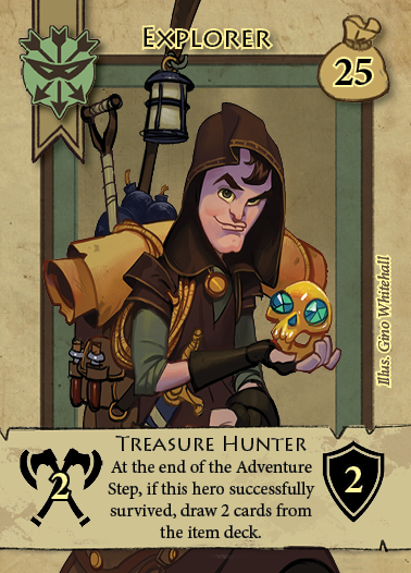

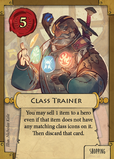

Mobster Metropolis: Art in Board Games #37
There are surely those who would argue that a Sicilian setting is the most classic one, but we always had an American setting in mind. That allows for a wide variety of characters and illegal businesses, as so many different people and cultures were present in the US gangster scene during the first half of the 20th century…
Welcome to Issue 37 in my series sharing the stories behind board game art.
Over the years of running my site, a publisher will slide into my inbox with a story to tell. After falling short at the first attempt, the team at STORMAKTEN Production was back behind the wheel, launching another Kickstarter. What had they learned, and how had they created Mobster Metropolis? Discover more below.
For more great insights into board game art, head to the interview archive.
Hi Joel and Karl, thanks for joining me for this Kickstarter interview. Firstly, can you just tell us a bit about who you are and how you've come to work with each other?
Joel: Our company, STORMAKTEN Production, was essentially founded by three childhood friends; Carl, Karl, and I. We’ve known each other for about 26 years, a somewhat disturbing amount of time. We all grew up in the same area and went to school and started playing games together. Since then, we’ve competed in everything from soccer to Counter-Strike. We’ve also played a lot of board games and card games like Magic the Gathering.
For a while, we all studied in various parts of Sweden but then ended up quite close to one another again in Stockholm, the capital in Sweden. Today Carl is a producer at an advertising agency, Karl is an art and director at a digital agency, and I work with communications and PR at an international company. We are all married to beautiful women. Karl and I are fathers to one kid each, while Carl has recently pledged for one but fulfillment isn’t done yet.
We started to play board games together again and realized that we combined a number of skills that would allow us to create something ourselves. We’ve all been part of (or managed) a large number of campaigns, productions and such. As a result, an embryo to Mobster Metropolis was born about four years ago. We’ve poured an enormous amount of time and energy into it since then and now we’re finally live (and funded!) on Kickstarter.
Mobster Metropolis is live on Kickstarter at the moment, so what makes this game special and why did you go with this theme?
Karl: The theme actually came first – there are just way too few gangster games! When we started, Eric Langs Godfather: Corleone’s Empire, hadn’t even been announced. But even after a successful game like that, you still don’t see many gangster games. However now you at least see an increased number of crime-solving games. For Mobster Metropolis, we’ve decided to go with a quite classic gangster theme, with our own twist on the look and feel. However, the gangster theme can be varied and presented in many other ways as well!
When the theme was set, we started to explore mechanics that would fit the theme but also make up a great game together. First of all, we wanted players to be able to build their own gangster syndicates and earn money through shady businesses. Second, we wanted to combine classic euro empire building aspects with aggressive player interaction and take that elements. Perhaps we were influenced by all the great strategy computer games we played as kids (such as Warcraft and Starcraft). Many computer games successfully combine those kinds of aspects, while board games often can be put in either the euro or take that category.
We’ve added and removed a lot of aspects during the years of playtesting, but really ended up with something quite unique. Many of our mechanics have been seen before, but we believe we’ve combined them in a really interesting way that not only goes hand in hand with the theme but also results in very enjoyable games. Mobster Metropolis includes popular mechanics like bidding and card drafting as well as investments and tile placement. But there’s also secret deployments of resources and defense, as well as hidden movement programming with our quite exceptional Drive-by Selectors. All in all, it’s a great game!

This is Mobster Metropolis's second campaign on Kickstarter after falling short of funding. What do you think you learned from this experience?
Joel: Yes, we made the first attempt almost two years ago. We really thought we were ready, but afterwards realized that we had been quite naive. We’d been playing board games for long and backed a few on Kickstarter but did not realize how different the board game category is compared to some other crowdfunding categories. The board game section is not about presenting ideas or concept, like some other categories. No, it’s all about presenting an almost 100% finished product, with reviews and everything. I truly believe we had a great campaign page but had still not finalized design and art completely. Furthermore, we lacked some crucial parts like reviews and clear shipping prices. Backers demand more from a new producer with a fairly complex and expensive game, which is totally understandable. Especially with the extreme competition out there.
So we said to ourselves, let’s slow down for a while and make sure we really get it done right next time. Now we’ve improved the game, involved even more people in playtesting, procured better production and shipping, included reviews from well-known Youtube profiles, and present more art and components. Now we’re funded and reach several new Stretch Goals each week! I wake up every morning to a 6 a.m. email from Kickstarter telling me how many new backers we have. A bit surreal to be honest.
How long has the game taken from that first seed of an idea to where we are now? What for you were the most memorable moments on that journey?
Joel: Well as mentioned, we’ve worked on Mobster Metropolis for four years, but also have other commitments. That being said, creating a game is an extremely time demanding project. Especially if you choose to make a rather heavy game with over 700 components. Most time demanding is, of course, all the playtesting, changes, more playtesting, some adjustments, external playtesting, some more changes, even more external playtesting, etc. etc. If you’re not careful, that process can go on and on forever, as there’s always something new to try or introduce.
Karl: One very memorable moment was when we finally were satisfied with the symbols, icons and text ‘system’ that are used on most components – the way we display different aspects like costs and income, or when you’re allowed to play a specific card. We love how Wizards of the Coast has manages to always make cards in new Magic the Gathering sets easy to read for anyone who’s played Magic before. But at the same time, we wanted something even more intuitive, as Mobster Metropolis will be a new experience for anyone. Now we have a ‘system’ that is easy to grasp for any gamer, but at the same time does not come at the cost of the art or the strategy and complexity we value.
Joel: Another memorable moment was our last round of external playtesting, which included a number of quite well-known profiles within the Swedish board game community. We received a lot of feedback, which is always great. But this time, the feedback from the experienced players were really similar and pointed at the same aspects. That made it clear that although we still needed to conduct some adjustments, we actually were close to having developed a very good game, otherwise the feedback would’ve been much more varied and extensive.
You've previously stated you wanted to stick to the classic Gangster theme. What are the key features that make a good gangster story?
Joel: That is of course very subjective. There are surely those who would argue that a Sicilian setting is the most classic one, but we always had an American setting in mind. That allows for a wide variety of characters and illegal businesses, as so many different people and cultures were present in the US gangster scene during the first half of the 20th century. Obviously, there is also so much great inspiration in pop culture for that kind of setting. Two of our favorites are the TV series Board Walk Empire and the video game series Mafia.
Some features should of course always be present in a classic gangster story. During our development, we strived to create and/or adopt mechanics that enhance the theme and creates a gangster story while people are playing, even though this is not a game with a lot of text and lore. That being said, we have a short background story that sort of ‘kick off’ the story that the player themselves will play out. Carello, the old gangster dynast/godfather is dead and players will fight to fill that void.
We wanted players to be able to build their own gangster syndicates, starting from zero. During a game of Mobster Metropolis, you will see how the board is filled more and more as players expand their syndicates throughout the city. It is not peaceful, but it is definitely beautiful. We also wanted to make sure that you can create the sense of your own faction, not just with regards to the gangster characters you play, but more importantly also with regards to the strategy you choose. Just like in any great gangster drama, there should be room for both defensive and economic factions, as well as aggressors with focus on drive-bys and combat. The same goes for sources of income, with businesses varying from the dirty ones like brothels, to the somewhat polished casinos. Then we have recruits on the streets, henchmen, hitmen, etc. I truly believe we’ve only added components and mechanics that enhance and enrichen the gangster theme.
There are quite a few bold graphic design choices in this game. What made you decide to create the game board in black and white?
Karl: Dark boards definitely seem to raise many questions from the community, but we have some very good reasoning behind our decision to design it like this.
First, it is important to understand that the board functions as a backdrop and structure to the rest of the game. It displays a map over the Metropolis with its nine districts, each divided into blocks. All districts got the same basic function, as do all the blocks. It is their position on the board that will be most important throughout the game, which is why districts are clearly marked with a letter in metallic bronze and each block with an apparent number. You will always be able to see this, even in a dark room.
Second, each district gets unique attributes as you add district tiles and legacy tokens during game setup. The combination and placement of those change each game and allows for great repeatability. But again, those are not attributes printed on the board, but on tiles and tokens that are more colorful and stand out against the board (and are easy to differentiate from other tiles).


Third, as players expand their gangster syndicates during the game, more and more illegal businesses and recruits will be placed on the board. Those are all key components and rich in both color and detail. In a four-player game, the board can become really crowded and colorful during late game. Hence, it is important that the board function as a backdrop that rather sort, structure and highlight the different tiles and tokens. If we had designed a very colorful and vibrant board, things would just get too messy. I want the board to support players’ vision and overview, not distract them.
Fourth, even though the board is dark and more or less black and white, it is still illustrated in detail, with many small particulars that can be found if you take time to look when it is empty. Don’t underestimate it! Last but not least, of course, it should be night in the Metropolis. Night time is crime time!


The cards feature some visual flourishes, such as the writing behind the imagery on the Mobster cards. How important were these style choices, and where did they come from?
Karl: Yeah, we have almost a poster-like design on Mobster and Black Market cards. I wanted to make sure that everything important is clear and easy to read, since those cards will make up players’ hands. The designated phase for each card is clearly visible on the top sign. The effect is always described at the bottom part, with a short text that is easy to read, combined with easy to understand icons. The name of the card, however, is actually not that important for gameplay, but still adds to the overall setting. I, therefore, decided to use the names as a backdrop and let the illustrations take over and cover parts of the wording to make them pop – but it is still easy to read each card name. I have created this quite unique style from scratch, which treats design elements almost like a poster.
For the Newspaper cards, which you only read once per turn, I looked at a lot of newspapers from the first half of the 20th century. Once again, I started with the essential effect of the card and then filled out the rest of the space with headlines. This creates a very nice look but also recreates very text heavy feeling of Newspapers, where a lot of (too much) text is often squeezed into a limited space. Last but not least, our Police Cards, also read once per turn, is all about clarity and structure as they contain effects for all players. Again, it is important for the game flow that it is easy to grasp the effects straight away.
As I am the only artist in this project, I have full control over all the art and layout. That provides many benefits. Instead of ordering imagery from external artists, we can start with adding all the text we find essential during the development, both the name in the background and effect text. I then continue to work with the illustrations in order to fill empty spaces and add elements on many levels. Many other producers instead have to make a dedicated box for text, one box where the art should be, etc. and then send that as a template to their artists. Our approach is more flexible but still presents key elements in a very clear way.


What advice would you give to anyone looking to launch a Kickstarter game?
Joel: Making a game is perhaps half of the job. Everything else surrounding the production of a board game and the making and launch of a Kickstarter campaign easily takes up as much time, if not more. Be prepared to learn a lot. Luckily, there’s many great blogs (James Stegmaeir’s being the most frequently quoted) and some extremely helpful Kickstarter creator groups on Facebook. Feel free to reach out to us if you want to be invited to any of those!
Karl: Concerning art and artists specifically. You’ll need a lot of art for a campaign and a huge part of it will be art that won’t be used in your game. There are many elements you’ll need for your campaign page, like signs for sections and gifs that explain the game, etc. etc. Much art will be static during the campaign, but you’ll also need to continuously update art for changing sections like Stretch Goals. Additionally, you should be prepared with art for the updates you’ll frequently send out to your backers. A lot of that will be specific art to showcase some new components you’ve reached in Stretch Goals, or new initiatives to encourage backers to spread the word about your campaign. You can’t plan all that in advance, as you won’t know the pace of your campaign or the number of Stretch Goals you will achieve. As a result, whether you have an artist in your team or hire someone, make sure it is someone that you can work closely with (and afford) during your campaign. It is an extremely intensive period, where new needs will pop up with very short notice, regardless how much you’ve planned.
Finally, if we’d like to see more of you and your work, where can we find you?
Karl: I don't have an online portfolio, because I haven't been looking for a job for a very long time. But feel free to check out some of my work at the agency where I'm working, Perfect Fools. I also have a Vimeo that showcase some of my motion.
Joel: Honestly, just look at Karl’s work. I don’t usually do the kind of work you show off in a portfolio. But I am fairly good with InDesign. So if you want to see something visual that I’ve done in this project, please feel free to check out our rulebook. You’ll find it at the Mobster Metropolis Kickstarter campaign page! Also, feel free to contact us at STORMAKTEN Production on Facebook, @mobstermetropolis on Instagram and @STORMAKTEN_Prod on Twitter!
(All images supplied by Stormakten Production, 2018)