

Parks (2nd Edition) Board Game Art - Reimagining the Hit National Parks Game - Interview with Josh Emrich (Issue #72)
“Some connect with an illustration because it captures a personal experience, others are drawn to a particular animal, and some simply love the way the sky makes them feel…”
In this board game art interview, I’m speaking to Josh Emrich, an American artist whose work on the Parks (2nd Edition) artwork gives the hit U.S. National Parks game a new look.
I first interviewed Josh back in 2018 about his work on Campy Creatures and Caper with Keymaster. Updating a well-loved game like Parks is no easy task, but I think the team has done a stellar job. I’ll leave it to Josh to tell you more about the Parks (2nd Edition) art.
Enjoying the site? Support it by sharing the articles you liked.
For more great insights into board game art, check out the interview archive.
Hi Josh, welcome back to the site! For anyone new to your work, could you tell us a bit about yourself?
I can’t believe it’s been seven years since we last spoke! Back then, I had just completed my first board game, Campy Creatures, and my design studio, Emrich Office, was primarily focused on branding for the craft beer industry.
Since then, I’ve added a few more game titles to my portfolio, but the biggest shift has been in our clientele. While we’ve retained a single craft brewing client — Bottle Logic Brewing — we’ve transitioned to building brand style guides and developing creative work for the entertainment industry.


We’ve been fortunate to collaborate with dream clients like Disney, Nickelodeon, Netflix, and TNT/TBS. Much of this growth stemmed from the storytelling ability and diverse skill set we honed through our work in both craft brewing and board games.
But to answer your question, I’m primarily a graphic designer and illustrator, though I tend to avoid strict labels because I love working across different creative disciplines. Ultimately, I love creating experiences that bring people together in the real world. I especially enjoy creating things that help people connect with themselves and with others, which is probably why board games have been such a natural fit for me.
Parks 2E - Photography by Kovray
You’re the artistic lead for Parks (Second Edition). What were your first thoughts when considering this project?
When the license for the 59 Parks artwork in the original Parks game ended, Keymaster approached me to help reimagine Parks for a new generation of players.
At first, I was hesitant — it was a massive undertaking with big shoes to fill. But as we discussed the game’s future and the creative possibilities, I became excited about the opportunity to explore the natural world in a new way. Much of my work is rooted in pop culture, so shifting my focus to the breathtaking landscapes of the National Parks was a refreshing and inspiring challenge.
Parks (Second Edition) looks stunning. How did your existing relationship with Keymaster Games help with the work?
Thank you! That really means a lot, especially coming from someone who appreciates the aesthetic details of board games.
My relationship with Keymaster Games, the publisher of Parks, goes back nearly nine years—which is a long time in the creative industry. Over that time, we’ve built a lot of trust in each other. We previously collaborated on Campy Creatures and Caper: Europe, along with other behind-the-scenes projects.
Caper Europe - Photo by Ross Connell
I’m a huge fan of the original 59 Parks artists and the artwork licensed for the first edition of Parks. Keymaster’s internal design team also played a crucial role, adapting the 59 Parks artwork and crafting the game’s overall visual language — some of which built on our work for Campy Creatures and Caper, especially in the wood grain textures and typography.
There was no way I could match their combined talents, nor would I try. Thankfully, I had an incredible team that included the original Parks developers — creative director Mattox Shuler, game designer Henry Audubon, and game producer Jen Graham-Macht — along with my co-illustrator Lisk Feng and graphic designer Seth Nickerson.
What areas for improvement did you identify when evaluating the first edition?
As much as we loved the first game, Keymaster and I wanted to offer something distinct while still honoring the beauty of the national parks and enhancing gameplay. We focused on three key opportunities. Optimizing the artwork & readability, creating a unified artistic vision, and evolving the game’s identity. Since we were starting from scratch, we could design the artwork specifically for the game and include all 63 National Parks.
Parks 2E - Photography by Kovray
Is there an advantage to using art created specifically for board games?
The original 59 Parks artwork began as 18” x 24” posters, meaning fine details and contrast were often lost when scaled down to playing cards. For the new edition, I tailored the illustrations to maintain just the right level of detail, contrast, and readability for the card format.
We also considered various lighting conditions—whether a well-lit kitchen table or a lantern-lit campsite—and improved readability by incorporating larger, crisper fonts, more distinctive icons, and brighter, high-contrast colors.


Parks 2E - Photography by Kovray
The first edition of Parks featured artwork with a wide variety of styles. Did anything in particular inspire your new approach?
For Parks (Second Edition), it was just Lisk Feng and I handling the illustrations, allowing us to create a more cohesive visual experience. I drew inspiration from three artists known for their ability to capture landscapes with striking simplicity and depth:
Eyvind Earle (an artist famous for his work on Disney’s Sleeping Beauty)—his serigraph prints capture light and shadow cascading over hills, iconic trees, and a sophisticated sense of space and color.
Gordon Mortensen—a reduction woodcut print artist whose work conveys undulating wildflowers, shifting weather, and layered depth that immerses viewers in the landscape.
Ray Morimura—a Japanese woodcut artist known for his unique perspectives and rhythmic compositions, such as lily pads dotting a pond or birds in flight.


How did reimagining the art present an opportunity to evolve Parks’ identity for the second edition?
Every game’s theme offers a distinct point of view that shapes the player’s experience and adds meaning to the mechanics — this, in turn, defines the game’s “brand.” The original Parks evoked a cozy, nostalgic feel inspired by WPA-era National Park posters, dark wood grains, and muted colors.
For the second edition, we wanted to emphasize a more modern sense of adventure, wonder, and awe in nature. To achieve this, we drew inspiration from the bold, energetic aesthetic of the 1980s and ’90s outdoor brands, which are seeing a resurgence today. This design direction is reflected in elements like the hiker, resource, and wildlife tokens, the new player mats featuring canteens and backpacks, the gear cards with modern outdoor equipment, and the topographic textures and fonts throughout the game.
Ultimately, this approach created a more cohesive and distinctive design, giving Parks a fresh aesthetic that not only enhances this edition but also sets the stage for future games in the Parks lineup.
Parks 2E - Photography by Kovray
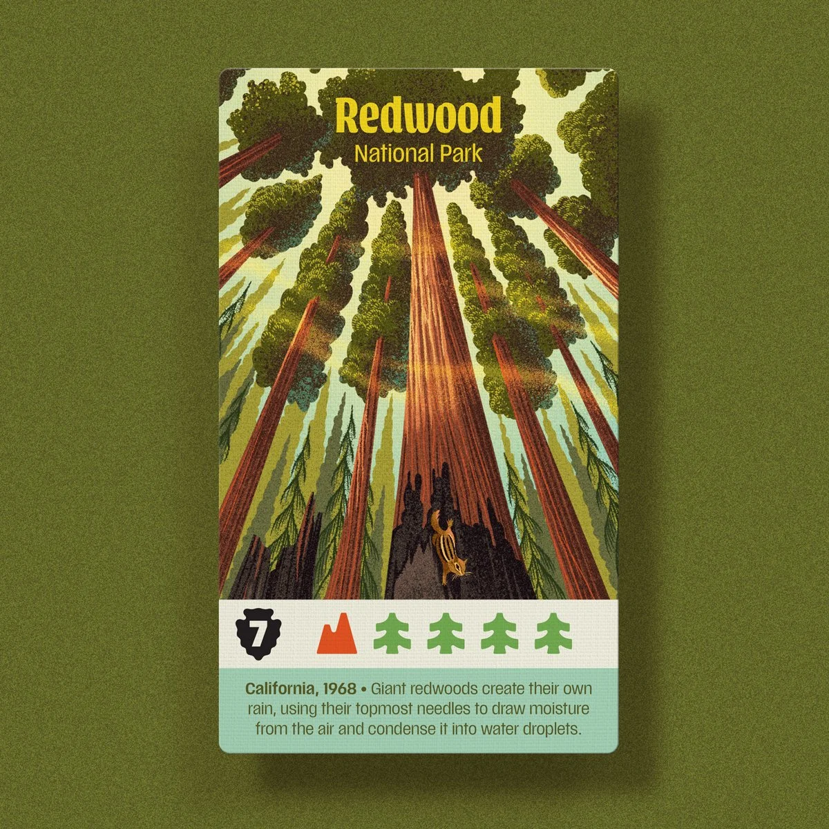
The new edition of Parks features 63 iconic locations. What is your process when handling such a substantial list?
Like the nerds we are, my wife and creative partner, Katie, and I researched every park and compiled our findings into a massive spreadsheet. We cataloged iconic features, flora, fauna, unique seasons, and notable weather events, as well as notable activities. From there, we grouped the parks into six major categories: Deserts, Mountain West, Alaskan/Northern, Coastal, Geological Wonders, and Forests.
This approach allowed me to tackle the illustrations in manageable batches, grouping parks with similar ecosystems or features. As I worked through each batch, it became easier to ensure distinctiveness by varying the time of day, season, landscape focus, or highlighting different wildlife and human activities. The larger guiding questions I asked myself were:
What is the most iconic feature of this park, and is it the most striking example of its kind in the National Parks?
If not, what’s the next best thing, or can I depict it in a unique way?
How can I capture a sense of awe and wonder — something visitors might experience under the right conditions?


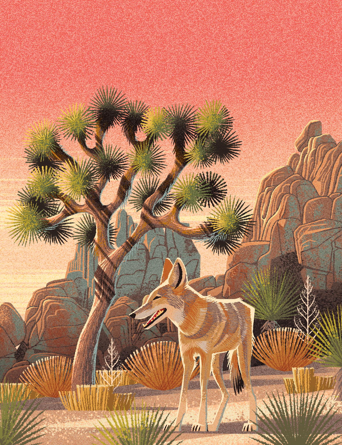
Many of the U.S. National Parks share similar geographic features. Was there consideration taken to ensure they all felt unique?
Sometimes, I feel compelled to feature an obvious landmark — like Delicate Arch in Arches or Old Faithful with bison in Yellowstone — because they’re the best-known representations of those parks, and people expect to see them. Other times, a park may be famous for a particular feature, but a more dramatic example of that feature exists elsewhere.
A good example is Wind Cave: it has the longest cave system in the U.S., and American bison roam its hills. However, Mammoth Cave and Carlsbad Caverns are visually more striking, and the largest and oldest bison herd is found in Yellowstone. Instead, I chose to depict Wind Cave’s rolling hills at sunset with an American elk, an animal I hadn’t yet featured in another park illustration.


How important was accuracy when depicting the National Parks?
Unlike many board game themes, Parks is set in real places — we can’t invent mountain ranges or alter the shape of a waterfall; everything must be grounded in reality. Ideally, we’d visit every park for firsthand reference, but that would be a costly and time-consuming endeavor (though we’d love to do it!).
Instead, we relied on reference photos — many of which are taken from the same vantage points. Often, that’s simply the only place photographers can stand without risking a fall, damaging native plants, or encountering an unfriendly bear.


The US National Parks hold a special place in the hearts of many, but do you have any personal favorites?
One of the things I’ve really enjoyed about this game is hearing which National Park illustrations resonate with people. Some connect with an illustration because it captures a personal experience, others are drawn to a particular animal, and some simply love the way the sky makes them feel.
For me, Rocky Mountain National Park holds a special place in my heart because of my Uncle Dave. He was one of my biggest supporters in becoming a professional artist—attending my art shows and buying my paintings even when they didn’t exactly go with his decor. When I moved from Indiana to Colorado after college to pursue better career opportunities, he encouraged me every step of the way.
Josh & Dave - Rocky Mountains National Park - 2005
Josh’s Uncle Dave in the Rocky Mountain National Park 2005
Eventually, when Katie and I decided to get married in Colorado, Uncle Dave came out for the wedding, fell in love with the state, and bought a house in Estes Park—right on the doorstep of RMNP. Having family nearby was incredible, and we often met up for hikes. Uncle Dave was deeply involved in RMNP, volunteering as a “Road Hog” and Hikemaster guide for the YMCA.
When my sister and her husband visited, he’d take us on epic hikes — whether summiting Longs Peak (the tallest in RMNP at 14,256 ft.) or traversing Flattop Mountain along the Continental Divide, descending by glissading down Andrews Glacier. One of my favorite experiences was snowshoeing through the park in the winter when the crowds were gone, and we could walk across frozen lakes to take in spectacular views.
Sadly, Uncle Dave passed away unexpectedly a few years ago, and working on Parks became a way to honor him. I know he would have loved it. That’s why, on the RMNP card, you’ll find a special tribute — Uncle Dave leading the way as we snowshoe across Lake Helene, beneath Flattop Mountain, Ptarmigan Point, and Notchtop.
Thank you for sharing this story with us Josh.
Josh and Dave, Snowshoeing through the Rocky Mountain National Park Artwork - Parks Second Edition
Final Card Art for the Rocky Mountain National Park card - Parks Second Edition
Last time we spoke, you were reading the Wildwood book series to your kids. What are you reading, listening to, or looking at to fuel your work at the moment?
Yes! I’m really looking forward to Laika’s stop-motion adaptation of Wildwood—hopefully later this year! Lately, I’ve been thinking a lot about how the virtual world—smartphones, social media, pornography, dating apps, video games, online betting, and AI—is shaping our mental health and ability to connect meaningfully in the real world.
As a father of teenagers now, this is especially top of mind. Jonathan Haidt’s The Anxious Generation: How the Great Rewiring of Childhood Is Causing an Epidemic of Mental Illness has profoundly reshaped how I think about my own relationship with technology. It’s a must-read for any parent looking to set healthy boundaries for their kids.
At the same time, my work relies on a deep understanding of people. Art is my primary language, but to create meaningfully, I need to see and know others on a deeper level. That’s why I’ve been reading How to Know a Person: The Art of Seeing Others Deeply and Being Deeply Seen by David Brooks.
He argues that “the act of seeing another person is profoundly creative”—a sentiment that resonates with me. How do we look someone in the eye and recognize something larger in them, and in turn, in ourselves? That’s the kind of connection I strive for in both my life and my work.
To better appreciate how cohesive the new art feels, I turned the cards into this GIF - Ross Connell
Finally, where can we see more of your work?
Keymaster and I have more games slated for release in 2026. I’m working on some fun projects for Disney Parks, but I can’t share details at this point. We continually create new label art for Bottle Logic Brewing, and each release is part of a larger story, almost like a serialized graphic novel. The best way to follow these projects is on my Instagram @emrichoffice.
Thanks to Josh Emrich for providing the images for this article and Kovray for the wonderful photography.
If you are curious to play Parks (2nd Edition) it is now available to buy, or play online at Board Game Arena.

Confusing Lands Board Game - Combining Art & Game Design - Interview with Zak Eidsvoog (Issue #69)
“I got my first couple of board game clients after I did a self-directed fan redesign project where I made new art and graphic design for a game I really love..”
In this board game art interview, I’m speaking to Zak Eidsvoog, an American artist and game designer. I get a huge amount of joy from discovering new (to me) artists, and I hope you enjoy discovering his work as much as I did.
Enjoying the site? Support it by sharing any articles you liked.
For more great insights into board game art, check out the interview archive.
Thanks for joining us, Zak! Could you tell us a bit about yourself?
Hi, thanks for having me! I’m a graphic designer, illustrator, and game designer (although I never know which order to put those in, haha). I was born in the Seattle area but grew up mostly in Portland, Oregon, where I now live with my wife and our dog, Kodi.
Pretty much all of my current creative pursuits began in college (in the early 2010s), where, after a couple of years of studying mechanical engineering, I decided to switch majors to graphic design with a minor in visual art. This was also around the time I got into hobby board gaming and started experimenting with game design myself.


A couple of years after graduating, I started freelancing for some indie board game publishers as a graphic designer and illustrator while working on my own game designs on the side. I’ve been doing all that for a little over 10 years now.
I’ve always had a balance of game and non-game-related clients, but at this point, I’ve worked on 20+ client games in some capacity as a graphic designer/illustrator. As for my games, I have a handful that I’ve released myself as print and play games online, as well as my first published game, Confusing Lands, which was released last year.

Do you have any advice for anyone trying to break into the industry?
My advice for anyone trying to break into any creative field is to start making whatever it is you want to be making professionally (art, graphic design, games, music, whatever). Clients will be more likely to hire you if they can see you have done the kind of thing they are looking for.
If you already have good examples of your work, make sure you’re putting it in front of people who are interested in that kind of thing (have a portfolio site that’s easy to find/navigate, post in bgg forums or on reddit, go to conventions or in-person feedback groups, etc.). Make sure that you’re putting yourself out there and making it easy for people to contact you and get a quote if they’re interested in working with you!


I got my first couple of board game clients after I did a self-directed fan redesign project where I made new art and graphic design for a game I really love (Impulse by Carl Chudyk) and then shared images and some of my process on my portfolio site and on BGG.
Game jams can be another great way to get some experience working on game projects and to make connections with other people interested in games. While there are generally more jams geared towards people who make video games, tabletop game jams are also becoming more common.

With such a broad spectrum of clients, do you have a process for starting new projects?
Whenever I’m doing client graphic design/illustration, my first step is always to interview the client and make sure I understand what the goals for the project are and what makes it unique. Sometimes, there’s room for me to bring some out-of-the-box ideas before settling on something and moving forward.
For those kinds of projects, I’ll do brainstorming exercises, gather visual inspiration, and create mood boards & sketches of potential creative directions. Other times, things are pretty locked in, and it’s just important for me to get up to speed and work with what’s already there.


How does your approach change when working on your own projects?
For my personal game designs, I would say that I’m a mechanics & game-feel first person. Usually, the very first test I do with an idea is to take as many blank cards or other components as I think the game will have and practice shuffling and dealing and moving things around, imagining how the game will feel to the players.
I tend to design my early prototypes in a somewhat abstract, themeless style to keep things flexible as I test out ideas. Laying things out this way helps me avoid getting carried away with the visuals before the gameplay is solid. Once I have something I like, I’ll either start showing it to publishers or, if it’s something I’m planning to develop myself, I will do my usual process of brainstorming, moodboarding, and pitching myself art and graphic design styles, as if I were doing a client project.
How important do you think the art is when pitching games?
Unless you’re designing something where the art is a fundamental part of the gameplay mechanics (like Dixit or Mysterium), I don’t think art is all that important when pitching games. I’ve heard from most publishers that I’ve talked to that the most important thing is that prototype components be clearly laid out and easy to understand/play with.
Keep in mind that some publishers may like your game but have a different theme they want to publish it with, or they might have specific artists they like to work with whose art style more closely matches their brand.
With all that being said, because I am an artist and a game designer, I will sometimes have ideas that I choose to develop in a more holistic way (with the art informing the game design and vice versa). When that happens, I think it’s ok to embrace doing both art and design, knowing that things might need to change later or you might end up going more in the direction of self publishing. This was essentially what happened with my game Confusing Lands although I was lucky enough to find a publisher whose vision for the game was pretty aligned with what I had already done myself.
Confusing Lands has a whimsical, lighthearted art style. Where did the idea for this board game come from?
‘Confusing Lands’ was one of three 18-card games I designed between 2020 and 2022 during the first few years of the Covid 19 pandemic. The other two are ‘Double Date Simulator’ (available as a print-and-play game on my itch page at zak-makes-games.itch.io) and ‘Solitairra’ an as-yet-unreleased solitaire game.
Like most of my games, Confusing Lands started with a very simple, somewhat abstract art style. However, even from the beginning, I imagined a lush landscape with rules that would prompt players to build very different ecosystems from game to game. As I developed the game more, the mechanic of stacking things on top of each other — as well as the random shapes formed by the cards — led me to think it could be a game about wacky floating island chains.
What does Confusing Lands art tell us about its world?
My initial goal for the art in Confusing Lands was to find a style that would look really pretty once players had finished gathering and placing cards to complete their landscapes. I first explored a more painterly style, thinking that it would add to that lush, picturesque feeling I was going for.
However, because the art serves such an important functional purpose in the game (it’s how players tell what type of terrain a given space counts as), I quickly found that I needed an approach that would make each space’s terrain type stand out more clearly.
This led me to the final art style for the game, where each terrain type has a bold outline and a specific color associated with it. After testing out this more cartoonish style, I was pleased to find that the final landscapes still look quite pretty, with the added benefit of being easily readable.
As for the world of Confusing Lands, I knew from the beginning that I wanted the game to depict the harmony between all the different elements within the game’s world (plants, animals, people, etc.). I do think the bright, cartoonish style that I ended up using helps give a sense of positivity and symbiosis to the world which people find appealing.

You’ve mentioned you’re mechanics first when designing games. Did you draw any inspiration from other games when creating Confusing Lands?
Gameplay-wise, Confusing Lands was inspired by a number of tile/card-laying games, most directly Micro Rome, Tiny Islands (digital) and Isle of Skye. All of these give players scoring conditions to influence tile placement but I wanted to see what would happen if the scoring conditions themselves were part of the tiles/cards and therefore a larger part of the players’ decision making process. When I designed Confusing Lands, I was also playing a lot of Lost Cities, and I wanted my game to capture some of the tension of committing to new scoring opportunities in that game.

After testing out several different approaches, I settled on the system where each scoring condition you take subtracts 10 points from your final score. This sometimes means that players will score in the negatives after their first game, but I’ve found that adds to the charm and usually makes them want to try again and improve. The name Confusing Lands is kind of my way of saying, “Don’t feel bad about your first score; it’s supposed to be confusing!”

What are you reading, listening to, or looking at to fuel your work?
I’m currently reading “Masters of Atlantis” by Charles Portis (author of True Grit). It’s a fictional account of a secret society founded in the early 20th century and it has been a super fun read so far. I also recently read the Earthsea books by Ursula K. Le Guin for the first time, which really had an impact on how I think about life and art in general. A couple of great art books I picked up recently are “Umbra” by Jordan Speer and “Houses with a Story” by Seiji Yoshida.

Comics-wise I’ve been following the webcomic “3rd Voice” by Evan Dahm, as well as anything that Simon Roy puts out. Pretty much the only TV show I watch these days is Taskmaster, but as a game designer I find it very inspiring and enjoyable (my wife and I are eagerly awaiting the next season). We’ve also started renting older/foreign movies from the library and two really great ones we saw recently were After Life (1998) and Petite Maman (2021).
Besides all that, I find a lot of inspiration in nature, especially going on hikes in the Columbia River Gorge or along the Oregon coast. My wife is a singer and we have a lot of friends in the performing arts, which I’m super grateful for. Being part of a community of people working to make art always inspires me to keep working on my own projects.

Finally, where can we see more of your work?
You can find me at zakeidsvoog.com and on pretty much all the socials at @zakeidsvoog, although Bluesky is probably where I’m most active these days. You can also find my personal games that are available for print and play at zak-makes-games.itch.io. Lastly, if newsletters are more your thing, you can sign up for mine at zak-makes-games.beehiiv.com/subscribe for occasional updates on the art and game design stuff I’m working on.

All images provided by Zak Eidsvoog.

Kwanchai Moriya: Art in Board Games #58
I was turning 30 without a clear path, and absolutely buried in loans paid for private art school, and going through quite a bit in my personal life. I unsuccessfully applied for job after job on my college’s job board for anything art-related…
Welcome to Issue 58 in my series sharing the stories behind board game art. While this website is a personal curation of board game creatives, I don’t tend to throw around terms like “favorites” very often. However, Kwanchai is, in my humble opinion, one of the absolute best in the industry right now. His name was at the top of my list when I launched my site, and I’m so glad we finally got to chat. Enjoy learning more about his work!
For more great insights into board game art, be sure to check out the interview archive.

Thanks for joining us, Kwanchai Moriya. For readers unaware of your work, could you tell us a bit about yourself and what you do?
Hi, thanks for having me! I'm an illustrator and painter, working mainly in board games and children’s books. I was born in New York to a Japanese father and Thai mother, both emigrated from their home countries.
I mostly I grew up in the ‘burbs of LA and Chicago, in the 80’s and 90’s. Did some schoolin’ and ended up with a degree in history before sayings ‘oops’ and going for my BFA in illustration in Pasadena, California.
I popped out the other side: nine years, lots of debt, and many part-time jobs later. I’ve been freelance illustrating for the past 9 years, though I’d say the last 4 years have been markedly different in terms of the growth and opportunity I’ve had.
I currently live in Los Angeles with my wife and like to spice life up with board gaming, backpacking, travel, woodworking, etc.
So how did you first get involved in making board games?
My first real gig illustrating board games was doing 11 half-inch counter illustrations for a little-known wargame called Heroes of the Gap. The publisher contacted me through Boardgamegeek, since I was quite active doing my own fan redesigns of games and posting the art there.
In fact, my next two freelance gigs came through BGG’s Geekmail system: Catacombs 3rd edition and a game called Twin Tin Bots. The Catacombs gig I was offered specifically because I had done a fan redesign of the game with my own whimsical art and had posted it to BGG.
In 2010, I also started going to all the big conventions (Essen, Origins, Gen Con) with my portfolio and the widest grin I could muster. Back then, I’d bother every publisher booth on the floor and hopefully fly home with at least a project or two in tow. The first handful of games I illustrated were equal parts, nerve-wracking and thrilling.
I feel like I’ve grown a lot as an artist since then, and it’s hard to look at early projects without feeling squirmy. With my scant experience, publishers were apt to pay very little and over direct a project to death. Definitely a lot of stress in those early years was because I was learning the business side of freelancing on the go, while butchering my work/life balance, and flexing relatively weak artistic muscles.
For example, Catacombs 3rd edition was the first time I’d ever done something in that cartoony whimsical style, as I was primarily doing figurative oil paintings at the time. But, one thing that hasn’t changed is how exciting board games are for me, both playing them and being invited into the process of making them. I love being an illustrator in this industry and having a hand in so many varied and interesting projects.
Having worked in the board game industry now for a number of years, how has your relationship with clients changed as your reputation has grown?
It's awesome! In general, I get a very warm reception from folks working in this industry. Sometimes, just wearing my name badge at a convention will get me a sit down with someone important I wasn't even planning on meeting. That's nuts!
Compare that to a couple of years ago, when I had to plead with people for a few minutes to look at my pitifully scant portfolio. The warmth I get is definitely attributable to the kind-hearted folks in this business, but I'm sure it also has something to do with the growing list of games I've been a part of.
With my clients now, there's more trust that I can get a project wrapped on time and it can look good. Earlier projects did tend to be over-directed, with a lot of hand-holding. But I don’t blame publishers, as choosing an artist is one of the many risks they take on in the process of making a game.
A brand new illustrator thinks they are hot stuff, with a unique style and vision. Or at least, I did! And it takes a few projects to smash that down, and learn how to collaborate well and flow with others. Nowadays, I do get more say on what a project should look like, but of course it varies wildly from project to project. Some clients know exactly what they want, and some take me to the park and just want me to run and run. I like the ones that take me to the park.
The negative side of an increased reputation is an increased expectation from people. Or perhaps I have an increased expectation that other people have an increased expectation? For sure I’m harder on myself now, and more scared to make mistakes. I feel like I have to constantly hit home runs, even though I just learned how to play. Moreover, I feel like I've made a lot of different plays on almost all of my projects, visually, conceptually. Dinosaur Island looks totally different from Flipships, which looks totally different from Catacombs or Capital Lux. So I'm stressed, Ross, I'm stressed all the time.
When you're presented with illustrative work that is outside of your comfort zone, where do you start?
I love a challenge, though often I end up over-challenging myself. I try to pick one big project a year that I'm going to totally just throw myself off a cliff with. Either something that challenges my command of a medium or trying a new style or type of art. For example, one year that project was the thick paints and stylization in Flipships, another year it was the crazy colors and line art in Dinosaur Island. Those styles I'd never really tried before. I'm also a sucker for weird themes and new concepts.
I have a running 10-item list of themes, or styles or kernels of ideas that I want to try at some point: a bucket list of 'style-cliffs,' if I may.
Tantamount with any project, in or out of my comfort zone, is doing good research. Looking at what's been done before for that particular theme, or making sure there are facts in the factual part of a project. I feel out of my depth all the time, and oftentimes I am. Really being a freelance artist means being in your own head all the time, and a polite nudge or two from the art director or graphic designer is sometimes just the ticket to a solid piece of art.

Alright Kwanchai, you got me, what's currently at the top of that your art creation bucket list and will we see this soon?
Okay, I'll give you a few off my list.
1. Classic Gnomes. I really want to do a project that features little mischievous gnomes in red hats. You know blue shirts and tiny beards, the whole thing. I would just get a kick out of illustrating tons of little gnomes just going about their day, tormenting the house cat, stealing food from the fridge. I don't know why, I love it.
2. Really Creepy Ghosts. Have you seen Nate Hayden's games (Cave Evil, Psycho Raiders)? It's unsettling and weird and I love it. I've been jonesing to do a theme that is about ghosts or some kind of creepy supernatural thing, but not done in a cutesy style at all. Just straight terrifying and dark, with lots of heavy paint and scratchy ink lines. I have a lot of bright colors and friendly themes in my usual work and it'd be fun to throw that out the window.
3. Illustrative Type. So this would be illustrating components using only hand-drawn type and fonts. Like if a card is supposed to have a Man-eating Squirrel on it, I would hand-draw the words 'MAN-EATING SQUIRREL' on the card and illustrate the letters in a way that is thematic and immersive? Hah, I have no idea what this would end up looking like, but I've been thinking about it a lot.
4. Women's Baseball League. "A League of Their Own' the board game, or something akin to that. Love the history there.
On another note, a goal of mine is to design and illustrate my own game. I have two or three game designs that have I've been puttering around with for years. I think it would be really fun to do all the design work, play testing, pitching to publishers, graphic design, and artwork.
Of course, everyone and their mom has a game design, and I'm sure anything I design would be mediocre at best. But I think going through the whole process would be a very valuable experience for me, since I've only really experienced one particular side of this industry.
You've illustrated some of the most distinctive and original board game box art in the industry, so tell me, what's your process when you come to work on a game cover and how is it different from creating other art?
Box cover art is usually the priciest line item in a project, and for good reason. It's the thing that wraps around the outside of all this important stuff. That stuff being: the designer's hopes and dreams for their baby, the publisher's investment in components, wrangling printers and scheduling, etc. So yea the cover is a big deal because it needs to speak to all the important things inside in one solid punch.
I usually begin planning a cover by looking at all the covers from any games, comics, or movies that share the genre. Then I try to cut sideways from the norm and try to come up with a concept that feels fresh. Sometimes that means using colors or a composition that atypical to the genre, or maybe using subjects that bend the stereotypes that genre. Most importantly, in my thinking, a cover needs to exude energy and investment.
For example, on Bosk, a recent project with the theme of forests and trees, the publisher really wanted the forest itself to be the subject of the box cover. So I thought okay let's make the trees huge, and have a few tiny hikers in the composition just to exaggerate the scale of the trees.
Or in Gorus Maximus, a game about gladiators, I wanted to make the covers just bonkers-level of dumb gore: brains popping out of helmets, crocodile sliced up like someone was playing Fruit Ninja.
A composition needs to feel full of liveliness and thought. And although I don't always succeed, I think it's a far worse crime to deliver something that looks boring or typical.


As someone who started out as a figurative painter in art school, one of my crutches has always been to just throw a well-painted person on an illustration to give it that 'wow.' Lately I've been trying to get away from that crutch, wanting to see I can still do an awesome cover without a person, front and center.
So for example, my recent cover for 'In the Hall of the Mountain King', it's three trolls marching into caverns on it. And I've only ever really drawn really cartoony trolls, like in Catacombs, so trying to do realistic ones was a really scary and I think it really paid off.
Or in my redesign of 'The Game' for Pandasaurus, it was all just paper cut-out of shapes and abstract objects, no humans at all. I finished up the cover for Gil Hova's 'High Rise,' which is a cityscape with towering skyscrapers looming in the background. No hoomans, but still much wow I hope!
I've found success when I try to paint towards a feeling. For the cover of Bosk, I tried to assemble reference material and choose colors and a composition that reflected that feeling I get when I pass the trailhead sign on my way into a national park.
For the cover of Dinosaur Island and its expansion Totally Liquid, I tried to tap into all my love of dinosaurs and growing up in the 90's: neon-dinosaur toys, Trapper Keepers covers, Capri-Sun, Disneyland, and Saturday morning cartoons.
For the cover of Dual Powers, I tried to tap into the sadness of that last scene in Doctor Zhivago, a man drowning against the onward march of history and conflict.
Sensibly, publishers and game designers often want a cover to arithmetically reflect the contents of the game. They want to show every faction type in the game, the landscape, etc. This can crowd out the potential of a well-composed, beautiful piece of art.
No publisher is that blunt, but given all the risks that a publisher takes on to make a product, the last thing they need is a cover that doesn't make sense or causes Kickstarter backers to form a mob, etc. But building a box cover illustration by just adding up what’s in the box and the rulebook is a total bummer for me.
We poke fun at Euro box covers that have a merchant in the foreground gesturing back at a medieval city, but man there's still a lot of that going around. Just not for me. At least as an internal starting block, I believe it's crucial for an artist to paint towards an emotion, a feeling, a nostalgic moment. What comes out the other end might still end up just looking like a typical genre box cover, but I think those lofty, flamboyant inner goals are what keep me chugging along happily.
There's a lot of technical things you can get good at, the longer you work in the biz: like friendly but pointed email writing, nailing deadlines while keeping buffers for personal life, etc. But I feel like the box cover is a tabletop artist's flagship product. It's the ship of the line, the cream of the crop. So you better enjoy it and you better make it sing.
The greatest critic is said to be ourselves, but are there any projects you worked on where you think you really nailed it?
Let me just point out that I'm not necessarily always pushing myself as an artist, though I would very much like everyone to think I am. I always try to try hard. But any given painting is a mix of blood, sweat, and tears; as well as whatever I ate that afternoon, how full my inbox is that morning, or if I've been outside more than usual that week.
Moreover, the final product that sits on shelves is a larger mix of: how tight the project deadlines were, what the graphic designer did with my raw art, and how supportive and/or collaborative the publisher was during the whole process. So I can't really take credit for an amazing looking product, there's often a lot of hands that are in there and they all matter.
Frankly, I always look back on the last three projects I did and am usually the happiest with those. Anything further back, and I tend to cringe at some of the inexperience I can see evident in the artwork. So currently the last three projects are Bosk, High Rise, and In the Hall of the Mountain King. I’m really proud of those, in fact. I think they represent a good jump in my confidence and abilities that wasn't there before.
In some past projects, I would approach a piece of art and truly not know if there was light at the end of the tunnel. I don't know if that makes sense, but there were illustrations early in my career, with which I felt like I was drowning near the end and just couldn't get a face or a scene right no matter how hard I tried. I feel more confident in my recent work.
If I had to pick all-time favorite projects, I'd say any of my large-scale figurative paintings are probably the most objectively impressive things to look back on: Overlight RPG cover art, Galaxy Trucker poster, Capital Lux/Rebel Nox, Dual Powers etc.
With my history as a figurative oil painter, I tend to lean heavily on those skill sets and the experience has some shine to it. I should mention that I happen to really like my earliest project, Catacombs. I still find the composition and colors of the box cover and components really appealing and fun.
Board game art can often play it safe, sticking to known themes or visual styles. How important do you think diverse styles are in board game art, and how would you like to see the industry change?
That's a big question! I think there’s a lot out there that looks same-y and homogenized, especially your 'European merchant trading something' game, or your 'lots of miniatures in oversized black box' sci-fi game.
I am not the artist needed on a game like that, nor do I feel compelled to take on those projects when they show up in my inbox. But that's not to say that those publishers and designers don't know what they're doing.
They are mainlining their target audiences with exactly what they want, and it's great that the board game world now has different mini-worlds that can argue and bicker and have opinions about who’s best. When I got into board games years ago, there were maybe a few dozen games you “had to buy” and that was it. So the glut is awesome.
As far as diversity, I think that's an even bigger question that I'm not sure I'm qualified to answer. From an art point of view, I think an easy way to add diversity to a project is to simply represent as many ethnicities, genders, or cultures in the world-building or characters.
The more compelling way I've seen diversity approached are in games that delve wholly into specific niches of culture or history. For example, there was a game that came out a few years ago called Navajo Wars from GMT Games, and it was about the historical journey of the Dine (Navajo) peoples, from a specific era in history. I thought that was awesome, shining a light on a lesser-known part of history, rather than just another 101st Airborne game from a war game publisher.
I think having a diverse cast of characters in a game is very cool but I think having a whole game be about something specific and unique, elevating something up and shining a light on lesser known corners of our world, is even more compelling. I'm not smart enough to come up with how that would work as a board game, but I'll definitely wax poetic on the subject!
How much do you think Kickstarter has changed the landscape when it comes to board game art?
Having worked with both Kickstarter projects and regular distribution publishing, I don't know that it makes much of a difference when it comes to doing the art. I think Kickstarter has given more opportunities for smaller publishers to get products to market, which in turn means that there's more opportunities for illustrators to get projects. So that's always good.
A downside to Kickstarter, or any publishing presence on social media or BGG for that matter, is people's propensity to skewer art in a public forum. I mean, even some of the best covers I've seen get a few inane comments like: "eh, hate it" or "liked the old art better." Kickstarter is particularly bad in this regard, where some backers feel empowered to judge the art harshly.
As an artist, it's crushing to see comments like that, after spending time and thought on a piece of art. Of course a piece of art should be judged on its discrete face value, especially one that is gracing a product meant to be sold. But, man, sometimes it's hard.
The people behind a lot of awesome games are often just a tiny ragtag team of: publisher, designer, artist, and graphic designer. It's easy to demand a lot from publishers and condemn failures.
But I've found that overwhelmingly creators in this industry are thoughtful and emboldened to create fun things, often leaving other careers to do something they feel passionate about.
I don't know what my point is there, or what I'm being defensive about. I guess, just please be nice to me all the time, is the moral to learn here.
What advice would you give to anyone wanting to work as an artist?
I went to a traditional art college. Let me be depressing for a moment. When I graduated from Art Center College of Design here in Pasadena, my program (like many other traditional illustration degree programs) was essentially grooming me to be an editorial illustrator.
As in covers for books and magazines and the little illustrations in the Op-Ed section of a newspaper. Professors encouraged us to fly to New York and schedule meetings with print media agencies in order to drum up work, which I did twice. I didn’t find success by any metric.
One book publisher did give me a pamphlet for their summer intern program. I was also taught to send out mailers using expensive databases of art director info. I sent out hundreds of mailers twice a year, punching out my cards with a corner rounder on the floor of my one-room studio, piles of letters all over my bed. Nothing shook loose for me, and it was very disheartening.
I don’t think those methods are wrong, and I do think I had a very weak portfolio. But, those traditional methods now look very antiquated in the current world of illustration. It’s a wider world that includes everything from Pixar to Patreon.
At that point, I was turning 30 without a clear path, and absolutely buried in loans paid for private art school, and going through quite a bit in my personal life. I unsuccessfully applied for job after job on my college’s job board for anything art-related.
The last one I tried for was an Archivist position at Yul Brynner's estate, scanning and digitizing photos. "I'm fascinated by the opportunity to work with photos from the Golden Age of Hollywood!" and "Can begin immediately!" I wrote. It was crushing after all the effort and hope I had drummed up in myself and my family and friends.
There were other graduates from my college that got work or hired by studios. They were better artists and made smarter choices during the program. But I gave up trying to be an illustrator and ended up working as a tutor at a Chinese after-school program nearby. They're a dime a dozen here. To go to work, I'd slap a laminated sign on the side of my car (Michael's Fine Art Classes!) and pick up kids from elementary school, and then help them with their homework.
There was a ray of light during that time, I had managed to get into a handful of gallery shows in LA and Seattle. So I was still doing some art. They're awesome to be a part of, but I don’t think I was good enough, and it was unsustainable as a single source of income. In fact, I was still working at Michael’s Fine Art Classes two years later when the opportunity to illustrate Catacombs, my first big game, fell in my lap.
My point here is that I feel like I barely made it, and every step of this process has been jumping from one lily pad to the next. I don’t know what I’m doing. I think that’s important to say before I give any sage advice. So here goes, my five-step method to becoming a tabletop illustrator:
Step 1: Get loaded with debt at art college, and then work at a Chinese after-school program for two years.
Step 2: Go to lots of board game conventions and walk around bothering people with your portfolio.
Step 3: Hide your poor grasp of anatomy and perspective by adding tons of color and dialing up the composition to eleven. Empty space on the canvas? Here’s some geometric shapes for no reason! Magenta!
Step 4: Feel guilty about how hard your parents worked their blue-collar jobs and then transform that guilt into valuable energy. Harness energy in a myriad of ways like: trying to stop watching that Youtube video, or not napping at noon.
Step 5: Be old. Your poor choices and bad luck means you don’t have as much runway left as your youthful, smiling competitors.
But less sarcastically:
1. Explore a multitude of paths, and work whatever side jobs you need to. But when it’s go-time, make the jump and bring all your time and resources to bear.
2. Go to where the warm bodies are in this industry. Shake hands, meet people.
3. Bring energy and boldness to your art. Nuance and subtlety easily translate as boring in an industry where shelf appeal and table presence is important. Solid command of composition and values will win the day every time.
4. Treat your freelance job with integrity and respect, suit up and punch in every day.
5. Don’t waste time. A year can pass by and all you’ve done is illustrated two good pieces and checked how many likes they’ve gotten. Move and shake now, when it’s important to carve out a space for yourself.
What are some non-game related creations (books, music, movies, etc) that you’re currently enjoying?
I’ve been reading a lot of RPG books, stuff for Delta Green and OSR RPG stuff specifically. I run two RPG groups and of course a health amount of board gaming, so I’m often reading rulebooks, RPG stuff, and the like. Also, just finished Kazuo Ishiguro’s Buried Giant. Finished “The Caliphate” podcast series, very enlightening.
I’ve been re-watching Parks & Rec for the zillionth time when I take breaks, since they’re quick fun bites. None of this necessarily fuels my work. As a freelancer, there’s just a ton of time spent totally alone in a room. So there’s always something I’m doing besides work, little projects, something on in the background.
Do you have any current projects underway, or coming up that you’d like (or are able) to tell us about?
I usually have between 3 to 6 projects running concurrently. And there’s always a handful of wrapped project that haven’t been announced by the publisher yet. Fun stuff!
But I can definitely mention High Rise, In the Hall of the Mountain King, Complexcity, Kodama 3D, and Pret-a-Porter that will be coming out in the next year or so. I’m particularly jazzed for Pret-a-Porter, because it was a big leap for me in terms of theme and working with a new publisher, Portal Games.
Finally, if we’d like to see more of your work, where can we find you?
I’m on all the social media at @kwanchaimoriya, and my website has a full portfolio at www.kwanchaimoriya.com. I also frequent a lot of board game conventions and meetups, doing signings or panels or just walking around. I really like it when people say hi!
All images copyright of Kwanchai Moriya.

Jordi Roca: Art in Board Games #12
This project meant working on a game for the revered authors of War of the Ring, surely one of the best strategic games for two players that exists and a massively popular best-seller. For David and I, it was a challenge to accept and live up to the demands of this project..
Welcome to Issue 12 in my series sharing the stories behind board game art. Graphic designers' work isn’t celebrated enough. Illustrations bring theme’s to life, but good graphic design helps us comprehend what we are seeing, pulling everything together and making it work. This week, we have Jordi Roca, a graphic designer and art director who has worked on games such as Victus: Barcelona 1714, Verbalia, Enigmàrius, and Barcelona: The Rose of Fire and with companies such as Devir, Vexillum, and Saladin games.
Be sure to check out the interview archive for more great insights into board game art.
Hello Jordi thanks for taking the time to speak to us. Firstly, could you tell us a little bit about yourself?
Hi everyone, I'm 53 years old and I graduated in graphic design at art school and started working in 1986. Since then I have worked in different studios, graphic arts workshops and agencies, as a designer and art director. At the moment I am director of graphic services in an advertising agency, but have frequently collaborated in editorial projects related to the world of boardgaming for 12 years now.
At the same time, I've been a board games enthusiast from the beginning, although I discovered a new generation of games, taking my hobby in a new direction when (in 1979) I bought Kingmaker, my first game from Avalon Hill Games. Since then my passion and collection has never stopped growing and already exceeds 1,000 titles.
Now we know a little more about you, I have to ask, as a child what did you want to be when you grew up?
My father's fondness for art and illustration surely predisposed me to my willingness to work in the graphic world. When I had the opportunity I trained for it and entered the professional field. After working intensively in the advertising world, it was not until years later, that my first works in the world of games arrived.
So how did you first get involved in making board games?
My link from graphic creations to board games came much later than my work in design, when I became acquainted with Oriol Comas, a creator and promoter of tabletop games in my country. I started work with him in 2006 to carry out the graphic parts of several projects after we had met thanks to our common liking for board games, and we kept traveling together for years to the Essen Fair. In 2007 we worked together on a game funded by the University of Barcelona, alled Pompeu Fabra i el seu temps, a card game that was the first box format game I worked on the graphics of. Through Oriol I contacted Vexillum, who wanted to publish their first board game Patim Patam Patum and two years after that became the first collaboration with Devir, a brand with which I have already carried out many more projects on an ongoing basis. The first was Verbalia in 2010 and the most recent is Barcelona - The Rose of Fire published this past year.
When you are working on the art of a board game can you give us a quick overview of your creative or thought process and has this changed at all since you first started?
Depending on the type of game, the work plan may be slightly different between some projects and others. For example, it would not be the same when making a game based on a historical moment, than it would be when working on an abstract games theme or environment. Having said that, I can identify these steps in the creative process of the graphic part of a game:
The first step is to test the prototype of the game that the authors have, as many times as necessary. In this first step I begin to take notes and imagine where visual and graphical improvements could be implemented with which to enhance the player's experience.
The second step is a documentation and research phase. Keeping in mind what components and mechanisms the game includes, I start a data collection phase. In this part of the process I research for data through the network, but also in museums and libraries, or in places where I can trace information. A good example would be when I worked on Barcelona - The Rose of Fire, where I spent a lot of time collecting old objects and publications, mainly in flea markets and from antique stores.
The next step is to elaborate on the overall graphic proposal of the project, describing the approach of the different components to present to the authors and editors. This proposal will be studied in terms of gameplay, simplifying and improving the visual language of the different elements, rethinking formats, ergonomics and accessibility of these game components.
Once the proposals have been approved, we establish the graphic work plan with the rest of the team and the illustrator makes the first sketches and illustrations that will be gradually incorporated into the final art of the project, before eventually sending them to the press.
All this creative process, depending on the project, can take 8 to 18 months.


You were involved in the creation of Barcelona - The Rose of Fire so could you tell us a little bit about what that involved and what were the biggest challenges you faced?
In April 2015 Marco Maggi and Francesco Nepitello were working on the development of Barcelona - The Rose of Fire for Devir. At that time, Victus - Barcelona 1714 had just been published, for which David Parcerisa and I worked together on all the graphics. Marco and Francesco liked the work we did for Victus and spoke with Devir about the possibility of us taking over the graphic part of their project. Two months later, the first playtest of the games prototype with the authors took place, in which both David and I participated.
This project meant working on a game for the revered authors of War of the Ring, surely one of the best strategic games for two players that exists and a massively popular best-seller. For David and I, it was a challenge to accept and live up to the demands of this project, and especially exciting as this game tells the story of our dear hometown.
What was the inspiration or core idea that drove your work on Barcelona - The Rose of Fire?
Barcelona - The Rose of Fire recreates a long period of time (from 1850 to 1930) where the city lived a real revolution in many aspects. From urban and sociological to industrial and artistic, this era brought about its definitive transformation from city to metropolis. This moment in the history of the city has multiple elements, of which, without a doubt, modernism is its greatest expression, encompassing architecture, painting, new construction techniques, mosaics, amongst many others. The biggest challenge we faced, both David Parcerisa and I, was trying to capture all those icons and visual elements and interweave them in the most harmonious way possible in the final aspect throughout the project.
What are you currently reading, listening to or looking at to fuel your work?
As a fan of boardgames, I have always liked fictional historical novels, because of their resemblance to the What if effect. They propose alternative versions of history, with the same elements or protagonists as we have when playing historical games. Within this genre I am follower of the work of Matilde Asensi, and now I am reading his last book The Hall of Amber.
Related to games, I also find inspiration in Sid Sackson's books A Gamut of Games and Philip Sabin’s Simulating War.
In terms of art, I love books that compile contemporary art trends from the second half of the 20th century, applied to graphic design, for example 1,000 record covers by Taschen.
What advice would you give to anyone wanting to work in the board game industry?
If someone who wants to dedicate themselves to the artistic part of the game world I would recommend that they really immerse themselves in it, in order to understand the challenges they face from within. I think that they should play and know as much as possible about published games, existing forms and game mechanics. For this, the great events of the world of games like Spiel fair in Essen each year, can be extremely enriching.
Do you have any current projects underway, or coming up that you’d like (or are able) to tell us about?
Lately I have rejected some proposals from a couple of publishers to better focus on personal projects, also related to the world of games. These projects will probably see the light next year.
Finally, if we’d like to see more of you and your work, where can we find you?
You can see all my game projects in my profile in Boardgamegeek: https://boardgamegeek.com/boardgameartist/11896/jordi-roca-parse
(All images supplied by Jordi Roca)
Flamme Rouge - Ossi Hiekkala: Art in Board Games #11
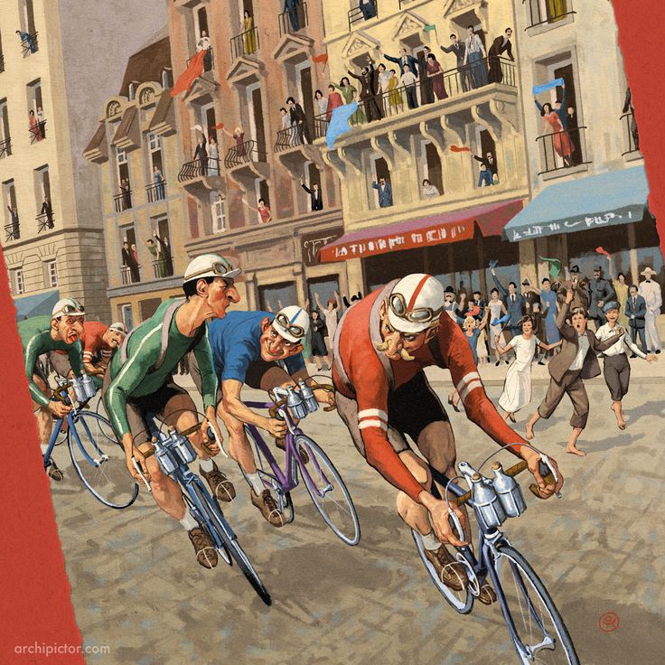
When I was asked if I would like to make illustrations for a bicycle racing game, it didn’t take me more that half a second to say ”YES!”. As a road bicycling enthusiast the subject was more than pleasing, but when I playtested it, I was thrilled. It really was a game..
Welcome to Issue 11 in my series sharing the stories behind board game art. Some box art perfectly encapsulates the theme of a game. Flamme Rouge features kinetic characters, in the midst of a race, and the energy bursts from the box. Ossi Hiekkala, created this artwork and we discuss his career below. Enjoy!
Check out the interview archive for more great insights into board game art.

Hello Ossi, thanks for taking the time to speak to us. Firstly, could you tell us a little bit about yourself?
Hi, thanks for talking to me. I am an illustrator from Finland and I have been in the business officially since 2005. Before that I had been living and studying in Japan for three years. My portfolio is full of every kind of assignment, from food and beverage illustrations to book covers and stamps. Board games are just one part of what I do, albeit a very pleasant one.
Now we know a little more about you, I have to ask, as a child what did you want to be when you grew up?
I am not lying if I said I wanted to be a comic artist and illustrator. Drawing has been my passion since I was a kid. Now that my first comics album has been published, I can also say I am a comic artist too.


So how did you first get involved in making board games?
It was somewhere around 2009 when lautapelit.fi first approached me and asked if I wanted to illustrate their upcoming game Hornet, by the Moliis Brothers. I have no recollection how they ended up choosing me, but it was a very interesting assignment as I had never done anything related to board games before. I’m always eager to try different things. It apparently went well as they wanted me to illustrate another game after that.
It also showed me that illustrating board games is a group project and I had to expect lots of changes during the process. Illustrations, like graphics, have to be tested. Sometimes you hit it with the first shot, sometimes it takes more tries. I like board games as a format for illustration and their big boxes allow large size art. It’s like comparing CD’s and vinyl albums. It becomes an appealing object in itself.
When you are working on the art of a board game can you give us a quick overview of your creative or thought process and has this changed at all since you first started?
I am grateful that my clients trust me to propose visual ideas. It is often the best part of the project, sketching and brainstorming. In comparison when working in advertising more often than little thought is expected from the illustrator, which is kind of waste.
Making the art is group work. The designer, graphic designer and publisher all want their needs to fulfilled, so illustrator has to learn to listen too. I want to make the games visually appealing but also true to the rules and spirit. That’s why I don’t want to force the visuals to fit my style but rather try to think what kind of visuals would fit this game the best. Sometimes it’s more polished, sometimes more painterly. I want there to be a story in the pictures, if possible - especially on the cover.
I start with the quick idea sketches, after which we proceed to more detailed sketches. When those are accepted, I start the final piece. It still might have to be tweaked here and there before it goes to the printer. It is also good if the typography and other graphics are done hand in hand with the illustrations, so they can support each other.
You were involved in the creation of Flamme Rouge, so could you tell us a little bit about what that involved and what were the biggest challenges you faced?
When I was asked if I would like to make illustrations for a bicycle racing game, it didn’t take me more that half a second to say ”YES!”. As a road bicycling enthusiast the subject was more than pleasing, but when I playtested it, I was thrilled. It really was a game that suited my tastes. Fast to learn and fun to play. Asger Granerud, the designer of the game, did manage to create a game that simulates the racing in a simple but pleasing way. I have enjoyed playing all the games I have been involved with, but this game I just love.
There were many possible ideas for the visual style, but I am happy that my suggestion to make the game a bit more retro in style was well accepted. The cover came pretty easily, but the cards, player boards and the track pieces took more tries. They had to be tested and improved. There was a lot of emailing back and forth with lautapelit.fi’s graphic designer Jere Kasanen to work on this until everything was finished. What I like about making board game art is the slower pace for producing the illustrations. You have time to think and plan what you can do.
What was the inspiration or core idea that drove your work on Flamme Rouge?
I guess my own passion for bicycling was the greatest inspiration, as was my love for older illustrations from the 1900’s. I collect art books and they provide me lots of inspiration. I just stop for a moment, have a cup of coffee and sit down in my armchair with a few selected books.


What are you currently reading, listening to or looking at to fuel your work?
I have a small baby boy who keeps me away from idleness. But if I can, I love to spend my spare time reading non-fiction or watching documentaries about history or art history. I am big fan of history and I have been lucky that I have had opportunities to portray it in the board games I have illustrated. Luckily I can also listen to podcasts while I am working, and many of those podcasts are about history. Unfortunately I haven’t had time to play board games, for the aforementioned reason.
What advice would you give to anyone wanting to work in the board game industry?
It’s a world full of people who would love to do the same thing you would love to do, so the competition is tough. I’ve been lucky to have been involved with lautapelit.fi’s great people and taken part in designing games that have been gone on to be critical and commercial successes.
My advice is to try to meet an individual game designer looking for an artist for his or her project and get your foot in the door. For an illustrator, understanding what a graphic designer does is essential, so you can communicate with each other. Also, work with the professionals, if possible, since they will know what is commercially possible and value same qualities in others.
Do you have any current projects underway, or coming up that you’d like (or are able) to tell us about?
I am happy to tell that while I was writing this lautapelit.fi made it public that Flamme Rouge’s first expansion Flamme Rouge - Peloton will arrive (hopefully) to Essen, so here is the cover. There are other games waiting to get to a printer, and some underway, and some at the drawing table. But unfortunately I am not able to say anything about those yet. What I can say though is that I have enjoyed working on every one of these, and I hope it will show.
Finally, if we’d like to see more of you and your work, where can we find you?
I have my own homepage and blog in www.archipictor.com
I also have an Instagram account I try to update regularly: www.instagram.com/ossihiekkalaillustration/
And of course Facebook page: www.facebook.com/Kuvittaja/
(Illustrations and artwork provided by Ossi Hiekkala, product shots by More Games Please).

Roland MacDonald: Art in Board Games #10
A project always starts with research. First broadly, everything to do with the theme. Then narrowing down to the different elements required for the illustrations. I make a new Pinterest board for each project and look at as many different approaches and sources as possible to get away from the obvious.
Welcome to Issue 10 in my series sharing the stories behind board game art. Battle Line is one of my favorite games, but I’d be lying if I said the original version art set my heart on fire. Then, I discovered an indie project that reimagined gorgeous medieval art. I had to learn more! The conversation with Roland below is the result of this curiosity!
Be sure to check out the interview archive for more great insights into board game art.

Hello Roland thanks for taking the time to speak to us. Firstly, could you tell us a little bit about yourself?
I am from London but am now living in the Netherlands. I began my art career working in the computer games industry for five years, culminating in concept art, illustration and art direction on Shogun 2 Total War. After that I went freelance and moved to the Netherlands with my girlfriend. The life is great here. Since going freelance I have worked for pretty much every industry, from comics and books to pharmaceuticals to Google but in the last four years I have focused increasingly on art for games, digital and tabletop.
Now we know a little more about you, I have to ask, as a child what did you want to be when you grew up?
I was probably always going to do something artistic. I latched on to drawing at an early age and was always making something. I think I thought I would be a graphic designer at a young age though I probably didn’t really know what that was. I studied fine art but it was in the end a conceptual art degree. I wanted to learn to paint but ended up learning about philosophy and nothing about painting.
So how did you first get involved in making board games?
The girlfriend I moved to the Netherlands with really liked games and her father is very involved in the games scene in the Netherlands. He has over 5000 games! He helped me make some contacts and I made two games in 2012 for Cwali games. It was a pretty bad experience, largely due to communication problems, and partly due to my inexperience with how much work was involved as I created the art and all the graphic design. As it was also badly paid I gave up on board games as a viable business direction. Over the last few years though the industry has boomed and good art and graphic design is better respected and valued. Over the same period my love of board games has grown so I decided to take another shot.
In 2015 I went to Essen to get meetings with publishers and I took a redesign of Cluedo as a card game to give away to them. That game was called Suspicion and was the catalyst for my new growth in the board games business. I chose Suspicion for two reasons, one, it’s a classic and two, has good characters, some items and some locations. That’s a pretty good spread of things to have in a showcase project. Also I had done a lot of work on a detective comic in the same style and knew it had a lot of potential. Of course once I started redesigning the cards of Clue I couldn’t help tinkering with the rules too. By stripping out the roll and move mechanic and by adding some event cards to increase interaction I think I ended up making some good improvements. This was also my first attempt at manufacturing a whole game which taught me a lot about the process. That experience, plus understanding more about how players interact with your art really added some great tools to my arsenal.
When you are working on the art of a board game can you give us a quick overview of your creative or thought process and has this changed at all since you first started?
I like to work closely with the client and understand the needs of the gameplay to come up with a great solution. A project always starts with research. First broadly, everything to do with the theme. Then narrowing down to the different elements required for the illustrations. I make a new Pinterest board for each project and look at as many different approaches and sources as possible to get away from the obvious.
If you are doing a Wild West game there are a ton of reference points. Partly these cliches are helpful as it helps the player connect to the IP and understand aspects of the game easier. However, looking sideways to Pirates or Samurai might give us some new ideas for character types or looking at 18th century American landscape paintings can help us get beyond the colour palette of Spaghetti Westerns and yet still feel authentic. Ideally the project isn’t rushed, then there is time to explore the theme with a range of sketches and different design solutions.
Once a basic look and feel is worked out I do sketches for all of the elements of the game. Mostly this process is digital, even the sketching. Though if the weather is nice I will use pencil and paper on a beer terrace. Sketches are loose as I like to keep some of the fun for painting. It keeps the illustrations alive and stops that part of the process being paint by numbers. Sketches are followed by rough colours studies. Once these get approved the final illustrations are done. It is Photoshop all the way. It's the fastest way to work for me and allows me to make changes both quickly and offer the publisher variations where needed. I used to do the whole sketch and scan process years ago but learning to use a Wacom tablet well enough to sketch has made that process a bit redundant. It was too slow and fussy.


You were involved in the creation of Stop Thief!, so could you tell us a little bit about what that involved and what were the biggest challenges you faced?
I have worked on six board game projects in the last year. Stop Thief is the latest one to get published and comes from a new company, Restoration Games. Their aim is to take old games and revamp them for the modern market. I was brought in to re-imagine the original 1979 game and modernise it with a nostalgic twist. The board has a very tricky perspective and had to fit a lot of gameplay information. Handling these two things, making convincing looking locations with visual interest that wouldn’t distract from the gameplay was a fun and difficult puzzle. I worked with the design and graphics team closely to refine elements of the original layout to create an optimal solution. We were all really pleased with the final board. It is both visually rich and very functional.
The project was on a tight deadline as restoration games are launching three titles at GenCon 2017 so the other challenge was the schedule. I don’t like to cut corners on the quality of the art so I worked for 32 days straight. It was tough but the outcome was really worth it.
What was the inspiration or core idea that drove your work on Stop Thief!?
I was chosen as the artist for Stop Thief! based on my own project Suspicion and the work I did for Escape Room: The Game. The colourful noir look of Suspicion was a great match for this game. So, that was a large part of the art direction I received, but as this is a redesign of an older game the other major influence was of course the original. That game was very much a product of its time style wise, and mechanically. It’s art was charming but a crude and simple strip comic style that now looks very dated. The new layout fairly closely matches the original game board and as the original game is well know by a certain generation part of the project’s appeal is the nostalgia.
What are you currently reading, listening to or looking at to fuel your work?
I don’t know that anything I am reading, watching or listening to is really seeping into my work. I do browse a lot of animation blogs and keep upto date with game and art trends. I love advertising art from the mid 20 century and that is a constant influence. Al Parker, Bernie Fuchs and early Bob Peak work are a few among some amazing talents. I could probably do with taking more time off and enjoying a good book but I am a workaholic.
What advice would you give to anyone wanting to work in the board game industry?
Do it because you love it. There are easier ways to make money. Computer games pay double what you get for a board game. If you want to learn what makes good game art and get your name out there maybe try reimagining an old game you love. It has worked twice for me and taught me a lot in the process. I recently redesigned Battle Line as a passion project and that and my Cluedo redesign have gotten me quite a few jobs and made lots of new contacts.


Do you have any current projects underway, or coming up that you’d like (or are able) to tell us about?
I am publishing my redesign of Battle Line as a very limited edition, 400 copies only. That is currently at the printer and available for Pre-order. The other project that is even more exciting for me is my own design, Ruthless - Legends of the Black Flag. This will be published by Essen this year! I have completely designed this Pirate themed deck builder from scratch and illustrated it too. I am very proud to say that it has found a European publisher. I will have some copies in English at Essen if you can find me but hope to find an English language publisher at Essen this year, or I might try Kickstarter.
Oh and look out for Kaiju Crush later this year.
Finally, if we’d like to see more of you and your work, where can we find you?
My portfolio can be found here http://rolandsrevenge.com/ or https://www.behance.net/PaperSails
Battle Line Pre-orders here http://rolandsrevenge.com/battle-line-2nd-edition/
I post regularly on Instagram: https://www.instagram.com/rolandtheillustrator/ both with art and stuff I like.
Twitter as an illustrator - https://twitter.com/RolandDraws and as a micro publisher - https://twitter.com/RolandsRevenge
(All images provided by Roland MacDonald)

Ryan Goldsberry: Art in Board Games #9
The biggest issue with Fugitive was the amount of art that was needed. The cards are numbered (0 - 42) and we decided that each card would be unique and that if you laid the cards all out in order, you could see a story and a chase taking place...
Welcome to Issue 9 in my series sharing the stories behind board game art. Growing up I watched a lot of Hanna-Barbera cartoons like The Flinstones and The Jetsons. This simple but expressive art style captivated me in my youth, and seeing Ryan’s work reminded me of art that strongly evokes that feeling of being from a different era.
Be sure to check out the interview archive for more great insights into board game art.
Hello Ryan thanks for taking the time to speak to us. Firstly, could you tell us a little bit about yourself?
I worked in video games as an animator for about 12 years, most of that at Crystal Dynamics where me and Lara Croft became best pals. Somewhere in that time I started making art on the side for the games that my good buddy Tim Fowers was inventing. Currently I'm working as an artist and animator for Lawrence Livermore National Lab, where I'm making cool art for sciencey type stuff. And, since life isn't busy enough, I continue to work with Tim to make our games, and I also illustrate books that my dad and I write (our first book, Floater, was published a couple years ago).
I live in the Bay Area in California with my beautiful, hilarious wife and our 5 kids (yes, that's no typo...FIVE kids).
Now we know a little more about you, I have to ask, as a child what did you want to be when you grew up?
An artist...always an artist. I had no idea what that meant or what kind of an artist I wanted to be, but I never really deviated from wanting to be an artist… except for a brief spell in my teens where I thought maybe I'd just go ahead and be a lead guitarist for some kind of super famous rock band. But, you know... reality.


So how did you first get involved in making board games?
I was happily working in the video game industry when Tim Fowers (who was a good friend from years back) called me up and said he was going to try and make a computer game and asked if I'd do the art for it. Not knowing any better, I said "sure!"
The rest is history. We made a couple of computer games (our first one, ‘Now Boarding’ was quite successful) and then we eventually switched to the board game media with Wok Star. I keep making the art I like, and Tim keeps saying he likes it, so we have no plans of stopping! I think we make a good team.

When you are working on the art of a board game can you give us a quick overview of your creative or thought process and has this changed at all since you first started?
Generally it starts with a conversation with Tim, where he tells me about the game he's working on, and tries to explain in detail how the game works. I try and pay attention, but inevitably zone in and out as he tries to explain it all. When he gets done explaining I stare at him with a blank look. Soon after that, I sit down with Tim and we actually play a prototype (Tim is the master of making prototypes) and finally a light goes on and I understand how the game works.

Then we have a lot of discussion about the theme of the game. Sometimes there is a very clear theme already in place, and sometimes we have to invent it. Once we feel like we have something cool in place, we start talking about how much art it will involve and we try and get a general idea of what we need, how long it will take, and also how much we should have done before we take it to Kickstarter.
As I'm creating the art I try and stick to the theme, and I do a lot of research to find references that support that. We have a certain art style and we try and stick to that because we feel like it has served us well. It's also fun because we now have a catalog of characters from the previous games we've made and we like to cross some of them over into our new games so it's like we're creating our own little universe. It’s fun!
You were involved in the creation of Fugitive, so could you tell us a little bit about what that involved and what were the biggest challenges you faced?
The biggest issue with this game was the amount of art that was needed. The cards are numbered (0 - 42) and we decided that each card would be unique and that if you laid the cards all out in order, you could see a story and a chase taking place. This added an extra challenge. Not only was there a lot to create, but it had to cohesively tell the story.
Also, with any good Kickstarter, you try and set a schedule and have an accurate delivery date. Goals help with the creation process and fulfilling goals keeps our awesome backers happy. However, after the Kickstarter ended and as I started to really dig in and work, it became obvious that we weren't going to hit our original timeline. This was a discouraging challenge. I was working as hard as I could to try and complete all the art without going too far beyond our estimated time frame but it was just too much to get done as fast as we wanted. Ultimately we came in late and it was pretty much all my fault, but, I think it turned out good in the end and hopefully was all worth it.
What was the inspiration or core idea that drove your work on Fugitive?
Inspiration for Fugitive came from several places. First, the game is a cat and mouse style chase game and we were inspired by movies like Catch Me If You Can. I was personally also inspired by all the cool chase scenes I’ve ever seen in movies. I looked at a lot of these, especially the classic chase from Bullitt and that cool car/train scene from The French Connection.
Another inspiration was comic books in general. Fugitive turned out to be a sequential art, like something you'd find in a comic book.


What are you currently reading, listening to or looking at to fuel your work?
Hmm, I just got through watching the new and final season of Samurai Jack, and that also inspired me to go back to rewatch some of the previous seasons. Along with the fantastic storytelling that show has some of the most beautiful looking art I've seen in a cartoon. It's truly inspiring.
I also just got the big hulking 2 volume set of Ralph McQuarrie's Star Wars art and I've been reading through that. It's amazing and I wish I could draw even remotely as well as McQuarrie.
What advice would you give to anyone wanting to work in the board game industry?
If you're trying to work as an artist, my advice would be to branch out and really try different styles of art and design. I really like to see games that look different from the pack, and have themes and styles that are unique.


Do you have any current projects underway, or coming up that you’d like (or are able) to tell us about?
Right now I'm finishing up our expansion to Paperback, and after that, we're going back to our beginnings with a game called Now Boarding. It will be coming to Kickstarter in August.
Finally, if we’d like to see more of you and your work, where can we find you?
You can follow me here:
Instagram: https://www.instagram.com/goldsberryryan/
Tumblr: http://thecartoonhead.tumblr.com/
(Artwork supplied by Ryan Goldsberry).

Atha Kanaani: Art in Board Games #8
[..] it was my first “big” board. There was some art already done and I had to respect the style by making mine very similar. When you don’t have a lot of experience, it’s a little bit scary because the board is the part where players are going to live their adventure..
Welcome to Issue 8 in my series sharing the stories behind board game art. Certain projects stand out. Pandemic: Iberia brought a gorgeous new art style to the series and I immediately wanted to know who was involved in it’s creation. This week, I’m joined by Atha Kanaani, an illustrator who has worked on games such as Traders of Osaka and Pandemic: Iberia and with companies such as Filosofia, Z-Man Games, Asmodee Canada, and Plaid hat Games.
Be sure to check out the interview archive for more great insights into board game art.

Hello Atha, thanks for taking the time to speak to us. Firstly, could you tell us a little bit about yourself?
Hi Ross, thanks for inviting me onto your blog! I’m a French illustrator currently living in Canada and I did a little bit of freelancing before coming to Montréal. That’s how I started working for F2Zentertainment in 2014. Our first Game together was Traders of Osaka. We did well and they appreciated my work, so, as little as a month later they offered me a full-time job with the condition of coming to their studio in Québec. At first I thought it was crazy but my girlfriend convinced me that it was a very good opportunity for us. That’s how we ended up here! Now the studio has changed owners and I’m a full-time illustrator for Asmodee Canada, as a part of the Z-man Games creative team.
Now we know a little more about you, I have to ask, as a child what did you want to be when you grew up?
I remember wanting to be an animal tamer, a race driver, and a lot of other things. I became conscious very late that drawing could be my thing. I drew a lot as a child and I just never stopped, finally I found out that there were people for whom drawing was their job.
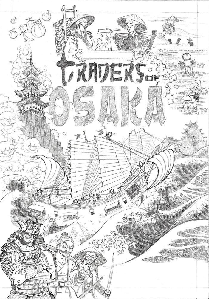
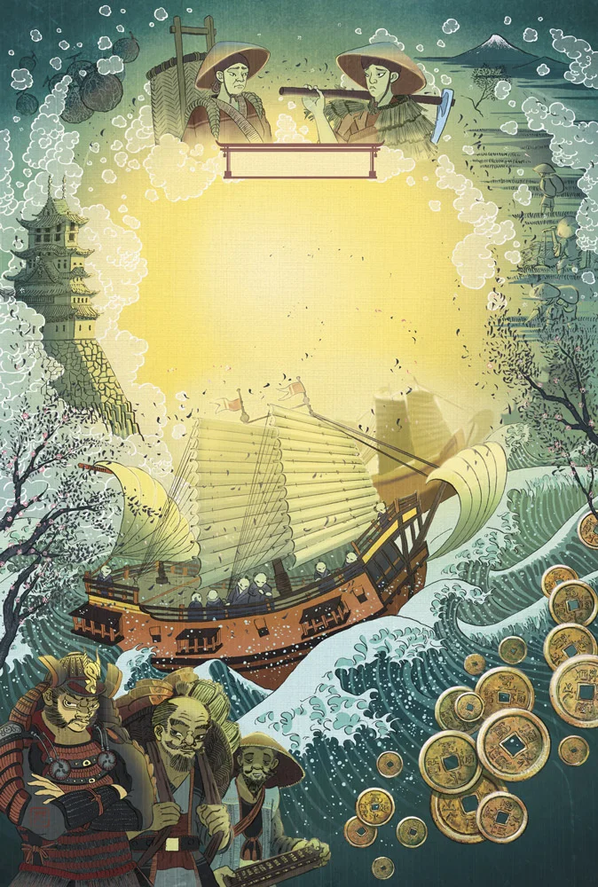

So how did you first get involved in making board games?
After graduating from art school, I didn’t know where to begin to become an illustrator. So, after some time, I remembered that my teacher (Vincent Dutrait) told us that the board game industry was growing bigger and bigger and we should take the chance to get involved. I contacted every company in France. By mistake I wrote a mail to filosofia without knowing that they were in Canada. They asked me to work on “Traders of Osaka” and that’s it, I had a foot in this industry.
When you are working on the art of a board game can you give us a quick overview of your creative or thought process and has this changed at all since you first started?
The first thing I get is a pitch from the art director. He gives me all he can at this stage (story, rules, old version of the game if it’s a reprint, etc) and if I can, I like to play one or two games just to know what it’s all about. If it’s a new game, I have more flexibility to play with the look (like for Smile as an example). In the case of a Pandemic game, the style must be close to the old ones.
We discuss about all the components that need to be illustrated and I do some visual research to feed my imagination. Then I can start sketching. I like to begin with the cover, I think it gives the tone for the rest of the game. But every company has its own way of working so you must adapt. For every part of the game I provide different sketches and the art director chooses the ones they want me to develop. Then I refine it and try some color sketches on it, and they choose the one they think best fits with their vision. After we agree on all of it, I can work on a final illustration. There are not so many changes in the process but art directors are humans, so I must deal with their different temperaments, but we always find a way to work together.


You were involved in the creation of Pandemic: Reign of Cthulhu so could you tell us a little bit about what that involved and what were the biggest challenges you faced?
On this one, I worked with Chris Quilliams. My job was to work on the game board, refine the cards already done by another artist and create the ones missing. The challenge was that the board is a very large piece with a lot of details, and it was my first “big” board. There was some art already done and I had to respect the style by making mine very similar. When you don’t have a lot of experience, it’s a little bit scary because the board is the part where players are going to live their adventure. People are expecting something high quality. There are a lot of things you must think about, like how people are going to move their pawns. Where to put the towns with enough space for all the graphic design around it and how to separate the cities whilst keeping unity throughout the board. On top of all of that, you need to think how to create the right mood for this game. Fortunately, my art director was here to help me and I hope people are enjoying playing on it!
What was the inspiration or core idea that drove your work on Pandemic: Reign of Cthulhu?
The idea was to give the players a feeling of anxiety and concern about what happened here. It was a lot of fun playing with the weird light and fog here and there. Are there people around? What could possibly do make a hole like this in a building? It’s a little bit like an old horror film, when you are waiting for the big hairy monster, jumping out from the woods!


What are you currently reading, listening to or looking at to fuel your work?
I started to read a book from Ed Catmull (president of Pixar and Disney animation) called “Creativity, Inc.”, and I’m also reading the Notebook of Leonardo Da Vinci which is really fascinating. I have another pile of books “in reading” because I can’t finish one before diving into another attractive book…it’s an addiction. I’m listening to Smooth Mcgroove! He makes Youtube videos where he sings video games music. Some people find that weird… but I don’t care, I love it!
What advice would you give to anyone wanting to work in the board game industry?
Make mistakes. That’s how I ended up 5500 km from my home illustrating board games. Contact people, do good work, try everything you want, the only risk is to get a "no". I don’t really have any exact advice, there are so many different way to meet your goals. Keep sending your work, ask for feedback from people actually in the field. But first of all, you have to believe that your dream job is somewhere waiting for you, so keep moving because it’s not coming after you!
Do you have any current projects underway, or coming up that you’d like (or are able) to tell us about?
I think “Smile”, a little card game, is coming out soon. I had a lot of fun painting the little monsters. And a lot of games are coming up in the future but I can’t talk about it and that’s a hard part of the job.
Finally, if we’d like to see more of you and your work, where can we find you?
You can see some of my illustrations here: http://www.atha-kanaani.com
Or also here: https://www.artstation.com/artist/atha
(All images provided by Atha Kanaani)

Pierô: Art in Board Games #7
This project should have been the best moment in my career. I was working with only friends (game designers and publishers) on a very fun and original game. Everything was supposed to be cool. Unfortunately, I’ve realised since then that it’s always when I think it will be cool and quick that it’s a painful and slow process..
Welcome to Issue 7 in my series sharing the stories behind board game art. Ghost Stories was a grail game of mine for a long time, as it was meant to be such a challenging cooperative game. When I looked into the work of its artist Pierre Lechevalier, I wanted to learn more about his work and methods. He’s also worked on games such as Mr Jack, Rampage, and Yggdrasil, as well as with companies such as Repos Production and Matagot.
Be sure to check out the interview archive for more great insights into board game art.

Hello Pierre thanks for taking the time to speak to us. Firstly, could you tell us a little bit about yourself?
Hello, so my name is Pierre Lechevalier but nobody has called me that in a very long time. Now everyone calls me Pierô and I never write my last name when I’m signing a game. If I have to, I’ll put la lune (the moon). Pierô la lune is a character from the italian Commedia dell’arte and in French there is an expression “avoir la tête dans la lune” which roughly translates to “have your head or mind in/on the moon” meaning you’re always dreaming and not very focused on the surrounding world. As a child (and still), it describes me pretty well and everyone calls me Piero because of that. Wow! Just my name alone made a long intro. I will try to keep the rest shorter!
So I’m a french board game illustrator working in the industry since 2006. The first game I illustrated was Mr. Jack which was quite successful and is still available now. I’ve done 40 games since then and the most popular ones are Dice Town, Ghost stories, River Dragon or Rampage aka Terror in Meeple City (depending from which country you’re coming from). Illustrating games is how I’ve made my living for 11 years now and I’m lucky to have had a lot of work meaning I can live from it. Which is great because it’s a damned good job.
Beside my work, I live in the south east of France in a very very small village where I can enjoy the birds singing and the wind in the trees. But don’t imagine me with long hair running naked through the woods with flowers in my beard... I don’t have long hair. More seriously, I lived for more than 30 years (I’m 42) in the city and I grew tired of it, plus as I’m working from home I need the calm and fresh air.
I’m a gamer and a pretty serious one. Videos games, when I have the time and a lot of boardgames. I have more than 500 board games at home and when I go beyond that amount my wife strongly suggests that I give some away to friends and family who can use them. My wife is also a gamer, as is my 8 year old son. When I don’t work or play I’m jumping from planes with my parachute and have been since 2012.
Hmmm, I think you know pretty much everything about me. Oh no! One last thing! I talk a lot. I mean A LOT! As you can see, quick answers are not an option here. Sorry.
Now we know a little more about you, I have to ask, as a child what did you want to be when you grew up?
For as long as I can remember, I wanted to be an illustrator and I’ve been drawing since I could hold a pencil. Drawing has always been a way of expressing myself and if there was something I couldn’t say, I drew it.
Not just that though, if there was a toy I couldn’t have, I would just draw it to play with. Or if I had to give someone a gift? Wow, it’s so much cheaper to draw for them, plus then they’d also have to say it was great too! My mother put me in an art school when I was 8 but perhaps she was just tired of the ugly drawings as gifts.
In France, comics are very different than in the U.S or other countries. They cover a much larger audience spanning children, teens and adults. They are hard backed and normally between 44 and 56 pages. Generally it’s the work of 2 or 3 artists (a writer, illustrator and colors artist) and they take around one year to finish. I wanted to be a comics illustrator until I was about 25 or 26 but I failed because it’s very hard to become one and requires a lot of work and talent. I didn’t have enough or didn’t work hard enough, who knows. Anyway, I always wanted to be an illustrator, a drawing artist and I did it! Which is pretty cool right?
So how did you first get involved in making board games?
I have a cousin who lived with me for a number of years or we always lived very close. I consider him my little brother and we played a lot of board games together when we were young. When I was 15 and he was 13, we discovered a store that sold board games and RPGs and we fell into the trap. We found a lot of different RPGs (Vampyr, Star Wars, Cthulhu and Cyberpunk…) and at the same time discovered American board games with Warhammer 40000, Dungeon Quest (yeah, the 1st version) and Cosmic Encounter as well as the French touch with Full Metal Planet, Sherlock Holmes and many more. We played until I had to leave my hometown for my studies.
I stopped playing board games until 2003-2004 when I dived deep back in after discovering modern games such as those from Days of Wonder or Asmodee. In two months alone I had bought 30 games, just because they were so good and so beautiful! Still drawing in my free time and trying to become a pro, I started to draw me and my board game friends dressed as characters from the games we played. I wanted to start a website about it and I contacted Bruno Cathala to ask him if I could use my version of Shadows Over Camelot on there. I showed him my drawing and had fun with it. However, one week later I received a message from him, giving me his cell phone, asking me to call him to discuss a project. That was Mr. Jack.
That’s how I first became involved in the board game industry, Bruno Cathala! Yep, you’re free to blame him! When Mr. Jack was released, I went to Essen (2006) to see my first box as soon as possible and I got invited by Bruno and Ludo (Ludovic Maublanc, co designer of Mr. Jack and Dice Town) to do little drawings on the lid of the box for gamers. This was the first time in Essen that an illustrator came to do a signing session. Once I sat on my chair to start doodling I never was able to leave it. During those 4 incredible days of drawing gamers really appreciated it and it ended up making a big buzz. That’s how I became a board game illustrator I think. My signing session made me famous and Mr. Jack was a huge success.
When you are working on the art of a board game can you give us a quick overview of your creative or thought process and has this changed at all since you first started?
First step, try the game. I’ve been going to Essen every year since 2006, to the Bruno Faidutti gathering since 2007 and to some smaller conventions in France too. Bruno Faidutti, Bruno Cathala, Ludovic Maublanc, Antoine Bauza, Roberto Fraga, Nicolas Normandon and many others became friends of mine. Real friends. I’m playing a lot of games at the prototype stage and sometimes, if I have a big crush for one of them (Dice Town and Ghost Stories are good examples) I really want to be a part of it. I think you never do a better job than when you’ve tried the game. It helps a lot to understand what’s important in the mechanics of the game and what you have to highlight. A beautiful game is not enough, it has to be a good game too in order to face the many games which will be released in the same year. Of course it helps to have a nice, beautiful game but illustrations are at the service of the game and sometimes, an illustration has to be simplified to help the comprehension of how the game works. That’s why it’s a very important first step for an illustrator to play the game.
When the publisher has finished their work with the game designer (creating the game and developing it) they will have a theme, a list of needs and this is when I start to work for real. I start some rough drafts to find the style I want and make some suggestions to the publisher (sometimes designers are involved too).
I like to change my style so I don’t get bored of my work. Sometimes, I want to make some cartoonish and colorful illustrations (Dice Town, Rampage, River Dragon, Medieval Academy) and others perhaps I want to be more serious in style (Yggdrasil, Ghost Stories). That’s why I’m always trying different styles for each project. Once we have an idea of what we want, I start to work with black and white roughs of the cards, boards and covers. There is no rule about what I do first so it depends. Sometimes the cover will give me the style and direction for the rest. Sometimes it’s the board, as I say there are no rules.
I send a big mailing with lots of roughs and then wait for the green light. Once I have it, I do the final drawings in black and white and send them to the publisher. When I have approval to go ahead further I put in the colors. I generally try to not do all the roughs, black and white final drawings and (at the end) colors at the same time. It’s very complicated to create an illustration from scratch on a white page so I generally try to alternate between differents step throughout the process, although adding the colors is a pretty cool and easy task.
Oh, I didn’t mention, I work 100% on a computer. That’s the only thing which has changed since 2006. The first illustrations of Mr. Jack were drawn on paper with computer colors. Now, from the first rough, everything is digital. I’m working on Corel Painter.
In regards to the art process, some game designers like to be involved and others don’t. For example, Antoine Bauza and Bruno Cathala love to discuss and give their opinions during the creation process. Sometimes designers don’t really care or leave it down to me. Or it might be the publishers who stop me sharing my work with the designers so as to not bring in more opinions thus slowing down the process.


You were involved in the creation of Rampage/Terror in Meeple City, so could you tell us a little bit about what that involved and what were the biggest challenges you faced?
I’m going to talk about Rampage (Terror in Meeple City on the second release) from game designers Antoine Bauza and Ludovic Maublanc (published by Repros Prod) as although it’s clearly not my best work (or even the one I enjoyed most) it explains all the processes I covered in the previous question and was a real challenge.
It started when I played a really early prototype during Essen in 2008. We were here with Antoine for the release of Ghost stories and Ludo (Ludovic Maublanc) was here for Cyclades (or perhaps also Cash and Guns). It was very late, something like 3am and we were drinking, just maybe not the water they had put on the proto table. One hour later, some guys from Repos signed the game and I was there to say “I’m the illustrator of it and you don’t have choice!”. I always have a video camera with me and I filmed a lot of things that night, proving we didn’t just drink water. We started to really work on the game 4 years later, sometimes it takes time to develop a game to its final version.
When I started to work on it, I spent a lot of time to find the style we wanted. It was very complicated because of the style of the game, which was fun and stupid with big monsters. We hesitated between a lot of different styles. After a few weeks of research and a dozen tries we, of course, chose the very first one. It’s always like this.
The cover was the first thing I started and I had done more roughs of proposals than I usually do. It had been a real fight between me and the publishers (friendly, of course) because I had a preference for a cover and they had another. As we are all very stubborn it took us some time to chose and finally we went with their choice. The publisher has the last word of course. The game then also had a second release with another name and another cover. This time the artwork I had prefered. So we both had our cover and we all won. But now, of course, I prefer the first version.
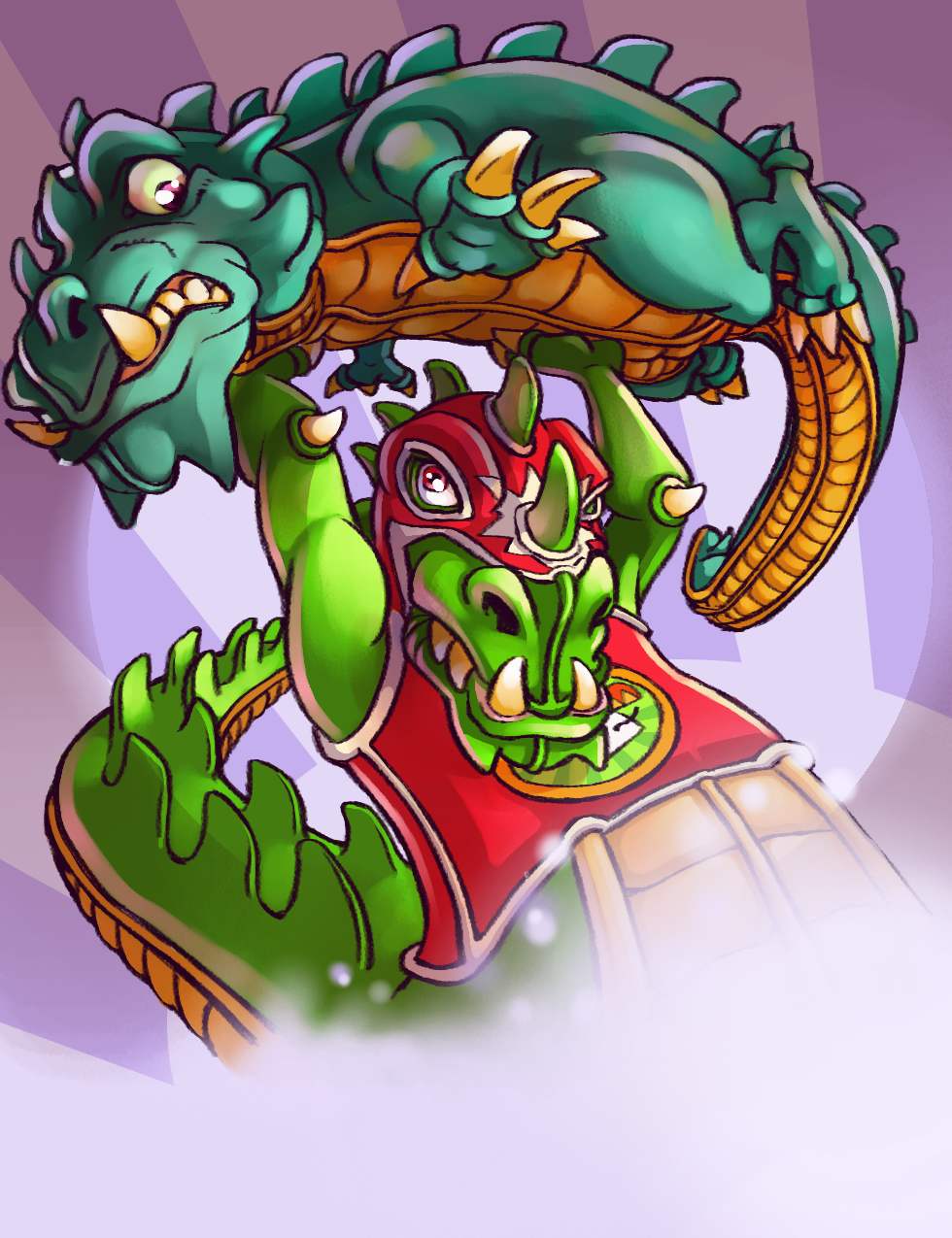
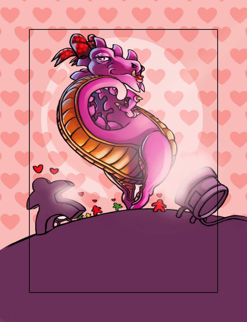
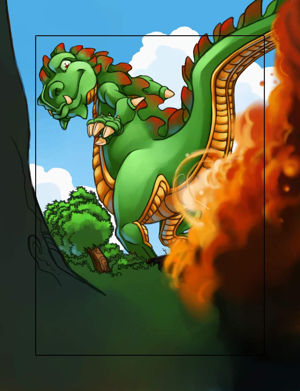
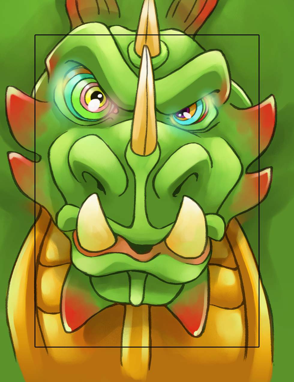
The cards were done very quickly as the cartoon style was fast to do and fun. The cards descriptions given by Antoine and Ludo were very clear so I just had to translate their wishes and follow their direction.
The real challenge was in the game board. I was, at this time, an illustrator for 6 years with at least 15 games to my name. Unfortunately, this doesn’t mean you won’t make a poor estimation of how much work you need to do. We chose a very cartoon-y style, simple and colorful. I’m pretty fast on this kind of work so I imagined it would take me one or two weeks to do the board. It took me 3 months.
The game was released at Essen 2013 and not 2012 partly because of my mistake in time evaluation. The illustration of the board was supposed to be a part of a big town with buildings and sidewalks. A simple top view. I wasn’t supposed to draw 3D buildings with perspective and so I was very optimistic about it. 5 years later, I still ask myself how I could have been THAT stupid. A top view of a cartoon building is basically a square. It’s very empty and so ugly! I had to add details, objects, and more details, more objects... I still wake up screaming “Nooooo! Please…! No more of this board!!”.
This project should have been the best moment in my career. I was working with only friends (game designers and publishers) on a very fun and original game. Everything was supposed to be cool. Unfortunately, I’ve realised since then that it’s always when I think it will be cool and quick that it’s a painful and slow process.
But, to be honest, I learned a lot (even more than I wanted) with this project and it’s still one of my best works according to my son. He’s young… He doesn’t know.


What was the inspiration or core idea that drove your work on Rampage/Terror in Meeple City?
The game was designed to be an homage to a very (very very) old video game called Rampage. We (Antoine and myself) were big fans of the game (I wasted so many coins on this game) which is why we did it. I took inspiration directly from the video games visual design. That’s what the publishers wanted too and we were good at it, unfortunately, perhaps a little too good. They had to change the name of the game and the publishers chose to change the cover as well to be cautious.
What are you currently reading, listening to or looking at to fuel your work?
I’m not reading as much as I would like to. Comics or books. Firstly because I don’t have much free time and secondly, like everyone else, I’m watching a lot of television series. I’m a big fan of old shows like The Wire, Six Feet Under or Firefly. I’m watching a lot of things, Netflix is a good dealer. Actually, I love Sherlock, Viking and Grey’s Anatomy…. Yeah, I know… I’m sorry! What can I say, it’s clearly a guilty pleasure. My wife was watching that show from the beginning and I started to get into it. Bam, I started again from the 1st season. Really? Am I talking about Grey’s anatomy in a professional interview? I clearly have to drop it!
I don’t really fuel my work with movies, tv shows or books. Or not consciously. When I’m drawing, I have podcasts playing in the background (Dice Tower and French ones) or music. If I put on music it’s generally a movie score in the mood of the game I’m working on. For example, when I drew Ghost stories I listened to Miyazaki movie soundtracks (Ghibli films like Mononoke or Totoro) and Memoirs of a Geisha. 3 months, I can’t listen to them anymore!
Of course, I have a lot of friends who are illustrators. Naiade (Tokaido, Seasons) Dijb (Clash of Rage, Titan Race), Miguel Coimbra (7 Wonders, Smallworld), Biboun (Dice forge, Time Bombs), Ani (Jamaica), Jeremy Fleury (Oceanos, Yamataï), Arnaud Demaegd (Ystari games) and many many others. We see each other a lot, we speak a lot and we help each other. We are real friends and not competitors. If I can’t do or don’t want to do a job, I ask them if they’re interested.


What advice would you give to anyone wanting to work in the board game industry?
Don’t! Stay where you are! There’s enough of us already!... please? I don’t really have too much advice because it’s a cool job in a very cool industry, for sure. Two things perhaps. First, play, play and play again. It’s a wonderful sensation to see our illustrations being played by perfect strangers but it has to be played first. Don’t hesitate to forget a little about your ego and highlight the game mechanics. Secondly, and much more importantly... wait let’s make this a new paragraph as it’s so important.
Here we are. So, secondly: It’s a job!! IT’S A JOB!! You’re a gamer? You’re an illustrator? Cool, welcome, but make sure you’re paid! It’s very easy to meet passionate people in this industry but it doesn’t mean that passion will fill your fridge or pay your rent. Don’t underestimate your work and its importance. Don’t listen to people who say “Hey! It’s cool for your artbook” or “I don’t have the budget but you will be famous after that!”. If you don’t have the budget for the illustrations of your game, don’t publish it! Actually, there are more than 1000 board games released every year. You just have to put some budget into the components and the illustrations.


Do you have any current projects underway, or coming up that you’d like (or are able) to tell us about?
Yep, I do. Would I like to talk about it? Oh Yeahh! Can I...? Nope! I can tell you a new expansion for Dice Town will be released soon with a new design of the base game. I’m also working with Matagot on some projects and I’m illustrating a game for two players with a very cool theme.
Finally, if we’d like to see more of you and your work, where can we find you?
You can find me on Facebook under the name of ‘Pierô la lune’ @Pieroillustrateur. It’s a page, not a personal FB. My personal is Pierô Lalune but I don’t accept friend requests anymore on my personal account. It’s just too complicated to manage private and professional lives at the same time.
I don’t post everything both in English and French. Mainly because I don’t have a lot of followers in English but I could do if I have to. You’ll see my last illustrations, some live videos so don’t hesitate to come and comment!
(All images supplied by Pierre Lechevalier)
Kingdom Death Monster - Lorinda Tomko: Art in Board Games #6
Nature is a big source of inspiration for me; nothing is creepier than some of the things that already exist here on Earth. I’ve based monsters on parasites, diseases, carnivorous plants and deep sea creatures - I like that the Kingdom Death universe isn’t filled with the same old thing!
Welcome to Issue 6 in my series sharing the stories behind board game art. The board game industry is filled with lots of cute and family friendly art. I’m not complaining, as I adore a lot of it, but it’s also great to see artwork with a darker and more macabre theme. Thankfully, Lorinda Tomko, an artist who worked on Kingdom Death: Monster, was kind enough to join me and share their work. Enjoy!
Be sure to check out the interview archive for more great insights into board game art.

Hello Lorinda, thanks for taking the time to speak to us. Firstly, could you tell us a little bit about yourself?
Hi Ross. I grew up loving art and illustration, and have been doing freelance work for just over 10 years. I went to JMU for a degree in Studio Art, and I’m now living in the Pacific Northwest with my husband Dan and our pet rat Brie. I’ve dabbled in a lot of different art projects, but my first love will always be game art and illustration.
Now we know a little more about you, I have to ask, as a child what did you want to be when you grew up?
I first realized I loved art in middle school. As a kid I was always doodling on everything; my desk, restaurant place mats. I even got into trouble for it at times. I also loved reading horror stories. My parents were extremely supportive, I was very fortunate!
So how did you first get involved in making board games?
I think Kingdom Death:Monster was actually the first board game I was involved in making. Adam had posted a call for artists on a forum I used. I responded and have been contributing on and off, to the growing game world that is Kingdom Death, ever since. I love the dark concept behind KD:M, Adam has very creative ideas and the other artists are fabulous. Games can be a great project to work on. It’s a substantial amount of work so I don’t need to be constantly hunting down other projects, but it’s still a lot of fun, especially when the game has an interesting theme.
When you are working on the art of a board game can you give us a quick overview of your creative or thought process and has this changed at all since you first started?
Since I’ve taken up more graphic design work than I did at first, I’ve come to consider these aspects much more, like what will fit well in the space, and what needs to be immediately visible and legible. I don’t usually do a lot of sketching before settling on 1-2 ideas. I prefer to brainstorm while doing other things, then when I’m ready to get down to work I already have an idea I’m happy with.
You were involved in the creation of Kingdom Death: Monster, so could you tell us a little bit about what that involved and what were the biggest challenges you faced?
I’ve contributed a few different sorts of things to KD. First are small images for the item cards, which is fast and fun. I get a short description to work off of for most items, which is pretty flexible so I get to play with what I think will look creepy or interesting. I’ve done some illustrations also. With these I aim for an interesting composition, something that will be eye-catching in the rule book. Lastly are miniature designs. These are the most challenging but also what I’m most proud of. Adam is open to a lot of design ideas from the artists, but it’s a challenge to hit the right aesthetic and feel for the existing game universe, especially since I don’t always have access to all the lore or what the other artists are working on. It’s very satisfying when a design is approved and you get to see your drawn concept become a real sculpt.
With miniature concepts there are some special challenges I try to keep in mind. KD has done some amazing things with delicate sculpts, but there are limits on what can bear weight. If the sculpting is done traditionally, small piercings in the designs will be hard to capture and the end effect may look blocky. I’ve learned a lot since beginning, both on KD and other miniature games like Purgatory, what makes for a clear turnaround design that sculptors can use, as well as what looks dynamic at a small scale.
What was the inspiration or core idea that drove your work on Kingdom Death?
I love horror and surrealism. I think my art reflects that a lot - it’s much easier for me to draw grim and creepy than cute and shiny. The monster designs of KD run the gamut from grotesque to elegant, but I’m drawn toward the ones that are subtler and almost graceful. Nature is another big source of inspiration for me; nothing is creepier than some of the things that already exist here on Earth. I’ve based monsters on parasites, diseases, carnivorous plants and deep sea creatures - I like that the KD universe isn’t filled with the same old thing!
What are you currently reading, listening to or looking at to fuel your work?
Right now I’m rereading the Dark Tower series, partly out of excitement that they’re making a movie.. I follow a few comics as well like Monstress and Kill Six Billion Demons, both of which I highly recommend. Junji Ito is my comic idol and I’m constantly rereading his works. As for music, right now I’m listening to a lot of RTJ and Shamir.
What advice would you give to anyone wanting to work in the board game industry?
Two words.. Be professional! Very few games are made start to finish by one person. This means there are people trusting you to know your stuff, respond quickly and courteously, set or negotiate your own rates (at a price point that is worth your time!), and of course meet deadlines. I can’t even begin to list the projects I was brought in on simply by being dependable and keeping a fast turnaround. It’s a very competitive market and if you prove reliable, the word of mouth will be invaluable.
Do you have any current projects underway, or coming up that you’d like (or are able) to tell us about?
I’m finishing up some graphic design and a bit of illustration for two other minis games who successfully funded on Kickstarter: Mythos by Paranoid Miniatures, and Purgatory by Underestimated Games. Both are small indie companies and I’m very excited to see where they go! Mythos is a Lovecraft-inspired game set around the 1920s, and I got to incorporate a combination of deco and nouveau styles into the design. Purgatory is a comedy/epic apocalypse game set in the end times of Earth, battling angels, demons and humans against each other. There’s a great sense of humour in the character designs which I had fun with - I can’t wait to get my hands on the Soul Train faction.
Finally, if we’d like to see more of you and your work, where can we find you?
My own website is at www.lorindatomko.com. You can also follow me at www.ensoulart.tumblr.com, or find me on FB at www.facebook.com/ensoulart. Thanks for having me!
(Images supplied by Lorinda Tomko)