
Cinyee Chiu: Art in Board Games #43
I'll look for lots of references, in 2 ways. One is to look for existing works with similar topics, to see how people approach this topic, and to find a way to demonstrate that in a fresh way so it can stand out. Another way is to grab whatever I feel is interesting visually, which can be illustration…
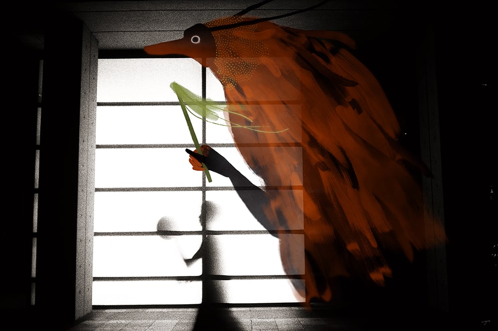
EDITORS NOTE: I love discovering new illustrators in this industry. I was absolutely delighted to witness a visual style very different from what I was accustomed to in popular board games and had to know more.
Hi Cinyee, thanks for joining me! For our readers who aren't aware of your work could you tell us a bit about yourself and what you do?
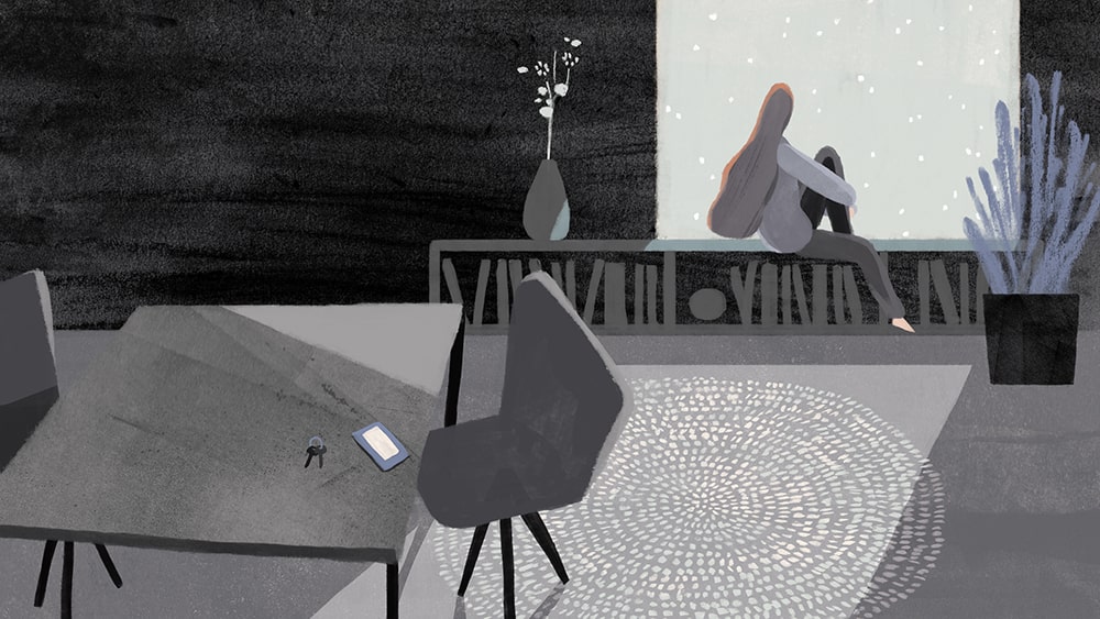
Hello people! I'm Cinyee Chiu, I'm a freelance illustrator from Taiwan and now traveling the world with my husband. I draw for books, products, animations, packages and more. We started the trip in September 2017, and have finished time in South America, stayed a few months in Colombia with my husband's family, and a few months in Taiwan with my family. Now we’ve been in Europe for 3 months already, staying in Spain, Portugal, France, and Germany. We are going to visit the rest of Europe and Africa in the following 6 months. The trip won't last forever, it probably will finish in 2019, then we might try to stay in Canada.
Could you tell us a bit more about your education in the arts? How did you learn to illustrate and how have you developed as you've gained experience as a professional artist?
Sure! I went to the US to study illustration and got my MFA degree in 2016 from the Maryland Institute College of Art. Before that, I had worked in the game industry for 3 years in a Taiwanese indie game company, where I mainly did character design. I actually didn't study art before that, my undergrad major was economics but I always enjoyed drawing since I was a kid.


I mostly learned drawing by myself, with tutorials online, from Pinterest, Youtube, and some drawing forums, etc. I started with digital painting (I thought it's less costly since you don't need to constantly buy paper and drawing materials) but then I started to draw more and more with traditional media, especially after I graduated from MFA in 2016. I’ve had a rather stable art style since 2017, but I believe it's still developing, I want to have more freedom in my work.
When beginning to work on a new project what are the first few things that you do?
I'll look for lots of references, in 2 ways. One is to look for existing works with similar topics, to see how people approach this topic, and to find a way to demonstrate that in a fresh way so it can stand out. Another way is to grab whatever I feel is interesting visually, which can be illustration, photo, product design, or something else. I collect the references into a mood board, and from that, I jot down the ideas that pop into my mind.


You've got a couple of board game projects under your belt now, so how did you first get involved in making games?
The first game came to me was Harvest Island in 2016, I believe they saw my 24 terms animal series so they decided to contact me. The game was actually about fruits and harvest, but they decided to make me draw animal and fruit combinations. I was always dreaming of drawing for a board game and they gave me all the freedom I needed, even letting me pick which animals to draw. The topic was something I really feel attached to, so it was a happy experience working with them.
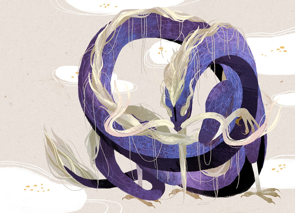
I discovered your work from the gorgeous Dragon Castle, could you tell us a bit more about the game and your collaborative process working on it?
It was actually a longer process than I expected when signing the contract. When they approached me, they actually were asking for some "Chinese infused visual style" art maybe with a tone of ink wash painting somehow? I thought it could be interesting to explore a bit on the styles, but when the project keep moving after a few style test back and forth they decided to go with a very digital direction. The content I needed to draw also changed because they'd been developing and fixing the game mechanics, from drawing lots more symbolic spots, to 36 animal and dragon character cards. In the end, I was very tired of drawing characters and I decided I'm not drawing for board games that have more than 12 cards anymore, haha.


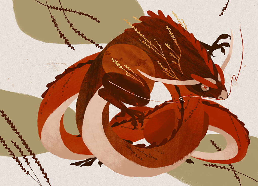
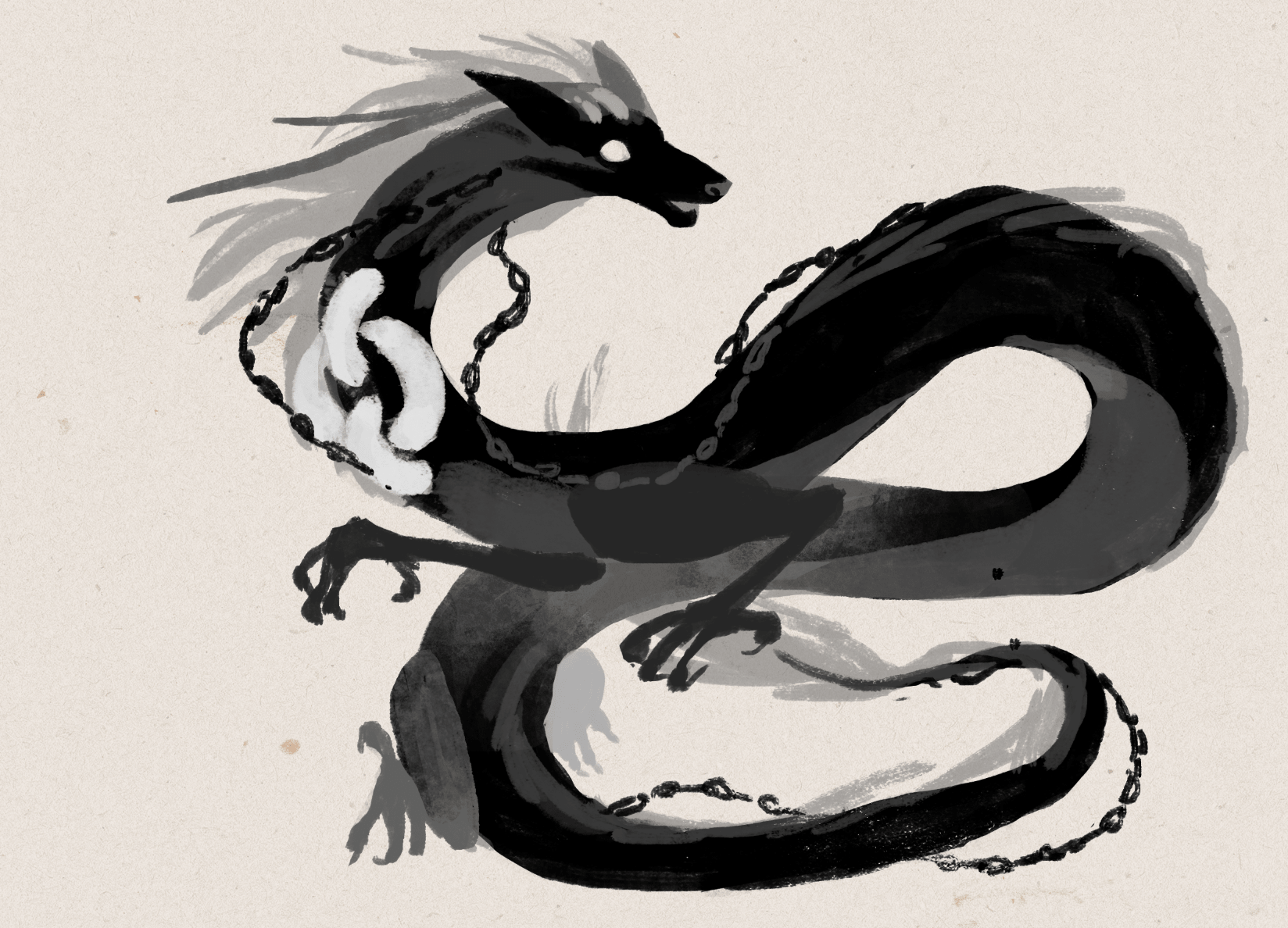
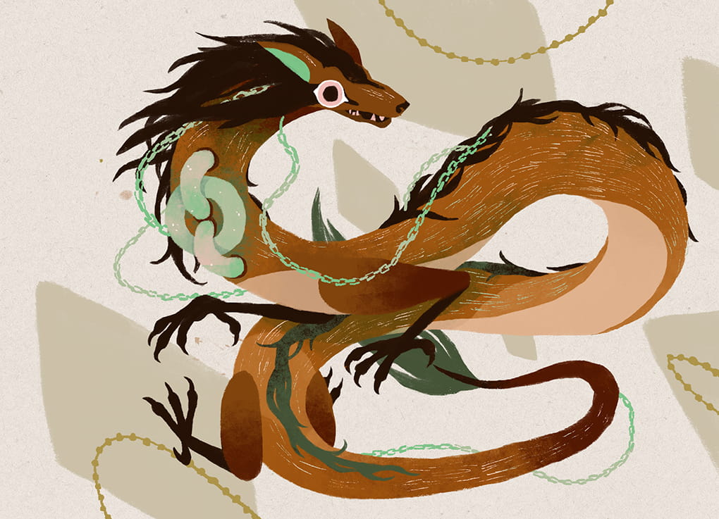
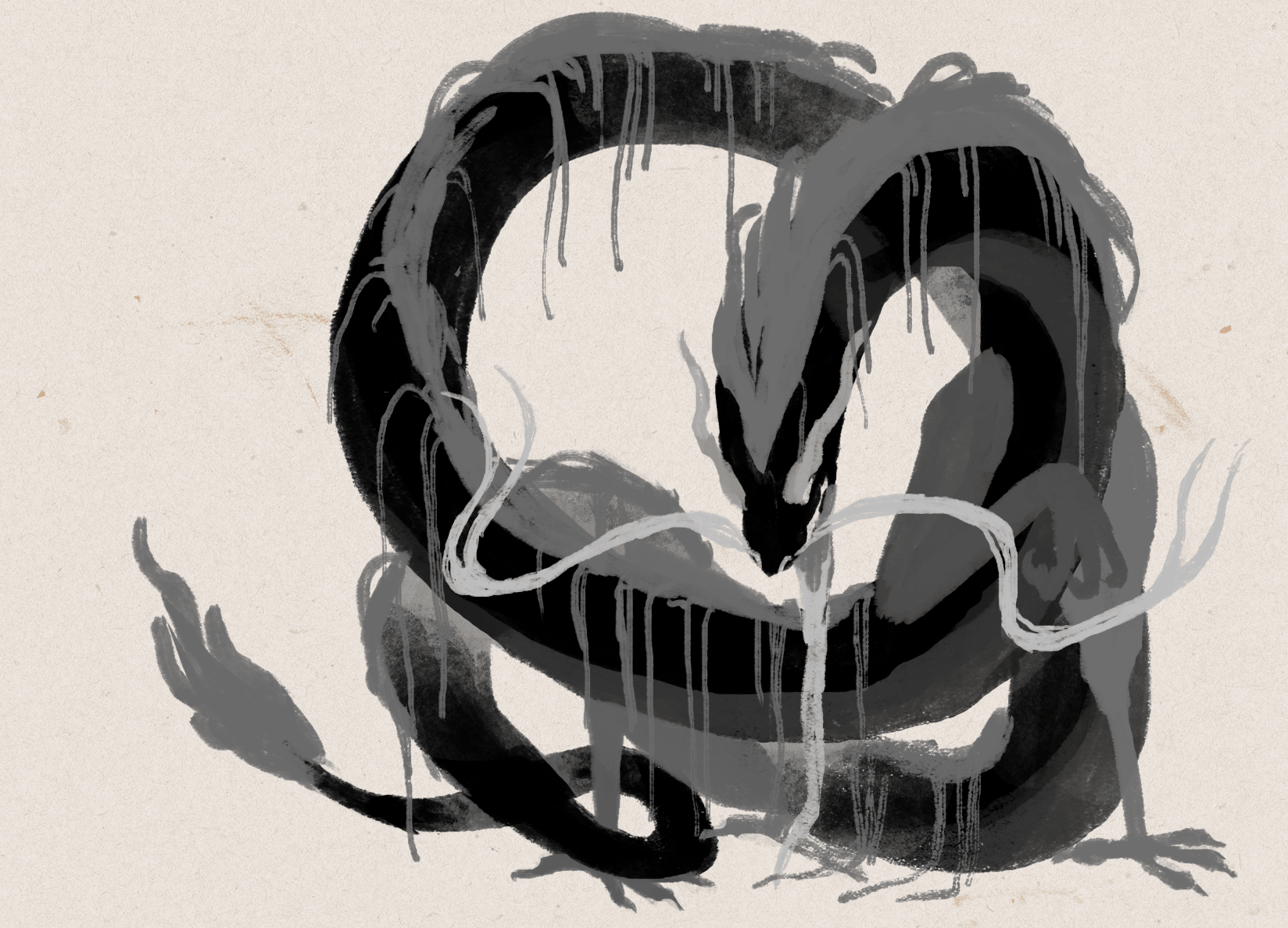
The dragons in Dragon Castle are all based around virtues. What were the challenges in trying to portray these and how did you approach illustrating them?
Some virtues are easier, some others took a longer amount of time. For example, for the Wisdom virtue I thought of an old man with a long beard immediately, and for Loyalty, I thought of dog and chain/lock. The challenging ones are those somehow similar in concept, like Fortitude and Perseverance, Power and Majesty....actually many were challenging.
I tried to illustrate them as differently as possible, in color and in the posture. So I decided the color for the easier ones first, like a cold color for Tranquility, or a transparent/white for Honesty. For the rest, I just picked a color I hadn't used, like red for Perseverance. The postures were difficult and it was hard to get them all different but I tried my best.
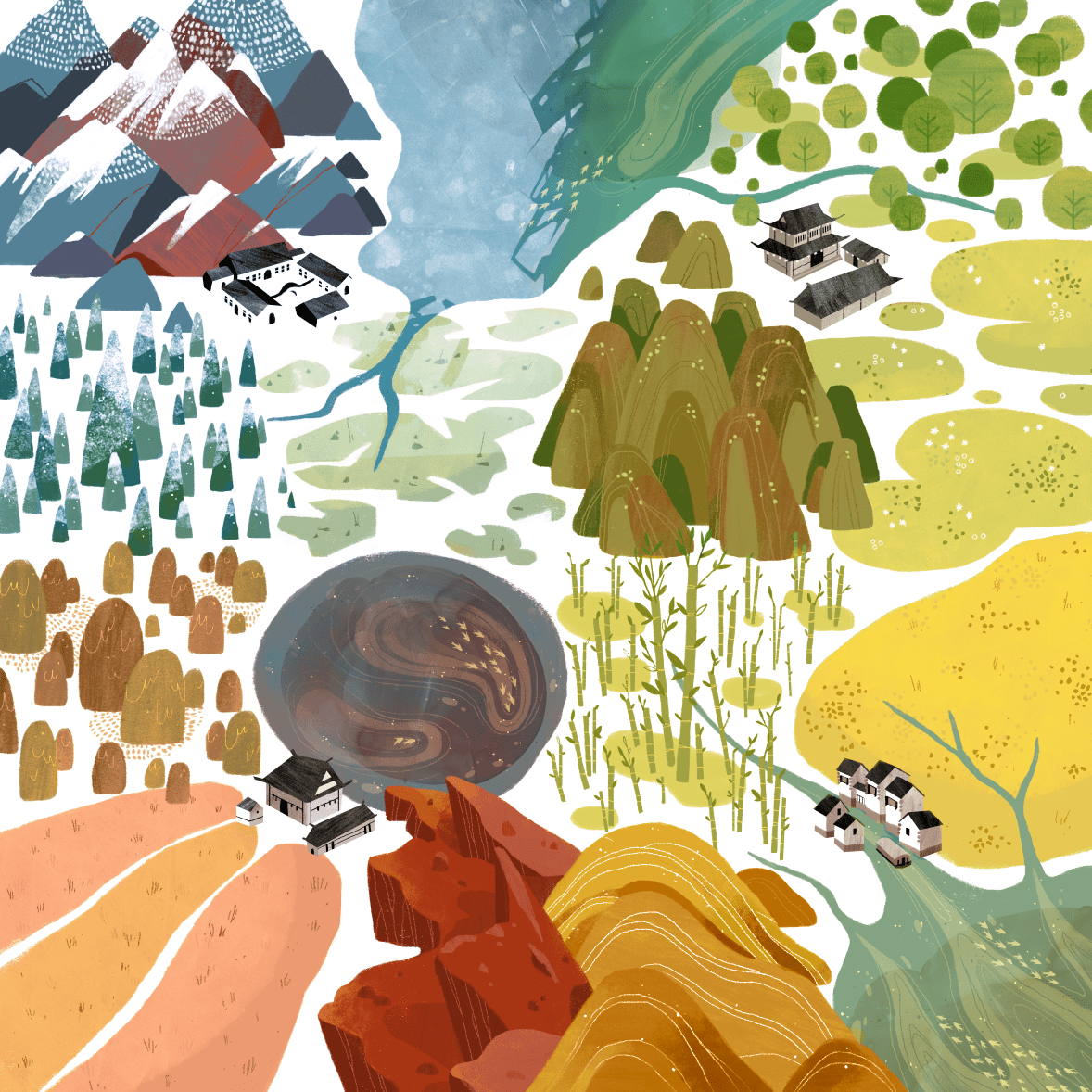
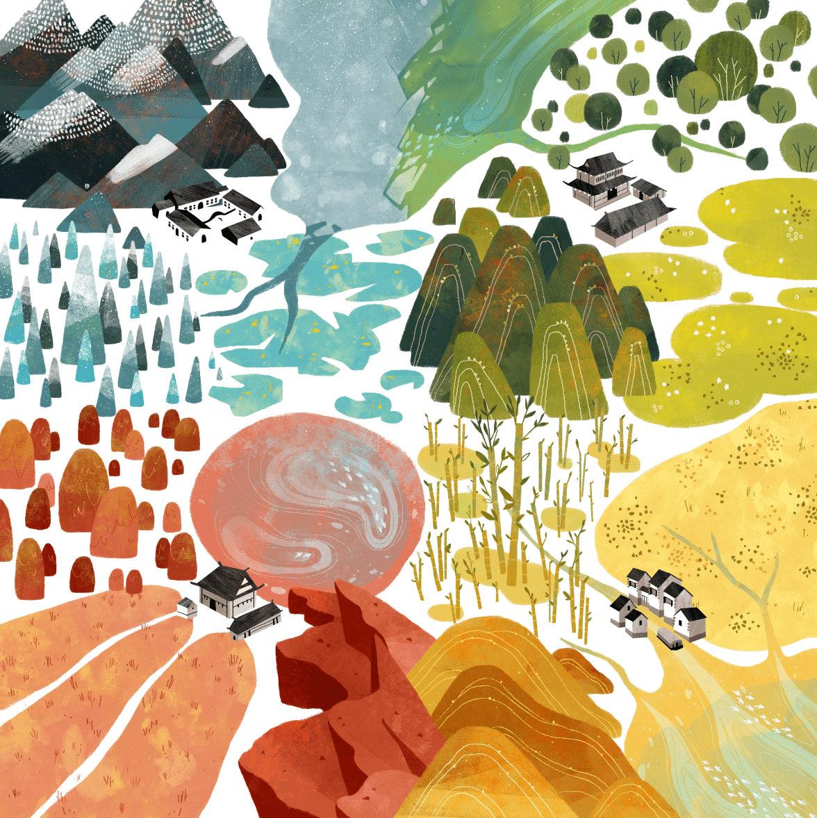
I love your use of colour so I’m curious what draws you to certain ones and where the inspiration comes from?
I think I do have some preferences toward earthy and warm colors, I find myself enjoying using rust orange, olive green, denim blue, etc. When I'm working on a new project, I first build the mood board, and one way I often use to set the color palette is to find an abstract art piece which gives the emotion that fits the project. From the abstract art piece, I gather the colors and make some adjustments from that if it feels right.
Based on your experiences so far, how should a client best approach work with an illustrator and what are some key things they can do within that relationship to improve the process?
For a board game, it's best if the game designing part is already complete, which means the game mechanics are done and the requirements for the illustrations are not going to change.
I have worked with 2 types of clients, one comes with a clear idea what they want, how many illustrations in which size they need, we sign the contract and I draw exactly what the contract mentioned I need to draw, within the deadline in the contract.
Another type of client comes to me when the game is maybe 70% developed, and it might either turn out later that I need to draw something different from what we agreed because they decided to change the mechanisms (I gave the quote based on the request), or they took longer than they planned to finish the designing part and that then affects the schedule I might have planned for other tasks once they are ready.
So I think it'll make the process easier for both if the client knows clearly what they want when they approach the illustrator. For the visuals, it'll help if client prepares some references to show what they wanted (eg: we want some floral frames like this), and which works from the illustrator's profile makes them think he/she is the good fit (eg: we like your illustrations for the XXX series..).


Do you have any advice for anyone trying to get into the industry or find work as a professional graphic designer?
The purpose of the portfolio is to show the client what you can do and how they can use you, so make it easy for this purpose. You should only present what you want to do. If you'd like to work on character design then make sure you have it in your portfolio with a clear category. Make it so the client doesn't need to dig through the whole portfolio to find what they are interested in among illustration for books, package design, or other distracting works. Save their time, they'll appreciate that. Also, just present your best works and presenting 15 great works is better than 15 great works + 10 so-so works, the later one shows your instability. The last thing, remember to add your email.
What are you currently reading, listening to or looking at to fuel your work?
When I work, I mostly listen to ambient yoga/meditation music, I find it less distracting but sometimes it also puts me to sleep, but I don't mind when that happens. For reading materials, I enjoy the references and researching process. So I'll dive into the related knowledge and expand it to other fields, for example from 24 solar terms to Wu Xing system, I enjoy learning new things. I also enjoy reading fiction, for this year I want more literary works in my reading list and to maybe work on my writing. I suppose writing and drawing skills would complement each other.
Finally, if we’d like to see more of you and your work, where can we find you?
You can find my website here: cinyeechiu.com. I’m also on Facebook, Instagram and Behance.
(All illustrations supplied by Cinyee Chiu, 2019)
If this is your first time visiting the site then why not stick around a while! I’d really recommend checking out the communities Top 10 Best Art of 2018 to see some absolutely gorgeous games and then head to my interview archive, as there are a wealth of wonderful stories in there.

PARKS: The Art in Kickstarter #5
A commercial artist isn't in the field just to execute someone else's vision. We like to approach the series as a collaboration and most feedback starts or ends with "what do you think?". That's because we value each artist's insights and ideas. Artists also work incredibly hard on their craft…
EDITORS NOTE: Hello and welcome to my first interview of 2019! Today I’m talking to JP Boneyard one of founders of the Fifty-Nine Parks print series, as together with Keymaster Games they have created PARKS: The Board Game. PARKS is currently on Kickstarter and smashing their funding goal. As soon as I saw this game I wanted to know more and I’m incredibly grateful JP took the time to talk to me about it. On to the interview!
Hi JP, thanks for joining me! For our readers who aren't aware of your work could you tell us a bit about yourself and what you do?
Thank you for making the time! I provide creative direction for The Fifty-Nine Parks Print Series. The series is a celebration of National Parks, design, and printmaking. Our origins are tied to DIY music, screen printed posters, and a love of the parks. During high school friends and I set up all ages art and music events in our small town. 100 of those shows took place in a backyard shed and we hosted bands from all over the world. As a necessity to promote those events friends and I developed a love for design and printmaking. Little did we know we'd later have a career in both!
In the early 2000's we spent a lot of time touring the country in bands and on road trips. This is where we developed an awareness of and appreciation for the parks. Being from a small isolated town in Massachusetts we couldn't believe some the awe inspiring natural wonders out there! 18 years and 350+ events later we've combined all of our favorite things into our full time focus. We still tour often but now it's with a traveling collection of gig posters and parks prints!
You helped found the Fifty-Nine Parks Print Series, so what can you tell us about it and what were some of the biggest challenges in bringing it all together?
The parks series began shortly after I moved to Austin, TX for a design job in 2015. One of the biggest challenges is finding the combination of the right artist with the right park. It's really important to find a scene that really represents the park, too. We're incredibly mindful about each artists strengths and interests. That often informs which park folks work on. Another challenge has to do with time. Since each posters costs about $3,500 to produce we have to be intentional and strategic about which park we release and when. Especially since we can only afford to release two posters a month. We know some parks only have a few thousand visitors each year. Since we've committed to making a poster of every park we know we won't recoup that initial investment for a year or two — and that's okay. But since each new release essentially kickstarts the next we have to be savvy about our release schedule. The first two years were pretty lean for us. Fortunately it feels like we're starting to gain some momentum now that we have almost every park represented.
In terms of cohesion we rely on the beautiful typeface Riley Cran designed and a simple but effective poster template. The rest is curation, some art direction, and careful color choices.
You're now working with Keymaster Games on the upcoming card game PARKS. How did this collaboration happen and what made you want to get involved?
We've loved Keymasters work for a few years now and we often travel with a copy of Campy Creatures on road trips — it's one of our favorite games we own! We were in touch with Keymaster after meeting Josh Emrich who did most of (or all of?!) the design work for Campy. The quality of the products, the game mechanics, and the appreciation for solid design really makes them stand out. I have a philosophy that basically says "swing at everything" and don't fear rejection. It was a long shot but we talked with Mattox at Keymaster and it turned out they were aware of the series! Shortly after a few enthusiastic conversations we began collaborating on PARKS! We're stoked to work together!
What kind of research goes into finding those scenes that really represent the parks? Do you have guiding principles or is it more instinctive than that?
We research every scene with each artist. Sometimes this is easier if we've been to the park ourselves. Some parks — like the ones in Alaska — are tougher to get to so we often reach out to friends or other artists who may have been. We also do as much visual and historical research as possible via the internet. We prefer basing each composition on our personal photos and experiences whenever possible though. When picking a scene we like to play to an artists strengths and choose something iconic enough to represent the park. We also like to include a loose narrative in each poster — that's often why you'll see hikers or wildlife in each poster.


Let's talk more about colour. Where do these palette choices come from and how do you use colour to communicate more about the parks themselves?
We use color to represent each park in the best light. In most cases we're being pretty faithful to the natural colors found within the parks. Some artists take a more stylistic approach to their work so we may have a color palette that is stylized but somewhat representative. We also have constraints with the number of colors we can use since each poster is a 6-8 color screen print. That in itself is a fun challenge. Showing the parks in the best light possible often means leaning towards vibrant scenes that evoke a sense of wonder and awe. This is largely conveyed through the rendering of each park and the scene we choose — the color palettes help drive this home though.


How do you go about translating the larger prints of the Fifty-Nine Parks project into the much more scaled down version we see here in the game?
Most of the illustrations were designed to look great large and still read well somewhat small. That's because we're considering what the images look like as a print and what they look like (smaller) online. The only snag we really hit was with longer park names. In some instances we had to make some tweaks to park name or the background of an image. Otherwise the illustrations felt like they worked pretty well within the context of the board game!


How has your perception of the board game industry changed whilst working on this game?
We had no idea how much play testing went into board games. It's brilliant! Usability testing exists in so many other fields, why not here!? I'm not sure why this was a surprise to us but it really speaks to the dedication of both game publishers and players!
With this project you’ve collaborated with a lot of different creatives, so what advice would you give to anyone wanting to work with artists?
I'd say the biggest consideration is respect. A commercial artist isn't in the field just to execute someone else's vision. We like to approach the series as a collaboration and most feedback starts or ends with "what do you think?". That's because we value each artist's insights and ideas. Artists also work incredibly hard on their craft. Respect in communicating what may not be working and acknowledgement of what is, is crucial. Almost every email exchange ends with "thank you". That's because I really do appreciate that someone made the time to work with us — and in many cases — made something pretty remarkable in the process.


Additionally, what advice would you give to anyone who wanted to work as an artist?
Stick with it. Practice. No matter what. And don't take design feedback or rejection personally — it's all in the interest of refining your craft. If you really do goof up on something, own it, learn from it, and move forward. At the same time be mindful of who you listen to. Message boards and comment sections are filled with critics who haven't put in the work themselves. Art is subjective and your worth as an artist — or as a human — isn't derived from other peoples approval. It's derived from loving what you do and doing your best at this moment in time. If your best doesn't feel like enough continue to work and refine your craft — you'll get there eventually!
What are you currently reading, listening to or looking at to fuel your work?
Art directing the series means I'm working closely with dozens of artists at once. For books anything by basketball coach John Wooden, NBA legend Bill Russell, mythologist Joseph Campbell, or anything on stoicism. This is often where I go for insight into working with others or finding more inspiration to enjoy this whole experience — meaning my work but also being alive! Music is all over the place but Minutemen, Kendrick Lamar, Sam Cooke, Aaliyah always do the trick. Instagram is a great resource for inspiring images of parks and finding new artists to work with.
Finally, if we’d like to see more of you and your work, where can we find you?
You can find us on Instagram at @fiftynineparks and online at 59parks.net. 5% of each poster sale is donated to the National Park Service and we screen print every poster here in the USA! Thank you for making time to talk with us!

PARKS: The Board Game, a game about exploring and discovering the US National Parks is on Kickstarter until 20th Feb!
(All images courtesy and copyright of Keymaster Games and the Fifty Nine Parks project).
If this is your first time visiting the site then why not stick around a while! I’d really recommend checking out the communities Top 10 Best Art of 2018 to see some absolutely gorgeous games and then head to my interview archive, as there are a wealth of wonderful stories in there.