

Techlandia: Art in Board Games #64
“The key for me was not to just have a guy in a suit with a Cthulhu head, but to have the guy in a suit with a Cthulhu head be just another cog in the corporate wheel…”
With all of the tech scandals of the last few years, the idea that a secret evil is lurking behind the scenes, pulling the strings, seems less like fiction every day. Techlandia is a board game that takes the premise of Silicon Valley corporations and spreads supernatural horror on top like a thick Lovecraftian marmite. Enjoy this glimpse into its dark reality.
For more great insights into board game art, be sure to check out the interview archive.
Today I'm joined on the site by Dan Ackerman. Thanks for stopping by! For our readers who aren't aware of your work could you tell us a bit about yourself and what you do?
I'm probably best known as a tech journalist, and I've been with CNET, the technology news and reviews publication, for about 14 years, covering everything from social media and hacking to laptops and games. I'm also a pretty regular TV news talking head, mostly on CBS This Morning, and even found time to write a book. Naturally, it was game-related. The Tetris Effect is the nonfiction real-life story of the classic game Tetris, which was created in the Soviet Union during the Cold War and eventually escaped to the West. Fun fact -- not only am I a New Yorker, I'm a native one at that -- born and raised here.
Dan Ackerman - photo by Sarah Tew
You've got a brand new tabletop game on Kickstarter called Techlandia. Now before we get into the game itself, after years as a journalist covering tech and videogames, why make your own board game?
Over the past several years, I've seen a lot of innovation and interesting storytelling coming out of the tabletop community. It reminds me a lot of the late '90s and early 2000s in the indie video game scene. So, when I had an idea for a story I wanted to tell in an experiential, interactive way, my first thought was: "This should be a video game." About five minutes later, I thought, "Wait, this should be a board game!" Precisely because it was about technology and technophobia and high-tech gear, I loved the idea of presenting it in a very analog way, with cards and map tiles. It made for a very interesting juxtaposition, high tech and low tech at the same time.
Alright, elevator pitch time, what is Techlandia and what's interesting about it?
Techlandia combines some of my favorite things about board games with some of my wish-list must haves. It tells a dramatic narrative story with some Douglas Adams satire vibe, it has cool characters on a hex-based map, some exploration, some combat, and the two big things that were key for me -- it fully supports solo play (or up to 4 players), and it'll fit on a normal, human-sized table. As an apartment-dwelling New Yorker, I'll tell you that's a big plus.
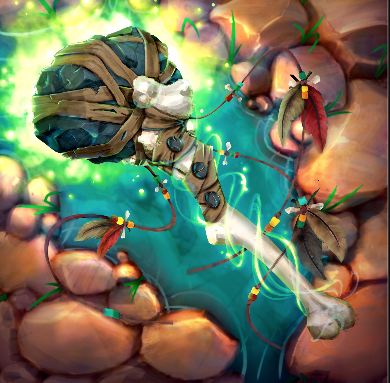
It's a modern-day dungeon crawl, where as heroic (but unknown) tech bloggers, you have to sneak into the massive headquarters of Techlandia, the world's biggest tech company. Their CEO is announcing a brand new smartphone on stage in a few hours, and you suspect he's going to use the power of millions of connected new phones to open a portal to another dimension and summon various Eldritch horrors. I pitch it as "Silicon Valley meets Lovecraft."
Techlandia - Light Side
Just to put on your journalistic hat for a second, tabletop gaming has seen amazing growth over the last decade or so. Why do you think board games and RPGs have seen such a rise in popularity and do you think this will continue?
Part of the rise, or re-rise of tabletop gaming has to do with people being burned out on digital. From non-stop news to the negative effects of social media, to harmful "blue light" from laptops and phones, it's become trendy to take time away from screens, and recapture some real-world interactions. The ongoing popularity of vinyl records confirms this, and physical book sales are outpacing digital books again. For games, do many video games are big-budget cookie-cutter affairs that lack any real imagination or originality. They're like blockbuster movies -- all focus group and no inspiration. Tabletop is in a unique position right now where it's big enough to be sustainable and have a decent economic footprint, but still small enough for auteurs and indies to compete .
First time designers often find projects change more than anticipated during their development. Thinking back to your first concepts for the game, how has it changed since then?
If anything, my concept became larger and more in-depth as I went along. The entire thing started as an idle thought after a particularly grueling tech industry press conference. "This should be a video game!" And I brainstormed briefly on the idea of an 8-bit-style narrative adventure. Then, like lightening it hit me: "This should be a board game!" I had been playing a lot of Mansions of Madness and similar games, and a dungeon crawl to escape a terrible tech company was such an amazing idea, I got to work sketching it out on hex paper immediately. It really started to come together when I flipped the narrative -- instead of escaping the tech company, you were trying to break in.
Techlandia - Night Concept Art
Techlandia - Dark Side
I've got to say, it's a great narrative concept. So how did you look to marry that theme to the art?
Techlandia is a satire, in the mode of Douglas Adams or Brazil. But satire works best for me when everyone involved plays it totally straight. The art for the game box, the hex tiles, the various cards and the characters all play it close to the vest. Dark, foreboding, creepy. But when you combine that with the text and the scenario, the humor comes out. The key for me was not to just have a guy in a suit with a Cthulhu head, but to have the guy in a suit with a Cthulhu head be just another cog in the corporate wheel. The ridiculousness and the horror work hand-in-hand, and frankly, except for the actual evil magic stuff, it's not that divorced from the real tech industry.
Techlandia - Concept Art
Where did you find your artist(s) for Techlandia and were there any challenges in communicating your vision for how the game should look?
I've worked on print magazines and websites for many, many years, often very closely with designers, so I brought a pretty solid mainstream media understanding of design to this project. That comes along with respectable skills in Photoshop, Illustrator, InDesign and the like (I mean, back in my print days, it was all Quark...). For Techlandia, I used three main artists, although I had preliminary discussions with many more, though the Board Game Geek forums, Fiverr and ArtStation. One artists did background and environmental art, another did all the characters, and a third did a single concept piece I had in my head and really wanted to include.
Techlandia - Pinboard of early game board sketches, which eventually transitioned into a hex tile map.
How long did you spend playtesting the game and at what stage of the project's development did you begin?
For me, development, playtesting and even art and design are all part of an organic whole, and you can't separate them. So, I was designing, testing, and sketching concept art from day one. For a narrative game like this, so much of the story is told visually, so if that doesn't work, the entire idea falls flat. One of the very first elements I designed was the player dashboard, which looks like a life-size iPhone. It's something I put together in one afternoon in Illustrator, and it's remained almost exactly the same ever since. Other elements change constantly, including all-new character design reasonably late in the game, when I wanted to shift gears a bit.
Techlandia - Early Prototype
Playtesting is often where board games graphic design elements are pulled into focus and refined. Did you find this was the case with Techlandia and what did playtesting make you more mindful of?
I'm not much of an artist, in that I provided original very rough sketches for a lot of the art, but they were really just pencil roughs. However, my long media career has given me many opportunities to work on page layout, UI and information design, so I'm a bit of a nut for that stuff. After the illustrations were ready, I laid out everything from the box to the rule book to the cards to the online ads. My design philosophy is all about clarity, purpose and narrative. Is the meaning of each design element clear? Does it serve a purpose? Does it advance the story?
Techlandia - Full game layout
Through playtesting, that led me to eliminate gameplay and design elements that did not advance those goals. By doing so, the writing became tighter and more focused, fiddly busywork elements were eliminated, and the visual design hewed towards minimalism wherever possible.
What are some non-game related creations (books, music, movies, etc) that you’re currently enjoying?
I'm a big reader, as many writers are. Some recent reads I'd highly recommend include Lovecraft Country by Matt Ruff and Fall by Neal Stephenson. I'm really into authors like Walter Mosley, Richard Price, and Elmore Leonard. But I also love hitting up used book stores for classic mid-century sci-fi and always look for stuff by Frederik Pohl, J.G. Ballard, etc.

The Tetris Effect - Dan Ackerman
Do you have any recent projects, or upcoming that you’d like (or are able) to tell us about?
Before Techlandia, my big project was The Tetris Effect, a non-fiction book from Hachette/Public Affairs. It's a real-life high-tech thriller about how the video game Tetris was created by a Soviet computer scientists in the 1980s, then essentially stolen by western software companies, leading to a huge international battle for the rights to the game. You can find it on Amazon or anywhere books are sold, and it even got reviewed by the New York Times.
Finally, if we’d like to see more of you and your work, where can we find you?
I am very easy to find. ;) You'll see my work on CNET just about any day of the week, where I've been reviewing gadgets and giving tech advice for the past 14 years. I'm on Twitter as @Dan Ackerman Instagram as @danack and I keep track of all my various projects at danackerman.com. Oh, and I do a semi-regular podcast where I interview authors, called CNET Book Club , and that's here:
And before I forget, the Kickstarter page for Techlandia is right here!
All images supplied by Dan Ackerman
If you’re new to the site, why not stick around a while? There are interviews with some of the best artists in the industry and if you’d like to read more you can them by heading over to the Interview Archive!

Untamed - Feral Factions: Art in Board Games #60
I think that the downfall of a lot of high fantasy themed media is that you either love it or you're indifferent to it at best. However, everybody knows what a Tiger, a Panda or Rabbit is and a lot of people have some sort of connection with animals. I think this automatically lowers the barrier of entry and allows people to actually look further than the theme…
I’m a big fan of board games with anthropomorphic art. When I saw Untamed: Feral Factions on social media, I was reminded of my favorite cartoons growing up. I had to know more. I hope you enjoy this conversation.
For more great insights into board game art, be sure to check out the interview archive.
Hello there Jeremy Falger, thanks for joining me! For our readers who aren't aware of your work could you tell us a bit about yourself and what you do?
Hi Ross, thanks for having me! I'm a game designer living Utrecht, one of the bigger cities in the Netherlands. If you ever have to chance to visit, Utrecht is great place for board game lovers, as we have 4 board game shops within 50m of each other! I also work in one of the aforementioned shops part time. After my bachelor degree in History I realised that what I really wanted to do was make games. I had been designing games since I was about 14 years old, and though I had put it on the backburner during my studies it came back in full force a few years ago. That led me to pursue a master's degree in Game Design at the University of Amsterdam and this is also where I met some of the guys with whom I eventually started our company: Grumpy Owl Games. Within Grumpy Owl Games I'm (obviously) involved with the game design side of things, alongside our other designer: Milan Lefferts. Additionally I'm responsible for the art direction and visual design side of things.


As my master degree also focused on applied (or 'serious') game design, before I became a Grumpy Owl, I worked on games focused on children's healthcare and wellbeing, at the University of Turku, in Finland. And while we've always been working on our title, Untamed: Feral Factions, for the general, tabletop entertainment market, Grumpy Owl Games also continues to develop games as training tools for the healthcare and educational market. Aside and not ever sleeping because I'm always thinking about games, I enjoy riding my road bike (sorta) fast, spinning obscure funky house tracks as a DJ and checking out traditional tattoo flash.
Can you describe your Kickstarter game to us and what makes it interesting?
So Untamed: Feral Factions is a card battle game, think Magic: The Gathering or Hearthstone. There's lots of games out there in that genre and I love the genre. However a lot of them require a significant buy-in, in the shape of time, or money, or both. I just wanted a game that's quick to setup and dive into, but still offers a level of agency as you choose your deck and your play style. Additionally I wanted a fairly balanced experience. In my opinion the shuffle-building mechanic is a perfect fit to accomplish this.


I don't claim to have reinvented to wheel together with my co-designer Milan Lefferts, but I think we took familiar elements and combined them in a package just feels really nice to play. There's a bunch of small mechanics that improve quality of life (or play?) I think. In addition to these smaller elements I also feel the 'bigger' Support mechanic adds a nice new twist to the genre by introducing a second, finite resource. It adds depth to the design without adding a bunch of extra 'stuff'. You're essentially using components you already have anyway and turn that into a second resource which you'll have to manage to get the most out of your cards and abilities. Furthermore I think the theme, artwork and graphic design is different from a lot of other games in the genre.


How long have you been working on this game? What made you launch the campaign now?
Work on the game started in early 2017. We hadn't set many limitations on ourselves except that we wanted to make a card battle game that was quick to set up and didn't have the traditional style of (fun yet time-consuming) deckbuilding. Still, this left us with a wide range of options.Thus we started experimenting with a wide range of mechanics and frameworks, most of which didn't work out in the end.


After realising we needed to set clear limitations and design goals, the design process actually progressed fairly quickly. We received loads of great feedback at Spiel 2018 and other playtest events and we kept tweaking and streamlining the design until we felt we couldn't streamline it any further. That's was when we felt confident enough to start prepping the Kickstarter.
What were some of the main design changes that took place?
We had a totally different resource system for the longest time which the whole turn structure and deck construction was built around. It was pretty novel with two sided resource cards but in the end it proved to be too limiting so we scrapped it and opted for a different combat system. I think we were actually pretty good in killing our darlings. I wrote down all mechanics we ever came up with, for future reference, but I was never really married to one particular idea, though I do love multi-use cards, so I tried to put that in anywhere possible. That's also what I enjoyed in designing together with Milan, I have a tendency to make big sweeping changes and Milan is way more conservative, so that balanced each other out nicely.


The art in Untamed: Feral Factions is anthropomorphic in style, why this theme and at what point in the process did this develop?
While we didn't really have any limits to the mechanics, we did commit to the art style and the theme early on. We felt that for a game in this genre, but without traditional deckbuilding, a different look would help distinguish itself and help communicate that this was intended to be a bit more of a casual affair yet still pique the interest of veterans of the genre. A fair amount of thought went into the theming as we wanted it to be recognisable and something that people could identify with.
I think that the downfall of a lot of high fantasy themed media is that you either love it or you're indifferent to it at best. However, everybody knows what a Tiger, a Panda or Rabbit is and a lot of people have some sort of connection with animals. I think this automatically lowers the barrier of entry and allows people to actually look further than the theme. Additionally I'm just naturally drawn to bright and vibrant artwork, so it was a natural choice to pursue this for the art style for the game.
You worked with a variety of artists on this game so how challenging was it to keep the style consistent throughout?
It was a challenge at some points, but I do think that careful selection before hand helped a lot. I spent a lot of time looking at portfolio's as well as creating a mood board up front. This made it easier to refer to what I had in mind. Also a lot of artists I worked with had the same 'artist idols' (e.g. Jesper Ejsing, Paul Mafayon) as I had, so that made everything a lot easier as well. And as soon as you have an established body of work for the game, it's easy to just refer to that for new artists coming aboard with regards to color palette and styling etc. Though I also think that it helped that we had different factions in the game, so it's okay if there's a little difference between the factions themselves, it just helps set each faction apart.


Where did the concepts for the card art come from and how much of that came from you and Milan, and how much came from collaboration?
All in all, it was a pretty organic process. Practically speaking I probably wrote the majority of the briefs but Milan and myself bounced ideas off each other, sometimes based on the name of the card or the mechanics we were doing for that faction. Other times we'd try to figure out what aesthetic would logically fit with this particular animal by looking at how a certain animal is perceived in popular culture.
Foxes for example are often seen as sneaky and sly in many (western) children's tales, therefore it just made a lot of sense to portray them as thieves and spies in Untamed, as that naturally connects with many people's expectations. After the concept for the card, the first piece I'd commission to an artist usually had a pretty detailed brief. However if we'd already done some pieces then sometimes we'd also have a bit more of a back and forth which was really fun as well.


It's safe to say clear graphic design is a must to keep any card battle game flowing. Were there any games you took inspiration from and how did the graphic design evolve during your playtesting?
For sure, during testing at Essen for example we saw people putting their Power and Support cards in all sorts of different places. We wanted to streamline that and facilitate an easy to read play area, so we added 2 little icons within an arrow shape on the Stronghold cards to help organise the player's playing area by having the Power cards always on the left, and the Support always on the right. These icons double as reminders to help players understand the iconography in the text box (mainly the paw symbol we chose to symbolise support). We also added the hexagonal icon to the back of each card to help players realise that each card can be played face down as a Power resource.
For the card frame we took a look at all the other card battle games out there. We saw a small trend towards the card frames and graphic design becoming cleaner and more simple (a trend found in every other industry as well). While the first drafts of the card frame for example had a very '3D stone skeuomorphism' vibe to them, in the end we settled for the much cleaner, more modern look we have now. It's not only easier to read, it gave us more space for text as well as providing the art with as much real estate as possible.


What made you choose Kickstarter and how did you prepare for your campaign?
As a small company and for our first game Kickstarter just made the most sense. We feel like it's a good way to gauge interest in the product and to get a community going as well as help with production costs. We analysed countless kickstarter pages of similar (and completely different) games and made an overview of what we should absolutely include and do (and not do). Additionally we also read loads of articles and blogs on how to run a successful kickstarter campaign, for example Jamey Stegmaier's blog proved to be super helpful (thanks Jamey!).


What are some non-game related creations (books, music, movies, etc) that you’re currently enjoying?
I've recently finished reading Brandon Sanderson's Mistborn trilogy, which I really loved. Looking to get started with his Stormlight Archive series during my holiday. I'm also halfway through Steven Erikson's Malazan Book of Fallen series, though I suspect it will take me a few more years to finish it due to the sheer volume, not only of the books, but also due to the huge amount of characters introduced and which I keep forgetting about.

I mostly read fantasy nowadays, though I also try to read some literature every now and then, most recently I finished Vonnegut's Breakfast of Champions, which was interesting. Music wise I listen to a lot electronic music, mostly funky house and melodic techno (Jesper Ryom for example) but I have pretty varied taste, so I also love me some American Sharks (really sweet punk rock) or Foals (indie). I haven't seen that many movies recently, though I'm looking forward to Jim Jarmusch's zombie movie The Dead Don't Die, I'm also really excited to binge watch Stranger Things season 3!


Finally, if we want to find the game and more of your work online, how can we find you?
There's a BGG page for the game here. The Kickstarter can be found here. You can also play on Tabletopia here or on Tabletop Simulator here.
I'm on Twitter (@CardbConspiracy)sometimes and I scroll through a lot of Instagram , though I don't necessarily post a lot (I just always forget to take pictures of stuff), the Grumpy Owl Games Instagram feed is a lot livelier though. If I ever have time in the future I want to start posting some more stuff on UX design in board game design, but that's still up in the air.
(All images copyright of Grumpy Owl Games)
If you’re new to the site, why not stick around a while? There are interviews with some of the best artists in the industry and if you’d like to read more you can them by heading over to the Interview Archive!

Atommix: Art in Board Games #59
Art shouldn't be in a museum where you need to go especially and pay money if you want to explore aesthetics, it should surround us…
It should come as no surprise that I’m a big fan of street art. I’ve walked around countless cities marveling not only at the talent of the art but also the location and scale of some pieces. When Rafi and Tutti got in touch about their card game based around street art, I was intrigued. I hope you enjoy this conversation!
For more great insights into board game art, be sure to check out the interview archive.
Today I'm being joined by Rafi and Tutti creators of the card game 'atommix'. Thanks for joining me! Before we find out about the game itself could you tell our readers a bit about yourselves and what you do?"
We are a duo of street artists from Tel Aviv otherwise known as Extra Crunchy. We’re creating murals and traveling together around the world for 3 years, nomadic lifestyle. Recently we’ve settled down in Costa Rica. We painted at street art festivals and music festivals. While traveling, we got to meet some of the guest artists (on the game) and thought it would be rad to form a project with them. Rafi also has a background of 3d modeling and animation and we both love creating art and finding new sources of inspiration.


Let's talk about your art collaboration, Extra Crunchy. When did it start and what have been some of your personal highlights along the way?
We’ve been doing Extra Crunchy since we started traveling three years ago. We both come from different artistic backgrounds. Rafi’s artistic style is more 3d because of his background and I’m more illustrative and flows. It seemed like going on an adventure together and combining our styles was the most obvious thing to do. We started in Panama and continued to about 10 other countries on this planet. Basically following opportunity, wherever we could paint and had good friends and vibes. We got influenced by each other’s style throughout this journey, and shared different kinds of inspiration to create Extra Crunchy. It’s always fun to check art together and zoom in on techniques.
You’ve now collaborated to create a card game 'atommix'. What inspired you to create a game and what do you think makes it interesting?
It started with an illustration we decided to call ‘Helium’ and slowly continued to grow. We thought it would be fun to learn science by illustrating the elements. Later on we realized a game would be the perfect way to engage with the cards, so we started creating the gameplay. Most of us have long ago discarded the periodic table from memory. But in order for it to genuinely stick we have combined the Elemental properties with visual language, which is immediately interpreted by the brain. Our brains are far more engaged by storytelling than just plain text, so by placing powerful and beautiful images next to words our brains create an immediate connection between the two - just like in advertising - the same manipulation can be used for a better purpose.


You're working with artists from a variety of backgrounds on this game. How did you decide who to include and when it came to directing the artists what kind of brief did you give them?
While traveling we had the opportunity to meet many great artists from different fields, street art, visionary art, character design and whatever in between. We feel art is a high form of communication and big ideas should be shared through them. It felt more accessible to refer to them first. We were looking for artists who also resonated with the project and could express that. Some of the artists had a clear vision for the element they wanted, and some wanted us to pick for them. We sent them the characteristics of the element and let them tell a story from their point of view.


What kind of characteristics would you give for the elements?
We did a lot of research about the properties of elements and what makes them magical, and decided to focus on the most interesting chemistry information we found. For instance, if it’s magnetic or diamagnet, metal or nonmetal, high or low reactivity, electric conductivity, energy levels and families. We wondered what we would like to learn about the elements and what would be fun to translate into a symbol. The symbols ('or special effects') are serving different purposes throughout the game. They are inspired by actual Alchemic symbols.


So how did you get started as street artists?
We're both inspired by street art. We love the idea of large scale art on the street. Art shouldn't be in a museum where you need to go especially and pay money if you want to explore aesthetics, it should surround us. We started with our first piece three years ago in Tel Aviv central bus station and we've both been hooked ever since. It took us some time to learn to work together, how to give and receive critique and create for the being that is Extra Crunchy that allows us to deliver our message better.
What do you think are some of the differences between street art and that of other mediums?
Street art in our opinion has raised the bar in the last few years. Pieces being made these days are such high quality, we believe it's made by some of the greatest artists ever lived AND they are not dead yet :) People are doing 12 story building murals with super high skill and often it's a one man band. You can see how different styles are merging together on buildings in international cities; hyper realistic with calligraphy, graphic design with portraits and so on. It's a strong effort of one to communicate a message.
Looking back on our first piece, it was actually two separate pieces one next to the other also designed separately. We would definitely do it differently today, nowadays we just move the sketchbook/sketch pad back and forth fixing, correcting, and creating the story as we go. Large scale mural open and shut different options in terms of size. It's best to have a rough sketch, see the wall and shape it accordingly. We never really know how a final piece is going to look like exactly.


When it comes to the game itself, how has it changed as you've been developing it?
Creating the gameplay wasn’t easy for us, we’re more visual artists than gamers. But we love learning new trades so it saw it as a challenge. When researching other card games we saw mostly what we DON’T want it to be like. It started as a Uno/Taki type game, a well known casual game that would be easy to catch up with. Naturally we kept finding ways to make it stand for itself. After we perfected the rules we found out that writing it down as a rule book was yet another challenge. We’re getting as much feedback as possible from reviewers and gamer friends, and using their high standards to make extra special.

What lessons have you learned about game design in this project so far? Have there been any surprises?
Everything is a learning process and because it's our first time running a Kickstarter we have to learn who our audience is and what they’re looking for. We wish to use this platform to allow an open communication with the backers, so we can use our collective intelligence to perfect the game.
As creators we are really enjoying the process of developing the gameplay. We had the idea of creating multiple levels and unlocking them during the campaign. Looking back it might have been better to reveal all of the levels at launch, because we figured that many potential backers that wanted to see the whole game might not return later on.

How has your perception of tabletop gaming changed?
Since we're more gamer creators, or let's say 'experience creators', we want to communicate with the gamer audience and elevate the game experience. We have some gamer friends who have reached out to design a higher level of game. It's important for us that it will be engaging in many aspects. This way the chemistry and the art will be memorable and THIS is what we want.

Do you have any advice for anyone looking to become an artist?
Be consistent. Make yourself spend around half an hour a day and draw shapes for fun, no expectations. Collect three favorite artists and study them, take note of the details you like and try to apply that in your work. Make your tools accessible for you to keep them in sight. But most of all - practice.
What are some non game related creations (books, music, movies, etc) that you’re currently enjoying?
Tekkonkinkreet, Paprika and Ghibli films are favorites. recently watched Kung Fury for the third time and also loved Hereditary and Jordans Peele's work, Get Out and Us. (Ross, if you haven't seen these yet, we recommend you to). In the video (on the Kickstarter page), the music is by Symbolico. These days we mostly like electronic music we can paint or work with, like Symbolico, Ott, Man of No Ego, Clozee, Hypnagog. Also we both look forward to the next Tool album.
Finally, if we’d like to see more of you and your work, where can we find you?
You can find atommix on Kickstarter here until July 10th. You can also find us on social media: Facebook / Instagram. Our website is: goextracrunchy.com
Instagram accounts for the artists featured in atommix:
Deih: https://instagram.com/deih.xlf
Thoth: https://instagram.com/t.hoth36
I AM EELCO: https://instagram.com/iameelco
N30: https://instagram.com/n30n3
Dragon76: https://instagram.com/dragon76art
Lubomir Arsov: https://instagram.com/lubomirarsov
Sermob: https://instagram.com/sermob1
Emily Ding: https://instagram.com/_emilyding
Hobbes Escrew: https://instagram.com/hobbesescrew
Otis Chambelain: https://instagram.com/otis_chamberlain
If you’re new to the site, why not stick around a while? There are interviews with some of the best artists in the industry and if you’d like to read more you can them by heading over to the Interview Archive!

Matijos Gebreselassie: Art in Board Games #57
The art director should be in charge of the final stitching of art components so they come together as one. You try to avoid the effect of a Frankenstein being put together from lots of different elements. It doesn't mean that only your art style goes on top of the last edit, it could be anyone's from the team, it's just a matter of keeping it all consistent at the end.
I first noticed Matijo’s great work on Dinosaur Tea Party before discovering he’d worked on Chronicles of Crime, a board game I’d supported on Kickstarter. I knew I wanted to find out more about his particular style and of course his photo realistic work on Chronicles of Crime. Enjoy!
For more great insights into board game art, be sure to check out the interview archive.
Hi Matijos, thanks for joining me! For our readers who aren't aware of your work could you tell us a bit about yourself and what you do?
Hi Ross, thank you for reaching out to me. Yes, I always wonder where to start with introducing myself- I'm a Pole, mulatto with Ethiopian Roots that was born in Sankt Petersburg, Russia. It usually works on job interviews as from the start everyone is curious about the combination.
I got my education in Poland and lived there from my early years. I've always been very passionate about drawing and expressing myself through illustrations. With the right mix of my other loves, cinematography and comics, I guess I figured out a characteristic art style for myself; cartoony and atmospheric with heavy outline. I also started experimenting with bringing my artwork to life and that led me to graduate from Polish National Film School in Łódź.
NetEnt character from Lost Relics game
This was a great place that gave me the skills to execute animation in a professional way. While still studying I moved to the capital city and started working on animated movies, then later on, mobile games. Then I traveled to Kraków and that happened to create many opportunities for me. As an Art Director there I guided teams and was creating slot games. But by night I continued on delivering freelance passion projects - like board games.
Right now, I'm quite fresh after a relocation to Malta where I continue to work on slot games, this time with some additions in game design along with the art.
Gandalf Set - Vikings Gone Wild
So how did you first get involved in making board games?
While moving to Krakow I was already in contact with Lucky Duck Games. Everything started with that company. Earlier I saw an ad that they were looking for a supportive artist for their new title Master of Elements, an expansion of the successful ‘Vikings Gone Wild’. I was attracted by the fantasy theme and cartoony art style that this game had and I knew it wouldn't be a problem for me to deliver something similar after hours. I drew a couple of cards for a start but soon the Kickstarter campaign turned out to be such a huge hit that fans started reaching almost every stretch goal planned within a day or even a few hours. New artwork for cards was needed to be done extremely quickly in order to update the campaign. It was a very pleasant time full of challenges and late night emails: 'We need 3 more!'.


When the dust has settled the CEO and Founder of Lucky Duck Games, Vincent Vergonejeanne invited me to the office with an offer of a wider collaboration. He showed me the prototype of Chronicles of Crime invented by David Cicurel with only placeholders on a print. Everything was yet to be filled with proper art and I was absolutely blown away by the whole gameplay concept and innovation.
Once again full artistic freedom was given to me by Vince with lots of trust and professionalism. In my previous experience that wasn't very common. So board games with LDG became my true passion!
Chronicles of Crime - photo taken by More Games Please
Your work spans quite a number of fields, from animation, film, concept and game art. How do you think this experience changes how you approach each new project? What key lessons do you think you've learned that you can apply throughout your work?
At the beginning I tried to grab almost every job opportunity in the industry there was. As they joke:
“So why do you want this job?”
”Well, I've always been passionate about not starving to death, sir”
Personal artwork
My girlfriend at the time, now wife, supported me all the way in order to stay focused and on track no matter the obstacles. So I was always doing art. Art in different forms that each time brought me joy. My goal is to use cinematic eye wherever I can, to leave a characteristic mark on everything I do. Now I've got this privilege to get involved in new projects only because I'd like to, not because of necessity and board games are a perfect example of this.
I realized that in every job I have I use the same skill set package that is learned once. No matter if it's VFX for the film, costume or scenery design for a theater, mobile, slot or board game. It's always sketching, storyboards, polishing in different art styles and animating. Each field somehow needs to use those tools.
I loved to work on my own but as an Art Director I guess I've learned to focus on teamwork more and I like the different chemistry that it brings. Everyone learns from each other and push projects forward at a pace that you'd never achieve on your own.
Sketch art for Dino Tea Party
I first came across your work in ‘Dinosaur Tea Party’. It’s characters are larger than life, so how did you create them?
Thank you, glad to hear that. At first I was given the theme and a core idea: 'Let's imagine dinosaurs wearing Downton Abbey clothes having a tea party'. With my character design I aimed for something family friendly and witty. I suggested my take on a single outlined sketch, it depicted a dino wearing a bow-tie, a hat and a monocle holding a bubble pipe. Then Restoration Games were kind enough to leave the entire art approach to me afterwards.
I was provided with a list of Dinosaurs names, not species types, actual names like Betty or Bob, which were gathered in Excel. This list contained visual characteristics required for the game play, assets like hats, glasses, flowers, patterns on the skin etc. Then I did some research on the different dinosaurs looks for inspiration. In the end some of them are based on real species, but with some mix of features as my imagination dictated. I just tried not to repeat myself visually. For the polishing part I used a technique in Photoshop that was new to me at the time, grey-scale maps. It was worth taking a shot at using it, as it's an extremely time saving technique, good for tight deadlines and it helped to keep everything consistent in style.


You mentioned you’ve learned to change how you work now that you’re an art director. What do you think are some of the most important aspects of this role?
To me it would be overall vision of the entire project and consistent art guidance towards the final product, plus creating a friendly atmosphere for the team because only then you can outperform the project in every aspect. For a long time in my artistic education I was very self-centered and tried to be self-sufficient in everything I did. The role of an art director (AD) opened different doors for my workflow model.
Chronicles of Crime - Draft box cover
The first thing is to know your team members; their strong fields of profession, even their attitudes toward different tasks. Only then you can assign the right one and control the development. The second very important aspect for me is the final composition. The AD should be in charge of the final stitching of art components so they come together as one. You should try to avoid the effect of a Frankenstein being put together from lots of different elements. It doesn't mean that only your art style goes on top of the last edit, it could be anyone's from the team, it's just a matter of keeping it all consistent at the end.


Chronicles of Crime ties it's narrative into real locations. How do you go about creating these art assets with the real world in mind?
At the beginning of the project I just needed to find the right style. I started with the character design of our victims/suspects cards, where with the studio we've chosen black comic book outline and a slight exaggeration of some features as a guideline for the entire game. It's actually something in which I feel the most comfortable.
Then I aimed in translating this to the location cards and 360 VR panoramas, which was a bit different because this time I wasn't designing from my imagination. The locations are based on the real London districts so I needed to stick to the right look. I began with photo research, and I created a library of references. Sometimes it takes half an hour, but with more complex views it may even take a couple of days.
Chronicles of Crime - VR scenery
Then comes the most engaging and important part of the entire process, compositing photos together. After this there's a time for the outline, which basically does major part in compositing because it blends everything nicely. Then a couple of Photoshop filters and lots of brush over-painting, that simplifies the shadings and gradients which gets away from the realistic feel and brings in more of an illustrated effect. The best part is this last stage where you already see everything in its place and the only aspect left is playing with the light, rim lights, reflections and gentle touches of brush stroke.
I learned this technique at the beginning of my freelance path where I was designing Hidden Object Games using photobashing.
Chronicles of Crime Location - Camden Town
Photobashing is the technique of combining photographs or images, using painting and editing to create larger pictures. Although it's a common technique in digital art some have accused it as being "cheating". What would you say to people with this opinion and how does photobashing help illustrators work?
Photobashing is for sure an excellent technique for concept art and the mood board stage. In many fields in the industry it helps artists deliver multiple high quality illustrations in a short time. It works similarly to story boarding in a sense, in that it clarifies visually where you’re aiming with the style and overall look. But when doing your final renderings it's of course all about being smart and having in mind intellectual rights, with heavy editing a must. This means cuts and edits, with strong over-painting that will change the basic look. It's just another technique you can reach for if you decide to achieve a photo realistic effect, it goes along with over-painting 3D models and pasting photo textures which is absolutely fine with me. If you manage to do it right, you can have unique and fresh visuals out of pre-made materials.
Chronicles of Crime Location - Soho
You mention looking to leave a charismatic mark on everything you do, so in a practical sense how do you approach each piece of art to ensure you do this?
When working on different projects that vary from each other I want to find the right technique that supports the core vision and a story, but my relatives always mention that they can spot my style in everything I do, so I guess I'm not that elastic after all and fail with each trial!
Of course, cartoon looks and black lines comes naturally as I sketch at the beginning of everything. Even when I decide to skip the outline in polishing I usually go for very strong rim lights (that does almost the same job but with opposite, bright colors) and that was the case of Dinosaur Tea Party made for Restoration Games for instance.


But aside from the technique, I guess I always go for a certain look of a human or monster body that is taken from the pop culture that I value. I push with a specific character design that I developed naturally through my learning process. So it doesn't matter if it's a scary and realistic horror project (concepts for a theme park attraction with VR technology) or concepts for more friendly Fireball Island board game - you'll always find my way of drawing muscles, eyes or hands. Even, or only, those small details.
How do you keep the balance between your work as a freelancer? Do you have any advice?
Actually I don't think I keep the balance at all. I should be the last person to give advice on that matter, but if I have to:
”Kids, if you'd like to follow my footsteps I suggest unhealthy little amount of sleep, late chocolate snacks and a good playlist in your ears”.
Night is perfect for art challenges, it's like winning an extra day.

The Bridgevale Train Company Conductor
What are some non-game related creations (books, music, movies, etc) that you’re currently enjoying?
I'll refer to something that I enjoy listening to while working on my projects. My playlist is always very strange because it mixes Rammstein with Vivaldi and Max Richter, but as a polish, patriotic move I'll recommend to all amazing bands like Bass Astral x Igo and Kwiat Jabłoni. I also look for interviews with writers and people of cinema, recently the Hollywood Reporter gave nice insight releasing on Youtube 'the Roundtable', a series of discussion panels. I think that cinema is something that I’ve had in my blood from birth, but while working I limit myself to audio only. I think almost every stand-up on Netflix I've got checked as 'watched'.
Screen from music video for Bass Astral x Igo and Sistars
Finally, if we’d like to see more of you and your work, where can we find you?
Feel free to check my Instagram where I usually post more often. Then there is my ArtStation account where I try to keep my work organized.
(All images supplied by Matijos Gebreselassie)
If you’re new to the site, why not stick around a while? There are interviews with some of the best artists in the industry and if you’d like to read more you can them by heading over to the Interview Archive!

Sarah Keele: Art in Board Games #55
The Salem witch trials was a dark time in American history and there were a lot of innocent victims, self righteous individuals and perpetrators. Lots of death, fear, lies and betrayal…
I first spotted Sarah’s art through her work on the Dark Cities Series by Facade Games, which I supported on Kickstarter. Seeing the complexity and quality of the art grow as the series continued inspired me to have this conversation. I hope you enjoy it!
For more great insights into board game art, be sure to check out the interview archive.
Hi Sarah, thanks for joining me! For our readers who aren't aware of your work could you tell us a bit about yourself and what you do?
Hi Ross! Thanks for having me. First off I want to say, this is a really cool thing you are doing here. There are a lot of talented and amazing individuals you’ve brought together, and I’m really honored that you’ve invited me to answer your questions and be a part of this community.
Now, a little about me, I’m a member of the Church of Jesus Christ of Latter Day Saints (that drives a lot of my life and how and why I do the things I do) and I live in the great state of Utah in a cute little 1950’s home (with a sporadic layout and lots of add-ons) with my husband, Josh and two little daughters, Juliet and Sivenna. I don’t have a day job, so I work exclusively on my freelance work which consists of games, custom portraits, book covers and magazine illustrations as of late. When I’m not doing freelance work or spending time with my family, I’m learning how to cook something new, gardening, contemplating our next renovation designs, collecting coins, or working on my graphic novel, GreenThumb.
So how did you first get involved in making board games?
My first board game, well card game, was Salem 1692 by Facade Games, but back then they weren’t Facade Games yet, they were just Travis and Holly Hancock, and they were fellow college students at Brigham Young University. I had never met them but they were looking for an artist for their first game so they posted a listing on the illustration job board. I saw the listing and I remember getting excited about it thinking it was fun, but then seriously debating on if it was a good idea to embark on such a project as a student.
At the time it sounded like a lot of work. And at the time for me it was. I was a student and things were already so busy, but again, it looked like it would be a lot of fun, so I did a sketch of Ann Putnam, sent it off, and they loved it. That sketch is now on the cover of the rule book but the character ended up being Mary Warren. I don’t think anyone could have predicted how much Salem would take off! Travis and Holly only imagined their friends and family playing it and supporting them. They had the funding goal of $6000 on Kickstarter, so when it reached $100k we were all absolutely blown away.
With hindsight, I think the tabletop game industry was in the beginnings of a boom with a subtle rebellion against screen time and with new crowdfunding platforms readily available to shift how new game designers could now get themselves published. Salem hit a nerve in the market. I see it being a big stroke of luck. From there Travis and Holly took advantage of the success and quickly got started on Tortuga 1667 and officially created Facade Games, which was another raging success from what our expectations were and now Deadwood 1876 yet again exceeded our expectations. They keep thinking it’s a fluke. And maybe it still is, but now they have loyal supporters and people who want everything they do. I think I’ll keep going with it.


In what way do you think your education prepared you for industry work and looking back how did you feel less prepared when starting?
It’s funny you ask this because going into the tabletop industry was not something I ever could have anticipated. My training was for doing visual development for video games and/or film. I don’t think any of my teachers even entertained the idea “oh you could do board games.” I don’t think they were against it or anything, it’s just more popular to dream of working for Pixar or Blizzard or even doing children's books and editorial work. Those industry’s seemed more “prestigious” maybe? Perhaps that’s not the best word. At the very least they are very structured and the path to success in a lot of those industries is clearly mapped out with lots of resources. There didn’t seem to be as easy access into finding out what industry standards were for the board game industry back when I first started or I just didn’t know where to find them. I think this site alone would have been a fantastic resource for someone like I was starting out.
I think maybe the Hancock’s struggled as far as what would be our standard as a business relationship between designer and illustrator. We learned a lot together, and now I think we have figured out a system that works for us. I feel like they trust me to do my best work and because of that every game I’ve done since Salem has felt like “mine” and I’ve got to push myself artistically a little bit more each time.


When it came to working on Salem 1692, how did the subject matter, the witch trials of this time, guide or affect the way you illustrated the characters themselves?
I did make a conscious effort to make all the characters moody. The Salem witch trials was a dark time in American history and there were a lot of innocent victims, self-righteous individuals and perpetrators. Lots of death, fear, lies and betrayal. Mary Warren (the first one I did, and the one I actually initially envisioned as Ann Putnam) was a perpetrator. She’s the one who started the witch hunt. When drawing her I wanted her character to feel ominous. Drawing her also set the tone for the rest of the art in the game.
Is the art and everything completely historically accurate? No, Not even close! While I did loosely reference images of individuals we were including in the game, those references were also another artists representation of what the actual individuals may have looked like. As there are no photos of that time period there was a lot of freedom for me to put my own twists into how these characters.. er.. people may have looked. I did have a few I kept close to their portraits, like character William Phipps for example.
I’m not sure whether the Hancock’s or I ever articulated this to each other, but for me the goal was not to be historically accurate. It was rather to simulate, to the best of our ability, the mood we wanted the players to feel while playing the game so that people could have fun and enjoy the game. The bios included in the rule book are the most accurate part.
I can imagine the first game presented plenty of challenges, both with time management and through the learning curve of the project. As you started on the follow-up Tortuga 1667, what did you look to do differently?
With Tortuga I was no longer a student, so I was ready to put my full and undivided attention into the game. Seeing the success Salem had, I knew I needed to step up my game. With Salem, I’ll be honest, I see a lot of flaws in my drawing skills in the art due to a combination of things like a lack of experience, feeling rushed, being a student and not being very good at managing my own time.
I was still familiarizing myself with digital painting programs like Photoshop, which is partly why the colors are so muted (aside from purposefully trying to keep things moody), things like that. It was no ones fault and it was the best I could do back then. With Tortuga though, I felt the urge to really push myself. and again I had quite a bit of freedom to just go for it in terms of taking charge of the direction for the style of the art. Plus, I had the time to do it. So I took my time and put a lot of love into those characters.


The latest game in the series, Deadwood 1876 features some of your most detailed work yet, with the characters giving off not only a sense of era but also a presence too. How did you look to bring more energy into these illustrations and what are some ways an artist can make their work seem more alive?
In Tortuga I put a lot of research into the 1667 pirate era and spent much of that time learning about what the characters should look like, but I kept the backgrounds fairly minimal. For Deadwood, I decided to put as much effort as I could into the backgrounds as I did the characters. So, for example you have the Saloon bar behind Kitty Leroy. In Tortuga I also kept characters in similar or simple poses only showing above the torso. For Deadwood, I made a point to make them look more natural and reveal enough of their body to get a feel for what their poses were, what they maybe were doing and where they were. The character, Al Swearengen for example was a pretty sleazy guy, so I have him doing the classic greasy hair swipe. He was one that did not have readily available old photos to refer to so with my artistic license I gave him big dark/villainous buggy eyes, inspired by actor Richard Harmon.
One of the more tricky ones for me to depict was Reverend Smith. If you notice in all the other deadwood characters, there’s not too much variety in the facial expressions (this might even be something I’ll try to better at on the next game I do for Facade Games). However, with Reverend Smith, I really wanted him to look like he really believed in what he was saying, and I wanted to feel like I could hear the tone of his voice as he was speaking, so I referenced preaching pastors from videos and paused them on frames where I liked the pose. I also gave him glasses to hint at the fact that maybe he studies the small words printed on pages of the bible often and wears out his eyes. His is mouth open and wide mid sentence and hands up passionately.
To really give a character life and light, it really helps to use references. Videos help me find new poses that I might not have thought of otherwise, plus it’s natural. For Poker Alice, I imagined her being fidgety during a bluff. She’s a definite gambler, but if she loses this round, (even though she looks like she’s winning now) she might be in really big trouble. She keeps her poker face up though, and is always fashionable. You just find ways to personalize them and give them subtle dimensions. Sometimes those things are big and obvious like a certain pose or expression, but sometimes they are little details like a pocket watch, or a pair of reading glasses. Those details make an impact.
Now as far as making a game look really good, it’s not just about the character, there’s a lot that can go into the supporting cards as well. I had loads of fun with those too and it gives me lots of practice drawing things that aren’t human.
When it comes to illustrating inanimate objects, what are some of the challenges in keeping these items interesting and engaging?
There are a few things you can do to make an inanimate object interesting or give it life. Depending on the style or feeling you are trying to evoke with your work whether it be humorous, moody, calm, etc, you can give your design a bounce to it by pushing the shapes and proportions and avoiding complete symmetry and equal repetition. Color is another powerful tool to evoke mood. One thing I had in mind as I drew the item/action cards for facade games was the pose of the objects or things.
I drew the bucket of water in Tortuga with the bucket tilted and pouring water out as if actively putting out a fire as it’s action was intended for the game rather than resting stagnant. In the Deadwood, the Cash card has a big messy pile of money as if someone threw or stuffed it in the safe in haste with some falling out because the door has just been opened and those bills no longer had a support. I could go on. All the art in the game should enhance the story behind it even if it’s not noticed at first. Players will feel it even if they can’t explain why when the art has been done well. Supporting cards are not usually in the spotlight like character cards are, but they are equally vital to creating a world players can get lost in.
How have you grown and developed your skills as an illustrator during the time you've worked on these games?
I’m always looking at other illustrators artwork, especially those whose skills proceed my own. I’m also looking specifically at the art of other table top games. Since, as I’ve said, there didn’t seem to be a whole lot of resources when I first started as to what makes a good game art design for board games, I’ve had a bit of trial and error. However, if you are a new illustrator looking to make your mark in the board game industry, it doesn’t hurt to always be honing in on your skills.
There are endless resources on how to improve drawing and painting skills. I went to college for my education but I know plenty who didn’t and are still doing great as artists/illustrators whether in the all encompassing entertainment industry or not. The first key to success as an illustrator in any platform is to make good art. Make good art and good things will come. The Second key though is just as vital. Make your work seen. If no one sees how great you are, then all your hard work is for naught. Sometimes this means getting out of your comfort zone and reaching out to people and doing more than just waiting for someone to find you.
Do you have any other projects underway, or coming up that you’d like (or are able) to tell us about?
I have a few that are still secret at this time, one of them is the next Dark City game from Facade Games! Ah! Then I have my ongoing Custom Character Cards on my Etsy shop where I do custom portraits of people (or pets/animals) in the style of one of the 3 Dark City games and print it on a character card so players can play themselves. (Examples attached include Façade Games creators Travis and Holly Hancock, repeat customer Jason Smith with his family and the fantastic Pirate Enthusiast and pirate game reviewer JW Cornelius of Pirate's Parley Gaming).


I did a book cover for upcoming author Cami Murdock Jensen, whose book is titled First Earth, the first in The Arch Mage Series about a girl who survived an explosion as a baby and grows up a burn victim before being catapulted into another world full of magic and demons where she gets treated a little differently than what she’s used to.
I recently did the cover for a children’s magazine called The Friend for the May 2019 issue. I grew up reading this magazine so it was very special that I’ve been able to do work for them.
I was also pleased to participate in a podcast with Artifice starring Emily Merrell who is launching our conversation sometime in June where we discuss creativity and how many different forms of creative careers overlap in experiences and challenges more info:
I’m always working on my comic GreenThumb when I have a minute, but I still have a long ways to go on it. I was taught however to always have a personal side project to work on for dry spells in freelancing.
Man, I'm seriously sooooo excited about all of these!
What are some non-game related creations (books, music, movies, etc) that you’re currently enjoying?
Resources: Will Terry’s Youtube channel. He talks about the basics and goes into depth about the business side of illustrating. He doesn’t go into the business side of board game art, but he does talk about negotiating and dealing with clients who are so savvy at speaking the lingo of artists. I have found his knowledge and experience to be helpful to me.
Color and Light by James Gurney is always a great book to have in your repertoire. Schoolism is a great resource for those with a little bit of money they are willing to invest in themselves with. Some of the schoolism teachers have youtube channels with great educational videos or interviews with leading industry artists.
There’s also always the good old fashion, find someone who you think you can learn something from and reach out to them and ask them if you can ask them some questions. Seriously, there are so many things!
Finally, if we’d like to see more of you and your work, where can we find you?
I have my main website that I’m still building on, and of course you can find me on Instagram, Facebook, Etsy, Pinterest, Artstation and even Deviant Art.
I also will be sending out email newsletters for those who might be interested in that.
All artwork copyright of artwork Sarah Keele. Photography property of More Games Please.
If you’re new to the site, why not stick around a while? There are interviews with some of the best artists in the industry and if you’d like to read more you can them by heading over to the Interview Archive!

Feudum: Art in Board Games #54
When Mark and I discussed the art style, Mark had a very specific vision in mind, which can be a double-edged sword! A lot of people struggle with vision and don't know what they want (or don't want) until they see it. Mark knew exactly what he wanted…
Feudum caught my eye back in 2017 when its campaign on Kickstarter launched to huge success. You voted it into your Top 10 Best board game art of 2018, and since then it had another very successful run on KS for the Rudders and Ramparts. I’ve long been a fan of the art, so this conversation was overdue. I hope you enjoy learning more about the series.
Check out the interview archive for more great insights into board game art.
Today I'm being joined by Mark and Justin, designer and illustrator on Feudum who will be telling us more about that game and it's upcoming expansion Rudders and Ramparts. Thanks for joining me! For our readers who aren't aware of your work could you tell us a bit about yourselves and what you do?
Mark: Great to be here, Ross. I guess you could say I’m a toymaker, living in the suburbs in a small town named Columbia, Missouri. To me, tabletop games are toys—albeit advanced toys that stimulate your mind. I also have a side gig as a Professor teaching strategic communication at the Missouri School of Journalism.
Justin: Hello Ross! I'm an artist living in Jackson, Mississippi. I work at an advertising agency during the day as a Sr. Art Digital Art Director and illustrate/design posters (and now, board games!) in the evenings.


How did you two first start working together? Can you remember those first few conversations?
Mark: This is going to sound a bit far-fetched, but it’s 100% true. I walked into an Ice Cream shop called “Sparky’s” and saw a poster for a band on the wall (some examples of these are above). It featured a giant monster traversing the countryside, and I immediately thought… “that has to be my artist!” When I found Justin’s email on the internet, I wrote a long and rambling email asking him to consider working on game art. To my surprise, he wrote back.
Justin: Yeah! Like Mark said, he sent me an email with something like "a guy with a dream" as the email title. I was like "oh great, here we go!" haha - just assuming it was another request for some free work for "exposure." But it really ended up being this thoughtful, heartfelt email about Mark's dream of creating a tabletop game. To an artist/designer, it sounded like a real dream project! Mark seemed very intelligent, creative, passionate and honest - so I was intrigued to say the least!
Marks Handmade Prototype - Feudum
Mark’s Daughter playtesting Feudum
Alright, elevator pitch time, what is Feudum and what makes it so special?
Mark: I had been playing Eurostyle (or German Board Games as they used to be called) for nearly 15 years. I immersed myself in the creations of Knizia, Teuber, Wallace and Seyfarth thinking that I’d find the holy grail of games! One with a working economy, with depth, with a wide open-world with multiple paths to victory. I couldn’t find what I was envisioning! So, I invented Feudum.
Justin: One thing that makes Feudum unique (design-wise) is the cohesion of the icons/graphics with the game itself. When researching tabletop games I was always baffled by the icons being completely detached from the rest of the design. Harsh outer glow effects and dark drop shadows on vector icons that were obviously designed without taking the original artwork into account. I suppose it was the result an illustrator not putting much thought into leaving "blank" areas for icons to live, and icon designers wanting to make sure their elements stood out - but to me, the end result looked like this mish-mash of design. Nothing felt like one complete, cohesive project - so one of my main goals artistically was to make sure Feudum felt like a timeless "artifact." Mark and I agreed that using iconography that was language independent was also important.


Let's talk for a moment about the world you've built with Feudum. Where did the initial idea for the theme come from and how did you decide on the visual style you ended up creating?
Mark: I discovered Eurostyle games in the late 90s and became a quick fan of legends like Reiner Knizia, Klaus Teuber, Martin Wallace and Andreas Seyfarth. However, I was not satisfied. I kept envisioning the holy grail of games. One that was an open-world sandbox. One where you could eke out your medieval existence. One that featured a working, cyclical economy. I couldn’t find it, so I invented it! Many games influenced Feudum including the multiple roles in Puerto Rico, the action programming of Maharaja, the area control of El Grande, the resource gathering of Settlers of Catan. But, I knew I needed a unique mechanic that I could call my own. That’s when Feudum’s economic ecosystem was born! Once the mechanics were in place, I knew I needed striking art! I’ve always loved Expressionism with its thick black lines, etchings and muted color schemes. (French Expressionist painter Bernard Buffet in particular). This is probably why I like Alexandre Roche (Artist for the game Troyes), and of course, why i like my artist/illustrator Justin Schultz!
The very first image Justin sent Mark - Feudum
The second image Justin sent Mark - Feudum
Final Knight with colour - Feudum
Justin: When Mark and I discussed the art style, Mark had a very specific vision in mind, which can be a double-edged sword! A lot of people struggle with vision and don't know what they want (or don't want) until they see it. Mark knew exactly what he wanted, which may seem a little constrictive creatively, but he was always very open to my input and ideas. Plus, I really loved the world he had created and his feedback always improved my illustrations (as much as I hate to admit it, haha). Mark is also a pretty great artist in his own right! He had the board all laid out and the characters mostly concepted, so really I just had to "re-skin" his designs. I like to joke I can only draw about 25% better than Mark, which is how I got the gig! He also inundated me with hundreds (and hundreds, no kidding) of reference images! At one point, I asked him to narrow the references to maybe five-ish images per topic - which he agreed to - but then would be like "well... here's 20 more images that I think really help show what I'm trying to convey". When we were at SXSW recently, we went through a lot of the old images/references and laughed about the whole process. It was such a beast of a job, but definitely one I could not be more proud of.
Early full game board - Feudum
Early map planning - Feudum
The board is a huge part of any tabletop game, both in the sense of its presence but also in connecting players to the world and Feudums does a great job of selling the theme. How long did it take to create this board and how did it change during the initial projects development?
Mark: I started thinking about the archetypal medieval roles (farmer, merchant, alchemist, knight, noble and monk) and the symbiotic relationships one might have with the other. I drew a large circle on piece of poster board to plot everything out. (I still have this, actually). The original map I drew evolved a little over time as did the vessel routes. I was inspired by the length of the Shogun (based on Wallenstein) board and how it gave everyone ample space for their personal playmats! Originally the Guilds, Military Service Track and Epic Voyage Track were detached from the board.
Early Map Art - Feudum
After a year of playtesting this in this detached manner, I figured out a visually efficient way to combine everything. Playtesting with my friends was critical to its evolution! My friend Dan inspired the Tax action while my friend Andy inspired the individual vessel routes. I like that there are two games happening at once. Players must think about playing their dutiful role in the guilds, while minding the empires they are building on the map. I’m most proud of the integration between these two elements.
Game board final design - Feudum
Justin: This was all Mark! Like I was saying earlier, he had a very clear vision of what he wanted, I just tried not to mess it up! There were definitely a few iterations along the way, but the bulk of the board remained the same (by the time I was included in the process).


Rudders and Ramparts is now your third Feudum Kickstarter, so what do you think this process has taught you about game design and about crowdfunding in general?
Mark: I never planned on launching three Feudum-related Kickstarter campaigns! It all happened organically. Midway through the first campaign, people began insisting that I create a solo variant—so The Queen’s Army was born. Then, midway through that campaign, one of my fans emailed me to show me some 3D components he designed. I asked if we could bring my artist into the mix to improve upon his design, and suddenly, Rudders & Ramparts was born! I’ve learned to be flexible, listen to fans and seize opportunities when they present themselves. Feudum’s worldwide success took me by surprise! The epic theme and mechanics of the game captivated people from many cultures. The game is offered in German, French, English, Spanish, Italian, Chinese, Russian, Portuguese, Dutch, Polish and Korean! Needless to say, building relationships with localization partners around the world is very rewarding…and time consuming. There are lots of stakeholders I must satisfy including distributors, retailers and customers. I never want to let anyone down!
Justin: Like Mark said, I've learned to be open, be more flexible. He's such a good listener and really takes the fans requests seriously. I've tried to be more like him and just go more with the flow as of late. In the beginning, it was challenging, but by RaR, I've realized it's just part of the process!
Feudum with Rudders and Ramparts expansion - photography by Anthony Jinson
The new expansion Rudders and Ramparts just funded on Kickstarter, congratulations! How do you think it expands and improves the base game?
Mark: Artist and miniatures painter Bruce Monson partnered with 3D sculptor Scott Ryan to create custom, fan-made Feudum vessels and castles. I was so enamored with their work, that we began to discuss how my artist, Justin Schultz might be able to put add Feudum’s signature art style to the pieces. After the pieces were born, I was inspired to create a combat variant of the game to capture both form and function. Because the base game features enough complexity, all Feudum expansions, including Rudders and Ramparts, add light, yet elegant nuances to the game! In particular, this expansion rewards the pursuit of fuedums (Latin for fiefdoms).
Justin: I was just happy to be involved! When I saw Bruce & Scott's original vessels and castles, I was floored! I gave the tiniest amount of feedback so they'd match the game a little more is about all I can take credit for! I also have to say they are some of my favorite elements of the game.
Game prototype carvings - Feudum
Starting player marker - Feudum
Feudum has some of the most distinctive "bits" of any game I've seen so far. What inspired you to invest so much time and creative energy into their design?
Mark: One of the joys of playing tabletop games is their tactile nature. There’s just something mesmerizing about handling wooden cubes, resin figures and colorful punchboard. Because of this love for componentry, I was determined to work with Justin to create something that reflected the highest level of craftsmanship. Both Justin and I shared the vision of creating—not just a game—but a work of art. This meant lots of trial and error. Lots of revisions. And, lots of samples from Panda Manufacturing (who also deserves lots of credit for helping us realize our visions). As an example, the vessels underwent several revisions so that they reflected the artwork of the game, while still being functional. To capture the detail I wanted, each mini has an impressive number of hand-painted applications.
Mark’s early sketches - Feudum

Feudum - Game pieces
Justin: It was an extremely fun (and unique) opportunity. I mean, how often does a designer get to design bits for a game!?! It was definitely intentional that the bits be unique from other games (and like Mark said, major props to Panda for being patient with us also!) We wanted the pieces to have a weight to them. To feel authentic, and handmade, like perhaps they had been through the test of time already. I like the idea that someone in the far future may come across Feudum and not be quite sure of the time or location from whence it came.
Game pieces art - Feudum
Do you have any advice for those interested in launching their own Kickstarter game?
Mark: You want to make sure you’ve built sufficient community around your game. This means that you’ve been posting game progress on places like Facebook, Instagram, twitter, Reddit, BoardGameGeek and the BGG Designer’s Forum. Second, you want to make sure you have your art ready, manufacturing quotes in place and shipping all planned out beforehand so that you can focus on being responsive to backers during the launch. Building rapport with your following is a critical part of building a favorable brand!
Justin: Try to make your page as informative as possible. Be responsive (Mark is great at this!) Have everything ready in advance, including lots of stretch goal options. Share it in advance (before it launches to get feedback). Most importantly, just go for it!


Photography by BoardGameShot
What are some non game related creations (books, music, movies, etc) that you’re currently enjoying?
Mark: I’m watching the final season of Adventure Time. I’m reading Piers Anthony. I’m playing lots of worker placement games! Creativity doesn’t happen in a vacuum. A lot of it happens by osmosis after immersing myself in art and pop culture.
Justin: I just finished 1Q84 by Japanese writer Haruki Murakami and am working on Let's Go (So We Can Get Back) by Jeff Tweedy (frontman for the band Wilco). I've been listening to the band Khruangbin a lot lately. They are an amazing instrumental 3-piece out of Houston (TX). I also can't stop listening to this great metal band Witch that J Mascis (from Dinosaur Jr.) plays drums in.

Feudum with Rudders and Ramparts expansion - photography by Anthony Jinson
Finally, if we’d like to see more of you and your work, where can we find you?
Mark: Follow me on Facebook or @Feudumgame on Instagram and Twitter. This year I’ll be at SXSW Gaming Expo and Geekway and Gen Con after that!
Justin: www.the-flying-chair.com
As mentioned at the start of the interview, if you’re interested in picking up the game and the expansion you can jump in and late back the Kickstarter right here.
All images artwork by Mark Swanson and Justin Schultz. Photography by Anthony Jinson and Mateusz Zajda (BoardGameShot) and supplied by Mark.
If you’re new to the site, why not stick around a while? There are interviews with some of the best artists in the industry and if you’d like to read more you can them by heading over to the Interview Archive!

PARKS: Art in Board Games #50
A commercial artist isn't in the field just to execute someone else's vision. We like to approach the series as a collaboration and most feedback starts or ends with "what do you think?". That's because we value each artist's insights and ideas. Artists also work incredibly hard on their craft…
Today, I’m talking to JP Boneyard, one of the founders of the Fifty-Nine Parks print series. Parks is a board game that combines the gorgeous art of this series with game mechanics from Keymaster Games. It’s a wonderful celebration of the US national parks well worth seeing. Check it out below!
Check out the interview archive for more great insights into board game art.

Hi JP, thanks for joining me! For our readers who aren't aware of your work could you tell us a bit about yourself and what you do?
Thank you for making the time! I provide creative direction for The Fifty-Nine Parks Print Series. The series is a celebration of National Parks, design, and printmaking. Our origins are tied to DIY music, screen printed posters, and a love of the parks. During high school friends and I set up all ages art and music events in our small town. 100 of those shows took place in a backyard shed and we hosted bands from all over the world. As a necessity to promote those events friends and I developed a love for design and printmaking. Little did we know we'd later have a career in both!
In the early 2000's we spent a lot of time touring the country in bands and on road trips. This is where we developed an awareness of and appreciation for the parks. Being from a small isolated town in Massachusetts we couldn't believe some the awe inspiring natural wonders out there! 18 years and 350+ events later we've combined all of our favorite things into our full time focus. We still tour often but now it's with a traveling collection of gig posters and parks prints!
You helped found the Fifty-Nine Parks Print Series, so what can you tell us about it and what were some of the biggest challenges in bringing it all together?
The parks series began shortly after I moved to Austin, TX for a design job in 2015. One of the biggest challenges is finding the combination of the right artist with the right park. It's really important to find a scene that really represents the park, too. We're incredibly mindful about each artists strengths and interests. That often informs which park folks work on. Another challenge has to do with time. Since each posters costs about $3,500 to produce we have to be intentional and strategic about which park we release and when. Especially since we can only afford to release two posters a month. We know some parks only have a few thousand visitors each year. Since we've committed to making a poster of every park we know we won't recoup that initial investment for a year or two — and that's okay. But since each new release essentially kickstarts the next we have to be savvy about our release schedule. The first two years were pretty lean for us. Fortunately it feels like we're starting to gain some momentum now that we have almost every park represented.
In terms of cohesion we rely on the beautiful typeface Riley Cran designed and a simple but effective poster template. The rest is curation, some art direction, and careful color choices.
You're now working with Keymaster Games on the upcoming card game PARKS. How did this collaboration happen and what made you want to get involved?
We've loved Keymasters work for a few years now and we often travel with a copy of Campy Creatures on road trips — it's one of our favorite games we own! We were in touch with Keymaster after meeting Josh Emrich who did most of (or all of?!) the design work for Campy. The quality of the products, the game mechanics, and the appreciation for solid design really makes them stand out. I have a philosophy that basically says "swing at everything" and don't fear rejection. It was a long shot but we talked with Mattox at Keymaster and it turned out they were aware of the series! Shortly after a few enthusiastic conversations we began collaborating on PARKS! We're stoked to work together!
What kind of research goes into finding those scenes that really represent the parks? Do you have guiding principles or is it more instinctive than that?
We research every scene with each artist. Sometimes this is easier if we've been to the park ourselves. Some parks — like the ones in Alaska — are tougher to get to so we often reach out to friends or other artists who may have been. We also do as much visual and historical research as possible via the internet. We prefer basing each composition on our personal photos and experiences whenever possible though. When picking a scene we like to play to an artists strengths and choose something iconic enough to represent the park. We also like to include a loose narrative in each poster — that's often why you'll see hikers or wildlife in each poster.


Let's talk more about colour. Where do these palette choices come from and how do you use colour to communicate more about the parks themselves?
We use color to represent each park in the best light. In most cases we're being pretty faithful to the natural colors found within the parks. Some artists take a more stylistic approach to their work so we may have a color palette that is stylized but somewhat representative. We also have constraints with the number of colors we can use since each poster is a 6-8 color screen print. That in itself is a fun challenge. Showing the parks in the best light possible often means leaning towards vibrant scenes that evoke a sense of wonder and awe. This is largely conveyed through the rendering of each park and the scene we choose — the color palettes help drive this home though.


How do you go about translating the larger prints of the Fifty-Nine Parks project into the much more scaled down version we see here in the game?
Most of the illustrations were designed to look great large and still read well somewhat small. That's because we're considering what the images look like as a print and what they look like (smaller) online. The only snag we really hit was with longer park names. In some instances we had to make some tweaks to park name or the background of an image. Otherwise the illustrations felt like they worked pretty well within the context of the board game!


How has your perception of the board game industry changed whilst working on this game?
We had no idea how much play testing went into board games. It's brilliant! Usability testing exists in so many other fields, why not here!? I'm not sure why this was a surprise to us but it really speaks to the dedication of both game publishers and players!
With this project you’ve collaborated with a lot of different creatives, so what advice would you give to anyone wanting to work with artists?
I'd say the biggest consideration is respect. A commercial artist isn't in the field just to execute someone else's vision. We like to approach the series as a collaboration and most feedback starts or ends with "what do you think?". That's because we value each artist's insights and ideas. Artists also work incredibly hard on their craft. Respect in communicating what may not be working and acknowledgement of what is, is crucial. Almost every email exchange ends with "thank you". That's because I really do appreciate that someone made the time to work with us — and in many cases — made something pretty remarkable in the process.


Additionally, what advice would you give to anyone who wanted to work as an artist?
Stick with it. Practice. No matter what. And don't take design feedback or rejection personally — it's all in the interest of refining your craft. If you really do goof up on something, own it, learn from it, and move forward. At the same time be mindful of who you listen to. Message boards and comment sections are filled with critics who haven't put in the work themselves. Art is subjective and your worth as an artist — or as a human — isn't derived from other peoples approval. It's derived from loving what you do and doing your best at this moment in time. If your best doesn't feel like enough continue to work and refine your craft — you'll get there eventually!
What are you currently reading, listening to or looking at to fuel your work?
Art directing the series means I'm working closely with dozens of artists at once. For books anything by basketball coach John Wooden, NBA legend Bill Russell, mythologist Joseph Campbell, or anything on stoicism. This is often where I go for insight into working with others or finding more inspiration to enjoy this whole experience — meaning my work but also being alive! Music is all over the place but Minutemen, Kendrick Lamar, Sam Cooke, Aaliyah always do the trick. Instagram is a great resource for inspiring images of parks and finding new artists to work with.
Finally, if we’d like to see more of you and your work, where can we find you?
You can find us on Instagram at @fiftynineparks and online at 59parks.net. 5% of each poster sale is donated to the National Park Service and we screen print every poster here in the USA! Thank you for making time to talk with us!

PARKS: The Board Game, a game about exploring and discovering the US National Parks is on Kickstarter until 20th Feb!
(All images courtesy and copyright of Keymaster Games and the Fifty Nine Parks project).
If this is your first time visiting the site then why not stick around a while! I’d really recommend checking out the communities Top 10 Best Art of 2018 to see some absolutely gorgeous games and then head to my interview archive, as there are a wealth of wonderful stories in there.

Up to 4 Players: Art in Board Games #48
From the illustration side, it takes about 10 hours to produce a page (back when we did short strips it was more like 3-4 hours). I wish I could reduce it somehow, but I wouldn't want to sacrifice either the style and level of detail we established, or the "amount" of plot we manage to get into every page; since we post a new page only once a week, we want each update to be worth the wait.
EDITORS NOTE: While this isn’t quite board games I couldn’t be happier to be speaking with the two creative minds behind, Up to 4 Players, a weekly web comic that tells the story of a group of friends playing an RPG together. They’ve also created a roleplaying game based on the Crystal Heart comic strip, currently on Kickstarter. Now on to the interview!
Hello Aviv and Eran, thanks for taking the time to speak to us. Firstly, could you tell us a little bit about yourselves?
Aviv: Hi Ross! Thank you for having us on, even though we don't technically do art in board games. I am a freelance illustrator, specialising in character art and comics. My passion for drawing started with the animated X-Men series from the 90s (of course I created my own super-hero group that was almost, but not quite, EXACTLY like the X-Men), so action, fantasy, and colourful, bigger-than-life characters have always been my cup of super-powered tea. Later, thanks to Eran, I got into the amazing hobby of roleplaying games, and that has become a major inspiration too. I've lived in Israel most of my life, and thanks to the internet I was able to expand my knowledge, skills, and social network, especially around those hobbies that were (and still are, although to a lesser extent) somewhat fringe in our small country. I moved to London 5 years ago because I've always LOVED this city, and I'm so happy to find it's just as lovely to live in as it is to visit and watch on screen.
Eran: Heyo, I'm Eran, and I'm definitely the writer, because when I do art, people cry. I've been a roleplayer ever since I discovered the D&D Red Box around 1990, and it quickly became a passion, then a career. I've worked as a game translator, a professional game master for social skill development, gaming store owner, and probably a few other things, all with "game" in the title. Like Aviv, I'm from Israel originally but I moved to London around 2012 following my wife's career - she has a PhD in English literature, specialising in "London and the Fantastic". Yeah! I love nothing more than to explore new worlds, even though I'm usually the game master, which means my players get to do most of the exploration. Aviv and I share a love for high-action, light-hearted fun, and so we got to create a few octane-fulled narratives over the years, trying out various approaches and concepts.
Tell us more about Up to 4 Players! What inspired you to start it and what have been some of the highlights for you so far?
Aviv: Eran and I first joined forces about 13 years ago on V-Squared, a webcomic for the online video game magazine he was writing for and editing at the time. I'm still kind of amazed to remember that I actually got paid for drawing comics back when I was 21! We had a really good connection working together, a mutual sense of humour and very compatible way of looking at things. At some point, though, V-Squared had run its course and ended. Years later, we both itched to work on something similar again, and the idea for Up to Players was born. (It actually originated as a Stretch Goal for a crowdfunding campaign Eran ran for his roleplaying podcast, On the Shoulders of Dwarfs.)
We had a couple of brain-storm meetings, thinking about the structure of the comic and the main characters, and we decided to combine jokes about board games - a hobby we both share - and anecdotes about Israelis moving to London - which we both are. It was great fun to do a steady 3-panel (more or less...) comic together again, but after almost 150 strips we wanted to try some longer-form storytelling, and talk about our even bigger mutual hobby - roleplaying games. Thus Crystal Heart was born.
Eran: Since Aviv covered the history, I'll cover some of the highlights. Several of our strips got some global attention, thanks to being shared by the likes of Blizzard's Heroes of the Storm, Fantasy Flight Games, Czech Games Edition, and others. That was always exciting, watching the next-day figures in our analytics, but most of the time, they didn't translate to tens of hundreds of new followers - most people enjoy what they enjoy, and have no interest in next week's joke, which will be about some other game. Discovering that despite this we have a large enough fan base to allow us to open and maintain a successful Patreon page, THAT was awesome. We have nothing but respect to the people that seem to have respect for us, and I think that's a good relationship between creator and consumer. The next step was having a table at UK conventions, which is what we've been doing for the past year, and also definitely going to continue doing in the foreseeable future.
I have to say the illustrations in your webcomic are absolutely gorgeous, where did the look and feel come from and how has this developed over time?
Aviv: Thank you! A huge inspiration on my style back when I did V-Squared - and still today - was the webcomic Penny Arcade. I've always loved Mike Krahulik's character designs, extreme expressions and smooth line work, and it's been a highlight in my career when I recently got to work with Penny Arcade on Thornwatch! In Crystal Heart there is also a lot of inspiration from animated shows like Gravity Falls and Steven Universe: I am awed by how much atmosphere and personality they create with very simple, minimalist lines and beautifully balanced colours, both in characters and in environments. And always in my art there are Disney influences, because I spent my childhood mesmerised by all the old and new classics.
Eran: Aviv mentioned a lot of cartoons, and for a good reason. We not only use a cartoon-inspired art style, we also have cartoon-inspired character personalities, humour, and storylines. High-action, light-hearted fun! Also, in order to publish weekly instalments (first strips, now pages), the art style HAD to be simple. Even though we nowadays have a Patreon and sell some merch at conventions, we mostly use this money to pay for what we need to maintain the webcomic. Aviv is still doing this in her spare time!
In regards to time, how long would you say each comic takes to produce, considering both illustrations and writing?
Aviv: From the illustration side, it takes about 10 hours to produce a page (back when we did short strips it was more like 3-4 hours). I wish I could reduce it somehow, but I wouldn't want to sacrifice either the style and level of detail we established, or the "amount" of plot we manage to get into every page; since we post a new page only once a week, we want each update to be worth the wait. As far as burn-out goes, I think the fact that this is a weekly webcomic helps tremendously: every week we get to hear readers' feedback and know that there are people out there who enjoy what we do. It makes it much easier to keep going, rather than if we had to draw page after page and keep them under wraps for future publication.
Eran: Writing-wise, we both decide on the main plot for the current storyline, and then I start turning it into pages. I already have a feel for how much panels/pages each plot point is going to take, but it's a fluid estimation that changes as we progress into the story. Each page is pretty straightforward, taking about 45 minutes, with lots of revisions and some research (mostly into our own archive, to maintain consistency). I decide what plot and dialog we should have in every page, and then provide a general storyboard which Aviv then develops into the final layout. The work process between us includes several back-and-forths and has been tried and tested to perfection, which is insanely important in this kind of creative endeavour.
Of course, I couldn't interview you without talking about Crystal Heart. Elevator pitch time, what is it and why should we be interested?
Aviv: Eran, I'll let you answer that one fully because OMG I really need to get on Monday's page!
Eran: Crystal Heart is our ongoing storyline, a webcomic about four players (exactly!) playing a roleplaying game. We show what's happening in the imaginary world, with all the special effects, crazy shenanigans and cool characters that should be there, but we also show what's happening around the table, between the players themselves. We want to cover the full experience of an RPG, and that means in-play action but also off-play remarks, misunderstandings, and problems that arise naturally in these kinds of games.
The world of Crystal Heart is one in which people have stones for hearts, in a very literal sense. Some people can replace their heart with a Crystal, ancient artifacts from before recorded history, and thus gain superpowers! But also get a bit deranged. You see, the Crystal influences your personality, giving you strange quirks or new thought patterns. It's meant as a fun exercise for the players - remember, this is a setting for an RPG, not just "a fantasy world"; It must have RPG sensibilities. The player characters are Agents of the powerful organisation Syn, scouring the world in search of new Crystals.
When we switched our webcomic style and started telling an ongoing story about roleplayers, we obviously lost some of our readership, who liked our focus on board games. However, we didn't actually lose that many people, and at the same time, we gained lots of new ones, making Crystal Heart popular enough to have us consider publishing it as an actual game you can play. So that's what we're doing!
The concept of turning a webcomic about people playing an RPG into an RPG people can play is so meta. I love it. Let's talk about the game itself, when did this idea come about and in broad terms what is it?
Eran: We created CH for our own gaming group, many years ago, and played several awesome sessions in it. Ever since then it remained in our hearts, pardon the pun; I actually started considered making it into a Savage Worlds setting several years before we even had the comic. There's a ton of roleplaying potential in the basic concept, of having interchangeable superpowers that also influence your personality, and also, I never got to tell the REAL STORY, the secret history that will eventually be revealed in the comics, so I was keen on finding a way to publish it in some form. Then the comic came, and now, the game follows suit.
In CH you play as Agents working for the powerful organisation Syn, sent to find and retrieve the ancient Crystals that are scattered all over the continent. If this feels like the plot for an anime-inspired video game - good! In the wild, the Crystals are feral and unpredictable, creating various dangerous magical effects. Syn developed a method that allows its Agents to implant "tamed" Crystals, and turn these effects into tools and weapons. The only problem is, the Agent has to give up their own heart, and the Crystal which replaces it comes with some emotional baggage. This concept, while unique, is also pretty straightforward, which is very important to us - we wanted the comic to be approachable and we want the game to be accessible, which is why we've released a free Starter Set with most everything one needs to play.
You've chosen to power the world of Crystal Heart with the Savage World ruleset. Why is this ruleset special and what makes it the perfect fit for your RPG?
Eran: Savage Worlds is advertised as being Fast, Furious Fun, and it really is. That's the kind of comic we wanted to have, full of quick actions and pulp-inspired twists and turns. SW works very well with unusual settings - it has about a dozen official settings, all of them weird in some way! Also, and that's super important, it's an easy system to explain and understand - you just roll a die and need to get a 4 - because we had to explain the rules as we were telling the story. It's a story about people playing a game, so the game is one of the main characters.
Originally we were thinking of using a more narrative-based system, like Fate, or a Powered by the Apocalypse game. These systems help the players create an awesome story simply through the process of being played. After some consideration though, we realise that WE are the ones that need to have control of the story, not the rules - what works around the table doesn't necessarily work for stories being told ABOUT what's going on around the table. We also have only good things to say about the owners of Savage Worlds, the people at Pinnacle Entertainment Group, who support their community (and us) very well.
The webcomic has built a rich narrative story, so what were some of the most important things you wanted to bring across into this game?
Eran: Oh, what a question! Most of the things we now bring into the game were established during the first few months of the comic, because Nadav, the game master, had to make some decisions when creating the campaign he's running (that is, we had to make these decisions, so that his game will be realistic). So, for example, the fact everyone is working for a powerful, mysterious organisation is a big deal both in the comic and in the actual game. We've replaced money with Requisition, meaning that if you want something, Syn will provide it, but you need to prove yourself (raise your Req points!). We created a reputation table, to help game masters decide on how people react to the player characters; it's called Everyone Has an Opinion About Syn. We add rules for special teamwork, training, rival Agents, Syn facilities, and more.
The second important aspect we import from the comic is the themes. Each Crystal has a theme, each Land has a theme, campaigns should have a theme. Themes help keep a tight narrative, they guide you toward a specific path and keep you from wandering off, and that's a powerful tool in any improv environment and especially roleplaying games. We explain all the themes and also give some guidelines and rules as to how to use them.
Finally, we wanted to bring the colourfulness of the comic, both literally - the book is going to be very colourful, I mean, just look at the cover art - and figuratively, by having rich, diverse populations. The entry for each Land, for example, focuses on what makes it different from the others. Everyone has politicians, sure, but in what way are Bogovian politicians different from Zingamaian? (the former lie to the public, the latter poison their enemies). We'll also have characters from many colours of the rainbow, many genders and races and whatnot. It might seem like a game about Crystals, but it's actually a game about people; and there sure are a LOT of kinds of people in the world, so we'll have them in the game as well.
A big part of the world you've built is shown through the art. How does the game continue that and what differences are there if any?
Aviv: We plan for the book to have A LOT of art in it. Probably more than the average Savage Worlds setting book, because as you said - that's a big part of the world. The main difference to what we've been doing so far is that it's not going to be sequential art, but individual illustrations that support and illuminate the lore, mechanics, and world building; so I am free to invest more time and energy in design, concepts and making every bit of this world as awesome as possible, because I don't have to worry about re-drawing these things for the next 30 comics pages! In terms of style, I think we've established a pretty strong artistic language through the comic and several other pieces of content we've created for our patrons (some of which would become available during the Kickstarter), so I don't see it change much for the setting book. It's also fairly unique in the world of RPG art, which I'm quite happy about!
Your Kickstarter for Crystal Heart launched on November 20th, so finally for anyone still on the fence why should they back?
Aviv: For those who enjoy Savage Worlds for its pulpy, fast, furious and fun adventures, I think Crystal Heart does all of that with a nice shiny crystalline gleam! It's a setting full of colour where so many settings nowadays go for the dark and gritty. There's plenty of drama and darkness to be found in Crystal Heart for sure, but you can also play it super lighthearted and fun (I have recently GMed a short one-shot where everyone ended up dancing to the beat of a disco-ball Crystal in the middle of a jungle).
For people who haven't played Savage Worlds, it's a fun, fairly simple system to learn (we actually explain the basic rules to it in a 2-page comic), and it's just finished very successfully Kickstarting its newest edition, so it's a good jumping-on point. And Crystal Heart is one of the first settings that will be be available for the new edition, so - join Syn, exchange your heart for a superpowered Crystal, and get adventurin'!