

Anne Heidsieck: Art in Board Games #66
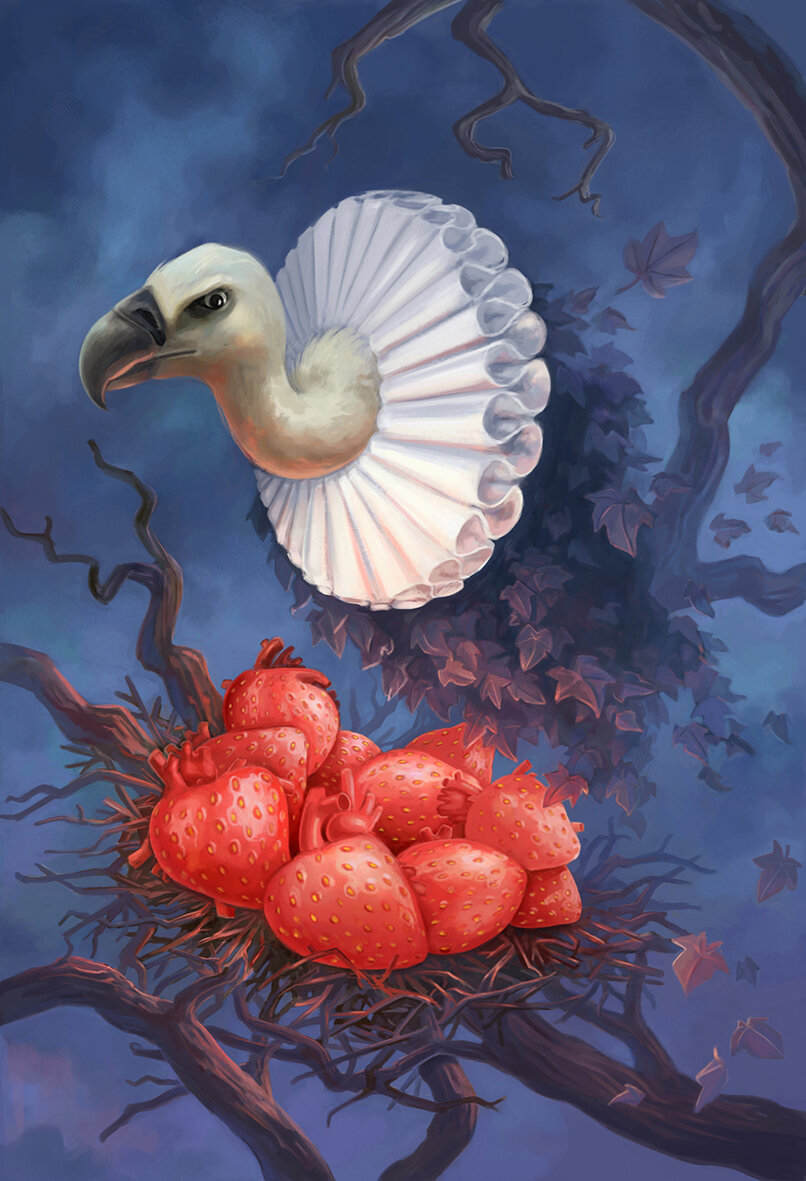
“I wanted to make a joke about the omnipresent sexism of the 50s era by reversing the roles on the cover. At first, I imagined a woman in a suit near a sold sign in front of a nice house, giving the key to her nice husband..”
Roll and Write games aren’t always well-known for their gorgeous art, but what struck me Anne’s work on Welcome To was how fully realized its theme was. Hearing about Anne’s process on this project and more was fascinating. I hope you enjoy!
For more great insights into board game art, be sure to check out the interview archive.
Anne Heidsieck - When I Dream board game card art
Hi Anne, thanks for joining me! For our readers who aren't aware of your work could you tell us a bit about yourself and what you do?
Hi Ross, and thank you very much for writing about the art in board games! I'm a 27 years old illustrator, working since 2012 after my studies in Nantes. Currently, I live in France and more precisely in Lorraine. When I'm not working, not often enough, according to my dog, I like hiking in the mountains and the snow (as much as possible!), reading, playing games of course, and devouring lots of series!
I have worked on several games from Blue Cocker (Welcome To, Argh and Meeple War), on Majesty and Carcassonne Safari of HIG, on some cards for When I Dream of Repos Production and on a game of Haba, Frido's Treasure Trove.

Anne Heidsieck - Frido’s Treasure Trove board game art
So how did you first get involved in making board games?
Soon after finishing my art studies I wanted to make the artwork for games. My sister and brother made a game themselves for our family when I was a kid and maybe that inspired me! So, with my partner, we created a game. We invented the rules, I carried out the illustrations and then we met several editors to present our project. It was quite a failure and the game is somewhere in a box in the cellar now, but it allowed me to meet people who were so nice and gave me the advice that really convinced me to keep trying, but only on the side of the illustrations this time.
Anne Heidsieck - Card Artwork - Frido’s Treasure Trove
I sent emails to many editors and, one day, Alain Balay from BlueCocker answered me. He was looking for an illustrator for his new game, Meeple war! That's how I found my first work on board game designs.
I haven't had the opportunity to work on a lot of things other than games but, from what I’ve seen, the work is really different in-game illustration and book illustration, for example. I think that game design requires even more organization. It can seem too strict because we have a lot of "rules" to respect, for the ergonomy of the game, but it's rather reassuring to me because we don't begin the work with a blank page.

Anne Heidsieck - Save the Meeples cover art
When beginning to work on any new project what are the first few things that you do?
I always begin by researching a looooot of pictures, on Pinterest mostly and also in my art books. I need to figure out the idea of the mood of the game, the color atmosphere, the style, etc. Even if I don't use them later during my work, they help me to find the first ideas. I make some first sketches after that, to be sure that we agree with the editor. When the work begins for real (and after I print a plan and fix it on my wall!), I start working precisely on each illustration. First with a sketch, a definitive drawing, a color rough and finally the definitive coloring, asking the editor for confirmation between each step.

Anne Heidsieck - Meeple War drawing construction
What do you remember about your first board game project Meeple War, and how did you prepare yourself for the job?
As I had already worked on a full project for a game (even if it was personal, it was really formative), I wasn't very surprised by the necessary rigor of work when I started to illustrate Meeple War. The first thing I did was to organize a very strict plan, that I totally exceeded of course. Today when I do planning, I schedule much more time than I estimated at first, to avoid being under too much pressure. I continue to exceed my time limit, but less ;)
What were the most challenging parts of the job?
The newest thing for me was the technique: it was my first project entirely digital, and I have to say that this new way of working wasn't really appreciated by my eyes and my back! The biggest challenge and stress I had were for the cover I think. We kept it for the end, when the art was well fixed on the game elements to be sure to have consistency. I looked into a lot of covers for games and put myself under more and more pressure. Finally, when we validated a rough design with the editor, the final realization was quicker than I thought.
Anne Heidsieck - Meeple War game tile illustration
Other challenges were the setting-up of the punchboard and the cover with the marges, bleeds, cut lines etc, as this was also new for me. I understood nothing at first and hated that. I had to make a lot of searches on forums to know what I had to do. Now I do all the setting-up for Blue Cocker and maybe even like it (sometimes), knowing the characteristics needed for the publisher later, which allows me to gain some time on the art. Moreover, it's rewarding to follow the project from the beginning to its very end. It allows too, amongst others, to check the colors of the first print (which are always very different than on the screen) and to adjust until the production all that must be modified.
I made a big mistake with ‘Meeple War’ when I drew the illustrations for the tiles. I had totally forgotten the bleeds! I had to add on to each file the margins for printing later and remake the forests. I don’t think I’ll ever forget bleeds after that!

Anne Heidsieck - When I Dream card art
You worked on 'When I Dream' a card game with wonderfully creative artwork. How freeing was it to work on a game with this kind of concept and what were some of the words you created the art around?
[Editor: When I Dream is a guessing game and without focusing too much on the rules I’ll just tell you about the cards that make it up. Each card features two words, one at the top and one at the bottom. Each card illustration represents these two words and can be rotated 180 degrees to focus on either one].
The art brief was wonderful because the artists were so free. We had a list of several words and had to combine them 2 by 2 however we wanted. After that, the only directive was to make a surreal illustration that showed both of these words. We could include other objects and ideas, but they had to be less important in the picture than the 2 chosen words.
The artists involved didn't have to work in a similar style, the common theme was the surrealism for the dreams. I wish I could seize this opportunity to reuse my paintings and brushes, which I miss very much! But traditional painting takes me more time than digital and sadly I couldn’t find the time to make it work.
I had some words on my list that I immediately wanted to illustrate. Words like "snow", "vulture", "tunnel", "bear" and I imagined different situations with the others words in order to make, if possible, poetic pictures, and sometimes nightmarish ones. When the project got down to only words that didn't inspire me, I asked for another list of words. I didn't understand at all that we had to deplete most words from our first list before asking for new words but the artistic director still gave me new words, so I was very lucky to have a lot of choices to make my pairs.
Some pictures refer to books, movies, or universes that I love, and I also often listen to audiobooks when I work, so maybe that influences and inspires me in some ways. The most perfect design brief I ever had was on the goodies card of this game, because I just had to do whatever I wanted with as many elements as I wanted! There are two blanks for writing the words, suggested by the card that the player wants to use.
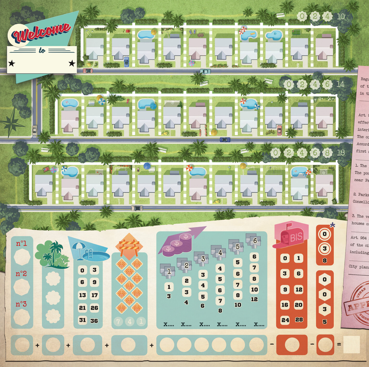
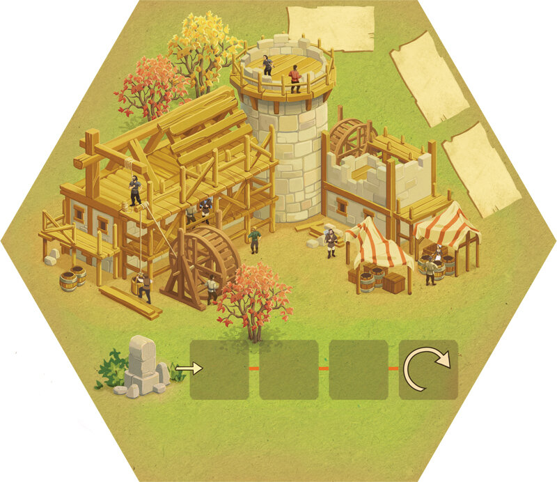
Anne Heisieck - Welcome To Game Sheet
2018 saw the release of the roll and write game 'Welcome To...' which has been a huge success. The game has a strong 50s vibe to the artwork, so how did that develop and was this look part of the original brief?
Alain Balaÿ already knew that he wanted the theme "urbanization during the 50s". The graphic style that he wanted was very much in the mindset of American ads from that era. Most of the work was spent on research: ads, maps, real estate documents, aerial views, logos, style, colors... I even listened to 50's rock and roll music and watched a few movies from this period to be completely in the mood! Even with a lot of research, I still think it could have been even more "50s" in my designs. But sadly it's always so different in my head than the end result I manage to create by my illustrations.
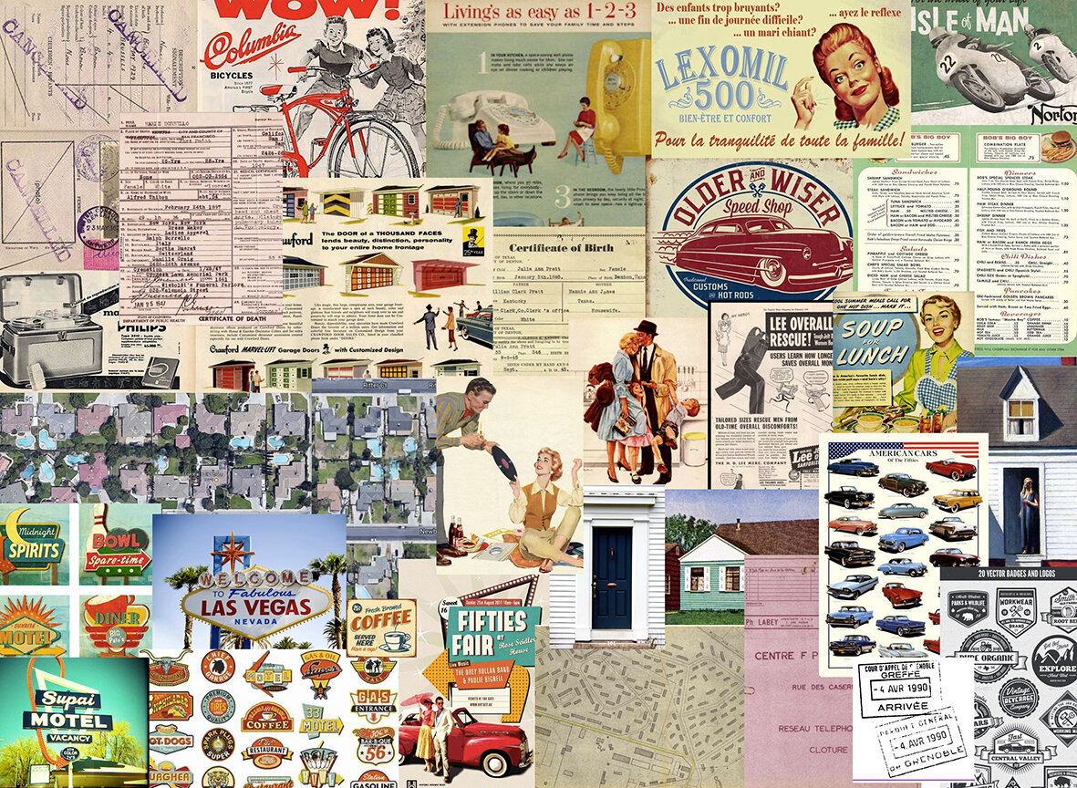
Anne Heidsieck - Welcome To - Art style research examples
I spent a lot of time researching the "perfect traditional house" during the 50s. I also viewed a lot of paintings from Hopper for inspiration. By spending time researching 50s advertising, I wanted to make a joke about the omnipresent sexism of the era by reversing the roles on the cover. At first, I imagined a woman in a suit near a sold sign in front of a nice house, giving the key to her nice husband with the kids in his arms. I wanted it to be so we could imagine her saying to her husband "see what I bought for you and the kids darling". This cover idea wasn’t chosen in the end, but that core idea of reversing gender norms pleased the editor and author.

Anne Heidsieck - Welcome To board game fake advertising
An extra detail I love in this game are the adverts on the back of the player reference sheets. How did this come about and where did your ideas come from?
Alain wanted to give me the chance to make more real illustrations. Beyond the cover, I mainly did icons and graphics, so to strengthen the atmosphere of the 50s he decided to add different advertisements on to the back of the player reference sheets.
The illustration of ‘Meeple War’ is a parody of a well-known ad, where a man and his son are playing battleships while the mother and the daughter are behind, doing the dishes. The illustration of Toulouse is inspired by the many tourism advertisements and the editor and the author are both from this town.

Anne Heidieck - Welcome To board game fake adverts
The one of the man in the kitchen is a reference to the countless pictures of housewives with their all-new household products, and the poster ‘le cocker aux trousses’ is a parody of the poster of the movie ‘North by Northwest’, ‘La peur aux trousses’ in french with all the authors and illustrators who worked with Blue Cocker until the release of Welcome to.
You mentioned that you made some early mistakes when it came to things like bleed lines on projects. So when it comes to creating and editing game art with punch boards and print work in mind what are some basic lessons that you could share?
I would recommend always being careful from the very beginning of the creation of a file about several things:
The size of the picture, personally I often work twice the print size
The definition with 300dp minimum for print
The color profile which depends on the manufacturer, but always at least in CMYK for print.
The density of black, as printers cannot print black deeper than a certain density.
To not forget to embed the fonts on a pdf export.
And in anticipation of the print, which always darkens and tarnishes the colors somewhat, to saturate and lighten up a little bit for each of the pictures.

Anne Heidsieck - Raccoon Illustration - Frido’s Treasure Trove
When it comes to resources, I think it's always a good idea to ask other illustrators how they work, as we have a lot to learn from each other! The boardgame manufacturer ‘Panda’ https://pandagm.com/tools makes very good guides for preparing the designs, it’s all in that link!
I also often search on adobe forums when I don't know how to do something in particular.

Anne Heidsieck - Carcassonne Safari board game cover
Last year you illustrated Carcassonne: Safari, so how did you end up working on this game and was it different working on an existing series?
After working on the game Majesty by Marc André with Hans im Glück, (thanks to Gaëtan Beaujannot from Forgenext, the agent of Marc André), Hans im Glück asked me if I was interested in creating the artworks of their next "around the world" expansion of Carcassonne. I couldn't say no! Besides, I love elephants so much! First, as a test, I made one tile with the different main elements (a piece of savannah, one of a forest, a baobab and a road), in order for them (and for me!) to see if I could make something in the spirit of Carcassonne that would fit with their vision. After that, I improved each kind of element separately as well as designing all the animals, plus some additional to give us choices.

Anne Heidsieck - Carcassonne Safari Animal artwork
For example, I made an antelope and a lioness, but the monkey and the lion were chosen instead. When we agreed on everything, they send me the final layout of each tile, with the frame of each element and the animals present on it, and I arranged them one by one, trying to diversify some set elements. It was kind of tedious work!
For the scoring board, I mainly used the frame of another expansion and used some of the same elements from the tiles I’d made as you see in the other Carcassonne games. As it is a collection with a very specific editorial line, the illustrators have to follow a general pattern, so it's not a very free "artistic" project, however, it is really well organized and we know exactly where we are going, which can be nice too!

Anne Heidsieck - Carcassonne Safari scoring track
You've also gone on to illustrate a variety of neighborhood expansion sheet packs for Welcome To. So are there any differences when illustrating an established game series (eg Carcassonne) and how do you look to make the art distinct within the design constraints?
It was my first work on an expansion, and indeed, it could have been a peaceful project by just modifying a little bit the first neighborhood, but we were under a bit of time pressure on these. Our American publisher (Deep Water Games) wanted to present the mini-expansions on their Kickstarter in Autumn, so we had to work fast. I was working on another project at the time, so they helped me by beginning some of the graphic work to have something to show to the backers at the Kickstarter launch, and I reworked it afterward for the final files.

Anne Heidsieck - Welcome To card art
It was nice and easy to create the art for something that I knew already worked for the players. I just had to change the aesthetic, the mood of the season or the event, and not on the games ergonomy. It was pretty relaxing! After searching for the main color for the ambiance, I made new trees and bushes and I felt that it immediately changed everything. Making new decorative files on the right, even if it isn’t important for the game, was fun too, and helps create a richer atmosphere I think.

Welcome to - Expansion Artwork
What are some non-game related creations (books, music, movies, etc) that you’re currently enjoying?
I often read or listen to audiobooks, mostly fantasy, and a bit of horror and science fiction. I'm a huge fan of Harry Potter and read and re-read them very often! I made the illustrations for my school examination about the french book ‘La horde du Contrevent’ by Alain Damasio, a beautiful emotional adventure! I also read the ‘Game of Thrones’, and wait for the next volumes while the internet spoils me every day. One of my recent crushes was for the books " The Gentleman Bastards" by Scott Lynch.
I watch more series than movies, of all kinds. Some of my favorites are ‘Orange is the New Black’, ‘Black Mirror’, ‘Stranger things’, ‘Parks and Recreation’, ‘Kaamelott’, ‘The Marvelous Mrs Maisel’ and of course ‘Buffy the Vampire Slayer’ :) Thinking about movies, I love in particular all the animations by Laika, especially ParaNorman!

Anne Heidsieck - When I Dream board game card artwork
Just as with my taste in books and series, the music I listen to is really diverse. When I work, I tried to adapt as much as possible the kind of music I’m listening to with the mood of the illustration I'm doing but I do listen to audiobooks and podcasts sometimes. Otherwise, I mainly love Nordic Folk music (groups like ‘Garmarna’, ‘Triakel’, ‘Omnia’) and some french artists like Camille, Claire Diterzi, Air, Polo & Pan. And when I'm working on layouts, I can only listen to very soft piano!
Finally, if we’d like to see more of you and your work, where can we find you?
Here is my website: www.anneheidsieck.com
On Facebook : Anne Heidsieck - Illustrations
All images provided by Anne Heidsieck.
If you’re new to the site, why not stick around a while? There are interviews with some of the best artists in the industry and if you’d like to read more you can them by heading over to the Interview Archive!
Nick Brachmann: Art in Board Games #53
If people keep interpreting something "wrong" they may just be right. Its not always worth fighting against human nature. If people keep interpreting something a particular way, see if you can leverage that expectation..
To create truly great board game art, I believe you need to marry it with effective graphic design. So far on this site, I’ve done a good job of covering the illustrations, but graphic design has been sorely ignored. I’d like to change that, and this interview (conducted late last year) is the first of many I’ll be doing to cover this area.
Check out the interview archive for more great insights into board game art.
Hi Nick, thanks for joining me! For our readers who aren't aware of your work could you tell us a bit about yourself and what you do?
Thanks for having me Ross! I'm a graphic designer living in Hopkins (just outside of the Twin Cities) currently working as a graphic designer for Leder Games! Outside of board games I'm also really passionate about art toys and model making. Lately, I've been trying my hand at making molds and casting my own resin figures and have recently developed an obsession with Gundam models.
Where did it all begin, how did you work your way into the board game industry?
During my education and professional development, I always had in mind I wanted to be involved in tabletop games, but I never really knew what that would entail. I just knew I wanted to be involved in the process. Like many people my friends and I would attempt to make our own games but nothing that made it past the kitchen table. I had a couple interviews at Fantasy Flight Games that didn't go anywhere before I saw a job posting for Leder Games. Patrick and I had a brief back and forth then 2 weeks later he was asking me to start!
I was originally brought on with the main purpose of making and updating play-test kits for our upcoming title Vast: The Mysterious Manor, but as the position developed it was obvious that I could be more involved. As of late, an average day for me probably includes a meeting with Patrick or Cole discussing rules and developing ideas, then we break off and I’ll go and make any new game assets or changes that we'll need if we're play testing that day. I also may be coordinating with our foreign language partners to answer questions or creating marketing assets for our Sales Manager, Clay. I honestly couldn't have gotten luckier to be so involved in the game creation process - I know most companies don't operate like Leder but I think the process shows in the product.

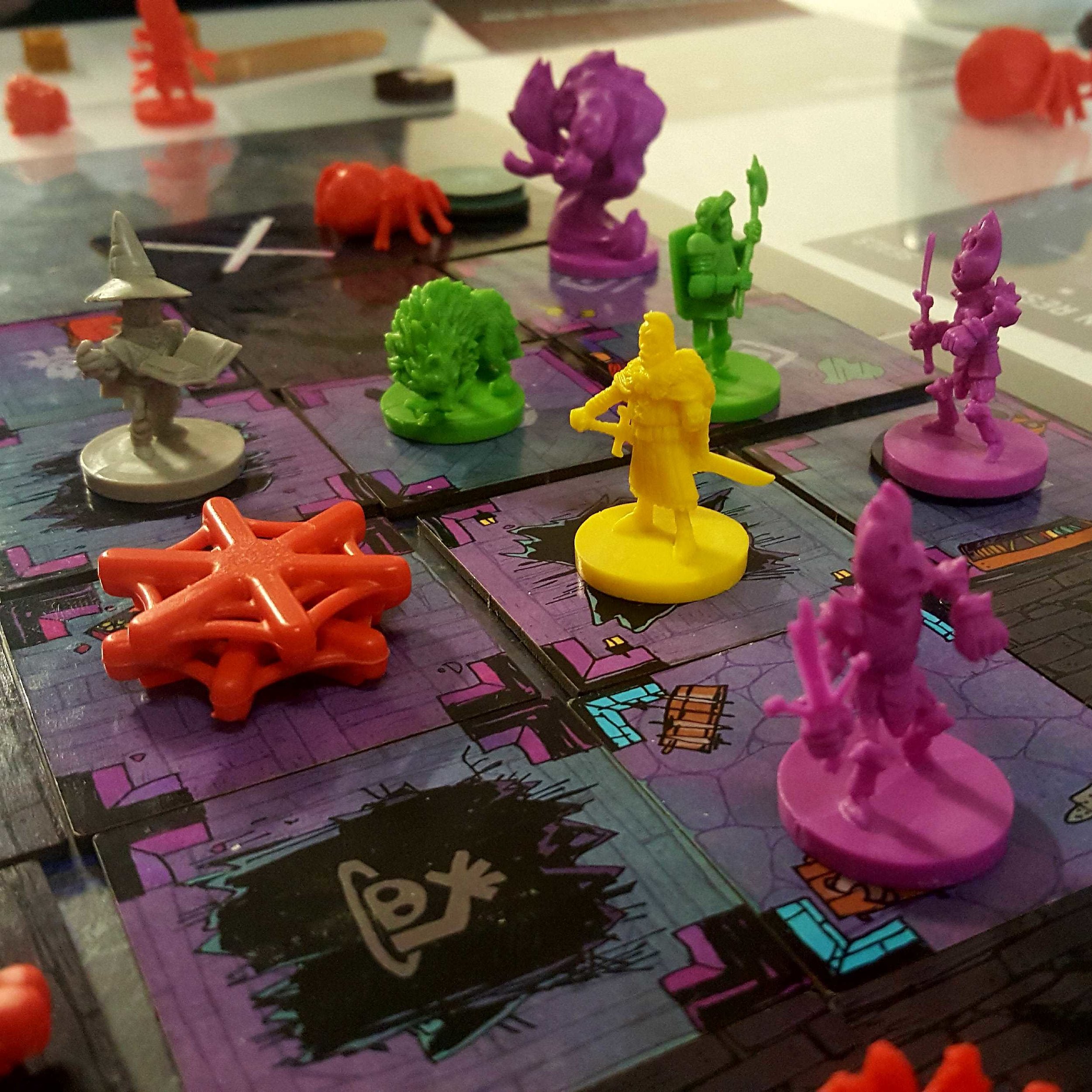
Vast: Mysterious Manor - Prototype Set Up
Where was your experience based before joining Leder Games and how did that prepare you for the job?
Outside of freelance projects my largest experience doing graphic design was for a department at the University of Minnesota, where I graduated. I think that job was more stereotypical of what people think when they hear "Graphic Designer". Me and the team would plan new initiatives, create assets for fundraising campaigns, and coordinate with printing services. We operated like a marketing team, and in that setting, the amount of information we needed to communicate was often small as well as being simpler. Because of that, solutions were more varied and we were working on new things constantly.
My position at Leder Games on the other hand, is a combination of graphic designer and usability developer. I'm working on one game at a time where my focus currently is on clarity of information and mechanics. So when I'm designing components like player boards for example, my attention is on effective and clear communication rather than an amazing visual element (after all that’s why we have Kyle Ferrin). I've actually found working like this to be more similar to the work I did while pursuing my product design minor - it's about focusing the design on the person who's going to be using it. There are still similarities as well - our need to iterate rapidly, and quickly tear down and rebuild ideas (prototypes) feels more similar to my time at the university job.
Based on what you’ve learned so far at Leder, what do you think makes for good graphic design?
For me, its about successful communication of information. The last thing you want a user to experience is not knowing how to interpret what’s in front of them. To put it simply, board games are complicated and its my job to visually minimize that complexity. Compared to designing for advertising or logos, there's much less opportunity or reason to be "clever" and anyone who has done design stuff knows what I mean when I say "clever". Board game graphic design isn't the place for a logo that has two images hidden in it or an abstract representation for your icon. Board game graphic design is the time to be clear and concise, sometimes this means you don't get to do the "clever" idea and I think that's where a lot of board game graphic design fails.

Vast: Mysterious Manor - Prototype
When it comes to being clear and concise, what are some of the most important things you’ve discovered?
Tough question, and I mean I'm still very new at this but if I was going to name some of my biggest lessons. If something seems awkward to communicate, it probably is. Explaining something should never feel uncomfortable, if it is, try to express it differently or recognize the rule/mechanic is weak. Physical mechanics, written rules, and thematic components always need to work towards the same purpose and can often inform each other. I.E You can answer a lot of questions about how something should work mechanically by asking why it works thematically and so on. If people keep interpreting something "wrong" they may just be right. Its not always worth fighting against human nature. If people keep interpreting something a particular way, see if you can leverage that expectation.
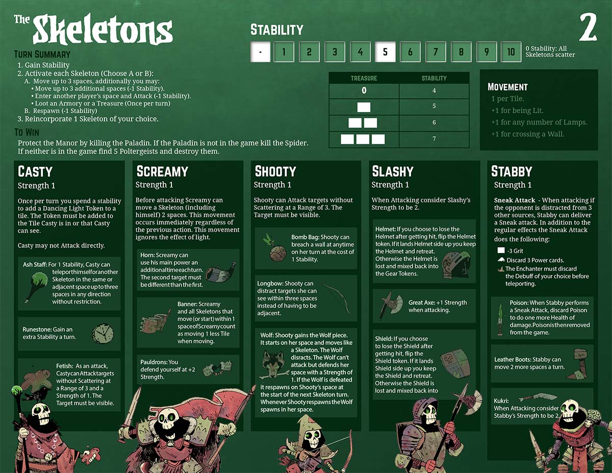
The development of the Skeleton Player board:
This was one of the most satisfying to figure out! Early on, the board was swamped with text and explained every possible thing you could know about the skeletons. As we refined the role during development, we learned how we can split up the necessary information. also, escaping the common 8.5x11" board gave us the freedom needed to make the player board fit the role. (a theme that's repeated throughout the design)


Following on from this how much does play-testing and feedback shape your work?
Next to direct feedback from Patrick and Cole, I'd say our play-testers are the people with the largest impact on graphic design changes. I'm actually writing this at a time where our rules editor, Josh Yearsley, is in town, and we're doing what I believe is one of the most important steps in this process. We bring in as many groups as possible who have little to no experience with what we're working on (currently Vast: The Mysterious Manor) and we watch them learn to play the game. Often, it's completely blind - we ask one player to read the rules, then they teach the others, and they all play. We watch, take notes, and try to allow them to learn and figure things out themselves, only helping when necessary. Josh distills all that feedback and we work together to re-organize information to deal with any problems we saw. These are often small changes with huge positive impact, both in language and presentation. Additions of simple things like small arrows, adjusting leading between text, and word choice like "all" vs "every" can remove minutes of rules checking and frustration. And that’s always been one of my biggest personal goals working in the game industry - making games easier to learn and less frustrating for the players.
Is there a minimum amount of time you think should be spent on the feedback loop of play-testing and changes? How do you know when you've got to that sweet spot where the game is ready?
It is near impossible to give a time frame for testing - it is definitely more of a feeling, especially given how different every game's development is. That being said, I've made some observations about what to look for to know its ready (some of these would apply to many games, not just asymmetric ones!)
You should see questions being answered by the other people in the game and their own materials rather than referencing the rule book.
You should see people asking each other about their specific rules.
You should see people surprised/impressed/jealous of what others can do.
You shouldn't have any rules you don't like explaining.
You shouldn't see people attempting things just because other players can.
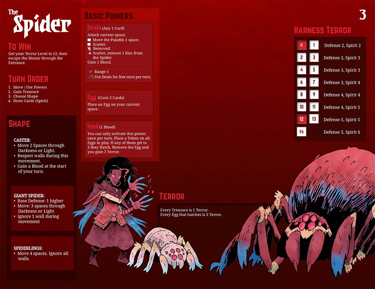
The development of the Spider Player boards:
I am showing these as a sort of counter point to the skeleton player board. Where the Skeleton board required less space, we found the most intuitive change for the Spider was actually giving them 3 separate player boards. Usually you want fewer components, but by splitting the forms into 3 boards and controlling exactly what information is accessible to the player, we've found it's easier to teach and understand.


Is there any advice you can pass on to those who are trying to get into the industry or find work as a professional graphic designer?
Be persistent, cast a wide net, attend local events, and play to your strengths. The gaming industry is busy and hectic - don't assume that because you haven't been contacted back its a dead end. It can feel discouraging when emails and applications don't get a reply, but seriously: follow up, and follow up again. I'm not recommending you spam your prospective employer, but sometimes it takes multiple weeks and emails for companies/teams/individual people to respond. Be patient, but be persistent. For attending events I've still found Facebook to be the best tool. I'll regularly visit the Events area and search "games" "game design" or "tabletop". These can vary week-to-week but most of the time you can find something going on - local designers play testing games (Protospiel anyone?) or indie video game jams - whatever it is you find, these are other people who are trying to work in the game industry also. Sign up for their newsletters, bring business cards, and stay in contact.

Current Gameplay (from December 2018)
What are some non game related creations (books, music, movies, etc) that you’re currently enjoying?
While I'm working I usually just put full albums on. This year has been a lot of Denzel Curry, Anderson, Paak and Kanye West - anything high energy to keep that forward momentum. For reading lately I've been loving Andrew MacLean's Headlopper comic and catching up on Hellboy as they reprint them all. For television I can't recommend 'Nirvanna the Band the Show' enough, a genre-bending buddy comedy with some of the most unique production I've ever seen.
Finally, if we’d like to see more of you and your work on or offline, where can we find you?
Best place to find me is on Twitter @BickNachmann and I very recently made an Instagram! I’m also currently working on an art toy in my free time and trying to post the progress, hopefully of some Gundam kits and possibly embroidered hats in the future!
All images supplied by and copyright of Nick Brachmann and Leder Games.
Did you enjoy this interview? Do you want to hear more about graphic design in board games? Let me know in the comments below!
Finally, whilst you’re here, why not check out some of the other wonderful interviews on the site via the archive or the Top 10 Best Board Game Art of 2018 as voted for by my readers!

Endogenesis: Art in Board Games #47
Star charts have an amazing aesthetic that feels foreign and esoteric, but mesmerizingly detailed. Combined with the use of astronomical symbols, I sought to create an art direction that gave the sense that you're peeking into this whole other alien universe through the perspective of its inhabitants.
Editors note: Welcome to another in my series of interviews looking into Kickstarter projects. Endogenesis (from David Goh) is well into its campaign and currently at over 1200% of its very modest funding goal. Upon seeing the Kickstarter page I couldn't help but be impressed by the production quality of this a first-time project so I'm really happy to find out more. The Kickstarter is live until 7th September so if you are curious I recommend you go take a look.
Hello David, thanks for taking the time to speak to us. Firstly, could you tell us a little bit about yourself?
Sure! I'm a freelance art director hailing from Singapore, and I'm 30 this year. I grew up being surrounded by gaming — as a teenager, the medium of choice was video games, from old-school RPGs like Chrono Trigger to thriving new releases then like DotA. But in the last decade or so, I've been slowly steered towards tabletop gaming, primarily due to its social nature. There's just something about sitting down with a group of friends at board game night that video gaming just isn't able to replicate.
As for designing games, I've always wanted to make them since I was 15. Regardless of medium, I believe that games are the next greatest art form, and that's why I'm obsessed with them! I just enjoy taking them apart and studying them, and try to understand how some games can be so engrossing, and others evocative. The idea that games are really just a collection of rules, visual aids and predictable logical outcomes that combine to captivate the human mind with a compelling experience is just mind-blowing, and still is to me.
My first foray into tabletop game design was with a fan-made card game called 'Final Fantasy Boss Battle.' It was created as a birthday present for my wife, made quickly in 2 months as it was intended to be less of a working game and more of a really cool looking gift. We played a couple of games with our friends at board game night, and while the game was clearly unpolished and a little frustrating at times, it was actually fun for a few sessions.
Seeing how I had created something that brought enjoyment to the game night table, I felt inspired to keep creating, if only to make games that my friends would enjoy. And so I did! Over the next 9 years, I'd designed prototypes to bring to the table. Many were pretty much trash, while some had potential. One other project that went beyond the table was 'The Award Winning Game', which I worked on as part of a team of two. While we did bring it to Kickstarter a few years back, a combination of inexperience and logistical difficulties led to the project not succeeding, so we published it via The Game Crafter instead. Having a group of friends to test out game concepts has been such an amazing learning experience, and I'm glad to have such patient friends!
Looking at the present, can you describe your current Kickstarter game to us and what makes it interesting?
Endogenesis is a competitive card game that features free-for-all combat, which means it focuses heavily on direct conflict! What I think makes it interesting is that the gameplay is designed to be highly customizable and interactive. Everyone starts off with the same blank slate, but as the game goes on, you build a customized power set with the Skill cards that you're dealt with. If you like the experience of building a character that starts out weak but incrementally grows until you're a behemoth of cosmic power later in the game, then you'll enjoy Endogenesis!
While the round and turn order are quite structured, what you do during your turn isn't. You're given freedom on how you perform actions, both in their order and frequency. This includes using Skills to attack others, equipping new Skills or leveling up your character with Shards (which are a bit like stat points). With a bit of creativity, you can pull off really powerful combinations of actions, but at the same time, just a bit of miscalculation can cause your plans to fizzle. There's also an element of intrigue, where you can interact with the active player's turn with Reaction Skills, which are hidden, allowing you to set up traps when you know what a rival player is planning.
Because of my background in video games, a lot of inspiration came from that medium. A key point of influence for Endogenesis was from a custom game mode from DotA called DotA LOD, which is the precursor to the Ability Draft mode in DotA 2 now. Each session of the game sees you crafting a character from a random pool of abilities, effectively building your own synergies and combos. My goal was to recreate that experience in the tabletop medium, and Endogenesis was the result of that attempt.


How long have you been working on this game? What made you launch the campaign now?
I've been working on Endogenesis for a little over two years. Like all my previous designs, Endogenesis started out as a prototype I brought to game night, with the intention of creating something my friends would enjoy. However, the response to Endogenesis was much better than usual, so I decided to focus more effort into refining it, eventually bringing it beyond my circle of friends to other board gamers, and later on to blind testers.
I would say that Endogenesis is the culmination of a few concepts I've been wanting to try out with the tabletop medium for a long time. Quite a few prototypes died along the way before I arrived at Endogenesis, and I feel that after a few hundred playtests and 6 major revisions, it's finally ready to be released. I've witnessed a lot over the course of testing the game; the intensity over a very close battle, the excited spark in a player's eye as they execute an elaborate game-winning combo, and their rage at having said combo be completely countered by a well-placed Reaction Skill or Wonder... I'm excited to let gamers around the world try out the game, and see what experiences they encounter as well!
Where did the world and lore of Endogenesis come from and how does that feed into the player experience?
Prior to working on the world and lore of Endogenesis, the gameplay came first. And a key part of the gameplay was the existence of Skills that would come from different categories: Cosmic, Mythic, Entropic, Organic and Mechanic — all of which meant to be very different from each other. This was the first spark that led to the direction we took while building the lore; given how different these categories were, we needed a setting that would serve as a plausible container for all of them. Thus the idea of a universe in which beings explored other planes of reality was born.
As for why the setting takes place in a tabula rasa universe with alien beings, I think that came from my love for creation myths in general. Combined with the challenge of building a setting that would see the clash of different planes of existence, I saw the opportunity to redefine the entire tone of the story by building it ground up with a whole new creation myth.
A big part of what Endogenesis offers is a "power fantasy." The journey you take starts you out as being weak, but you incrementally grow stronger and stronger until you're inches away from literal godhood. This lore feeds into the player experience by creating an epic setting that players operate in, so as to make that power fantasy feel magnified to cosmic proportions!


This lore also seems to have fed into the artwork and style, showing a mixture of astronomical symbology crossed with arcane monsters. What were some of the most important factors in making you take these visual choices?
As a huge fan of RPGs, I find world building to be incredibly fun! I also had two writer friends (Ryan Mennen and Sathya Seth) who were excited to lend their expertise, and as such we pushed ourselves to go as deep as we could with the lore behind Endogenesis.
Having a detailed setting to work off helped tremendously as I was creating the art direction of Endogenesis. One of the most important considerations was trying to decide how the universe would look. How does one portray an entire universe feels completely alien from ours? This wasn't just in a different galaxy — it was an entirely different reality, with its own physical rules and destiny.
To that end, I decided that the simplest way to do this was to avoid trying for a realistic portrayal of that universe. Instead, I imagined how the inhabitants of the universe would have illustrated their visions of how they perceived their surroundings instead — not unlike how early humans would make rudimentary cave paintings of their environments to store information. In doing so, the Endogenesis universe could actually be made to feel even more alien, since an exact representation of that reality is never seen.
With that direction in mind, I researched the ways humans have of recording observations and information across the ages. I eventually settled on star charts and runic symbols as a key visual reference. Star charts have an amazing aesthetic that feels foreign and esoteric, but mesmerizingly detailed. Combined with the use of astronomical symbols, I sought to create an art direction that gave the sense that you're peeking into this whole other alien universe through the perspective of its inhabitants.
How did playtesting and community feedback guide you in this project? What lessons did you learn and was there anything that surprised you along the way?
Besides the obvious improvements that heavy playtesting brings to a board game, the feedback I've gained also revealed a lot about me as a game designer, as well as the blind spots I didn't know I had. As someone who's still very new to the scene, this was especially important for my growth.
I would say that one of the biggest changes in my mentality as a designer was towards the inclusion of catch-up mechanics. In the early half of the game's development, I was rather against including catch-up mechanics. For some reason, I felt that doing so might make the game feel better for casual players, but worse off for experienced ones, and that that trade-off simply wasn't worth it. But on the advice from a few blind testers and early reviewers, I decided it was worth a shot.


And I was so glad I did. The game became a lot more interesting as a result, because now gaining power comes at an increased potential cost. The more you have, the more you stand to lose, so you have to consider carefully how you go about gaining power. Being able to snowball without much thought might give you a fleeting sense of power and invincibility, but it's nowhere compared to the intensity of having to watch your back. On the flip side — for weaker players — the less you have, the less you stand to lose, so you can be more proactive and fearless in pursuing opportunities, therefore giving you more agency to better your situation. I was so surprised at how much of a positive change a few catch-up mechanics brought.
You collaborated with a number of people to help create the look and feel of this game. Who was involved and what did they bring to Endogenesis?
For the creation of the Endogenesis myth, I worked with Ryan Mennen and Sathya Seth. Both of them are writers, and have unparalleled knowledge when it comes to pop culture and mythology. They're both also my closest friends and amongst the first few to try out Endogenesis, so it just made sense to work with them.
For the creation of the monsters from the Realm of Chaos, I worked with an illustrator named Yang Shao Xuan. These Monsters were inspired by Lovecraftian horror — they're creatures that emerged from the source of pure entropy, and are powerful enough to serve as threats to cosmic beings. Shao Xuan was a great fit for this, given his keen eye for detail and skill for portraying anthropomorphic characters. His monster illustrations were very flavourful and distinct, which was no easy task given that they're just silhouettes!
Lastly, being a project made in Singapore, I sought to work with as many Singaporean talents as possible for the needs of the project. Not that there's anything wrong with looking abroad for help — I just wanted an opportunity to showcase the works of local talent!
I think it's really important to support your local communities when you can. So what should people be doing to make them a part of their projects?
The best way to start is to definitely go out there and make connections. It's never too late to start, and it's incredibly easy to do so. Go to flea markets, artist alleys, youth events and meet people. Join groups on Facebook where artists gather and interact with them. Find out they care about, and see how you can help. Another thing you can do is to look up old friends, school mates and see what they're doing right now, and see how you can trade expertise with them.
Do you have any advice for people looking to launch a Kickstarter game?
I'm still in the midst of my first Kickstarter, so I kinda feel ill-equipped to give advice. I can, however, speak from personal experience and talk about the things I felt I could've done better.


While I did a great deal of preparation work for the campaign, the campaign went off in a direction I never dreamt of, which led to me feeling like I was in catch-up mode for the first week. Initially it made me wonder if I didn't do enough prep work, but looking back now, I think that it's just down to the simple fact that unexpected things happen. Especially if it's your first time — no amount of discussion with other creators or reading of articles can fully prepare you for how people will respond to your work. So I'd say do as much prep work as possible, but expect that the unexpected will happen.
Another thing would be to not underestimate how difficult it will be to say no. It's one thing to say no to a stranger, it's another to do so to someone who's investing in you and your vision. The latter takes a lot more out of you. Saying no is something I feel like I've been doing fine at so far, but I just never expected that it would be so difficult. In hindsight, I suppose I should've been more prepared (though, how does one really prepare for that?!)
That's all I have at the moment, I'm sure I'll have more thoughts and ideas once I'm further along the campaign.


Are there any artists and designers in the community whose work you’re inspired by?
This is probably something you hear a lot of, but I'm a big fan of Jamey Stegmaier. His approach to crowdfunding, customer engagement and competence as a game designer just wows me. I think it's safe to say that many board game designers (including myself) would not have found success on KS if it weren't for his articles.
I'm also just blown away by Daniel Aronson and the work he did for The Isle of El Dorado. I came across his campaign very late, but I was just wowed by the game's level of polish and how the campaign was designed. I've never seen anyone use pre-1900 art in such a way that looks so attractive and modern. And as someone who had to build most of the art in Endogenesis single-handedly, I'm amazed at the amount of resourcefulness Daniel had in conceptualizing his game's art direction.
Lastly, there's a game designer who frequents the game design forums on BGG by the name of Jeremy Lennert (Antistone). Every time I come across a post by him, I stop and take the time to read it carefully. He's so incredibly knowledgeable, insightful and eloquent, whenever I read his stuff for just 5 minutes, I feel as though I've squeezed in an hour of game design classes. Absolutely riveting.
What are you currently reading, listening to or looking at to fuel your work?
I'm watching Psycho-Pass now, a cyberpunk anime that's mind-blowingly good! If you haven't guessed, I'm a big fan of sci-fi :D I'm also doing a playthrough of the entire Dark Souls series with my wife. Dark Souls is a huge source of cognitive dissonance for me — there are so many design choices I disagree with in the game, and at times I'm very frustrated by it... and yet, it's brought about some of the most memorable and enjoyable moments I've encountered in my life as a gamer. I recently played a game of Rise of Moloch too, and while I didn't enjoy the heavy usage of dice combat, I find the asymmetric gameplay to be very attractive. I'm hoping to get back to it soon (as soon as things with the campaign get less crazy!)
Finally, if we’d like to see more of you and your work, where can we find you?
You can check out Endogenesis on Kickstarter.
My personal portfolio can be seen at http://www.awesome.sg and my illustrations at http://www.hyperlixir.com.
(All images supplied by David Goh)

Josh Emrich: Art in Board Games #46
A memorable color signature can really help a game stand out. Like any design decision, color should always point towards the story or experience you think will engage the audience. I always want to find colors that are unexpected and complex, but functional and serve the story and setting.
Editor’s Note: When I created this site, Josh Emrich was among the first people I contacted. Their work is exceptional, and you seem to agree, voting Campy Creatures in the top 10 for the Best Board Game Art of 2017. Enjoy the interview, I can’t wait to see more from this talented studio.
Check out the interview archive for more great insights into board game art.
Hi Josh, thanks for joining me! For our readers who aren't aware of your work could you tell us a bit about yourself and what you do?
For as long as I can remember, I always wanted to be an artist who made things other people could enjoy. Which is crazy because I grew up in a blue-collar family in the industrial midwest USA. My parents had no artistic background and I had to explain to them what makes good art and why I was doing a particular thing. Many artists aren’t great at articulating their ideas, so I credit my parents in helping me develop this skill.
When I went to study art at university, I had a hard time picking one thing — I loved it all — but ultimately studied visual communication design because it touches multiple disciplines — graphic design, industrial design, illustration, etc — with a commercial or strategic purpose. I have since worked as a creative director, designer and illustrator at brand design agencies, eventually becoming a founding partner at a design firm. Eventually, running a firm became a strain on my family, and I got burned out. My wife Katie is also an artist and together, we have four artistic kids. We decided to simplify and make design and illustration the family business. In 2013 we created Emrich Office, a brand design agency that specializes in creating identities and packaging for craft beer and spirit brands. We work from home in a 1000-sq-ft studio filled with vintage action figures and midcentury furniture.
Because we work with a lot of craft breweries, these clients can’t all look the same, so we have had the opportunity to develop and master new art styles with every project. This unique skillset is what brought us to the game industry.


When beginning to work on any new project what are the first few things that you do?
As a movie buff, I like to think about my projects like a film director thinks about a film — the story is the most important thing. If you don’t have an interesting story, you don’t have much to stand on. It’s something I really try to draw out of my clients. The first step is identifying the audience and crafting a unique message that’s engaging. The next step is fleshing out our guiding principles: what world this story takes place in, who are the characters, and what will the experience be? Like a method actor, I have an obsessive personality and will get really immersed in the research — watching any relevant films, reading books, studying history, finding forgotten illustrators, listening to music, etc. Because most of the story is told visually, Pinterest has become a great resource for collecting inspiration and sharing it with my clients.
This creates a foundation of intentional and well-articulated rationale for everything I do. It shows my clients that my creative decisions are focused and not arbitrary, ensuring that I’m delivering something that fulfills their purpose.


Your first board game project was the absolutely gorgeous Campy Creatures. So how did you get involved in that and what do you remember about it all?
Let me start off by saying I’m new to the board game industry. The first things that struck me is that much of the game art (in the industry) shares a similar formula and style. There’s a large emphasis placed on illustration, but often the graphic design is not very well integrated or well executed. Much of it is not very sophisticated. This creates an opportunity for game publishers and artists to break some stereotypes and attract new people who are normally turned off by board games into the fold.
I put a lot of work into research and understanding the project before I dive in. I don’t like presenting tons of options. I think that’s a cop out — like throwing a dart at the wall. I want to have everything worked out before I present anything and nail it on the first go. So I watched tons of the old Universal and Hammer horror films and collected vintage posters in Pinterest. I wanted to honor those films and characters while making Campy Creatures it’s own thing — knowing the exact right points to adhere and deviate.
Keymaster Games, the publisher of Campy Creatures, is run by two graphic designers, Mattox Shuler and Kyle Key, who really understand what it takes to create a game with street cred and still have a broader appeal. They are willing to take risks and invest in production details. They also encouraged me to share my in-progress work on social media to help generate interest in the game, which is a different experience for me. Usually, my clients want me to keep things tight-lipped until the beer is released. It became a little focus group and the reaction was really positive so it gave me a lot of confidence in my approach.
From this experience, I am now hooked on board games and I’ve found a great partner in Keymaster.


You make a good point about board game visuals largely playing it safe. When you talk about taking risks, what stylistic risks did you take with this game?
I guess I don’t see it as taking risks as much as finding ways of differentiating to stand out. Before I started working in board games, I was a brand consultant. Coming from that perspective, it’s a bigger risk to blend in. For Campy Creatures, we could have made it look either very cartoony or like the standard concept art style that pervades the game industry now. Instead, we really embraced the classic horror movie poster vibe, not only with pulpy illustration but also with the type.
Campy Creatures was Keymaster's second game and they really wanted to capture the feeling of classic monster films. Many of the original movie posters from this era were created by commercial artists who could not only illustrate but could also integrate lettering and type. These days, illustrators and designers tend to be more specialized and often work separately under an art director. This can lead to some mixed results where the illustration and type are not working together. In order for Campy Creatures to feel authentic, Keymaster needed an artist who could work like an old-school commercial artist integrating both illustration and type. Mattox had seen some pulpy, b-movie-inspired beer labels that I had designed and illustrated and thought that I could pull it off.


You also mentioned the need to inject a distinct character into the creatures you drew. So what is the trick to creating memorable and captivating characters in your work?
One of the major points of deviation was that many of the original horror monsters tended to be male, so we reinterpreted several of the creatures as female. I always try to push past a general trope by adding a humorous detail or element that allows the viewer to start imagining a larger story around the creatures. For instance, the Invisible Man in Campy Creatures has a Film Noir vibe and is in the process putting on leather gloves. Not only does this create a threatening posture, but it implies that he’s about to commit a crime. Hopefully this sparks the viewer’s imagination and they begin to fill in the rest of the story.
The only creature that received any major revision was the blob. A blob by nature doesn’t have any defining features, which creates a difficult problem when it needs to be a distinct character. My initial thought was to feature a melted victim within the blob to give it some structure, but that was a little too scary for younger players. We ultimately decided to give the blob an eye and to suggest a more defined character.


One aspect I love about your games is the very distinct color palettes you use. How do you use these colors to set the tone in these games?
A memorable color signature can really help a game stand out. Like any design decision, color should always point towards the story or experience you think will engage the audience. The colors for Campy Creatures are rooted in classic movie posters and pulpy lighting, while the colors for Caper are inspired early 1960s European fashion and interior design. Some things that I think stand out in our work is our use of color on Caper. It’s offbeat and sophisticated, using pink, mint, and metallic gold, evoking a Wes Anderson aesthetic. I never want to use a “standard” color palette — basic red, blue, green, etc. I always want to find colors that are unexpected and complex, but functional and serve the story and setting.


Speaking of Caper, can you tell us a bit about its theme and how that developed?
Caper was designed by Unai Rubio and was originally published as “It’s Mine” by Mont Taber in Europe. When Keymaster approached me about helping bring this game to U.S. audiences, I had two suggestions. First, there are a lot of games set in Europe, but if we pick a specific time period, that will help build an interesting world and refine our design choices. We decided 1960-something Europe would be a fun place for players to visit, evoking the great heist films from that era like Pink Panther, To Catch a Thief, or The Italian Job. Second, the characters and gear really help set the tone, so they need to be eccentric, humorous and interesting. The best way I could describe what my approach would be to Keymaster was “what if Wes Anderson directed a Pixar-animated heist film?”


Did your experience working on Campy Creatures change your approach when it came to Caper?
Not really. The two games are completely different, which is refreshing for me. I get bored easy, so I really like charting new territory. The characters in Caper were less defined so I had an opportunity to explore my own ideas. There’s also a lot more art in Caper — 24 thieves, 24 gear items, and 23 locations — so I had to work quickly, which helped inform the vintage gouache style I used to render the illustrations.


What advice would you give to anyone wanting to work as an artist?
Art is not just copying something you see or letting your imagination run aimlessly. To me, it's visual communication and the best artists are able to cut through the clutter and deliver an engaging message. Obviously, you need to develop your skill and technique through constant learning, experimentation and practice. But the most important thing is being able to empathize with others so that you can speak to them. Lastly, you can’t be drawing all the time — you must have your own experiences too so that you have something of value to share.


What are you currently reading, listening to or looking at to fuel your work?
I’m sort of between major projects at the moment, but I’ve been reading the Wildwood book series to my kids during their summer break. The series is written by Colin Meloy of the Decemberists and illustrated by Carson Ellis — part of the same team that developed the beautiful game Illimat with Keith Baker. It’s inspiring to see other artists and storytellers that do not confine themselves to one discipline!
Do you have any current projects underway, or coming up that you’d like (or are able) to tell us about?
Umm…I hear there are more Campy Creatures in the works! And Emrich Office, the brand design and illustration practice that I run with my wife, Katie, is turning 5 years old. We are going to partner with one my favorite collaborators, Bottle Logic Brewing, to produce a limited release beer to celebrate. We hope to raffle the bottles off in the Fall to help raise money for arts education.

Finally, if we’d like to see more of you and your work, where can we find you?
Instagram is where I post my most recent collaborations. You can follow me @emrichoffice.
(All images courtesy and copyright of Emrich Office, 2018)

Ryan Laukat: Art in Board Games #45
There's an inner child in me that guides almost everything I work on. The sense of wonder I had when experiencing new worlds when I was young is one of my biggest reasons for creating games and settings.
Editor’s Note: There are a few artists whose work inspired me to start this website. Ryan is one of them. His work features in a number of board games in my collection, and whenever I play them, I feel immediately drawn into worlds that feel magical and inviting. Enjoy our chat!
Check out the interview archive for more great insights into board game art.
Hi Ryan, thanks for joining me! For our readers who aren't aware of your work could you tell us a bit about yourself and what you do?
Hello! I'm a board game designer and illustrator. I've been lucky enough to work in this industry for around ten years. I started as an illustrator and then founded Red Raven Games so that I could publish my own designs. Some of my games include Above and Below, Near and Far, and Eight-Minute Empire. I live with my wife, Malorie, in Salt Lake City, Utah, right up against some beautiful, snowy mountains, and within two miles of where I grew up! We have a daughter and two sons.
Red Raven Games has become synonymous in the industry for combining great art with captivating worlds and stories. When you're creating a game what is your general thought process? Where do you start?
My obsession with creating games started when I began inventing tabletop role-playing games as a teenager. I loved to create worlds to explore and creatures to inhabit them. So naturally, that influences how I approach most of my board game designs today. When creating a game, my motivation is usually to build a world and use the game mechanisms to allow players to explore it and experience it. I think about who the players will get to be in the game, and where they will go, and start there. I think it helps create a more immersive experience.


Last year you successfully kickstarted Empires of the Void 2 the follow up the 2012 original. What can you remember about that time (2012) and what made you want to return to this project?
I'd wanted to revisit the game for many years. I actually made many redesigns of the original game but never published any of them. I wanted another shot at the setting because I felt my skills as an illustrator and game designer had improved. Of course, Empires of the Void was my first published game. I'm proud of what I accomplished, but there certainly were things that I didn't do quite right. The rule book in that first game was not sufficiently clear and left too many things unexplained. The trading did not pan out as well as I had hoped. Some players left the game with a frustrated feeling because of a multiplayer direct conflict problem where two players can gang up against a third, leaving no way to catch up. I wanted to solve these and many other problems, and so I attempted it in Empires of the Void II.
In terms of the illustration, when you worked on Empires of the Void 2, how did you aim to develop the originals aesthetics into this sequel? What have you learned about graphic design and art since the original and how did that impact your choices?
My goal this time around was to create something a little more on the realistic side when compared with, say, Near and Far, and indeed, the original Empires of the Void. I wanted to make a beautiful space map like the original had, and of course many of the of the original aliens and planets, but with an updated vision that I felt would be more immersive. I looked at a lot of hard sci-fi art, especially the covers of books from the 60s and 70s. This meant painting with more subdued tones than usual and experimenting with new brushes.


You are arguably best known for your work on Above and Below and it's sequel, Near and Far. So starting with the original, how did you create this world and was there any inspiration you drew from in developing it?
When creating Above and Below, I actually sketched the cover before I even designed the game. That sketch worked as a compass for me, and I designed the rest of the look and the game mechanics around it. I was trying to pin down the feelings and memories that I had playing Super Nintendo games as a child, and that helped me build the friendly, colorful setting. At the time I was also very interested in making my games look as natural as possible, letting the art easily incorporate symbols or information, rather than have obvious graphic design boxes to keep art and information separate.

So thinking about that first sketch of the box cover, how did you get from that initial idea to the game we see today?
I took that sketch and taped it to my computer monitor, hoping to get the same sort of feeling that was in the sketch. Sometimes it's hard to replicate the feeling that is present in a thumbnail or sketch, and it can be pretty frustrating. Thankfully, this time, I threw down the colors quickly and it was like a seed sprouting into a huge, blossoming tree. The Above and Below cover took around four hours, and it didn't change too much after that. Sometimes I repaint the covers for my games multiple times (like with Near and Far), but this time, it felt right pretty much from the get-go.
I used a lot of blue and green, especially on the box, as a message to players that the game is pleasant and inviting. Just as important is the chalky brushwork and painterly style, which is meant to remind the viewer of a children's book. It says, "There's a story in this game."
I paint using a Wacom tablet, but I've learned to watch the monitor so I don't have to use the tablet's screen (it's much faster and more efficient for me if I don't have my hand in the way of the painting). My method has changed over time, but it's been pretty consistent for the past five years, besides updated brushes and the way I choose colors. I paint exclusively with Photoshop, and I'm pretty particular about having the right brushes, shortcut keys, and layout.
When you came to work on Near and Far, how did you aim to base it in the same world (as Above and Below) yet still take the player new places?
I made sure to keep the painterly style and chalky brushwork, but the yellow and orange tones are more associated with risk, exploration, and adventure. Western movies and art were a big influence on the look of the game. At the same time, people need to know that this is in the same universe, so animal races play a big part in the setting! I also decided to include some inked drawings instead of detailed renders on some components, such as the World Cards and the Treasure Cards. I feel like this matches the "wild frontier" feel I was going for.
You talked about nostalgia towards childhood games, so how important has it been when illustrating your games to create worlds that are inviting for all ages?
There's an inner child in me that guides almost everything I work on. The sense of wonder I had when experiencing new worlds when I was young is one of my biggest reasons for creating games and settings. And with my kids, it's like I get to experience that sense of wonder all over again as they dive into books and games. A common inner thought I have is: Would 10-year-old me get excited about this?
As someone who has experience working in all areas of a games production what advice do you have for designers, publishers and illustrators to help them successfully collaborate?
Good illustrators are in this business not only because of their skill with a brush and their time spent honing their craft, but also because of their imagination and ideas. A good publisher and designer will give some creative liberty to the illustrator and not be too picky about how every little thing should look. Of course, for me as an illustrator, I want tons of creative freedom and it's hard for me to get interested in a project if I don't have it. Any good collaboration is going to require some give and take on everybody's part though. One thing I'm still learning is that I need to listen to all suggestions and know how to look through another person's eyes to see the project in a different light. What I might prefer personally might not be the best thing for the game.


Upcoming release from Red Raven Games, Megaland, is the first to have your partner Malorie as co-designer with yourself. Can you tell us a bit more about how this came about and what effect that had on the creation of the game?
It was a lot of fun designing a game together, but truth be told, Malorie has always been very involved in my game design projects, so it was only a slight change in dynamic. It didn't start out as a co-design. I was trying to design a light, push-your-luck game, but nothing was really working out. Malorie helped me solve mechanical problems with new ideas. We both have strong opinions about what works and what we like, so there were moments when we had some strong disagreements about this design. But I think that kind of thing is the forge fire that gets the design where it needs to be. I'm sure we'll do another co-design in the future.


What are you currently reading, listening to or looking at to fuel your work?
I've been reading Homer's Odyssey and The Count of Monte Cristo by Alexandre Dumas. Reading the Odyssey has been especially eye-opening and enlightening. It has an amazingly timeless quality. I've also been playing Pillars of Eternity, an excellent successor to the Infinity Engine games I enjoyed so much as a teenager.
Finally, if we’d like to see more of you and your work, where can we find you?
You can follow me on Twitter @ryanlaukat. We also post lots of photos of our games on Instagram @redravengames.
(All images provided by and copyright of Ryan Laukat and Red Raven Games)

Ian O'Toole: Art in Board Games #44
From the perspective of the work that I produce, the gaming industry allows the rare opportunity for me to create a complete product. For most of the games I work on, everything in the box, and the box itself, is designed by me (apart from the game itself of course!), and that level of ownership is pretty rare.
Editor’s note: This week I'm joined by one of my favorite creatives in the board game industry. He's been involved in some of the best-looking games of the last few years, proven when he grabbed the top 2 places in your Best Board Game Art of 2017 vote. Enjoy our conversation!
Check out the interview archive for more great insights into board game art.
Hello Ian, thanks for taking the time to speak to us. Firstly, could you tell us a little bit about yourself?
Sure! I was born in Ireland, where I grew up, received my education and met my wife, Sarah. We moved to Perth in Western Australia a little over a decade ago and have since had two children. I still have not acclimatized to the heat.
I read a lot of comics growing up, and my artistic development was always directed by that. I can’t remember entertaining the idea of doing anything else. When it came time to go to college I decided on Graphic Design because I knew there was a clear career path there, I could leave college and get a job. Fine Art was a little more nebulous, which didn’t entice me at all. I’ve worked as a graphic designer/illustrator for my entire professional life, in a wide variety of roles and industries, including marketing, advertising, packaging design, publication and spatial design.
Mysterium Poster - part of the BoardGameGeek Artist Series
For the past five years I’ve worked for myself, and board games have grown to occupy almost the entirety of my workload. This allows me to work at home which is ideal for me, giving me flexibility as well as the opportunity to see my kids more during the week.
I’ve always been a gamer to some degree, and played a lot of Dungeons and Dragons when I was a kid, as well as Games Workshop 40K games. I started playing modern board games about 9 years ago, when a friend bought me Catan, and shortly afterwards Dominion. I found a local gaming association and my interest in the hobby exploded from there.
As regards other hobbies, I really have very little time. I read when I can, and play guitar intermittently, but it’s mostly gaming.
The Gallerist
So how did you first get involved in making board games?
When I decided to work for myself, I reached out to the community on Boardgamegeek.com in an effort to diversify my client base. At the time I was working mainly in designing exhibit booths for petroleum companies, so I was hoping for something a little more fulfilling to work on. That got a bit of interest, and I ended up working on a few games. Some were very small Kickstarters, like Mage Tower, for which I only created a small part of the artwork, and others were full board games such as Fool’s Gold.
I quickly realised that having skills as both a graphic designer and illustrator set me apart from a lot of others in the industry. Publishers were very happy to hear that I had years of experience working with printers and manufacturers, so I already knew all of the ins and outs of setting up punchboards, box dielines etc.
Escape Plan box art
At some stage early on I wrote to Vital Lacerda, one of my favourite designers, about some of his upcoming games, as I was considering dabbling in publishing at the time. That didn’t work out but he did need artwork created quickly for The Gallerist, and asked if I’d like to take a look at it. The Gallerist ended up being one of the games that most people know me for, so that was really down to luck, and being proactive in trying to create opportunities. It has led to a very fruitful working relationship with Vital, and we are just now completing our fifth game together, Escape Plan.


Another such lucky opportunity was meeting Martin Wallace at PAX Australia, and joining him for a playtest of Ships. During the game we chatted and I told him about some of the work I’d been doing, and he asked if I’d be interested in working on the second edition of A Study in Emerald, to which I quickly said yes!
Working in games professionally also afforded me the opportunity to attend the Spiel in Essen in 2015, which would otherwise have been prohibitively expensive. That was the year that I got to see most of my games for the first time, as coincidence saw a few of them being released there. It was the first time I saw The Gallerist, A Study in Emerald and Fool’s Gold in the flesh, and also got the opportunity to meet a lot of designers and publishers, so that was a big year for me.
A Study in Emerald
Having stepped into the board gaming industry from a different background, what do you think the key differences are in how the work is created?
From the perspective of the work that I produce, the gaming industry allows the rare opportunity for me to create a complete product. For most of the games I work on, everything in the box, and the box itself, is designed by me (apart from the game itself of course!), and that level of ownership is pretty rare. It’s also the perfect industry for my particular blend of skills, which have struggled to find equal footing in other projects. Here, graphic design and illustration are both of very high importance.
Looking more widely at the industry itself, there really are no standards of any sort because it’s so young. Every publisher handles things differently. This can be especially apparent when it comes to discussions about licensing and contracts. It very much feels like it’s driven by passion rather than profit at the moment, and I think there are some growing pains on the horizon as the mean profitability of the industry creeps upwards due to its growth.
Miskatonic University
What is your creative process when working on a board game? Can you talk us through it?
The first thing I always do is play the game. I’ll make a prototype, or sometimes the publisher will provide one, and I’ll get some people together and play it. During this I’m thinking about how the players interact with the pieces and the board. Is there a more elegant solution? Do we need all of those counters, or can we use a track instead? Is there a clearer way to present the information that will help players learn and play easier?
Then I start sketching ideas for each element, all rough thumbnails on paper. This is time for all of the big ideas. Do we need a board at all? Should the layout be portrait instead?

Depending on the game, there is sometimes a period of research involved at this point. For historical games I’ll look into the style of visual communication that was prevalent at the time, things like fabric patterns, building materials, costumes etc. Lisboa is a good example of this, as the artwork is very much rooted in the time period. Nemo’s War is another example of a game that needed a LOT of research, as I decided to find a reference for all 100+ ships depicted in the game.
After that I start to make a very rudimentary layout, using only boxes and circles to denote spaces etc. No “artwork” whatsoever. Depending on the complexity of the game I’ll usually make another prototype at this stage. The game should be fully playable, and this gives me a sense of the changes I’ve made to the ergonomics of the prototype.
Lisboa in progress overview
If I’m happy with that, then it’s just a case of tackling the finished artwork in the most logical way. Sometimes that’s iconography first, or card layouts, or maybe the board. I tend to vary my style a lot for each game, so there’s always a stage of visual development and experimentation as well. I don’t tend to submit options on style or layout, preferring to commit and put my effort behind the solution I think will work best. The other reason for this is that the style often emerges during the first few hours of development, so creating a sketch in advance is often impossible, as I myself don’t know what it will end up looking like.
Once the game is almost finished, I’ll make another prototype and play it again, to catch little things that only become apparent when you ask people to play it.
Vinhos Deluxe
As regards tools, I use a pen and sketchbook a lot. Once I move to the computer I use the Adobe Creative Suite, primarily Photoshop, Illustrator and InDesign. I also do some 3D work in Cinema 4D. I typically build a 3D version of the game as I’m developing it, as I like to see how each element looks as part of the whole.
If you want to read more about the process of creating Lisboa, I’ve written a post on boardgamegeek detailing the development of the visual style, as well as the changes that were made to gameplay as a result of graphical solutions. You can find that here.
Nemo's War - Ship Counters
You mentioned finding references for all the ships in Nemo’s War, so in broad terms how much of a project do you spend on research, and how important is this phase in shaping what you create?
Reference is really important to me, if it’s available. For any game that even dips its toe in the real world I want to look at as much relevant reference as possible. Design styles of the time, common pattern forms, fashionable colours etc. Sometimes that reference becomes the heart of the visual identity of the project (Lisboa is the obvious example of this). Sometimes I will mix it with other anachronistic elements, such as in The Scarlet Pimpernel. It all depends on how important I feel that authenticity is to the game experience itself.
For Nemo’s War, it’s not enormously important that each ship is 100% accurate to its real-life counterpart, but what is important is that the seas are populated by ships that are unique, so that the narrative of the game comes to life that little bit more. Given that all of the ships did exist in real life though, it seemed obvious that seeking real reference was the thing to do.


You’ve been working on Stephenson’s Rocket recently so could you tell us a little bit more about it?
Stephenson’s Rocket was an interesting project for me, because the game already existed, fully formed. So it was easy enough for me to play it and assess the game very quickly. The very first thing that occurred to me was that the game felt old fashioned. This was mostly down to the fiddly nature of using paper money and stock cards, which kept the banker very busy. It became clear very quickly that the money was entirely unneeded, as players never spent it during the course of the game, it was simply points, so my first suggestion was to ditch it and move to a points track on the board.
Stephenson's Rocket overview
Another feature that bugged me was constantly having to visually check, or ask for, the number of shares in each company that a player was currently holding, so that was also removed for share tracks on the board, making all of that information easy to access and track.
The last, and somewhat more tricky part of the puzzle was the industry markers. In the original game, every city has three industry markers, each depicting one of a number of industries. The markers are small cardboards tokens, with the colour of the city and its name in very small writing. During setup, all of these need to be sorted and placed out on the board, it’s a big pain, and feels really clunky. After a bit of experimentation, I came up with a table system that lives on the main board, onto which players place their cubes instead of claiming markers. This has many benefits for gameplay. Firstly, it completely eliminates setup entirely. Secondly, the players can very easily see which cities provide which industry, and lastly, it allows the assessments of majorities in each of the industry types (for which points are awarded at the end of the game) very quick. The other benefit that this solution offers is that, as more maps are created for Stephenson’s Rocket, new industry markers are not required to maintain thematic accuracy (this is also true for currency).


The last element that was added was a player board, featuring an iconographic guide to the various scoring methods of the game, which can be a little tricky to remember at first. Other interesting elements to the project included creating a miniature for the famous locomotive, and coming up with a wooden design for the stations that could be placed on a hex at the same time as a locomotive. I also designed a pair of custom passenger meeples, replacing the tokens of the original game, which I think add a nice element of character to the overall presentation. We also added track joiner tiles as an aesthetic upgrade.
Stephenson's Rocket
All of these changes leads to Stephenson’s Rocket feeling a lot more modern without actually changing any rules (only the expression of them). Overall Stephenson’s Rocket was very enjoyable to work on, and Grail Games were very supportive of me taking a wrecking ball to a much-loved game.
This interview isn't the first time you've been featured on my site, gaining the top two places for my best Board Game Art of 2017 public vote. Without votes like these, how easy is it to gauge the feeling towards your work in the community? Also, how important is that feedback to you and are there any ways you seek it out yourself?
I’m fairly active on Twitter, so I usually get pretty immediate feedback when my work is released. Users on Boardgamegeek are also never shy about sharing their feelings! Good feedback is always really important. I’m pretty isolated over here in Australia, and only get to travel and meet most of my gaming contacts once a year at Spiel, so keeping in touch online is essential.
Nemo's War - box art
Hearing players get excited about the games I’m working on is also really gratifying, and of course, seeing them being played all around the world is really rewarding as well. I subscribe to all of my games on BGG, and do keep an eye on the threads. As long as feedback comes from a good place, and is respectful, I’m always happy to engage with players.
Certainly awards such as the ones you’ve created provide a nice opportunity for me to stop and reflect on the fact that players are enjoying my work, so that’s really great.
What are you currently reading, listening to or looking at to fuel your work?
I’m reading Authority, the second book of Jeff VanderMeer's Southern Reach trilogy, which I’ve only just started. I liked Annihilation a lot (and also loved the film). Before that I had just finished the Red Rising trilogy by Pierce Brown, which I enjoyed a lot. I’ve also just finished reading The Hobbit to my kids, which was a big deal for me.
Red Scare
What advice would you give to anyone wanting to work in the board game industry?
Get to know as many people as you can, don’t be afraid to ask questions. Try to help other people as much as possible and support what they’re doing. Engage with content creators, designers, other artists. Not just about work but about the games they’re playing and the things they create. That’s how opportunities are made. And speaking of opportunities, don’t wait for them to come knocking, you have to go out and make them happen.


Do you have any current projects underway, or coming up that you’d like (or are able) to tell us about?
Yes! Stephenson’s Rocket should be going into distribution very soon. Also hitting distribution soon is Smiths of Winterforge, from Rule & Make and Passport Games, for whom I’m also wrapping up on Hand of Fate. I’m almost done with Escape Plan, Vital Lacerda’s newest game about escaping a city after a bank heist gone wrong. The last game I worked on with Vital, CO2: Second Chance, should be going into production very soon. I’ve also finished up The Scarlet Pimpernel, by Brian Kelley and Eagle Gryphon Games. Victoriana is a cooperative game from Games Afoot that was funded on Kickstarter that I’m also finishing up, after completing many many card illustrations.


I’ve just wrapped on the graphic design for The Reckoners, an adaptation of the book series by Brandon Sanderson, by Nauvoo Games. Miskatonic University: The Restricted Collection is a light push-your-luck game from Reiner Knizia and Chaosium that’s wrapping up its crowdfunding campaign soon. I’m right in the middle of Black Angel, the spiritual successor to Troyes, coming from Pearl Games. As well as all that there are about six other games I can’t talk about! Some of which will be announced soon I believe, others are more long term.
Phew deep breath, that was a lot of games. Finally, if we’d like to see more of you and your work, where can we find you?
Twitter is probably the best place to find me, I’m @ianotooletweets.
My website is www.ianotoole.com.
If you have any questions about the above don’t hesitate in contacting me.
(All images supplied by and copyright of Ian O'Toole)

Peter Wocken: Art in Board Games #2
I had visited La Sagrada Familia in Barcelona when I was living over in France, and it was an amazing and beautiful structure! When the game was pitched to me, I got really excited about the setting…
Editor’s Note: Peter Wocken is a Board Game Graphic Designer who has worked on a variety of games such as Sagrada & Dead of Winter, and with publishers such as Plaid Hat Games, Fantasy Flight Games (FFG), Floodgate Games, CMON, and a bunch of other companies with “Game(s)” in their name. I’m incredibly grateful he joined me for my site’s second interview!
Check out the interview archive for more great insights into board game art.

Hello Peter thanks for taking the time to speak to us. Firstly, could you tell us a little bit about yourself?
Hi Ross, it’s my pleasure talking to you. I’m a full time freelance Board Game Graphic Designer based in Minneapolis, MN.
Now we know a little more about you, I have to ask, as a child what did you want to be when you grew up?
I wanted to be an illustrator or comic book artist. I was super inspired by geeky things growing up, and was constantly looking for new fantasy and sci-fi art. I purchased my first Magic the Gathering cards in probably third or fourth grade just for the art, but I didn’t learn how to actually play the game until maybe five years ago. I was also a voracious reader and read everything in the DragonLance and Star Wars universe.

Dead of Winter: The Long Night


So how did you first get involved in making board games?
I was laid off from Best Buy as a Lead Production Artist (creating signage such as “Hot DVDs Just..”) and was looking to switch up what I was working on for a daily basis. I had some friends that worked at FFG and I knew that I loved gaming, so I applied as an intern and was quickly hired on full time as a Marketing Graphic Designer. After a few years in Marketing, I moved departments and became a Game Graphic Designer.
When you are working on the art of a board game can you give us a quick overview of your creative or thought process and has this changed at all since you first started?
I try to start in my sketchbook. It helps me quickly brainstorm components and icons before working on them in the computer. It’s too easy to have work start to feel precious once it’s on the computer, and it’s tempting to keep adding more details. For a while, I was only working on the computer, and when I started sketching again, my hand kept trying to find the keyboard and hit [command]+[z] and undo. At that point, I told myself that when starting a new project, I at least needed to sketch a bit of the brainstorming so I didn’t get too rusty.
You were involved in the creation of Sagrada, so could you tell us a little bit about what that involved and what were the biggest challenges you faced?
For most of the games I work on, I’m doing graphic art, so lots of borders, card layouts, logos, icons, etcetera, but I tend to stay away from doing the illustrations themselves. It’s not that I can’t do them, it’s more that my rates are high enough where generally it makes more sense for a client to hire a separate illustrator. For Sagrada though, it’s the seventh game that I’ve done for Floodgate Games. After talking through the visuals during our kickoff meeting, we knew that there wasn’t much need for illustrations since most of the cards were primarily graphics “heavy”. We agreed that I would do the end-to-end visuals on the game.
What was the inspiration or core idea that drove your work on Sagrada?
I had visited La Sagrada Familia in Barcelona when I was living over in France, and it was an amazing and beautiful structure! When the game was picked to me, I got really excited about the setting. I had also been playing around with stained glass as a graphical element in a couple of games before Sagrada, Council of Blackthorn and Dark Frontier, so I had been honing my technique. Then, it was a matter of creating stained glass visual elements like they have in La Sagrada Familia, so no gothic super intricate windows with lots of figures in them, but something a bit more modern and abstract. The publisher also suggested creating a gradient across all four player windows, which was an awesome idea, so I just went from there and created thousands of panes of glass, but tried to recycle enough elements between windows where I didn’t have to do everything from scratch.
What are you currently reading, listening to or looking at to fuel your work?
As long as I’m not dealing with text or rulebooks, I tend to listen to a lot of podcasts and audiobooks. I recently finished listening to The Wheel of Time series, and now am returning to reading the Dark Tower series, which I revisit every few years. Podcast wise (and alphabetically), I love listening to Board Games Insider, Breaking Into Board Games, Comedy Bang Bang, The Dice Tower, Fear the Boot, Ludology, MBMBaM, Planet Money, Spontaneanation, StartUp, Thrilling Adventure Hour, and 99% Invisible. I’ll also pepper in other podcasts, especially if they’re board game related, so I can stay on the pulse of the hobby game industry.
Bioshock Infinite board game card
What advice would you give to anyone wanting to work in the board game industry?
Do it, but don’t quit your day job until you’ve got a few games under your belt. It’s also important to specialize and get paid what you’re worth. It’s not worth making slightly more than minimum wage unless you’re independently wealthy and are doing it ‘cause you love board games.
Do you have any current projects underway, or coming up that you’d like (or are able) to tell us about?
There are a lot of games happening behind the scenes, but unless they’ve been talked about by a publisher, I can’t talk about what I’m working on since almost everything is under NDA. I will say that you should check out News@11, which I’m working on with Floodgate Games. It’s not out yet, and I’m still working on the visuals, but it’s super-duper fun.
Finally, if we’d like to see more of you and your work, where can we find you?
The best place to find my work is at: www.BoardGame.design. I don’t update it nearly as often as I should, but that’s my personal site.
I also tweet at @PeterWocken, am on BGG, and I occasionally update LinkedIn.
(Images supplied by Peter Wocken)